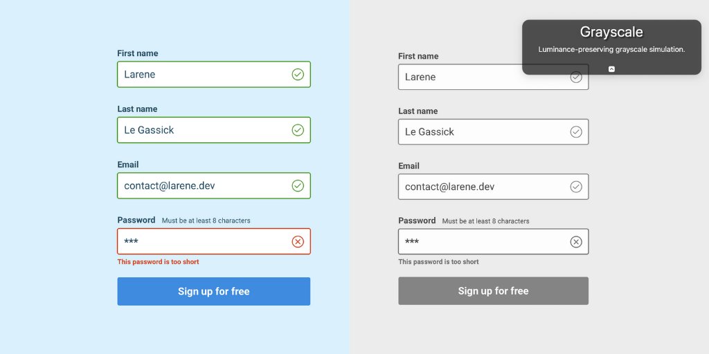
We cannot use only colour to provide meaning, or risk excluding nearly 1-2 in every 20 people from the web.
I use colororacle.org to simulate types of colourblindness, just hit f5
But at least for colourblindness, using icons and helpful error messages are a great solution.
A useful tip I learnt from @refactoringui is to design in greyscale, then add colour. 👍
Next, I'll talk about contrast

Web standards say accessible text/background contrast should be at least be 4.5:1
Let's take the form below. I'm testing contrast in @sketch using @getstarkco - you can also simulate colourblindness
But it is great for all. It reduces eye strain, and is easier to see in all environments. Think, outside in the sun on your phone.
It's easier to fix contrast issues early, so test while designing 🎨
I'll be sharing these browser accessibility checkers, tomorrow 😉
Happy #a11y week!


