

There is a total of 433 victims data analyzed in the research; however, not all fields were submitted or valid so total data ranges will vary throughout. 

Chart 1 - Age of impacted victims 🎂
The year of birth for the victims with the most impacted being aged between 21-30yrs old. Notably it is not just elderly people who get impacted by phishing which is often assumed.
The second most impacted are victims aged 31-40yrs old.
The year of birth for the victims with the most impacted being aged between 21-30yrs old. Notably it is not just elderly people who get impacted by phishing which is often assumed.
The second most impacted are victims aged 31-40yrs old.

It is worth nothing the delivery method used when looking at impacted age.
Different age demographics will get impacted by different delivery methods and different lures also.
Different age demographics will get impacted by different delivery methods and different lures also.
Chart 2 - Location of victims 🏠
Heat map of victims according to the postcode which they entered as their home address.
Locations are wide spread but concentrated in areas of high density, with the capital London having the most victims.
Heat map of victims according to the postcode which they entered as their home address.
Locations are wide spread but concentrated in areas of high density, with the capital London having the most victims.


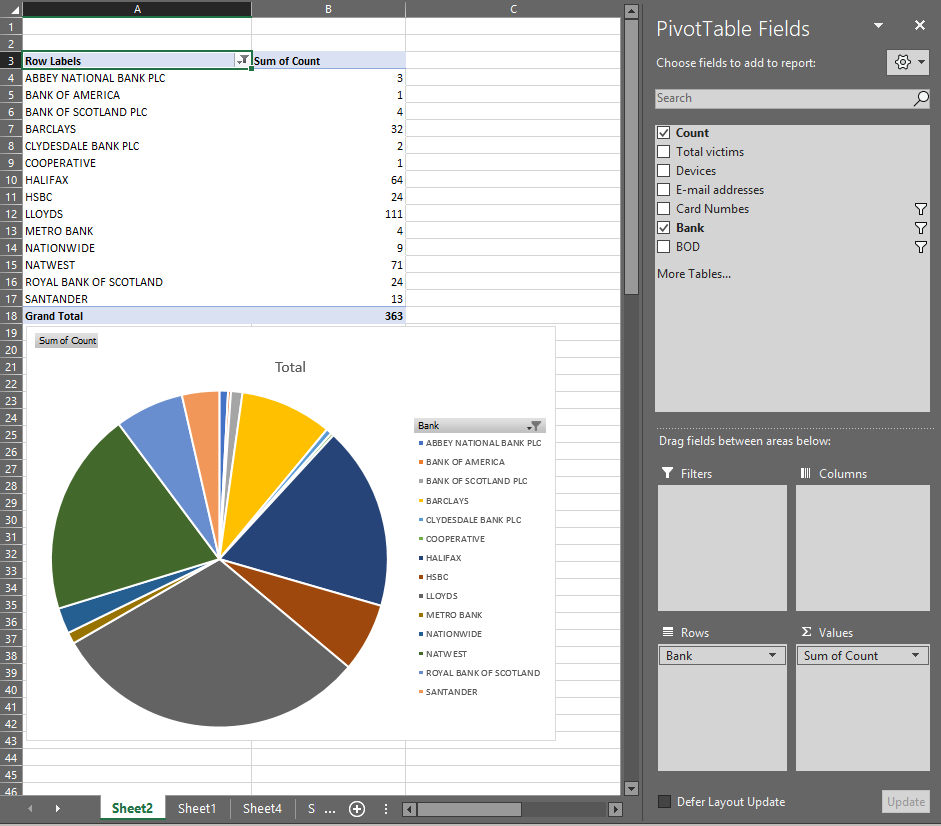
Chart 3 - Victim Bank Data 🏦
The most prevalent bank affected is Lloyds followed by Natwest. Although all banks are impacted by this campaign and it will vary depending on the bank the user enters into the phishing site.
The most prevalent bank affected is Lloyds followed by Natwest. Although all banks are impacted by this campaign and it will vary depending on the bank the user enters into the phishing site.

Chart 4 - Payment Card Brands 💳
There are only VISA and MasterCard details entered into the phishing data with VISA having the most cards impacted.
Cards are often used by threat actors for payment fraud or to sell onto other actors.
There are only VISA and MasterCard details entered into the phishing data with VISA having the most cards impacted.
Cards are often used by threat actors for payment fraud or to sell onto other actors.

Chart 5 - User Agent of victim accessing the phishing page 📳
The top two are Apple iPhone with 212 hits (49%) and Android with 199 hits (46%).
I suspect the other user agents present are researchers rather than victims.
The top two are Apple iPhone with 212 hits (49%) and Android with 199 hits (46%).
I suspect the other user agents present are researchers rather than victims.

Chart 6 - Targeted email addresses 📧
This data is email addresses belonging to victims, with Gmail being the most prevalent and Yahoo second.
I have removed email addresses with only one hit to reduce the amount of data.
These addresses are not where the phish lure was sent.
This data is email addresses belonging to victims, with Gmail being the most prevalent and Yahoo second.
I have removed email addresses with only one hit to reduce the amount of data.
These addresses are not where the phish lure was sent.

This was a very interesting activity with visualization really helping to demonstrate trends which cannot be seen using other methods.
The data has all been reported to the appropriate banks and the data is over 3 months old at the time of posting.
The data has all been reported to the appropriate banks and the data is over 3 months old at the time of posting.
To create the visualizations I used sublime and regex to extract data elements.
📉Excel pivot charts were used to create the graphs.
🌐geo.sg was used for the heat map.
📉Excel pivot charts were used to create the graphs.
🌐geo.sg was used for the heat map.
Thank you for reading and I hope you found this interesting. Any questions my DMs are open.
👍
</THREAD>
👍
</THREAD>


