Leaving aside the implications for what we know about the spread of #COVID19, which we'll get to in a second, THIS, simply as a story about management of data, is astounding. At one of the most crucial points in the pandemic tens of thousands of positive cases were underreported. 

We've known for some time there've been problems with #COVID19 data. There were serious problems collating data and turning it into national dashboards from early on. It was being done by hand in the early stages, we revealed in this investigation news.sky.com/story/amp/coro…
It seems those problems have not been laid to rest. Acc to @PHE_uk the explanation for what’s happened is “a technical issue… in the data load process that transfers #COVID19 positive lab results into reporting dashboards.” Thank God this was discovered within a few days...

BUT. This should NOT happen. We’re talking about thousands of tests being underreported ON SINGLE DAYS. Daily figures have looked v low in past few days. Did someone in PHE or Test & Trace really not do a sense check? Staggering this was going on for more than a week...
Much, much more worrying: this has a direct impact on test & trace.
15k people’s contacts won’t be traced.
In tracing every day counts.
That's a week or more in which #COVID19 was potentially allowed to spread in clusters.
Preventing that is the WHOLE POINT OF THIS SYSTEM.
15k people’s contacts won’t be traced.
In tracing every day counts.
That's a week or more in which #COVID19 was potentially allowed to spread in clusters.
Preventing that is the WHOLE POINT OF THIS SYSTEM.
At this stage it's perhaps worth remembering that test & trace is one of the most expensive investments ever made by a UK govt.
It already costs TWICE as much as the two aircraft carriers we spent a long time mulling whether we could afford.
It already costs TWICE as much as the two aircraft carriers we spent a long time mulling whether we could afford.
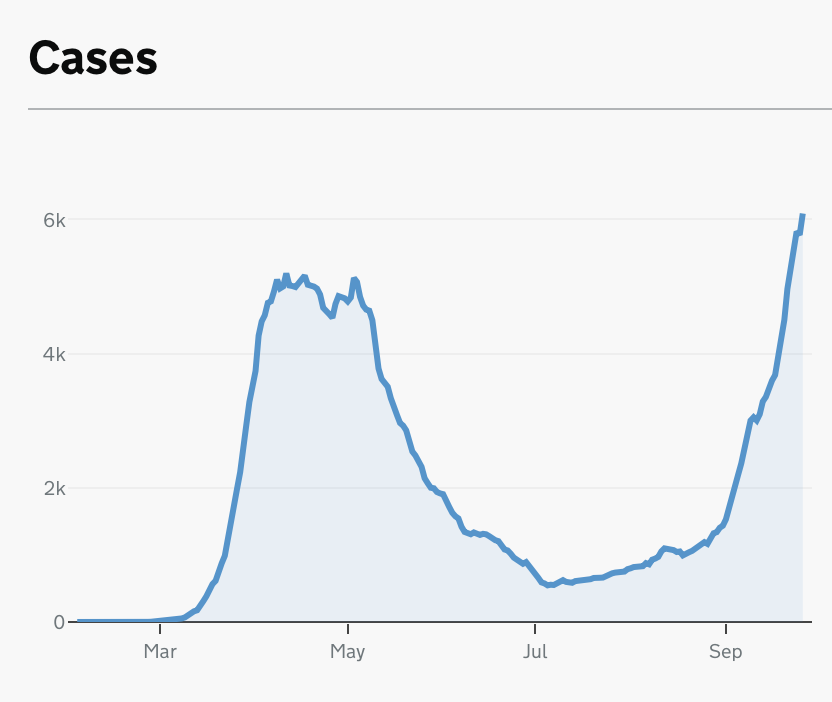
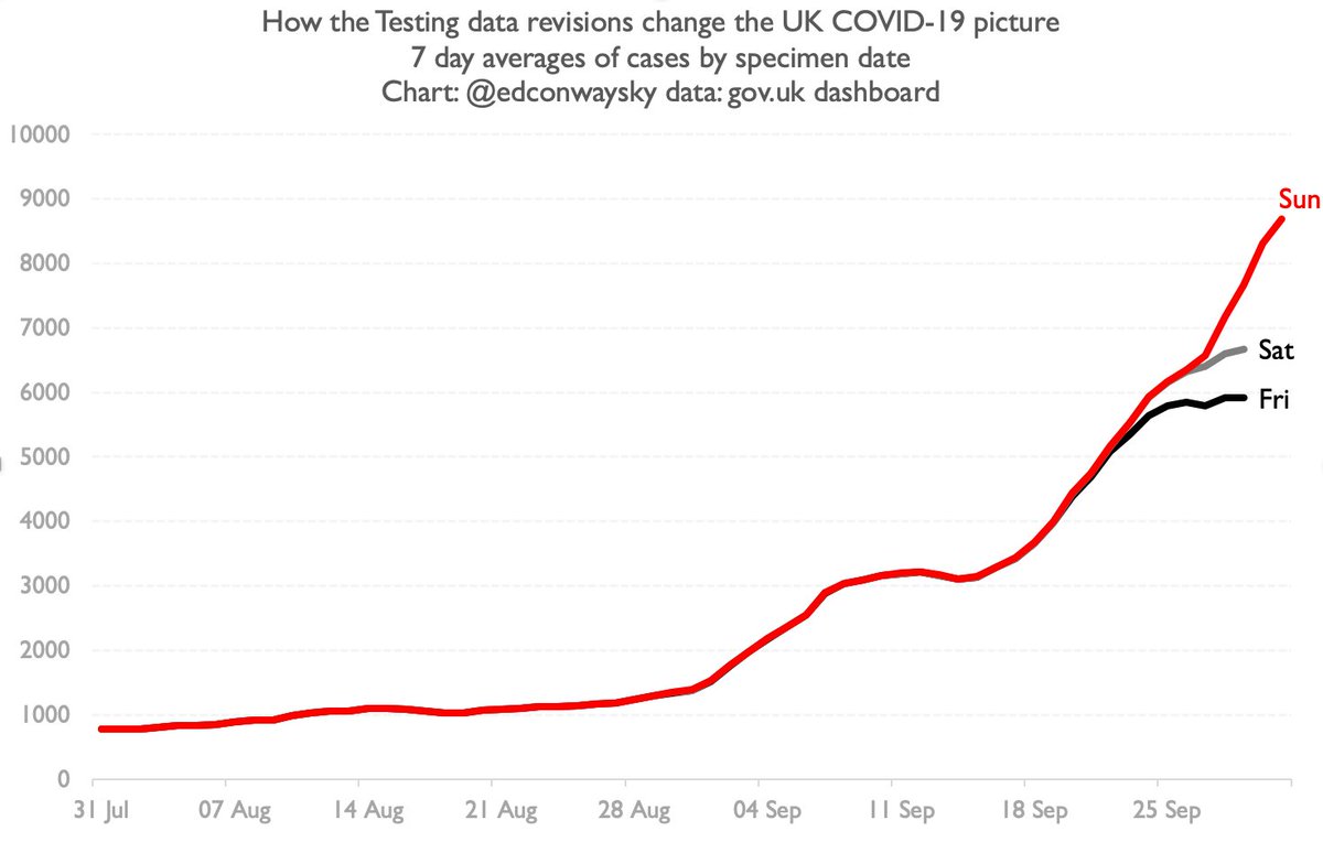
Does this testing data shambles change our picture of how fast #COVID19 is spreading around the country?
Short answer: yes.
This chart shows you case growth as we were being told on Fri (black line).
The red line is what we now know.
Not good. And these are 7-day averages.
Short answer: yes.
This chart shows you case growth as we were being told on Fri (black line).
The red line is what we now know.
Not good. And these are 7-day averages.
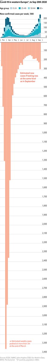
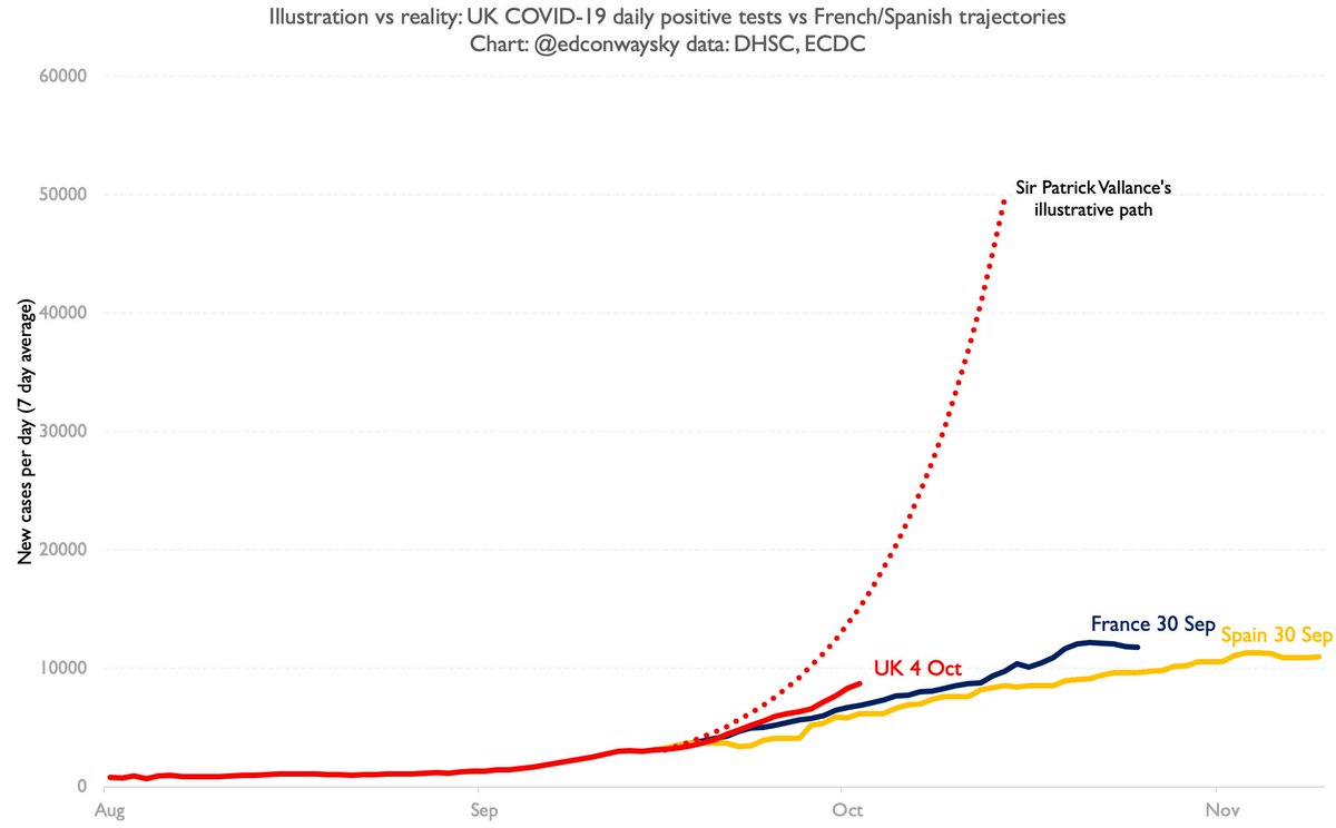
Regular readers will know I've been comparing the UK path with France & Spain, not because that's a "good" outcome but because this might give us a sense of where we may be heading.
Up until today we were v much in line with them.
Not any more.
Up until today we were v much in line with them.
Not any more.
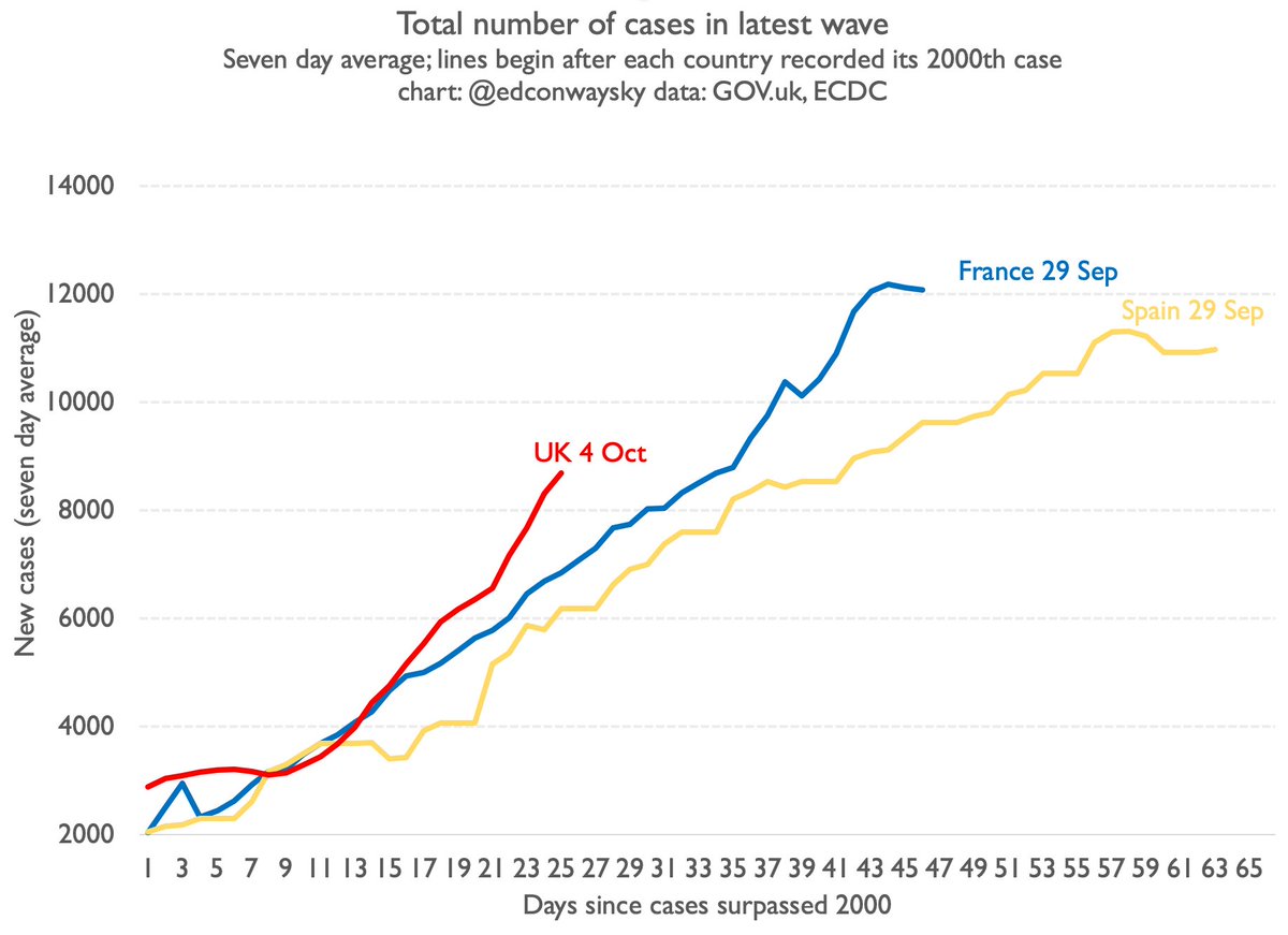
But - and it's a big but - we are still nowhere near the kind of exponential doubling-every-seven-days growth @uksciencechief warned about a couple of weeks ago. Growth is steeper, yes. If it continues that's v bad.
But let's keep things in proportion.
This chart tells that story
But let's keep things in proportion.
This chart tells that story
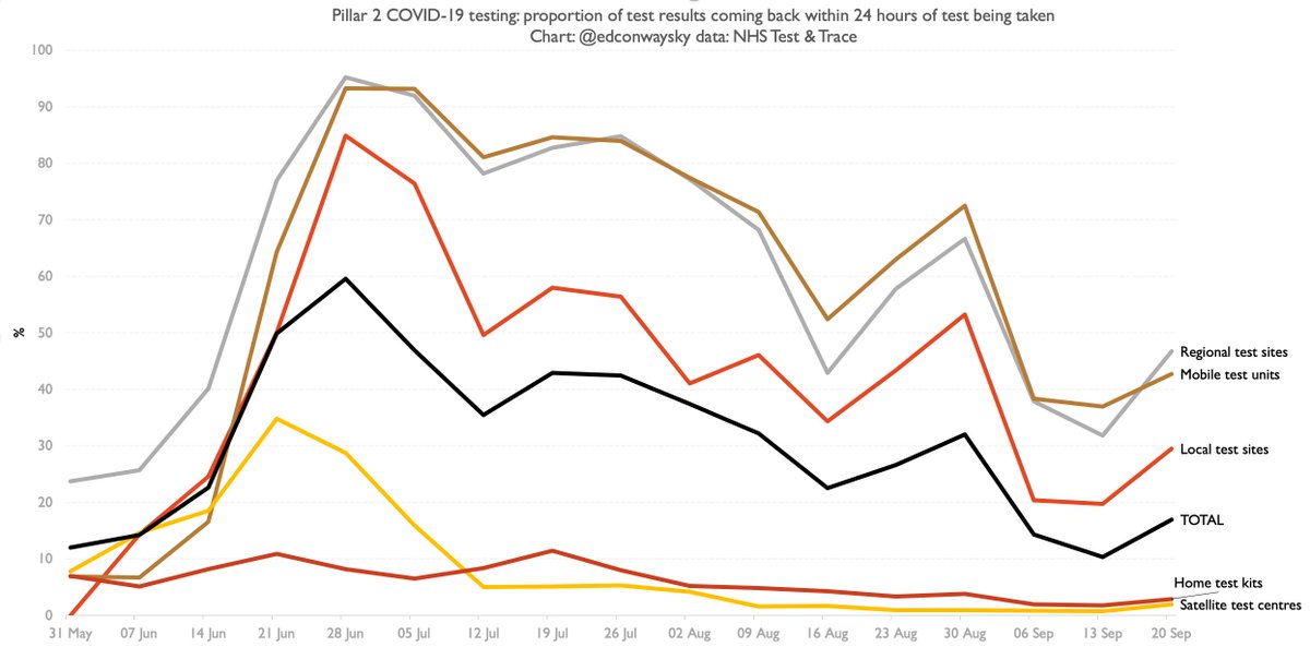
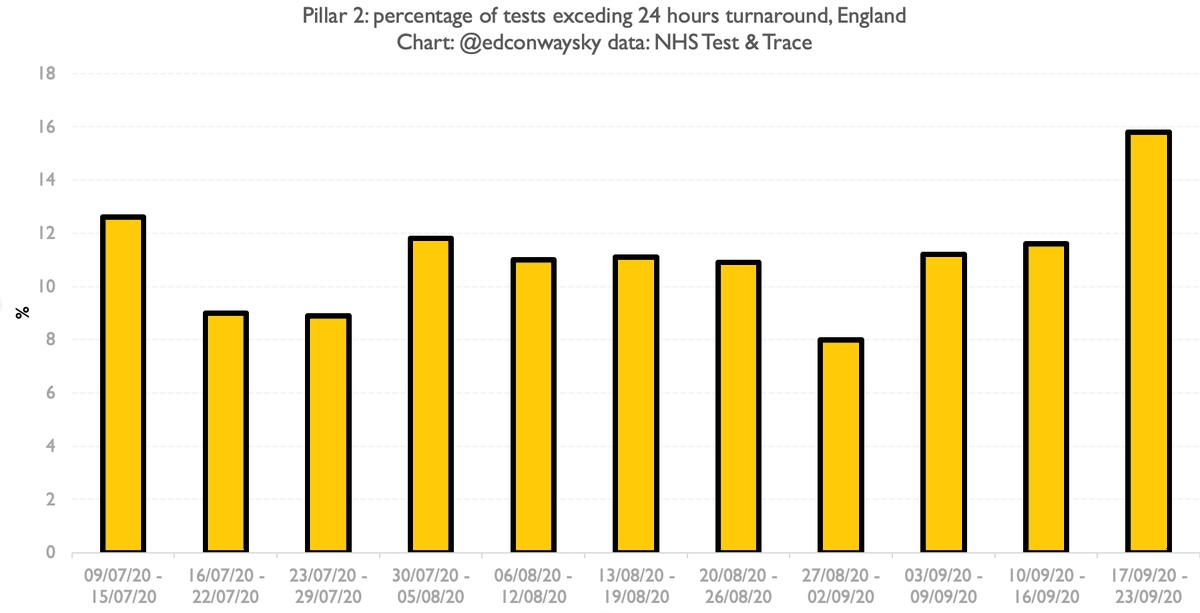
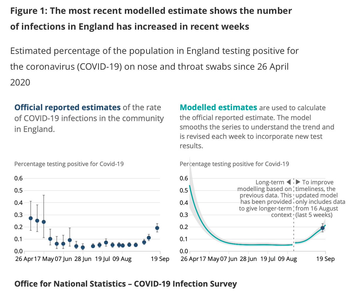
Also remember the following: we've known for some time daily testing data is suspect.
Far more reliable is the @ONS survey & hospitalisations data.
Both of those series suggest #COVID19 spread has actually been slowing, not accelerating.
Tho early to draw too many conclusions
Far more reliable is the @ONS survey & hospitalisations data.
Both of those series suggest #COVID19 spread has actually been slowing, not accelerating.
Tho early to draw too many conclusions
Finally, the charts were put together in haste so apols if there are any mistakes. It's late and I'm still getting my head round this.
Main tragedy seems to be those 15k cases that weren't properly traced.
Bigger picture: worse but not apocalyptic.
I'll do a deeper dive tomorrow.
Main tragedy seems to be those 15k cases that weren't properly traced.
Bigger picture: worse but not apocalyptic.
I'll do a deeper dive tomorrow.
Big thank you to @UKCovid19Stats who helped me track down some of the old testing data to compare Fri to Sun (hastily removed from gov.uk site, naturally).
One of many people out there doing good work in their spare time to help us all get our heads round this.
One of many people out there doing good work in their spare time to help us all get our heads round this.
Addendum to this thread: one or two of you have correctly pointed out that while the UK line in that chart above comparing Spanish & French trajectories is by specimen date, the other lines aren't. Here's a chart with ALL trajectories by specimen date, as just shown on @SkyNews:

• • •
Missing some Tweet in this thread? You can try to
force a refresh