How ON EARTH did the government manage to temporarily mislay 16,000 test results, putting thousands of people at risk of contracting #COVID19?
I try to explain it here.
Warning: you may find yourself shouting at the screen as you read it news.sky.com/story/coronavi…
A thread with some of the main details:
The key point (and perhaps the second most important revelation today) is that sitting at the very apex of Britain's testing system is a PHE computer system which processes test results and sends positive cases onto Test & Trace.
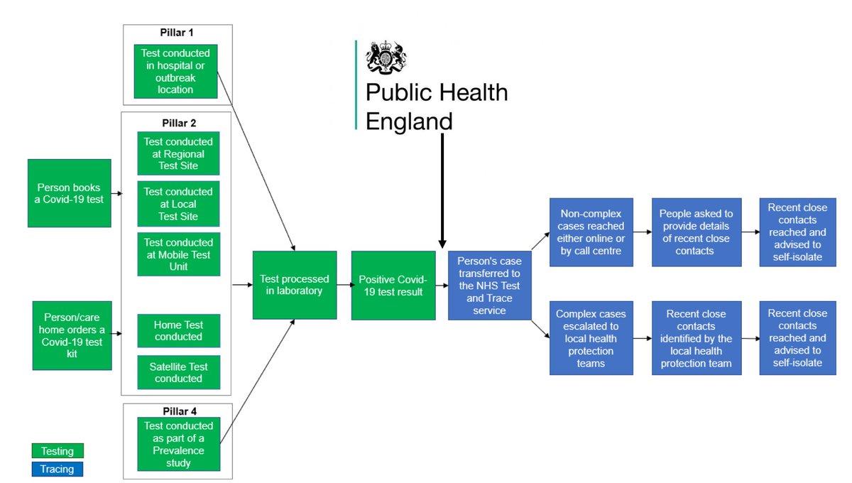
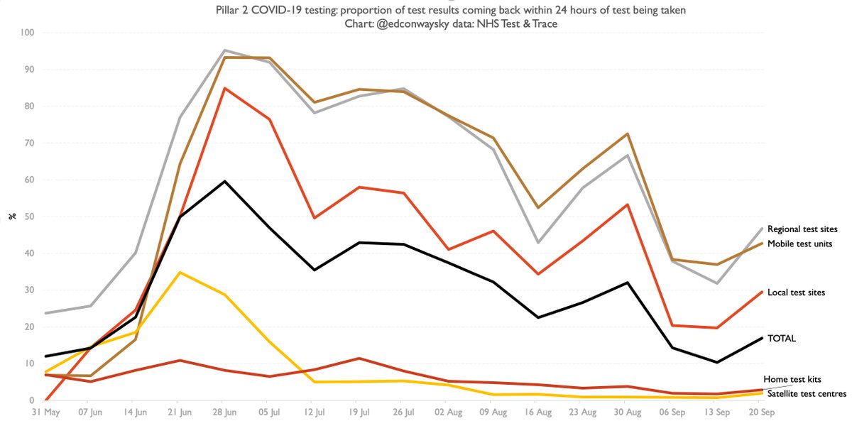
Now, this computer system works very well when it comes to the test result data coming in from the established pathology labs (pillar 1). There's a secure FTP link from them to something called SGSS. No problems there. But more testing these days is being done by "pillar 2"
"Pillar 2", you'll prob recall, is the centralised bit - the new bit, the Lighthouse Lab/Deloitte/Serco bit. And for some reason no-one can explain to me they haven't worked out how to feed their results directly into SGSS. So (wait for it)...
All the pillar 2 results (basically most English test results these days) are sent in the form of a csv spreadsheet file to @PHE_UK. They then feed those results into an Excel template and from there it gets fed into the dashboard and, like those SGSS results, along to T&T
It’s worth dwelling on this for a moment before we get to the car crash moment. At the very apex of our key #COVID19 defence mechanism is a database setup that’s a bit like putting a car together with sellotape. It is so, so, so not how to manage big, crucial databases.
And this isn’t just a database. It’s a mechanism which is supposed to save people’s lives. The sooner someone who’s got #COVID19 is identified and their contacts traced, the more we can halt the spread of the infection. This is the WHOLE POINT. Data saves lives.
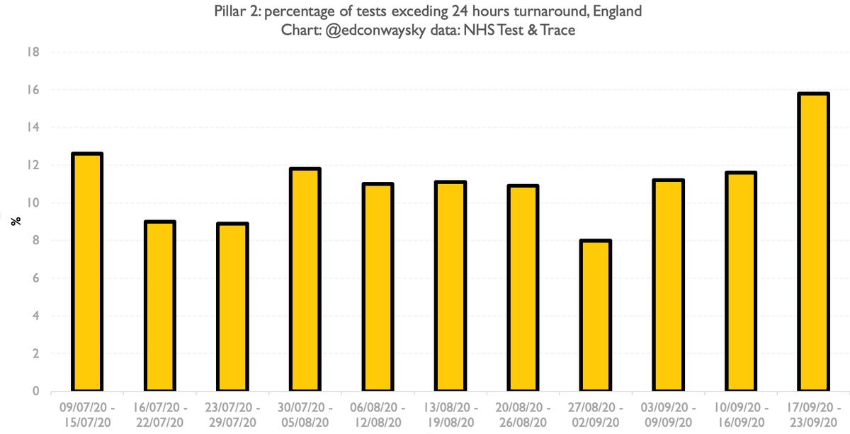
You may already know how this ends. It turns out old versions of Excel have a somewhat arbitrary and very well known limitation: the files can’t have any more than 65,536 rows in them. This is not the only reason people DO NOT USE EXCEL as a database, but it’s one of them.
It turns out the computer @PHE_UK was using to convert the CSVs into Excel and hence onwards into their dashboard/T&T was running an old version of Excel. Last Friday those monitoring the dashboard discovered it had run into that limit a week earlier.
There was, I’m told, sheer horror in the corridors of @PHE_UK in the following hours. They realised that as cases had mounted, so had the length of the CSVs coming in, and they were now well over 65,536 rows. So thousands of cases were simply not being ingested.
The upshot is around 16k cases were passed onto the contact tracers late. Around 12k were a few days late. Around 4k were as much as a week, perhaps a bit more, late. It seems highly likely people will have contracted #COVID19 as a result of this. Some may die.
The irony is if someone at @PHE_UK had simply upgraded Excel to the new version they would have upped their row limit to a million and we might never have had this catastrophe. Though, in case this wasn’t already obvious, Excel is NOT the program to use for this kind of thing.
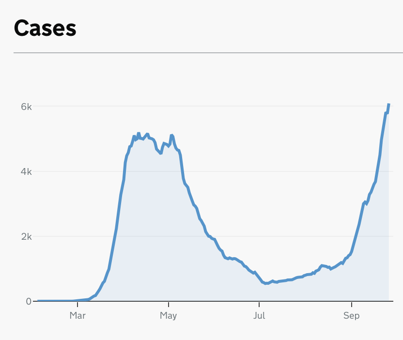
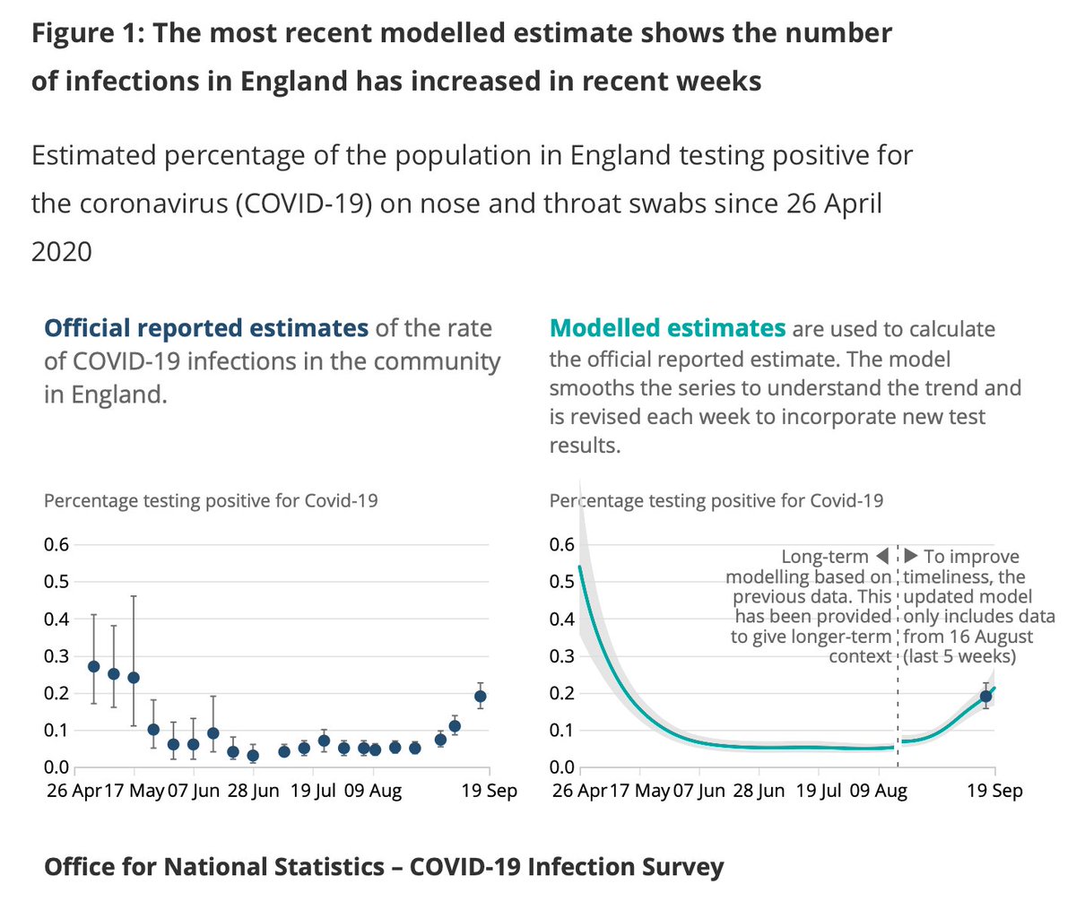
Now as I outlined last night, this might make some of the recent UK #COVID19 data look a bit scarier. But it prob doesn’t change the broader picture as depicted by the @ONS infection survey: it's spreading but prob not at the speed it was a few weeks ago.
The real worry is that we allowed so many cases to go untraced for such a long period. That might or might not change the disease's course. Let's hope not. Either way, some will prob get #COVID19 as a result. Some may die. And all due to hideous, elementary data mismanagement.
Back in July we revealed that data collection when it came to #COVID19 tests was so primitive that they were being collated with pen and paper.
Ironically that method would have been more robust than the Excel method that caused this latest data fiasco…
news.sky.com/story/coronavi…
For those who prefer their news in video form, here’s a short explainer on how on earth an obscure computer error somewhere in Whitehall meant that tens of thousands of people were unnecessarily exposed to #COVID19

• • •

Missing some Tweet in this thread? You can try to force a refresh
 

Keep Current with Ed Conway

Ed Conway Profile picture

Stay in touch and get notified when new unrolls are available from this author!

Read all threads

This Thread may be Removed Anytime!

PDF

Twitter may remove this content at anytime! Save it as PDF for later use!

Try unrolling a thread yourself!

how to unroll video
  1. Follow @ThreadReaderApp to mention us!

  2. From a Twitter thread mention us with a keyword "unroll"
@threadreaderapp unroll

Practice here first or read more on our help page!

More from @EdConwaySky

6 Oct
Jeepers the UK #COVID19 numbers are rising fast.
Another 14,542 cases over the past 24 hours.
We've been assured this is no longer the backlog effect following the data disaster.
And when you drill into the data we're now comfortably above 12k new cases a day *by test date*
Last week it looked v much from the data as if UK cases (at least as reported each day on the govt dashboard) were slowing. This week it's suddenly a v different picture. Compare the red and black lines.
#COVID19 cases are rising fast. Doubling roughly every 10 days. Image
How does UK compare with France/Spain? Case growth now seems to be accelerating faster than it did there.
Chart 1 is #COVID19 positive tests BY TEST DATE.
I'm going to retire my old chart because it's totally distorted by the data dump. But wave goodbye to it in chart 2 ImageImage
Read 6 tweets
4 Oct
Leaving aside the implications for what we know about the spread of #COVID19, which we'll get to in a second, THIS, simply as a story about management of data, is astounding. At one of the most crucial points in the pandemic tens of thousands of positive cases were underreported. Image
We've known for some time there've been problems with #COVID19 data. There were serious problems collating data and turning it into national dashboards from early on. It was being done by hand in the early stages, we revealed in this investigation news.sky.com/story/amp/coro…
It seems those problems have not been laid to rest. Acc to @PHE_uk the explanation for what’s happened is “a technical issue… in the data load process that transfers #COVID19 positive lab results into reporting dashboards.” Thank God this was discovered within a few days... Image
Read 13 tweets
3 Oct
Blimey: 12.872 new #COVID19 cases announced in the UK.
V big number. Biggest single daily number by a long distance.
Explanation is they left some cases out of the past week’s numbers down to “technical” reasons. 🤔
I’m pretty flabbergasted. Eight days - EIGHT DAYS - of #COVID19 case numbers were being under-reported due to “a technical issue which has now been resolved”.
And even tho it’s “resolved” no clarity abt how much of the shortfall is left to be reported. Hundreds? Thousands?
Does this change our picture of the disease?
Perhaps, perhaps not.
If today's figs contain the bulk of underreported cases the trajectory remains pretty similar, tho a bit higher.
But we don't know because once again they've been abysmally vague abt the extent of this. Astounding
Read 5 tweets
2 Oct
Belatedly catching up with Test & Trace data from yday. Good news is on most metrics the performance of Pillar 2 tests (the private bit of the testing network) have improved from the previous week.
⬇️Time taken to get a test result
⬇️Distance travelled to get a test
That said, across the whole of pillar 2 in England the percentage of people getting test results within 24 hours of taking a test is still just 17% as of 17-23 Sep (eg last week). That's still a lot lower than earlier this summer as you can see from this chart:
Actually when it comes to test turnaround the one area where test processing/delivery seems to be slowing down is pillar 1, which is primarily hospital labs - the bit of the system that had held up best thus far
Read 12 tweets
30 Sep
One problem with using #COVID19 trajectories to work out where we may be heading is question marks over the data - something illustrated brilliantly by this chart via @AlexSelbyB. Official case numbers look v v high now, but we weren't measuring cases v well back in spring. Image
Upshot is charts of cases alone are of limited use - and this is before you get to questions about whether the testing figs are reliable. We could look at positive tests as % of total (chart 2). It adjusts for fact we're doing more testing. But is that early data reliable? ImageImage
The best measure of #COVID19 prevalence in England is prob the @ONS infection survey but again: it started after the peak. And right now what we REALLY need to gauge is not post peak but the run up to the peak Image
Read 16 tweets
30 Sep
Pointy-headed thread: Do you remember this tweet of mine from earlier this year? About how extraordinary flows of gold out of the UK are completely changing the picture of UK trade? Well, brief update: it's still happening. Big time.
In the past few quarters, the UK trade account has swung into positive territory for the first time since the 1990s. And not just positive territory: the biggest trade surplus EVER. £16.9bn in Q2 alone...
It's worth emphasising that even if you look at the trade balance as a % of GDP it's still one of the highest levels we've ever seen. Only one other quarter - Q1 1981 - had a higher surplus. And I don't think it's ever swung quite as dramatically as this...
Read 12 tweets

Did Thread Reader help you today?

Support us! We are indie developers!


This site is made by just two indie developers on a laptop doing marketing, support and development! Read more about the story.

Become a Premium Member ($3/month or $30/year) and get exclusive features!

Become Premium

Too expensive? Make a small donation by buying us coffee ($5) or help with server cost ($10)

Donate via Paypal Become our Patreon

Thank you for your support!

Follow Us on Twitter!