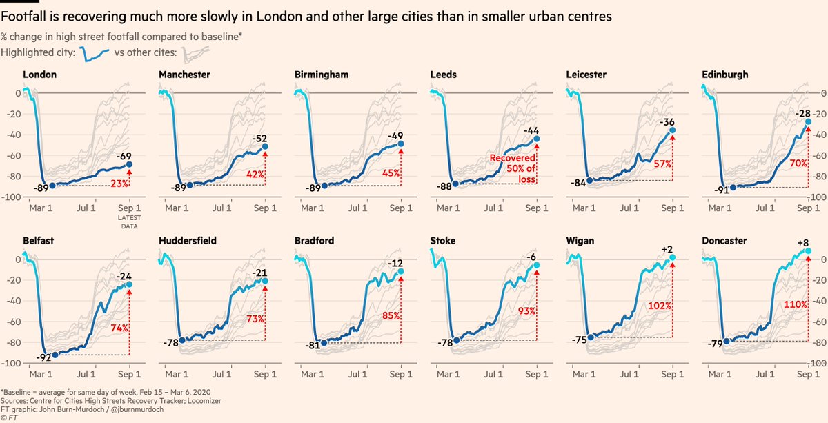
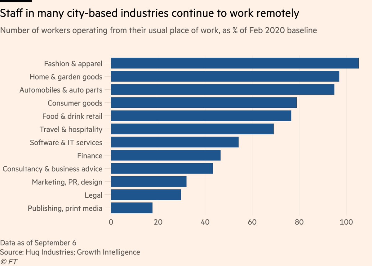
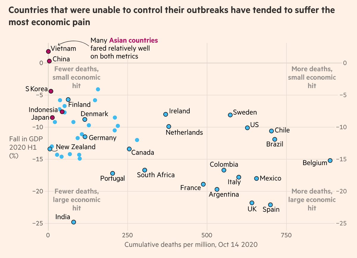
NEW: today we've published the culmination of a weeks-long @ftdata team effort, summarising everything data has shown us about the virus over the year so far, from Wuhan to the autumn resurgence ig.ft.com/coronavirus-gl…

Free to read, with a wealth of #dataviz on the key trends.
A huge amount of work from a vast cast of people went into this, over many weeks.

Consider this our rolling credits screen:

1) @caletilford & @aendrew built a beautiful interactive experience, designed by @carolinenevitt who also drew up a bespoke colour palette for the series
2) @tomhannen @BobHaslett @sdbernard created some stunning visuals, including gorgeous animations 🎥😍

3) @alekswis @martinstabe @officeofjane @theboysmithy and I dug into data and scientific papers to report out the story itself, and added charts that told that story 📖📈
4) @manib0g was a masterful cat-herder, keeping us on our toes and making sure everything happened when it needed to

And 5) in the director’s chair as our Spielberg/DuVernay was @theboysmithy, who somehow managed that alongside making charts, writing words & doing 12 other jobs

• • •

Missing some Tweet in this thread? You can try to force a refresh
 

Keep Current with John Burn-Murdoch

John Burn-Murdoch Profile picture

Stay in touch and get notified when new unrolls are available from this author!

Read all threads

This Thread may be Removed Anytime!

PDF

Twitter may remove this content at anytime! Save it as PDF for later use!

Try unrolling a thread yourself!

how to unroll video
  1. Follow @ThreadReaderApp to mention us!

  2. From a Twitter thread mention us with a keyword "unroll"
@threadreaderapp unroll

Practice here first or read more on our help page!

More from @jburnmurdoch

15 Oct
⚠ warning to anyone using ECDC subnational cases rates data ⚠

Figures released this morning include several errors, some very significant.

They’ve since silently uploaded a new file, but incorrect one is still online 😑

We’re checking new file for errors and will report back
Latest ECDC data appears to be correct: ecdc.europa.eu/en/publication…

You can the impact of the correction in this before (left) and after (right) duo courtesy of @sdbernard.

With the correction, all of France breathes a sigh of relief
Today has been another classic episode of the hit series "Covid data is an utter shitshow".

Data jiggery pokery going on everywhere, well beyond that ECDC slip-up.
Read 4 tweets
1 Oct
Tidied up a chart from the new Indian study that I think does a great job of showing what we mean by super-spreading:

Vast majority of confirmed cases don’t go on to infect anyone else; a small number of people account for the majority of transmission

science.sciencemag.org/content/early/… Image
This is why the Japanese approach of avoiding the three Cs (enClosed spaces, Crowded spaces, Close contact) has been so effective.

Even if someone is highly infectious, you hugely constrain the amount of spreading they can do if you limit the number of people they’re mixing with
We still don’t know exactly what causes super-spreading. Is it mainly that someone is especially infectious, or mainly that a moderately infectious person spends time in an enclosed & crowded space while infectious?

Whatever the answer is, avoiding the 3Cs can only help.
Read 4 tweets
28 Sep
I’ve noticed a lot of people slipping up on how they interpret UK Covid-19 prevalence & testing data, so here’s a very brief thread on how to interpret figures from different sources, and what caveats each source does and does not come with:
• Pillar 2 community testing: these are the bulk of cases picked up at the moment. Case and positivity rates here *could* be influenced by where and who is being tested, so e.g patterns in this data with age, deprivation etc could be skewed by who is getting tested
@ONS infection survey: these tests are random, and designed to be representative of the overall population.

Therefore trends and patterns in this data *are not* due to e.g certain locations or groups of people being more likely to get tested.
Read 5 tweets
14 Sep
NEW with @ChrisGiles_ & @DanielThomasLDN: UK’s big cities are shadows of their usual selves, but smaller urban areas have rebounded ft.com/content/203cc8…

What’s driving the divergence? Chart thread:

1/ Footfall in central London is still down 69%, but has picked up elsewhere
2/ This is driven by working patterns, but that in itself plays out in two distinct ways:

First, job type. Staff are returning to the workplace at very different rates in different sectors, and the sectors with the most remote working today are clustered in cities, esp. London
3/ Workers in retail, hospitality can’t do their jobs remotely and have returned to the workplace. They’re popping out for lunch or drinks near work and maybe shopping centrally before going home.

In big cities, office-workers are still at home, leaving the high streets empty.
Read 12 tweets
9 Sep
The most effective way to keep Covid in check and return to semblance of normality (far more so than blanket restrictions) is to have as many people as possible being tested, regularly & regardless of symptoms.

For government to be discouraging people from getting tested is wild
If there’s still a shortage of testing (or in this case test-processing) capacity, that’s a problem to be solved on the supply side, not the demand side.

Blanket restrictions (which do the most economic damage), are what countries do when their testing apparatus is inadequate.
The “overreaction to a 'casedemic' is killing our economy/cities” crowd are tilting at a false dichotomy where our only options are:

"Keep restrictions in place to limit transmission, hurting econ & cities" or "It’s overblown, let’s get back to normal and save econ/cities"
Read 5 tweets
4 Sep
When @christinezhang joined the FT as our US elections data reporter, this is exactly the kind of piece I was excited to see:

Read her brilliant explainer on how US polling methods have changed since 2016 and why this makes 2016 vs 2020 comparisons tricky ft.com/content/b32976…
2 big differences between 2016 and today:

1) As the link between US education levels and partisanship has grown, it's become vital for pollsters to weight by education.

Most didn't do this in 2016, but are doing now, so the same Biden lead today would have looked larger in 2016
Here's a more detailed example: there was little to no partisan slant of education before 2016, but in 2012 the gap opened up, so new edu-weighted methods (pink) now give consistently smaller Dem leads than old methods (green)
Read 4 tweets

Did Thread Reader help you today?

Support us! We are indie developers!


This site is made by just two indie developers on a laptop doing marketing, support and development! Read more about the story.

Become a Premium Member ($3/month or $30/year) and get exclusive features!

Become Premium

Too expensive? Make a small donation by buying us coffee ($5) or help with server cost ($10)

Donate via Paypal Become our Patreon

Thank you for your support!

Follow Us on Twitter!