Organifi: CRO case study
Why Organifi?
>Well know for having a crazy conversion rate (around 10%)
>Made billions of tests to get the best CR
>+50m$ in Rev per year
>Fitness/health Supplements Brand
Here are 10 techniques Organifi uses to get crazy CR% and AOV
*/Thread/*
Why Organifi?
>Well know for having a crazy conversion rate (around 10%)
>Made billions of tests to get the best CR
>+50m$ in Rev per year
>Fitness/health Supplements Brand
Here are 10 techniques Organifi uses to get crazy CR% and AOV
*/Thread/*

1. Ultra Optimized "Above the fold" section
The goal is to grab attention and make people scroll
How they do it:
>Problem solved(benefits list + testimonial)
>Discount(in red)
>Social proof (mini testimonial
>Obvious CTA (Enormous + color contrast)
>Money back guarantee
The goal is to grab attention and make people scroll
How they do it:
>Problem solved(benefits list + testimonial)
>Discount(in red)
>Social proof (mini testimonial
>Obvious CTA (Enormous + color contrast)
>Money back guarantee

2. AIDA Product page structure
They respect the AIDA principle and focus on showing as much social proof as possible
See it by yourself:
organifishop.com/products/organ…
Here is the product page structure:
They respect the AIDA principle and focus on showing as much social proof as possible
See it by yourself:
organifishop.com/products/organ…
Here is the product page structure:

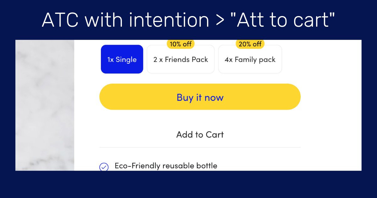
3. Action-centered CTAs & Big visual contrast
Every of their CTA is has a great visual contrast (bright colors + big size) and is always action-turned.
Some say "buy now" is better than a "Add to cart"
But if they do it it means it worked for them
Test it.
Every of their CTA is has a great visual contrast (bright colors + big size) and is always action-turned.
Some say "buy now" is better than a "Add to cart"
But if they do it it means it worked for them
Test it.

4. Offers Subscription to increase LTV
Offering a subscription is the best way to increase the lifetime value of your customers.
but don't do it unless:
>Your product is good
>consommable/rechargeable
>You can give a discount
Make the option visible
Offering a subscription is the best way to increase the lifetime value of your customers.
but don't do it unless:
>Your product is good
>consommable/rechargeable
>You can give a discount
Make the option visible

5. "Buy more and save" to Increase AOV
>Allow people to buy more items of one product and give them a discount
A very simple technique to increase the AOV but very few do it.
Organifi does it very well with the image & the "save x$"
>Allow people to buy more items of one product and give them a discount
A very simple technique to increase the AOV but very few do it.
Organifi does it very well with the image & the "save x$"

6. Emphasizing on discounts & the word "Save" + visual contrast
-"Buy more and Save" (in Capital letters & Bold)
-"Save 26%" (In red next to the price)
-"Complete the bundle & Save 25%" (In orange)
"SAVE 100$" is better than "Get a 100$ discount"
Loss Aversion bias.
-"Buy more and Save" (in Capital letters & Bold)
-"Save 26%" (In red next to the price)
-"Complete the bundle & Save 25%" (In orange)
"SAVE 100$" is better than "Get a 100$ discount"
Loss Aversion bias.

7. Bundles & Packs to increase AOV
Bundles are a great way to increase AOV but not so much stores do it well
Organifi created unique identities for each bundle to target as many people as possible (Irresistible offer + discount)
Do it and see your AOV increase
Bundles are a great way to increase AOV but not so much stores do it well
Organifi created unique identities for each bundle to target as many people as possible (Irresistible offer + discount)
Do it and see your AOV increase

8. Phone number for customer support & question (+CR%)
I rarely see phone numbers on Ecommerce websites but It's definitely a great way to build trust and increase CR%.
Even if people don't call it can have an impact on the buying decision
Phone number = They care about people
I rarely see phone numbers on Ecommerce websites but It's definitely a great way to build trust and increase CR%.
Even if people don't call it can have an impact on the buying decision
Phone number = They care about people

9. Very simple and straightforward Cart page
They Made it as simple as possible
The UNIQUE goal of the cart is to get people to go on checkout.
Nothing else.
+the cart is not a page but a slider.
No loading time. It appears instantly (no fictions)
They Made it as simple as possible
The UNIQUE goal of the cart is to get people to go on checkout.
Nothing else.
+the cart is not a page but a slider.
No loading time. It appears instantly (no fictions)

10. All Checkout process is on one page
One page checkout = Less clicks = Less frictions = Higher conversion rate
To optimize the checkout they add:
>Security badges on top
>Clear CTA in bright green at the end
>Shipping costs are displayed after you enter your address
One page checkout = Less clicks = Less frictions = Higher conversion rate
To optimize the checkout they add:
>Security badges on top
>Clear CTA in bright green at the end
>Shipping costs are displayed after you enter your address

• • •
Missing some Tweet in this thread? You can try to
force a refresh