1/10 Sweden - cases, deaths & testing. A 2nd wave of PCR testing has created a 2nd wave of bad analysis of Swedish data. Influential commentators have eagerly picked up the increase in cases that has followed a ~3x increase in testing. It is time to revive some old diagrams.
2/10 Sweden. Firstly, 20 weeks have passed since the 1st surge in cases with no subsequent increase in deaths. There was a smaller bump in cases 11 weeks ago, no increase in deaths. Cases have increases for 6 weeks straight with no noticeable effect on deaths – how can this be?
3/10 Apart from the initial outbreak, all increases in detected cases have coincided with upped testing. This time PCR testing increased from 54k to 139k between weeks 31-41. Would we normally be surprised to find more of anything if we expand our efforts ~threefold?
4/10 Luckily there are ways to gauge whether we find more cases due to prevalence or testing. Apparently, cases have increased far less than testing (+113% vs +159%). In fact, cases began incr. in week 36 - just prior to the week & month with the lowest positivity rate on record.
5/10 To clarify, at a point where growth in cases itself would signal that this has been one of the most severe periods of the pandemic, finding active cases was more unlikely than ever before. Prevalence would appear to have been low.
6/10 The positivity rate has gone up for four weeks straight, but the monthly avg. remains below that of August. Nonetheless, this increase in positivity (rather than changes in absolute case counts) is something worth keeping a closer eye on in the coming weeks.
7/10 Stockholm. A remarkable increase in detected cases. So far deaths have not followed. That is not to say deaths will remain this low. Rather, if conventional knowledge of respiratory illnesses holds true, we would assume an increased severity of the virus the coming months.
8/10 In these two diagrams we can see the disconnect between cases and deaths widening as testing was ramped up. It is also worth to reiterate that 20, 11 and 6 weeks have passed since the past three increases in detected cases occurred with no discernable effect on deaths.
9/10 There are a lot of commentators jumping at case numbers that they hope can confirm their preconceptions. Sometimes this requires unconsciously or purposefully desisting from digging deeper into the data if it risks running counter the chosen set of beliefs.
10/10 Such a selective approach to data analysis is unfortunate. It risks impeding us from making well-informed decisions and cause unnecessary harm.
11/11 No one knows if deaths will increase in the coming weeks. But up to this point, without a doubt, there is unequivocal evidence that Covid19 deaths have never increased proportional to cases in Sweden. Claiming otherwise is ill-informed.
• • •
Missing some Tweet in this thread? You can try to
force a refresh
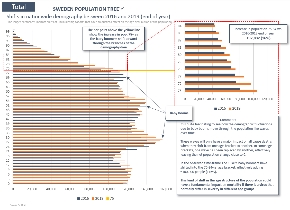
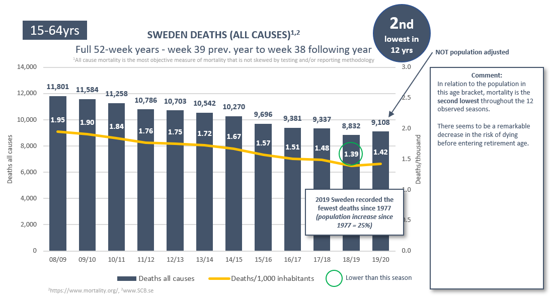
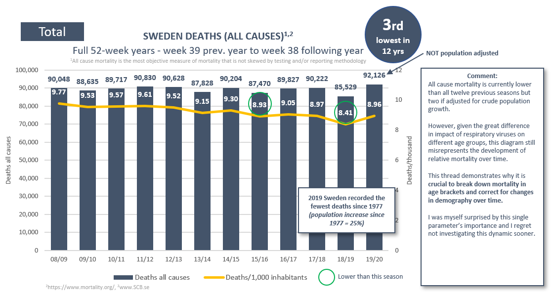
(1/19) #covid19 Sweden. Respiratory illness IFR varies greatly with age. This season the demography-adjusted all cause mortality has been historically low in all available age brackets. A reminder that demography is a crucial factor in susceptibility that shouldn’t be overlooked.
(2/19) We will explore two types of diagrams for each age bracket. The first type is straightforward. In the second one you would expect the yellow lines to follow the blue lines if mortality in that age bracket remained constant (and the grey columns to remain close to 0).
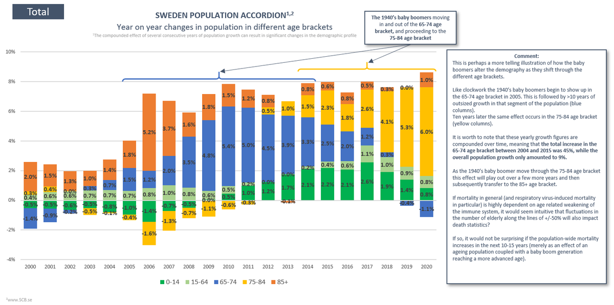
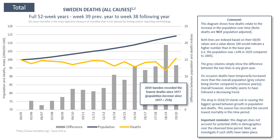
(3/19) This thread should help wean us off crude PFR measures. But it’s worth mentioning that simply adjusting for overall population growth puts this season’s mortality at the 3rd lowest over the past 12 seasons. Has there been any shifts in demography that could affect PFR?
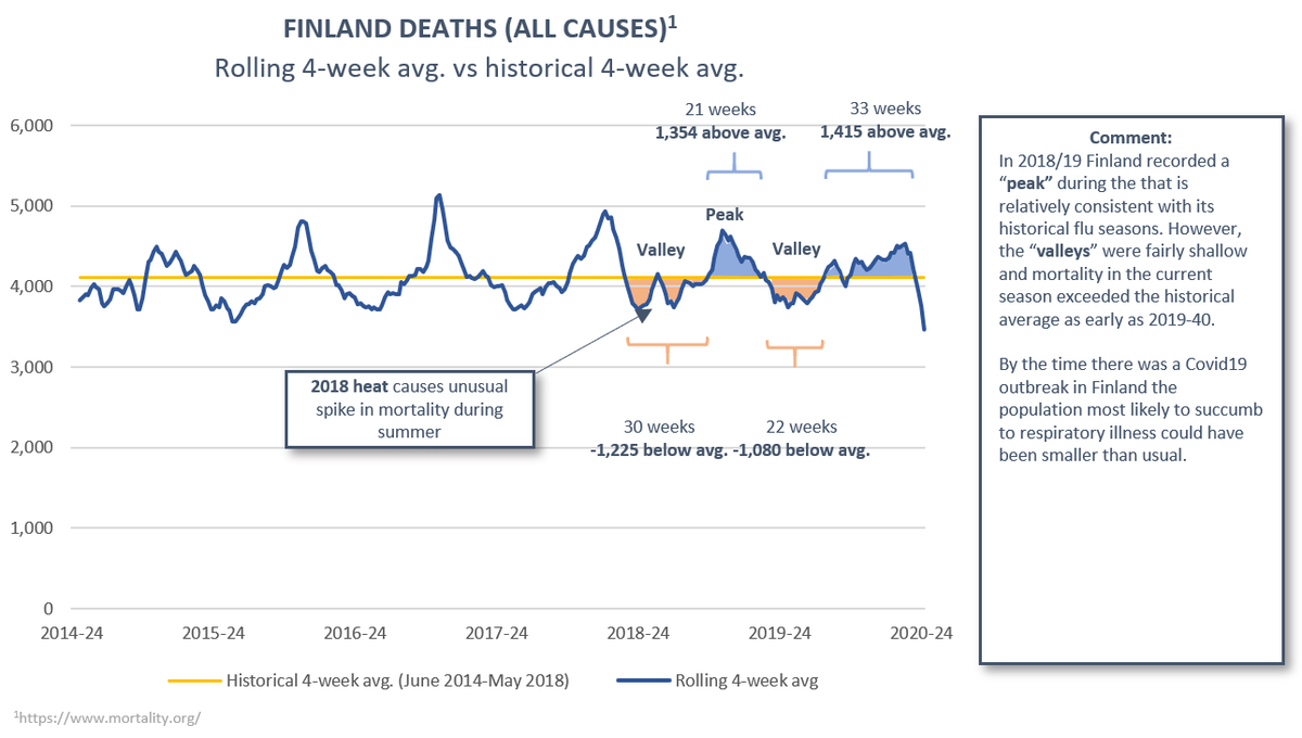
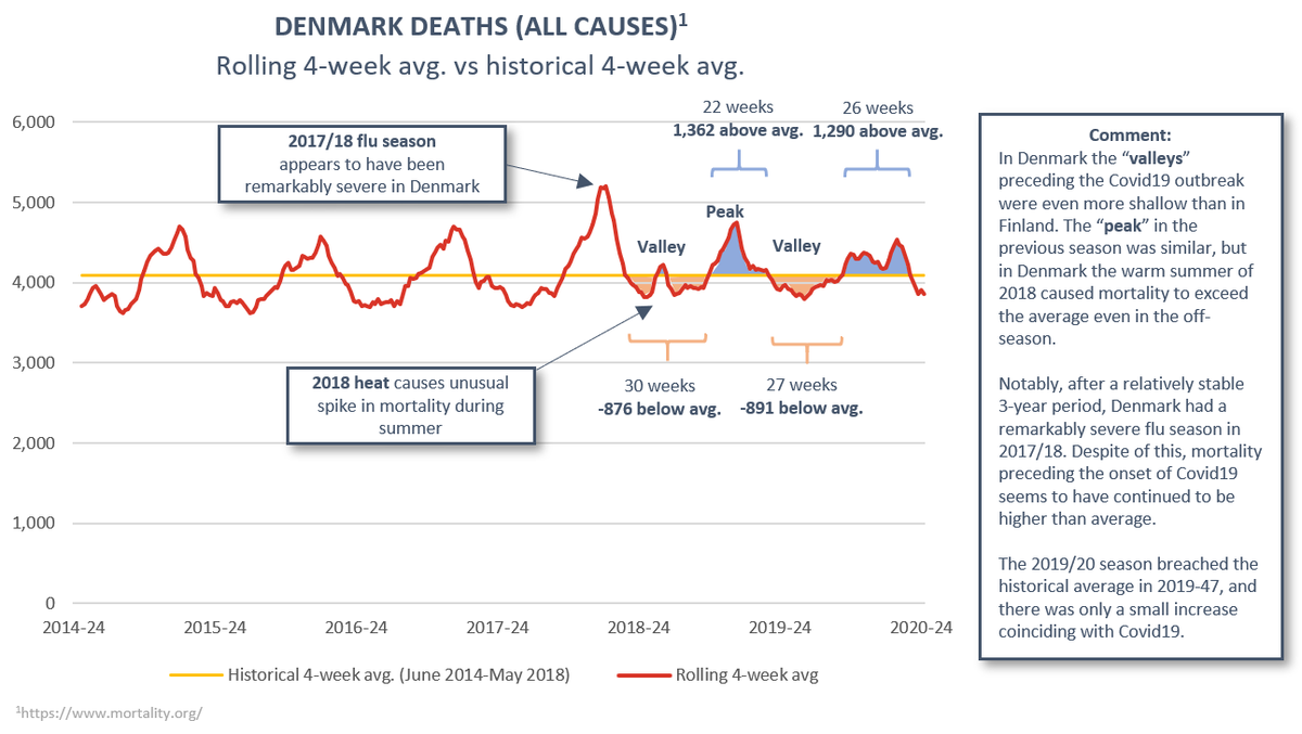
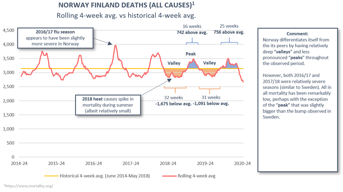
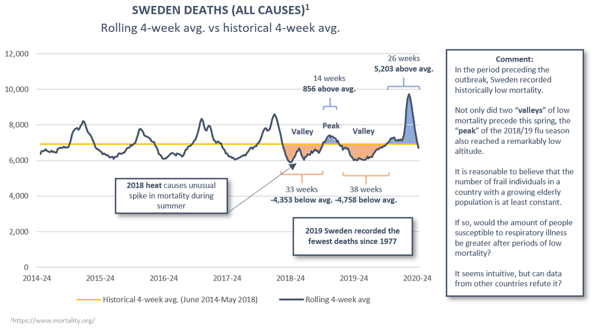
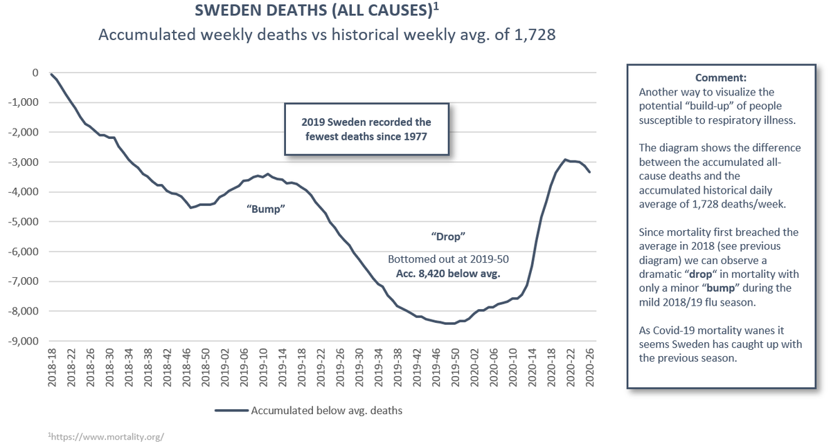
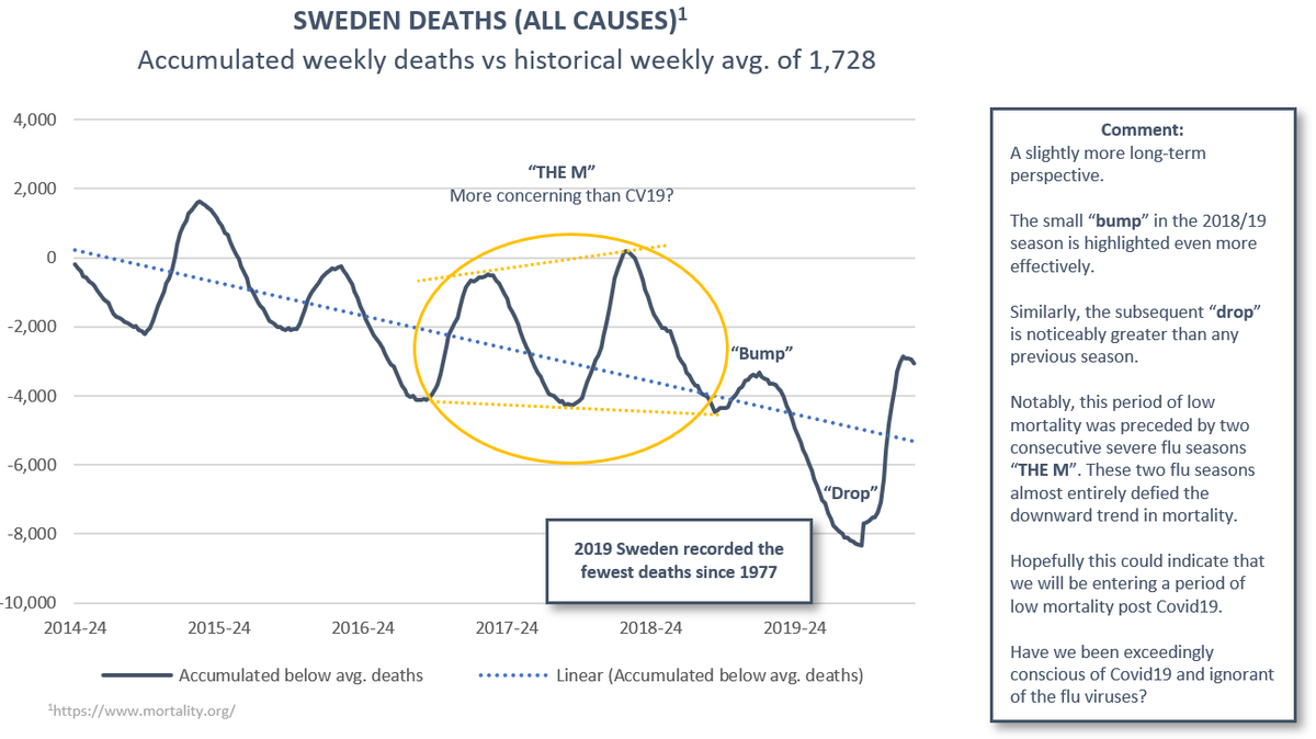
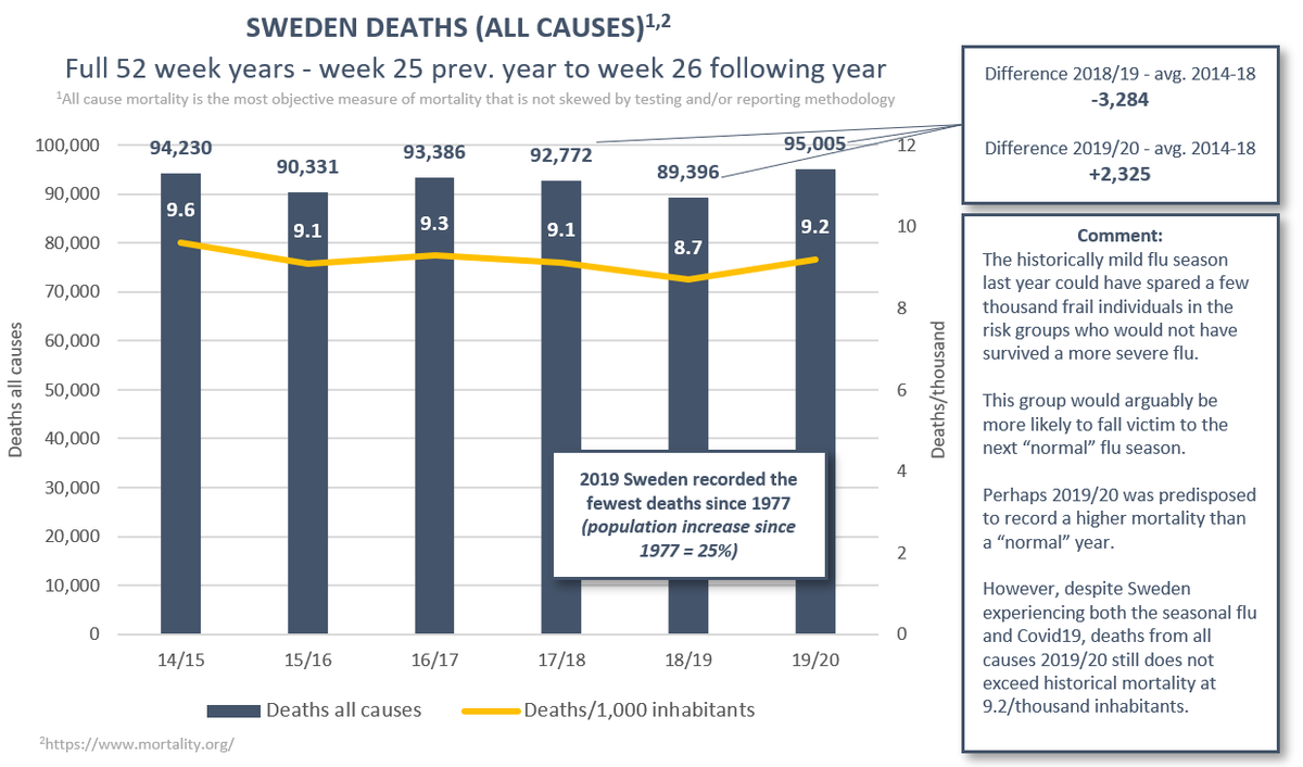
(1/12) Big thread with 16 diagrams to investigate the “dry tinder” hypothesis (mild preceding seasons affecting future mortality). We begin with a deep dive into the Nordics – in short: the data does not seem to refute the hypothesis (preview in pictures).
(2/12) I provide comments in the pictures to keep the thread manageable. The diagrams are organized by country. Although I generally advise against inter-country comparison, in this case I would suggest looking at the same diagrams for different countries side by side too.
(3/12) Sweden. The outlier in the group in terms of response policy. A record-low mortality in 18/19 and 19/20 flu seasons could have spared a large population vulnerable to respiratory illness.
(1/9) New thread and diagrams on cases/deaths in Sweden. I will keep this updated weekly to alert us if cases suddenly transform into a leading indicator of deaths. So far, the Swedish experience strongly suggest that they do not (once there is community spread). #Covid19Sweden
(2/9) A casual observer might be worried that the case count in Sweden has more than doubled over the last 5 weeks. But rather than a surge in mortality, deaths over the same 5-week period are down by 80%.
(3/9) It seems as soon as the spread of the virus has peaked (with mortality being the only reliable metric of this), cases are no longer relevant to determine the spread or severity of the virus and will more likely be dependent on testing strategy.
(1/9) The decision to close schools is one of the most disruptive and potentially inefficient measure that has been attempted to counter Covid19. @NahasNewman and many others have worked tirelessly to protect the rights of children against fact-resistant calls to isolate them.
(2/9) Sweden didn’t close schools. If this policy was detrimental to their health, this should manifest in Swedish Covid19 statistics. What does the facts tell us? So far, out of 2.4 million people, one person below the age of 20 has died with Covid19 (0,000042% mortality).
(3/9) Perhaps you are more concerned about teachers? There is already a wealth of research showing that children only rarely transmit Covid19