I wanted to follow up on @davegilmartin's question about ballots returned from my first data thread this week. He asked about early voting turnout by county and by party. Strap in, we've got to talk about color choice and geospatial data analysis 1/???
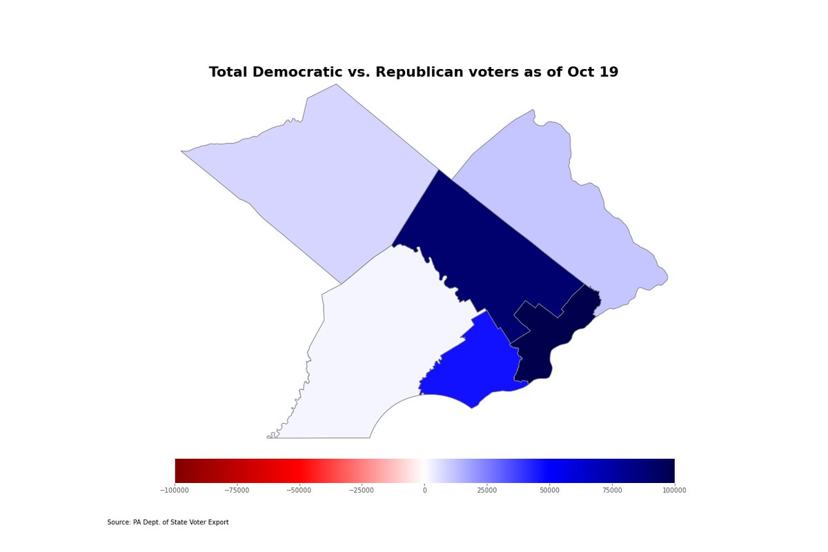
Let's start here: here's the overall breakdown of total voters by major parties in each county. The darker the blue, the more democratic voters and vice versa. While GOP voters trail Dems, the margins aren't so far off that we can't use a decent color spectrum.
In the case of this map, I'm subtracting Dems from GOP and setting our range at -25,000 to 25,000 because each party has at least several counties where they lead by that many voters.
Between 25% and 60% of registered Democrats in each county have requested a ballot. Republicans haven't really embraced Mail-in voting quite as much, with only between 12% and 30% of voters asking for a ballot before Nov. 3.
Democrats are also returning their mail-in ballots at slightly higher rates than Republicans. As a percentage of ballots requested, counties are seeing an average of 70% returns for Democrats and 55% for Republicans.
I'm calling the returned mail-in percentages the "mail-in turnout" for now. Comparing turnout rates is a little difficult. If I simply subtract one party turnout by the other, I get this monstrosity.
This map makes it look Republican mail-in turnout is higher in some counties. The problem is, that's not what this map shows. The color bar doesn't go into the negative range, so all of these counties have higher Democratic turnout.
Here's the same data with the color bar normalized (-50% to 50% percentage point difference). This one might more accurately display the party percentages, but we practically remade a democrat-only chart above.
In case you're wondering why I included those last two maps, I thought I should offer examples of iffy graphics. You're all going to see a lot of maps over the next few weeks. Best to point out potential problem areas as you all try to figure out what's going on.
In case you have no idea what any of this is, here's the link to my first election data thread earlier this week. I think we'll look at gender and age by party and town or county tomorrow
As always, I'm using @PythonPr language, @matplotlib
@geopandas @pandas_dev in an @ProjectJupyter notebook.
@threadreaderapp
unroll

• • •

Missing some Tweet in this thread? You can try to force a refresh
 

Keep Current with Christopher Ullery

Christopher Ullery Profile picture

Stay in touch and get notified when new unrolls are available from this author!

Read all threads

This Thread may be Removed Anytime!

PDF

Twitter may remove this content at anytime! Save it as PDF for later use!

Try unrolling a thread yourself!

how to unroll video
  1. Follow @ThreadReaderApp to mention us!

  2. From a Twitter thread mention us with a keyword "unroll"
@threadreaderapp unroll

Practice here first or read more on our help page!

More from @ulleryatintell

26 Oct
Last week, we took a look at new voters over the past month using Pennsylvania's voter export. @James_McGinnis wrote this story on the lead Democrats have across the state bit.ly/3ou6EyO and the map below is one I made last week showing party control by county 1/
I often consider countywide maps like these not quite as informative as I think voter breakdowns should be. You don't really get the nuanced analysis that you'd probably want to see. For instance:
Democrats outnumber Republicans in all of these southeastern Pa. counties. You can get an idea of which counties have the most Democrats, but that's about all you can really get from a countywide heatmap
Read 9 tweets
18 Aug
1/ A new coronavirus alert app from @PAHealthDept was the focus of today's press conference - you can read about that here - bit.ly/2Ee6zga - but lets go over some of the new case numbers and see what the past couple weeks has looked like in PA and in #BucksCounty
Let's start with the broad overview: 7-day and 14-day average new cases are currently holding fairly steady at about 770 cases as of Monday. That's roughly the same levels the state saw in late May, when new cases were declining after an initial boom
Looking at August alone, it looks like the 7-day average was valleys and peaks in the first two weeks before almost intersecting with the 14-day average that had a much steadier decline over the past two weeks.
Read 21 tweets
10 Aug
1/ All right, this week we looked at some programs @BucksDa and @BucksCountyGovt are looking at to make some changes to how local law enforcement deals with individuals with a mental illness bit.ly/3abvzkd
2/ I wanted to take some time and review some 911 data provided through a series of Right to Know requests to @911BucksCounty. Let's start with some baseline information on the 4.5 million call database of police and EMS calls between 2012 and April 10, 2020
3/ Police make up the bulk of the 911 data, and these are all calls that pass through the radio room. EMS calls only make up about 10% of all calls, but the radio room is also logging everything from traffic stops to homicide investigations.
Read 17 tweets
7 Aug
1/ The spread of the coronavirus in PA seems to be slowing after a recent spike in cases. Let's take a look at how the data has changed in the past week or so bit.ly/2XDJbiV
2/ 7-day and 14-day average cases in the state were steadily dropping through May and most of June after an exponential climb that began in March. July was a setback, however, as cases gradually increased.
3/ Average cases rose from between 500 and 600 cases to just under approximately 1,000 cases until about July 27. bit.ly/30KpXcc
Read 17 tweets
26 Jul
With a surge in new coronavirus cases in Pennsylvania, I wanted to delve into the data a bit more to see how the state went from approaching a new normal to trying to stem a new surge in cases bit.ly/2CK7Zib 1/
First, let's take a brief look at where we're at now in PA, and I'm using data pulled from the Johns Hopkins GitHub Repository. Philadelphia's numbers tend to be a bout 20% higher than on the state's website. As of Sunday, there were 111,115 cases and 7,124 deaths since March 2/
The state Department of Health estimates nearly 75% of cases have recovered, and there's been an increase in cases among younger adults in the weeks since moving to the green phase of the state's reopening plan. Story on that from @JoCiavaglia
here bit.ly/2ZSpfdG 3/
Read 26 tweets
26 May
Last week's thread (linked below) looked at mail-in ballot numbers by county and party. I do these threads as an exercise for various data analysis and viz tools, and I wanted to do another one that goes a little deeper into those numbers. bit.ly/2TAB3Or 1/
I'm using tableau for the data viz this time, rather than the Python Matplotlib module. As of May 23, between 10% and 30% of voters in each county have requeted a mail in ballot for the June 2 primary (Ballots requested/Total Voters by county) 2/
While more than 1.5 million voters have received a mail-in ballot, some counties (like Bucks) have seen less than 1% of them returned. Some have seen over 50% returned (like Union County). 3/
Read 15 tweets

Did Thread Reader help you today?

Support us! We are indie developers!


This site is made by just two indie developers on a laptop doing marketing, support and development! Read more about the story.

Become a Premium Member ($3/month or $30/year) and get exclusive features!

Become Premium

Too expensive? Make a small donation by buying us coffee ($5) or help with server cost ($10)

Donate via Paypal Become our Patreon

Thank you for your support!

Follow Us on Twitter!