Thought I'd switch things up from the standard party differences I've been looking at with the voter export. Let's talk a little about the gender make up of the ~9 million voters in Pennsylvania. 1/???
For the most part, the gender makeup of voters in each town is relatively even. The difference between total male and female registered voters as a percent of all voters is generally less than a few percentage points.
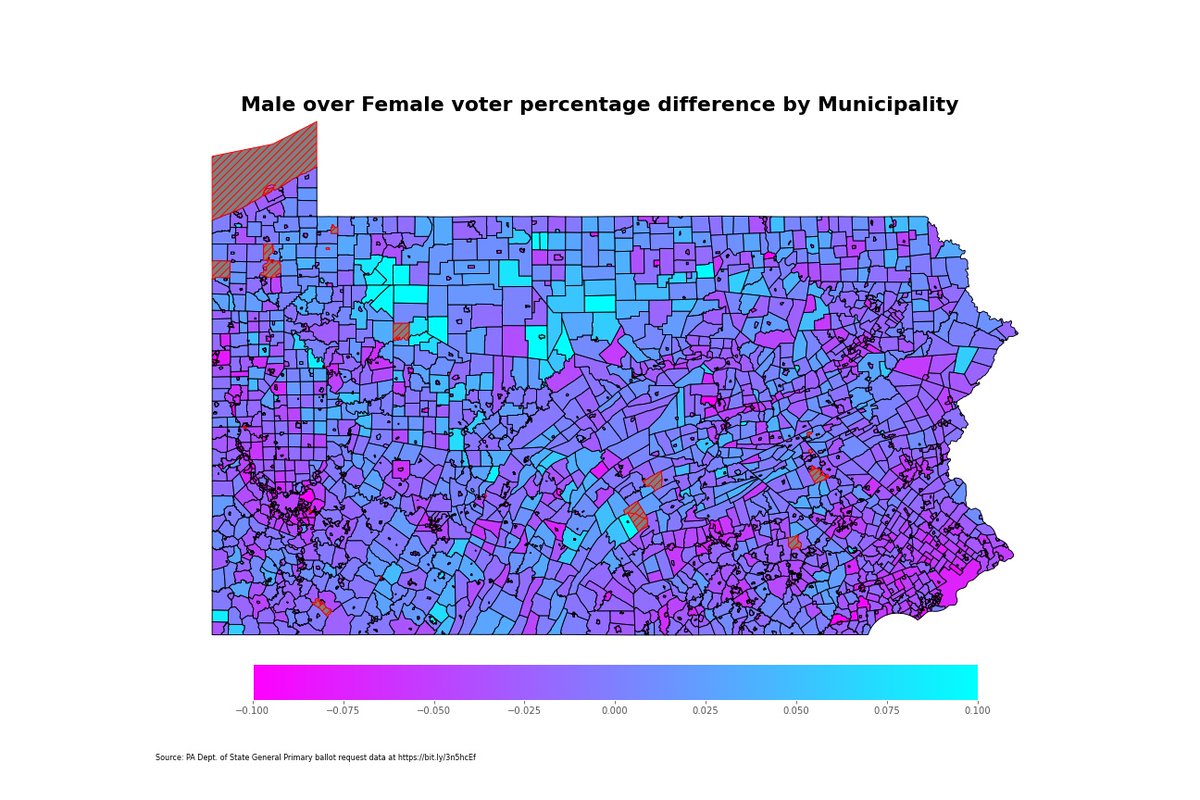
There are only about 20 towns where women voters make up over 50% of the registered voters, and 8 of them are in Somerset County. Only one municipality has a 60% female voter makeup.
Keep in mind, we are talking percentages here. In fact, I don't think I can really say which town has the highest percentage of female voters because there are only about 15 registered voters.
Southeastern Pa. is very much a woman-led electorate, at least as far as total registered voters go. Most municipalities are made up of mostly women voters. Of the towns that do have more men than women voters, men lead women by less than 10 percentage points.
Real quick, I did also compare Republican/Democrat voters by gender as well. I'm not sure how more there is to really get into with that though, statewide at least. Regionally, we have some more interesting things to check out.
More women tend to be democrats in a lot of towns in southeastern PA. The map below is showing the difference of total Republican women and Democratic women in each town, using a color scale between -500 and 500 people.
Male voters are basically polar opposites here. Even the democratic strongholds of lower Bucks County are swept red in most instances. Solebury is about dead even, and men in nearly all of Montgomery, Chester, Delaware and Berks counties give the GOP voters a major lead.
Keep in mind, overall party difference is a much different picture than any of our gender plots here.
That's about all I have time for tonight. I do plan to have a very, very interesting analysis for tomorrow though. I don't want to go into it too much, but here's a hint:
As always, I'm using @PythonPr language, @matplotlib @geopandas @pandas_dev in a @ProjectJupyter notebook. @threadreaderapp unroll

• • •

Missing some Tweet in this thread? You can try to force a refresh
 

Keep Current with Christopher Ullery

Christopher Ullery Profile picture

Stay in touch and get notified when new unrolls are available from this author!

Read all threads

This Thread may be Removed Anytime!

PDF

Twitter may remove this content at anytime! Save it as PDF for later use!

Try unrolling a thread yourself!

how to unroll video
  1. Follow @ThreadReaderApp to mention us!

  2. From a Twitter thread mention us with a keyword "unroll"
@threadreaderapp unroll

Practice here first or read more on our help page!

More from @ulleryatintell

28 Oct
I wanted to follow up on @davegilmartin's question about ballots returned from my first data thread this week. He asked about early voting turnout by county and by party. Strap in, we've got to talk about color choice and geospatial data analysis 1/???
Let's start here: here's the overall breakdown of total voters by major parties in each county. The darker the blue, the more democratic voters and vice versa. While GOP voters trail Dems, the margins aren't so far off that we can't use a decent color spectrum.
In the case of this map, I'm subtracting Dems from GOP and setting our range at -25,000 to 25,000 because each party has at least several counties where they lead by that many voters.
Read 11 tweets
26 Oct
Last week, we took a look at new voters over the past month using Pennsylvania's voter export. @James_McGinnis wrote this story on the lead Democrats have across the state bit.ly/3ou6EyO and the map below is one I made last week showing party control by county 1/
I often consider countywide maps like these not quite as informative as I think voter breakdowns should be. You don't really get the nuanced analysis that you'd probably want to see. For instance:
Democrats outnumber Republicans in all of these southeastern Pa. counties. You can get an idea of which counties have the most Democrats, but that's about all you can really get from a countywide heatmap
Read 9 tweets
18 Aug
1/ A new coronavirus alert app from @PAHealthDept was the focus of today's press conference - you can read about that here - bit.ly/2Ee6zga - but lets go over some of the new case numbers and see what the past couple weeks has looked like in PA and in #BucksCounty
Let's start with the broad overview: 7-day and 14-day average new cases are currently holding fairly steady at about 770 cases as of Monday. That's roughly the same levels the state saw in late May, when new cases were declining after an initial boom
Looking at August alone, it looks like the 7-day average was valleys and peaks in the first two weeks before almost intersecting with the 14-day average that had a much steadier decline over the past two weeks.
Read 21 tweets
10 Aug
1/ All right, this week we looked at some programs @BucksDa and @BucksCountyGovt are looking at to make some changes to how local law enforcement deals with individuals with a mental illness bit.ly/3abvzkd
2/ I wanted to take some time and review some 911 data provided through a series of Right to Know requests to @911BucksCounty. Let's start with some baseline information on the 4.5 million call database of police and EMS calls between 2012 and April 10, 2020
3/ Police make up the bulk of the 911 data, and these are all calls that pass through the radio room. EMS calls only make up about 10% of all calls, but the radio room is also logging everything from traffic stops to homicide investigations.
Read 17 tweets
7 Aug
1/ The spread of the coronavirus in PA seems to be slowing after a recent spike in cases. Let's take a look at how the data has changed in the past week or so bit.ly/2XDJbiV
2/ 7-day and 14-day average cases in the state were steadily dropping through May and most of June after an exponential climb that began in March. July was a setback, however, as cases gradually increased.
3/ Average cases rose from between 500 and 600 cases to just under approximately 1,000 cases until about July 27. bit.ly/30KpXcc
Read 17 tweets
26 Jul
With a surge in new coronavirus cases in Pennsylvania, I wanted to delve into the data a bit more to see how the state went from approaching a new normal to trying to stem a new surge in cases bit.ly/2CK7Zib 1/
First, let's take a brief look at where we're at now in PA, and I'm using data pulled from the Johns Hopkins GitHub Repository. Philadelphia's numbers tend to be a bout 20% higher than on the state's website. As of Sunday, there were 111,115 cases and 7,124 deaths since March 2/
The state Department of Health estimates nearly 75% of cases have recovered, and there's been an increase in cases among younger adults in the weeks since moving to the green phase of the state's reopening plan. Story on that from @JoCiavaglia
here bit.ly/2ZSpfdG 3/
Read 26 tweets

Did Thread Reader help you today?

Support us! We are indie developers!


This site is made by just two indie developers on a laptop doing marketing, support and development! Read more about the story.

Become a Premium Member ($3/month or $30/year) and get exclusive features!

Become Premium

Too expensive? Make a small donation by buying us coffee ($5) or help with server cost ($10)

Donate via Paypal Become our Patreon

Thank you for your support!

Follow Us on Twitter!