1/ If we want to avoid situations in this pandemic in which we have to make the decision between more people dying or lockdown, we should increase testing.
It needs to be very easy for people to find out whether they are infectious or not.
It needs to be very easy for people to find out whether they are infectious or not.
2/ The number of tests is not the relevant statistic – a large outbreak needs more tests.
How many tests are needed depends on how many people are infected.
That’s the ratio of cases to tests: the *positive rate of tests* is telling us whether a country does enough tests.
How many tests are needed depends on how many people are infected.
That’s the ratio of cases to tests: the *positive rate of tests* is telling us whether a country does enough tests.
3/ If a country tests enough, the positive rate is low. The country does many tests for each case they find.
You want to be in a situation where it's easy for people to find out whether they are infectious.
Whether you achieved that is visible in a low positive rate.
You want to be in a situation where it's easy for people to find out whether they are infectious.
Whether you achieved that is visible in a low positive rate.
4/ Look for example at Korea, whenever cases increased they increased their testing.
[Here is our study on how they did that and how they followed up on positive cases and allowed people to isoolate (it's a short read): ourworldindata.org/covid-exemplar…]
[Here is our study on how they did that and how they followed up on positive cases and allowed people to isoolate (it's a short read): ourworldindata.org/covid-exemplar…]

5/ That Korea was successful in providing enough tests is visible in their very low positive rate.
Below 1% means that they do 100 tests for each case they find.
The WHO recommends to achieve a rate below 5%, better below 3%.
Below 1% means that they do 100 tests for each case they find.
The WHO recommends to achieve a rate below 5%, better below 3%.

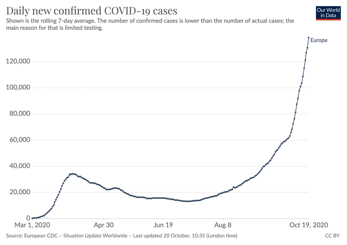
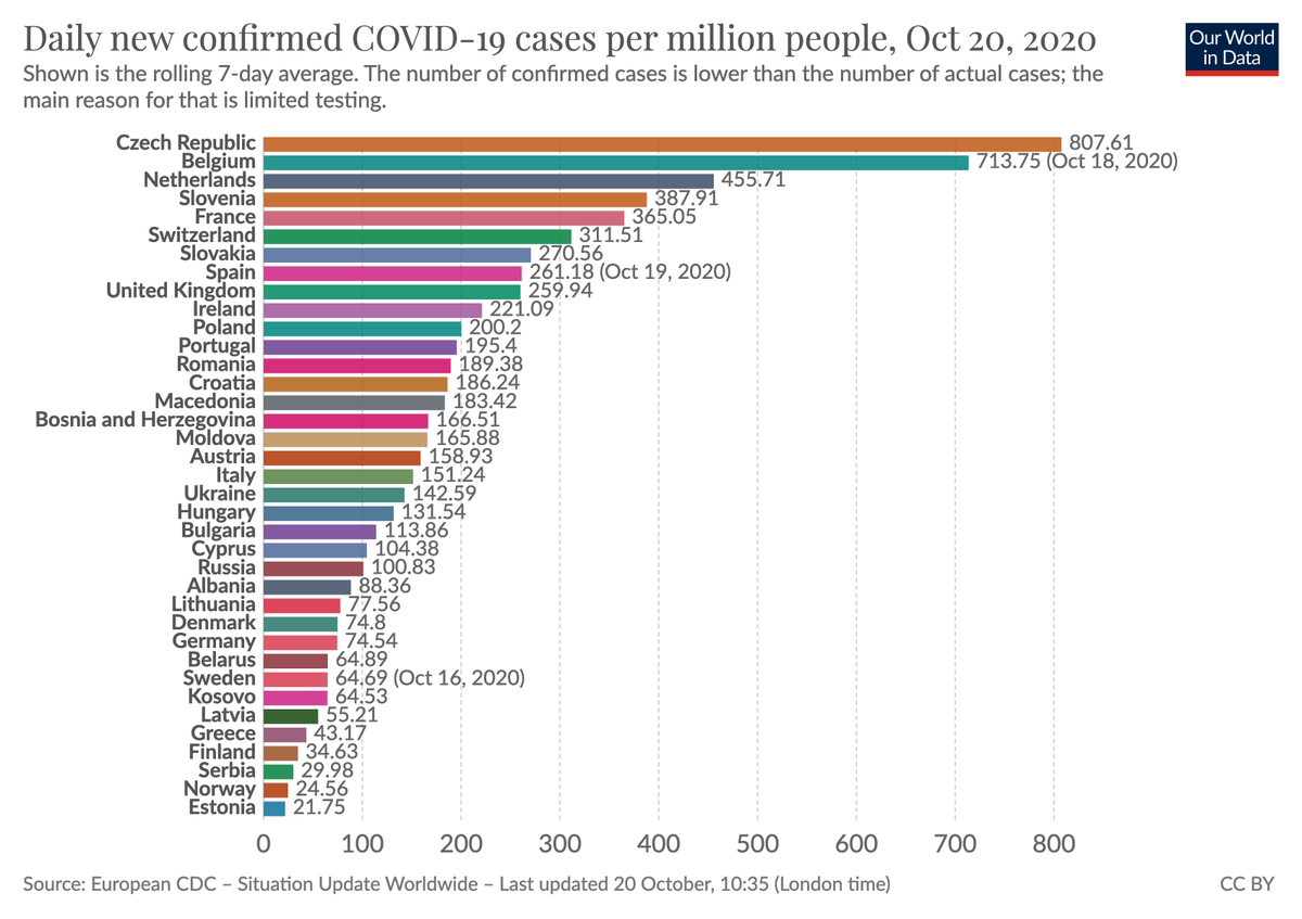
6/ Europe was in the fortunate situation in the summer months that they had time to increase their testing capacities. And they did.
We test more than in the first wave. More people who are sick know that they are sick and can avoid infecting others. That's very good.
We test more than in the first wave. More people who are sick know that they are sick and can avoid infecting others. That's very good.

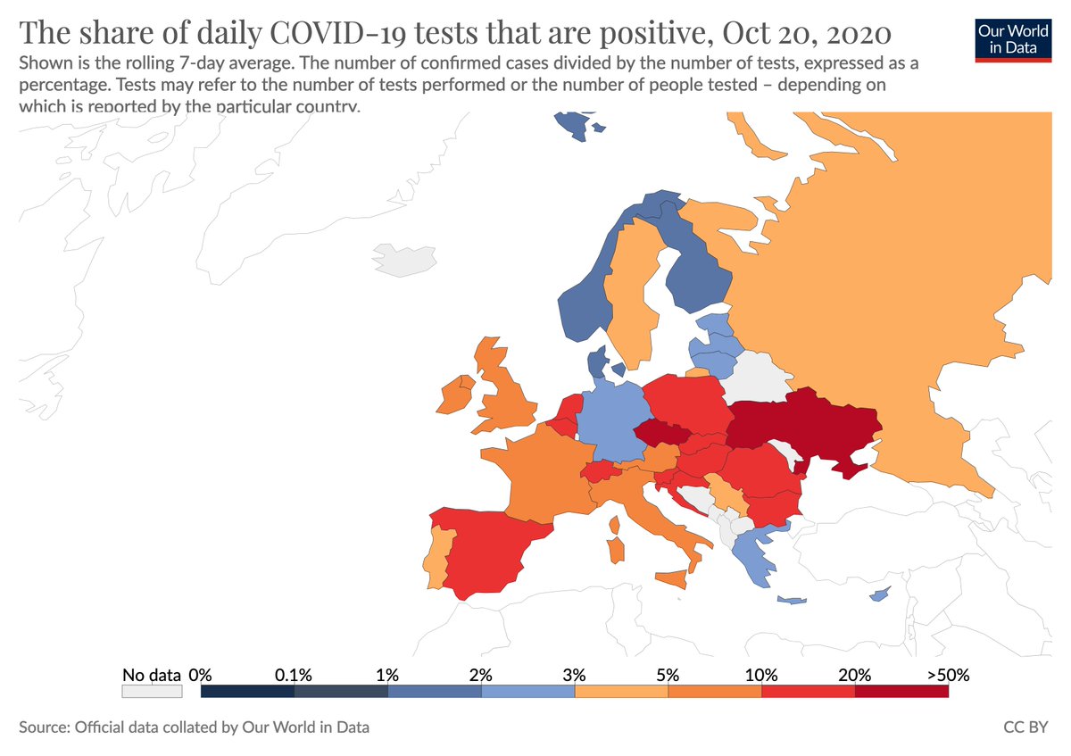
7/ But crucially European countries did not expand testing nearly enough. The countries in shades of red all test way too little, their positive rate is high.
In these countries many people are sick, but don't know it.
In these countries many people are sick, but don't know it.

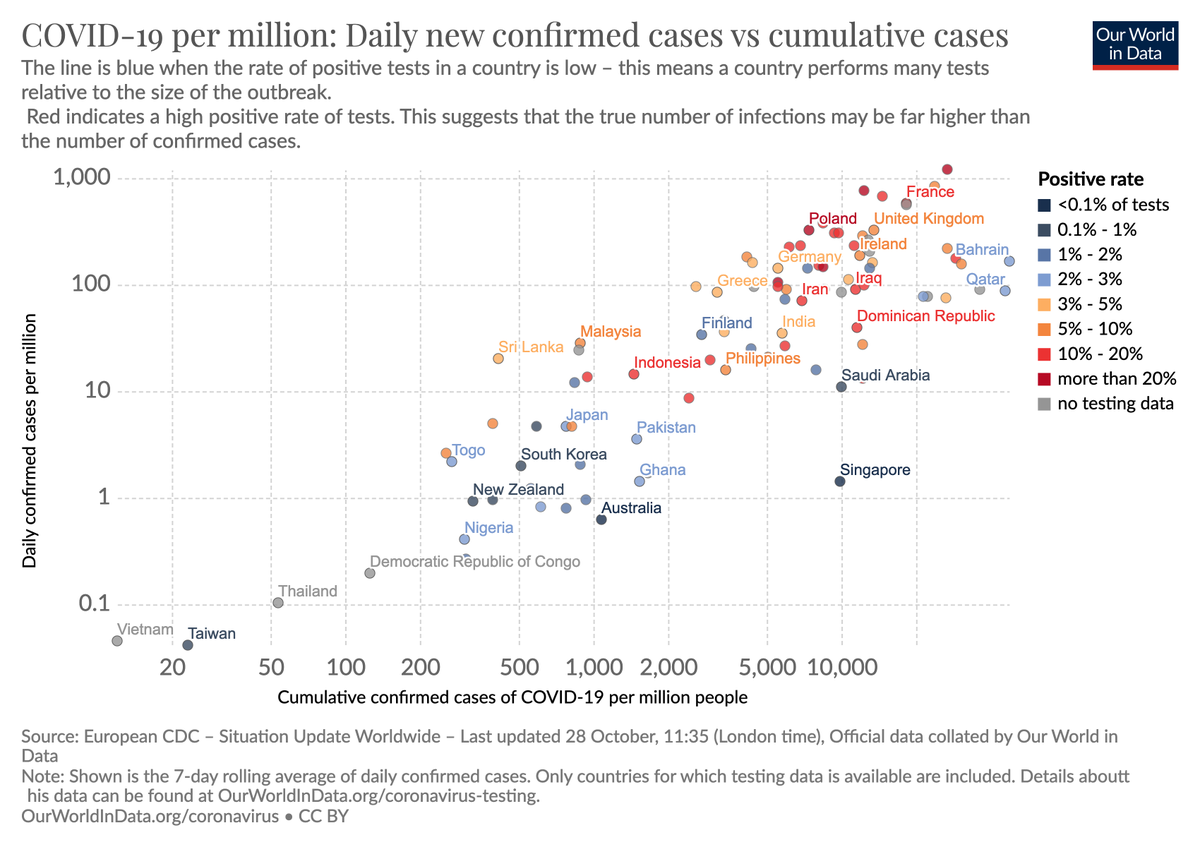
9/ The goal is to never get into the situation where you have to choose between more deaths or lockdowns.
Look what the positive rate of countries that got closer to that goal than others. (I included the US to show the contrast.)
[source ourworldindata.org/coronavirus-da…]
Look what the positive rate of countries that got closer to that goal than others. (I included the US to show the contrast.)
[source ourworldindata.org/coronavirus-da…]

10/ In February we made the decision in @OurWorldInData to focus on testing and we built the international COVID-19 testing database.
Our paper is here nature.com/articles/s4159…
We also make all our data available so that you can research for yourself github.com/owid/covid-19-…
Our paper is here nature.com/articles/s4159…
We also make all our data available so that you can research for yourself github.com/owid/covid-19-…
11/ It’s been frustrating to see how very slowly testing has expanded.
Many governments did very little to get their populations into a position where they know what is happening – to others and themselves – so that they can respond to the situation appropriately.
Many governments did very little to get their populations into a position where they know what is happening – to others and themselves – so that they can respond to the situation appropriately.
12/ Expanding testing massively is so attractive because it is cheap. Really extremely cheap relative to the huge costs of lockdowns or people dying.
@paulmromer estimates that the returns are at least 10x
For very cheap tests perhaps up to 100x !
paulromer.net/email_to_atlas
@paulmromer estimates that the returns are at least 10x
For very cheap tests perhaps up to 100x !
paulromer.net/email_to_atlas

13/ Testing is of course not the only strategy that we should work towards. There is no single strategy ever for any big problem in the world.
14/ But the reality is that this pandemic isn't over any time soon.
And I believe that if we want to avoid these awful situations where we have to choose between lockdowns and deaths we should give people the chance to know whether they are infectious or not.
And I believe that if we want to avoid these awful situations where we have to choose between lockdowns and deaths we should give people the chance to know whether they are infectious or not.
15/ Whether countries are achieving this is visible in a low positive rate.
You can see the positive rate in our page on testing, ourworldindata.org/coronavirus-te…, it's the very first map on that page.
We update it all the time, for many months now.
You can see the positive rate in our page on testing, ourworldindata.org/coronavirus-te…, it's the very first map on that page.
We update it all the time, for many months now.
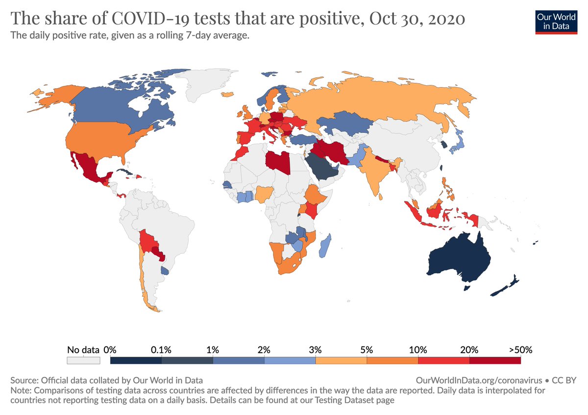
16/ We should make it our goal to avoid getting into these awful situations where it's a choice between lockdown or the deaths of more people.
I believe a crucial step for this goal is to provide enough tests. Let's make it our goal to turn that map blue.
I believe a crucial step for this goal is to provide enough tests. Let's make it our goal to turn that map blue.
• • •
Missing some Tweet in this thread? You can try to
force a refresh