Good afternoon! Today I will talk about something that I mentioned with my friends and thought it would be a great artistic subject: "Anime Mouths and Gestalt Principles and Pixelart Applications". Let's go!
If you are a fan of anime style artwork, you might've come across this style of mouth. It is strange at first because it is a broken line, and yet it is readable as a single entity. What happens here? This is Gestalt being employed. 

Gestalt (read ɡəˈʃtalt) is a German branch of psychology that affirms we perceive things as a whole, not the individual parts. This hollistic approach allows us to see seemingly different things, detect a pattern and interpret them as a whole. 

There are several Gestalt principles that can be studied, but for this example I want to talk aout Closure. The principle of closure is when a drawing is made in such a way that the gap is filled in by your brain. The most famous example of this is perhaps the WWF logo. 

This allows artists to draw anime mouths as broken lines without it being interpreted as two separate lines. Instead, this empty space is interpreted as volume of the lips, even though no detail has been added there. This comes extremely in handy when making pixelart. 

Since pixelart is such a limiting medium, any added detail can severely impact the readability of your piece. No matter what you do, even the smallest details will use up a pixel. However, closure allows us to suggest design without actually drawing any lines. Here's an example: 

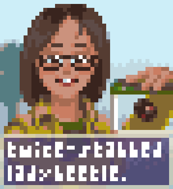
In this small pixelart, I was able to suggest a smile with very few pixels. Notice that there is no "upper lip" being drawn formally, but this doesn't negatively impact our perception. I've emphasized the bottom lip, the sides of the mouth and the teeth.
These emphasized parts all work together to form the shape of a smile, and thus the closure principle has been applied correctly. See how it compares with an actual smile. The extremities are darker due to shading; the lower lips are much more pronounced and the teeth is visible. 

Another example is this one, where a character is chewing on food. Only a couple of strategic pixels are able to suggest volume and expression. Again, the corners are darker and the lower lips are emphasized, but now there's a slight shadow under the lips as well. 

These pixels all suggest that the character is puckering up due to chewing, similar to this cartoon. However, instead of employing solid contour around the mouth, I've used closure to suggest the shape without having to spend extra pixels. 

Doing the same thing but with solid lines reveal how flat and strange the lines become. Because of how pixels work, you can't get the same slight angles with them, making the expression more "cartoony" or "silly". It's totally different from what I wanted. 

To wrap it up, Gestalt can be employed in more things (not just anime mouths). However this seemed like the most readily available example in hands, and one with a very definite consequence when applied properly. Be sure to try applying this same principle on other subjects too!
I hope you have enjoyed this small thread, and happy pixels! Let's see what you can make with this knowledge!
@threadreaderapp unroll
• • •
Missing some Tweet in this thread? You can try to
force a refresh


