
Transparency, worst case scenarios, & why govt is treading a dangerous path over #COVID19.
This is the longest thread I've ever posted.
But I think it may be among the most important.
Please do read and share if it strikes a chord.
This stuff affects all of us.
Deep breath... 🧵
This is the longest thread I've ever posted.
But I think it may be among the most important.
Please do read and share if it strikes a chord.
This stuff affects all of us.
Deep breath... 🧵
Before we go any further let's get something out of the way: I'm not making a point here abt whether govt is right or wrong to impose lockdown. Like most of you, I can see strong arguments for & against but respect that others are better informed than I am to make these calls
This is really about something else: trust. Lockdowns, like em or not, won't work if no-one trusts the process and doesn't comply. It would be the worst of both worlds - economic damage but limited epidemiological effect. But that trust is earned. And easily lost.
How do you earn trust? Well part of the answer is transparency. If you're clear and honest about why you're doing something and the evidence behind it, you will bring people along with you. For a good example, consider the @bankofengland...
Just yday BoE announced it was printing £150bn of cash. This is a MASSIVE deal, yet there was little shock in markets. Part of the explanation: BoE was v transparent abt what it was doing, so no surprises. Agree with them or not, at least everyone could see their workings.
Now imagine BoE did said: "We're printing money because the economy is doing worse than our worst-case scenario," but then refused to publish the worst-case scenario. There would be uproar. Markets wld be all over the place as people speculated what on earth was going on.
Well, that's precisely what @10DowningStreet has done with the English lockdown.
Recall PM press conference on sat. His explanation for this lockdown? "The virus is spreading even faster than the reasonable worst case scenario of our scientific advisers"
Recall PM press conference on sat. His explanation for this lockdown? "The virus is spreading even faster than the reasonable worst case scenario of our scientific advisers"
But here's the thing: Downing St had NEVER PUBLISHED THE RELEVANT REASONABLE WORST CASE SCENARIO (RWC). As far as I can see they still haven't. Indeed, the latest RWC on the Sage site dates back from May. This is an extraordinary lack of transparency.
Yes, there are strong arguments for keeping scary risk management scenarios private if there is a chance they will foment panic or unrest. But surely that argument is flipped on its head the moment the scenario itself becomes the justification for policy action?
To make matters worse (& fuelled perhaps by the lack of transparency) there's widespread confusion about what those worst-case scenarios actually ARE. Brief detour here back to September and *that* famous @uksciencechief chart showing cases doubling every 7 days. Is this the RWC? 
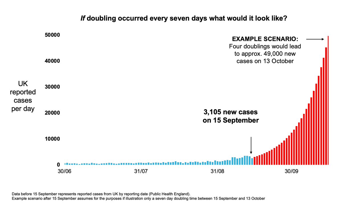
Some SAGE members certainly think so. Here is @JeremyFarrar the other day, saying explicitly that the 50k projection was "based on the SAGE RWC". Oh, and there's also a sideswipe at those who derided it...
https://twitter.com/JeremyFarrar/status/1321170163409035266?s=20
But was the derision wrong? Did the 50k illustration really come to pass? Not by a long shot. UK reported cases per day (look, that's the measure on @uksciencechief's chart) never got anywhere near 50k a day. Never. This chart shows you what actually happened vs the illustration
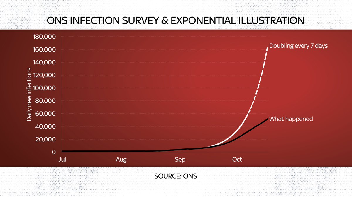
True: some measures, eg @ONS infection survey, have infections at 50k a day. But the ONS measure is v v different to the reported cases measure @uksciencechief was referring to. If his illustration had started with where the ONS was in mid Sept we'd have hit 160k infections!
Yes: I'm being pedantic. But this distinction 👆isn't exactly complicated. Either the scientists are being sloppy or they're being dishonest. Neither is v encouraging. Of all those in public life, surely these folks should be on top of the figures?!
Now @uksciencechief's illustration proved right in one sense: that we may hit 200 daily deaths. We are now above that. But here's another oddity: 200 deaths was based on 50k cases. But 50k cases would imply MANY more deaths, as some pointed out at the time
https://twitter.com/BristOliver/status/1308031072563855361?s=20
To some extent this is all ancient history. Honestly I wish we could stop talking about this blooming illustration.
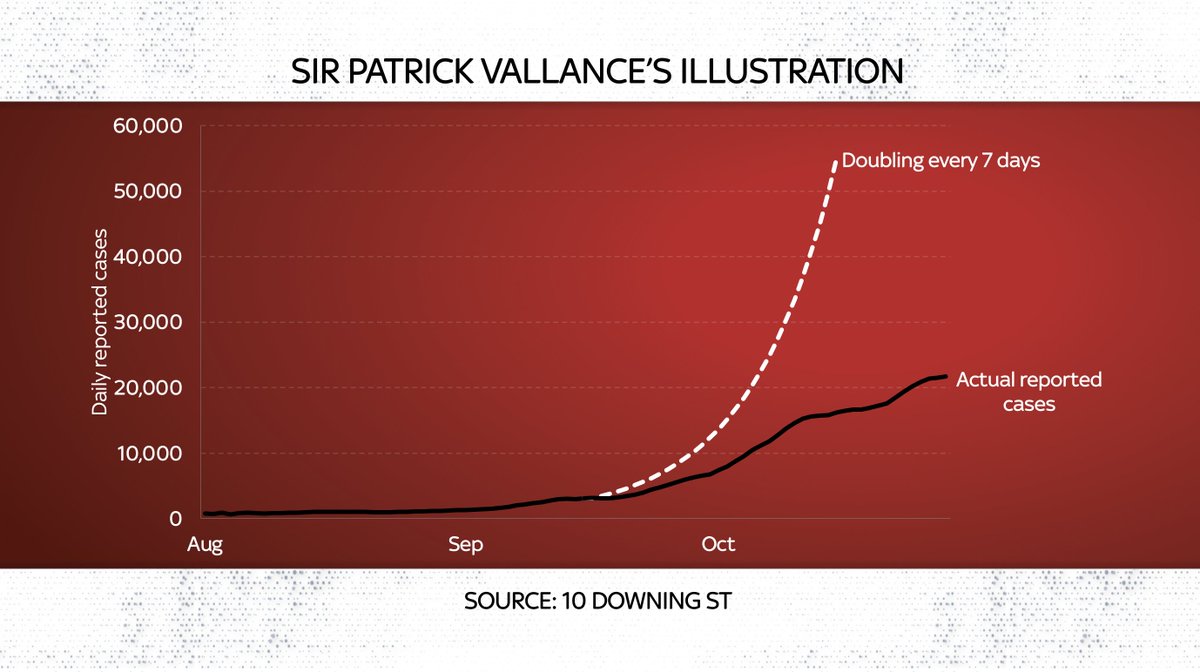
But look: SAGE members are still out there pretending it was right. IT WAS NOT. Here's Sir Patrick in a parliamentary hearing this week:
But look: SAGE members are still out there pretending it was right. IT WAS NOT. Here's Sir Patrick in a parliamentary hearing this week:
But here's the twist: the 50k illustration was NOT the worst case scenario - at least as far as I can divine. Instead the RWC was something else v different indeed. Not that it's ever been published, but it was leaked to the Spectator the other day spectator.co.uk/article/classi…
This actual RWC (dated July) turns out to be quite different. It sees infections rise sharply - tho not to 50k cases a day (the measure here is WEEKLY figs). That is nonetheless worrying. But there are also some oddities. What's with that flat line in Sept/Oct, for instance?
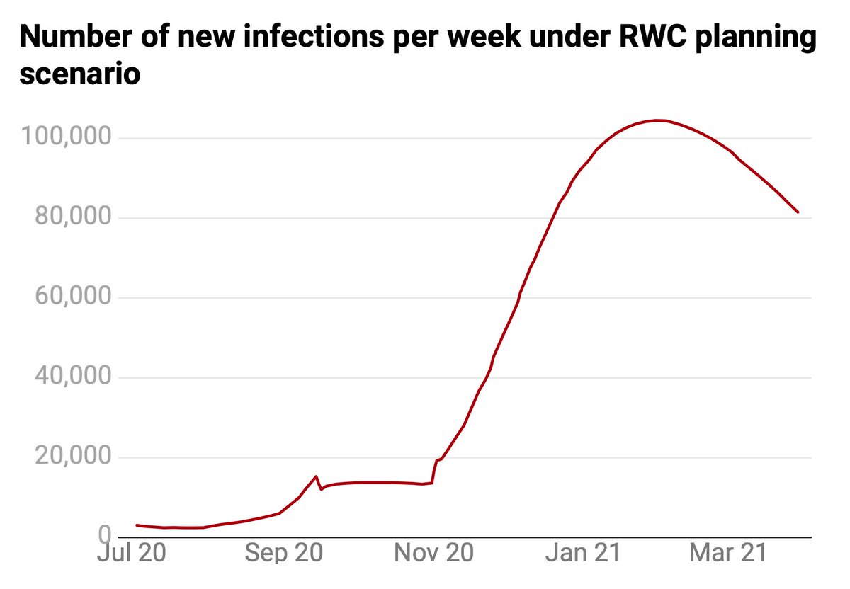
It seems to imply there'd be no rise in infections when kids went back to school and students to university and everyone went back inside and had the heating on. Even so, it's clear that case growth is MUCH higher than this RWC (albeit lower than the Sept illustration)
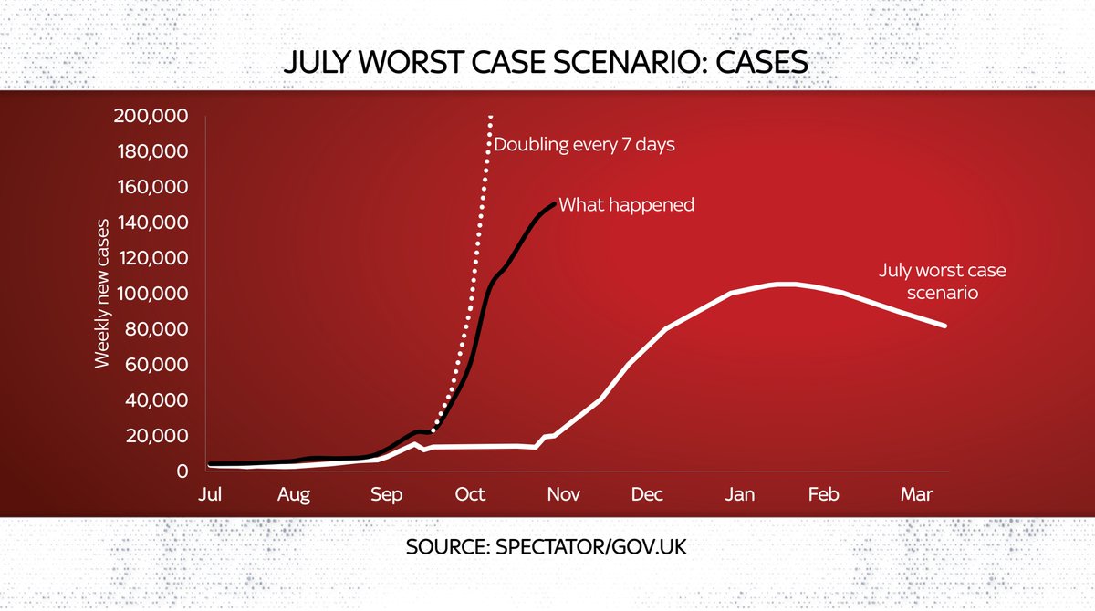
Now, others more qualified than me will be able to judge whether this is indeed a "worst" case scenario (it doesn't see deaths rising higher than the first wave, for instance).
Except: they can't. Because it's NEVER BEEN PUBLISHED. Bringing us back to the key point: transparency.
Except: they can't. Because it's NEVER BEEN PUBLISHED. Bringing us back to the key point: transparency.
The clearer govt is abt its rationale, the less likely people will question their motives. So: pretending you got it right when you didn't is not a good look. Nor is locking down on basis of an unpublished RWC. Nor is the way the govt portrayed the state of the epidemic on Sat.
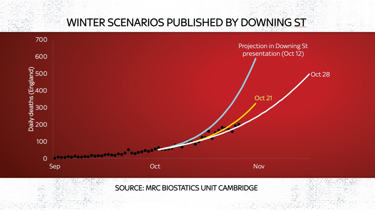
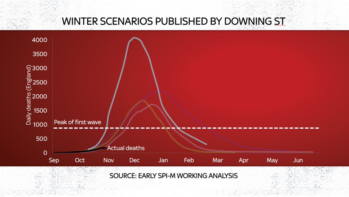
Consider this chart, displayed by @uksciencechief over the weekend. The point you're supposed to be struck by is that we're heading into terrifying territory - 4k DEATHS!
But there's little sourcing: no context or labelling.
In dataviz terms, it's an an atrocity.
But there's little sourcing: no context or labelling.
In dataviz terms, it's an an atrocity.
That scary #COVID19 deaths chart over the weekend was such an atrocity that:
a) the Statistics regulators issued a warning to Downing St
b) No10 quietly uploaded a brand new, labelled chart onto Sir Patrick's pdf (see this footnote from the website)
a) the Statistics regulators issued a warning to Downing St
b) No10 quietly uploaded a brand new, labelled chart onto Sir Patrick's pdf (see this footnote from the website)
https://twitter.com/StatsRegulation/status/1324321021726494720?s=20

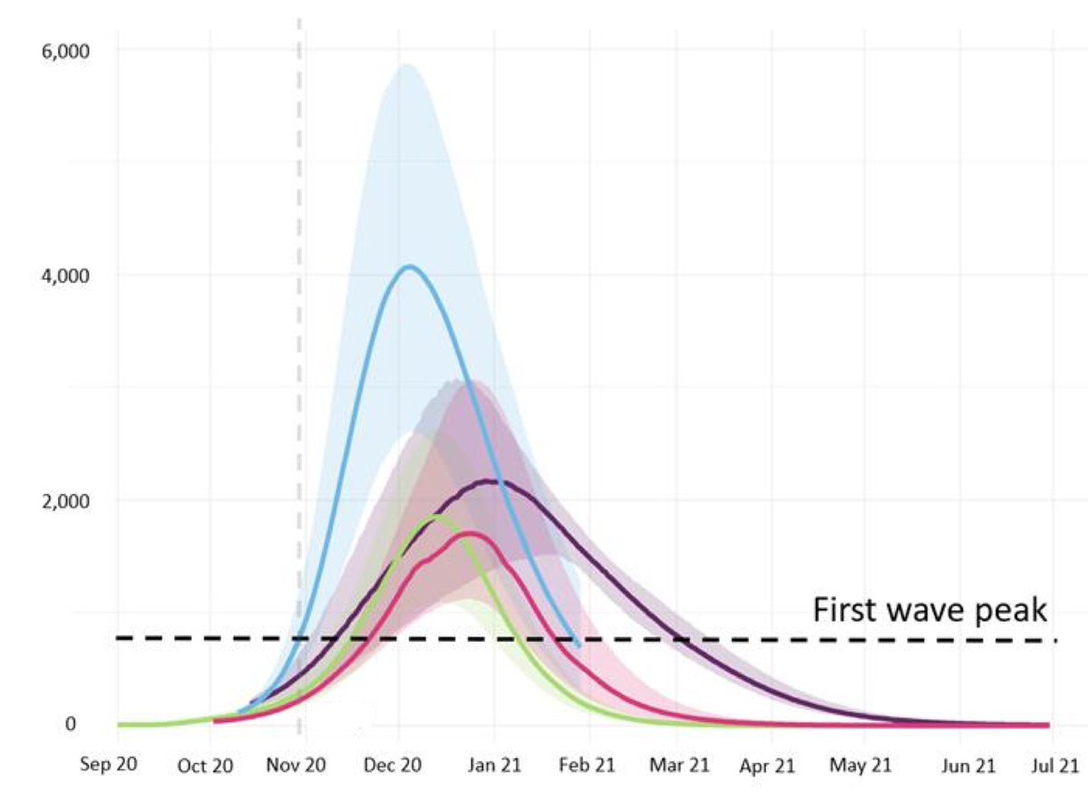
The other problem with that chart - and the lack of detail on it - is that it was already almost three weeks out of date by the time was being shown on TV screens around the country. Actually the modelling in question, by PHE England, had been updated twice since then. Look:
Notice any difference? Turns out the actual path of deaths was already below those projections used to justify the lockdown, at the very time the PM was making the announcement. Look at the black line in this chart, which ends on Monday:
That 👆explains today's Tgraph splash: govt's near-term projections have changed since that presentation because the modelling changed (why oh why didn't they just show up to date charts on sat?!).
Scandal? Actually this is the first bit of good news! telegraph.co.uk/news/2020/11/0…
Scandal? Actually this is the first bit of good news! telegraph.co.uk/news/2020/11/0…
It looks like govt is FINALLY starting to publish a bit more info on its expectations. That will of course leave them exposed to things like that Tel splash. But it is at least more honest than their previous stance of non-publication of this kind of stuff
https://twitter.com/JoshBiostats/status/1323669369755475968?s=20
We're grown ups here. Everyone knows this is not a static situation. #COVID19 may look scary one wk & slightly less scary next wk. The data will not turn out how anyone expects. So these projections WILL be wrong, time and time again. That doesn't mean you shouldn't publish them.
Sadly there is a culture of secrecy over data in Whitehall. It doesn't go for all parts of govt: @ONS is one of the finest statistical agencies anywhere and has done sterling work during #COVID19. But they're an exception. Consider this story:
https://twitter.com/EdConwaySky/status/1321862822540824579?s=20
The most alarming thing abt this chart - save for the fact that it suggests that in some parts of the UK #COVID19 has again spread rapidly into the care sector - is that the NHS refuses to release this data (which it has for all areas) publicly.
https://twitter.com/EdConwaySky/status/1321866773705170951?s=20
We need transparency.
Not secrecy.
Not lying abt whether an illustration was right or wrong.
Not using out of date, poorly labelled charts to justify decisions which will put thousands out of work.
Not hiding data that helps explain why we're facing unprecedented restrictions
Not secrecy.
Not lying abt whether an illustration was right or wrong.
Not using out of date, poorly labelled charts to justify decisions which will put thousands out of work.
Not hiding data that helps explain why we're facing unprecedented restrictions
Data should be used to inform. Instead the government - especially 10 Downing Street, has repeatedly used it to intimidate. This is unacceptable.
Something I've written about this for @skynews news.sky.com/story/coronavi… and here's my @thetimes column on it: thetimes.co.uk/article/eb65fa…
Something I've written about this for @skynews news.sky.com/story/coronavi… and here's my @thetimes column on it: thetimes.co.uk/article/eb65fa…
Finally, here's a video I made about this. Like this thread, it's very long (17 mins - sorry!) but it has lots of charts which underline my point.
Which is a simple point:
SHOW US THE DATA!
Which is a simple point:
SHOW US THE DATA!
• • •
Missing some Tweet in this thread? You can try to
force a refresh


