🟠 Ritual - Case study: From 0 to 20m$ per year in 4 years selling vitamins.
This Ecom brand achieved this in a market know to be "saturated" dominated by Amazon.
If you are in Marketing & Ecommerce, read this thread.
This brand is really a golden gem
/ / Mega Thread / /
This Ecom brand achieved this in a market know to be "saturated" dominated by Amazon.
If you are in Marketing & Ecommerce, read this thread.
This brand is really a golden gem
/ / Mega Thread / /

In this case study, we will take a deep dive into every aspect of their marketing strategy and analyze their success
>The Brand & Competitors
>Marketing & Social media Strategy
>Acquisition and traffic
>Facebook ads
>The website & Conversion rate/AOV Optimization
👇
>The Brand & Competitors
>Marketing & Social media Strategy
>Acquisition and traffic
>Facebook ads
>The website & Conversion rate/AOV Optimization
👇
🟠What is Ritual?
Ritual is a DTC eCommerce brand selling multi-vitamins to women.
They only offer subscriptions (it starts at 30$ per month)
no single products.
They have offers for every type of woman (segmentation & personalization)
They recently launched an offer for men
Ritual is a DTC eCommerce brand selling multi-vitamins to women.
They only offer subscriptions (it starts at 30$ per month)
no single products.
They have offers for every type of woman (segmentation & personalization)
They recently launched an offer for men

🟠About Ritual:
CEO Katerina Markov Schneider is not random.
She is a well-known investor and has a huge experience in marketing.
But she is not a scientist, she didn't invent anything.
CEO Katerina Markov Schneider is not random.
She is a well-known investor and has a huge experience in marketing.
But she is not a scientist, she didn't invent anything.

🟠The Visual Identity
-Sunny yellow main color and dark blue
-Yellow = optimism and Confidence
-Bright, friendly, cheerful colors
-Clean & Minimalistic Design (Website, social media, packaging, brochures)
-Sunny yellow main color and dark blue
-Yellow = optimism and Confidence
-Bright, friendly, cheerful colors
-Clean & Minimalistic Design (Website, social media, packaging, brochures)

🟠Messaging and Personality
Ritual’s voice is friendly and approachable.
The exact opposite approach of what’s dominated the vitamin category.
The goal of the brand is to make the use of vitamins simple and approachable. They do it perfectly well.
Ritual’s voice is friendly and approachable.
The exact opposite approach of what’s dominated the vitamin category.
The goal of the brand is to make the use of vitamins simple and approachable. They do it perfectly well.

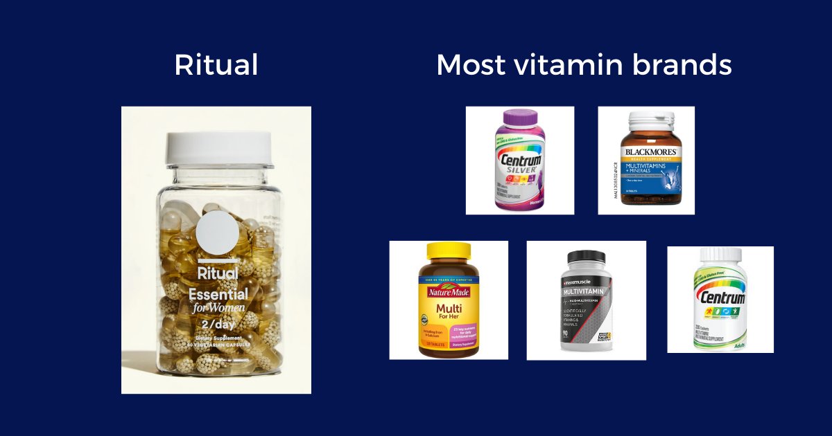
🟠Ritual VS Competitors
>Most vitamins brand:
No Branding, the product is a commodity
Multi-color bottle/packaging (all look the same)
Target all people
>Ritual:
Unique design & Aesthetics
Subscription model
Strong branding
Formula made for women only (and different offers)
>Most vitamins brand:
No Branding, the product is a commodity
Multi-color bottle/packaging (all look the same)
Target all people
>Ritual:
Unique design & Aesthetics
Subscription model
Strong branding
Formula made for women only (and different offers)
🟠Marketing Strategy
-Vitamins formulas designed for woman only (specialization)
-transparency. No false promises like most vitamin brands (people are skeptical)
-Aesthetic product & packaging. Feels "premium"
-Strong presence on social media (Build a community)
-Vitamins formulas designed for woman only (specialization)
-transparency. No false promises like most vitamin brands (people are skeptical)
-Aesthetic product & packaging. Feels "premium"
-Strong presence on social media (Build a community)

🟠Social Media & Ads
Most of the traffic of Ritual's website come from direct traffic & branded searches (organic)
Only a small part of the traffic comes from Facebook and Google ads.
They are also doing a lot of IRL ads and it seems to work very well for them.
Most of the traffic of Ritual's website come from direct traffic & branded searches (organic)
Only a small part of the traffic comes from Facebook and Google ads.
They are also doing a lot of IRL ads and it seems to work very well for them.


🟠Facebook Ads
I suggest you visit their Facebooks ads library to take a look at all their ads (45+).
Here are 2 ads I selected:
🟠AD 1: Targets +50 Women
-UGC & Focused on social proof
-Targets only +50 woman
-dynamic montage (video & audio)
I suggest you visit their Facebooks ads library to take a look at all their ads (45+).
Here are 2 ads I selected:
🟠AD 1: Targets +50 Women
-UGC & Focused on social proof
-Targets only +50 woman
-dynamic montage (video & audio)
🟠AD 2: Targets +18-30 Women
-Focused on Scientific proof and Facts
-Focused on skepticism/fear of people
-Focused on Scientific proof and Facts
-Focused on skepticism/fear of people
🟠3 type of retargeting Ads:
-Retargeting for Bundle offer + Trust "easy to manage subscription"
-Article about Ritual on famous Press (Social proof). First time I see press article ads like this
-Simple retargeting ad with huge discount
-Retargeting for Bundle offer + Trust "easy to manage subscription"
-Article about Ritual on famous Press (Social proof). First time I see press article ads like this
-Simple retargeting ad with huge discount

Some examples for IRL Ads:

🟠Social Media Strategy
You can't build a community on Instagram just by posting pictures of your products and people using your products.
You have to use humor and follow trends.
If you post memes and cute animals. Stupid but it is the best way to get engagement on Instagram
You can't build a community on Instagram just by posting pictures of your products and people using your products.
You have to use humor and follow trends.
If you post memes and cute animals. Stupid but it is the best way to get engagement on Instagram

🟠Website & Conversion Optimization
Ritual's website is one of the best I've seen in terms of UX, Navigation, and Design.
The website is also well optimized for Conversion.
Great page structure (AIDA) & Very easy and smooth purchase.
You feel no frustration on the website.
Ritual's website is one of the best I've seen in terms of UX, Navigation, and Design.
The website is also well optimized for Conversion.
Great page structure (AIDA) & Very easy and smooth purchase.
You feel no frustration on the website.

🟠Great product page following AIDA Principle
Attention (above the fold, Benefits, CTA, Guarantee)
Interest(Benefits details)
Desire(social proof)
Action (Reviews+guarantee+CTA)
Attention (above the fold, Benefits, CTA, Guarantee)
Interest(Benefits details)
Desire(social proof)
Action (Reviews+guarantee+CTA)

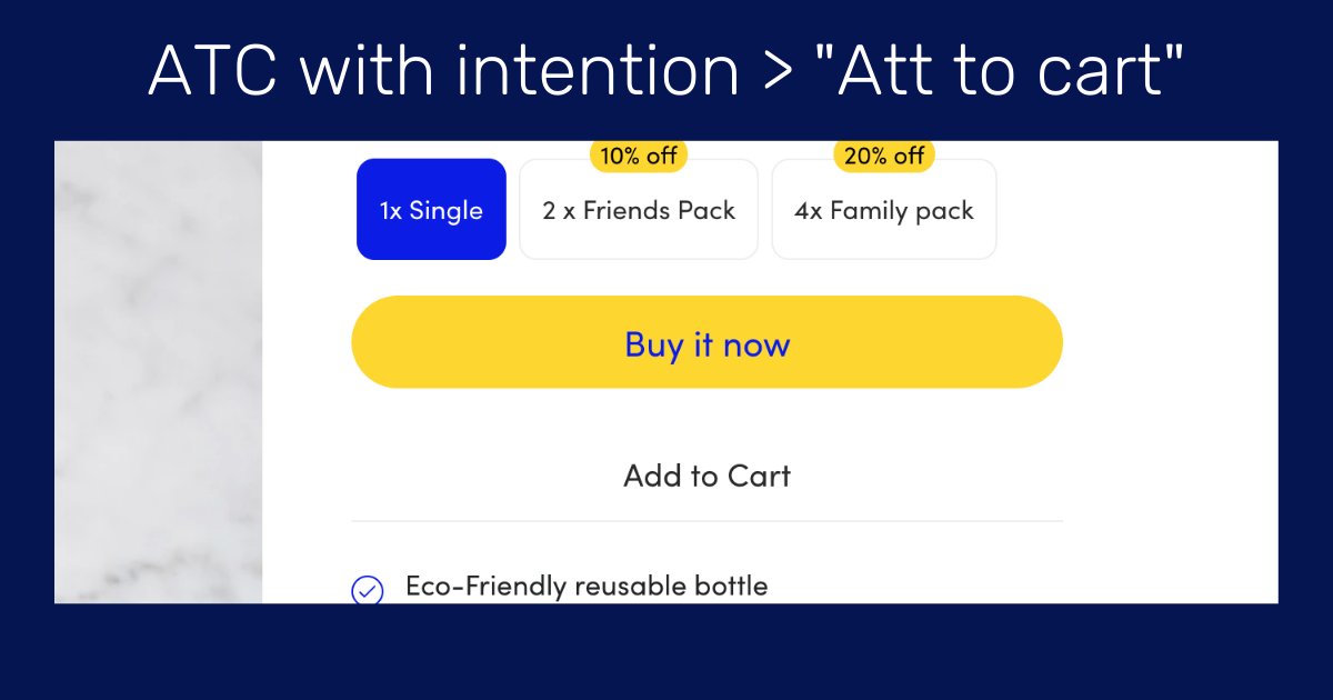
🟠One of the best Cart Page I've ever seen
The Ritual's website cart page does exactly what it is supposed to do.
Lead to the checkout and eventually increase the cart.
+Maximum trust with Trust badges, payment methods, and FS/Guarantee illustrations
The Ritual's website cart page does exactly what it is supposed to do.
Lead to the checkout and eventually increase the cart.
+Maximum trust with Trust badges, payment methods, and FS/Guarantee illustrations

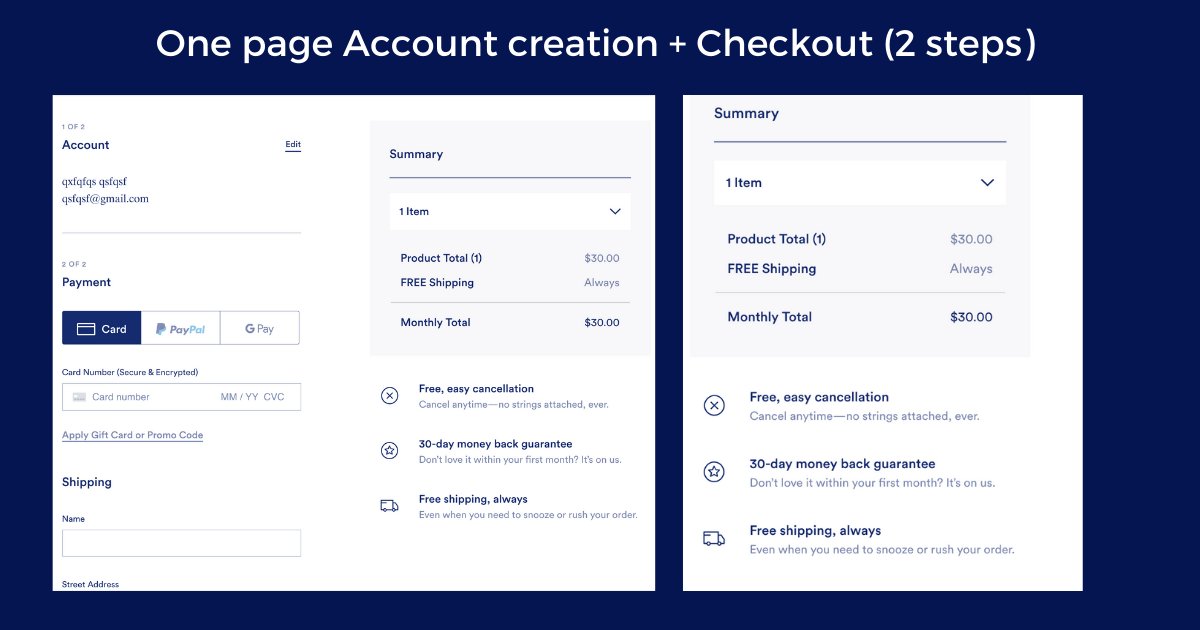
🟠Super Fast checkout Process (2 steps in 1 page)
2 steps In One page. Perfect.
1-Account creation (they need it for subscription)
2-Checkout process
All on one single page.
They also add the trust badges bellow the final CTA to make sure they complete it
2 steps In One page. Perfect.
1-Account creation (they need it for subscription)
2-Checkout process
All on one single page.
They also add the trust badges bellow the final CTA to make sure they complete it
🟠Bundle offers to increase AOV and LVT
-Unique Names + Purposes(Personalization & Segmentation again)
-Great Discount
-Possibility to personalize your bundle.
Once again, perfectly done.
-Unique Names + Purposes(Personalization & Segmentation again)
-Great Discount
-Possibility to personalize your bundle.
Once again, perfectly done.

🟠Quiz for personalized Bundle
As you probably know, I am a big fan of Quiz because they get people really involved in the process.
When people feel involved personally, they are much more likely to buy.
Look how smooth and personal it feels:
As you probably know, I am a big fan of Quiz because they get people really involved in the process.
When people feel involved personally, they are much more likely to buy.
Look how smooth and personal it feels:
🟠What we can learn from Ritual?
-Selling a Personalized solution for a specific niche, Unique Branding, Community, UX are the best way to kill it in Ecom
-Ultra-personalization is the way the beat Amazon
- Supplements/Health is a great industry (+36B$) and constantly growing
-Selling a Personalized solution for a specific niche, Unique Branding, Community, UX are the best way to kill it in Ecom
-Ultra-personalization is the way the beat Amazon
- Supplements/Health is a great industry (+36B$) and constantly growing
That's all
If you liked this thread, consider giving a like and an RT :)
If you have any question/suggestion, let me know
If you're interested I published a more complete version of this thread on Utopia.
marketer.wizofecom.com
If you liked this thread, consider giving a like and an RT :)
If you have any question/suggestion, let me know
If you're interested I published a more complete version of this thread on Utopia.
marketer.wizofecom.com
If you want your Ecommerce store to be more profitable and reduce your acquisition costs
Shot me a DM 📧
I know what to do to increase your CR and your AOV👇
twitter.com/messages/compo…
Shot me a DM 📧
I know what to do to increase your CR and your AOV👇
twitter.com/messages/compo…
Thank you Harry @GoodMarketingHQ for the inspiration to make such threads
I Dmed you on Linkedin 6 months ago and you gave me some really good advice
Would love to get your feedback
I Dmed you on Linkedin 6 months ago and you gave me some really good advice
Would love to get your feedback
• • •
Missing some Tweet in this thread? You can try to
force a refresh