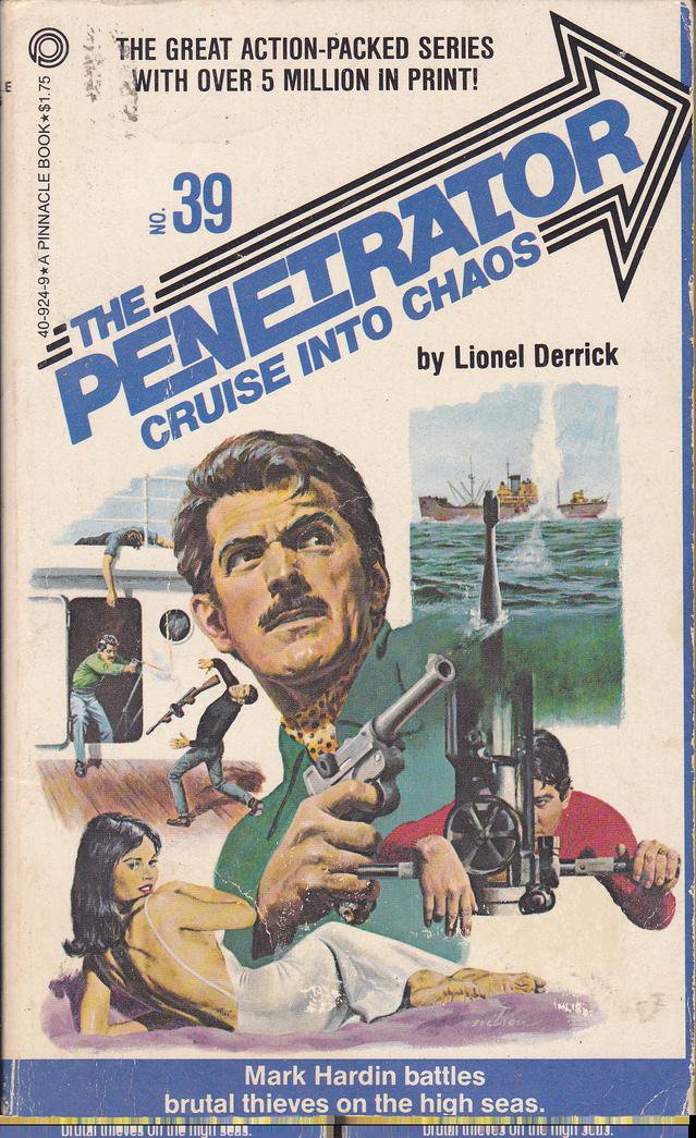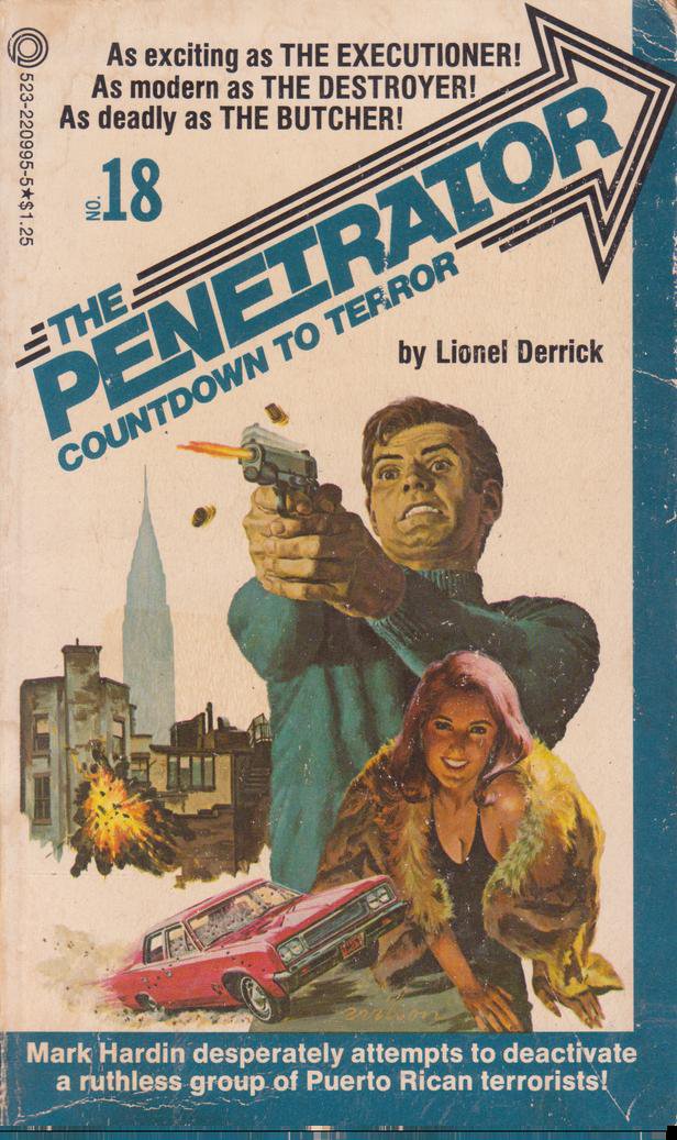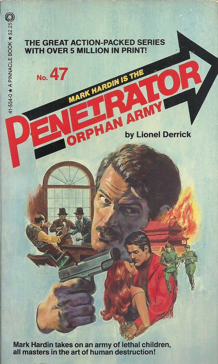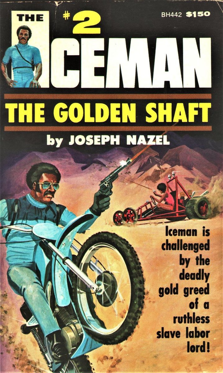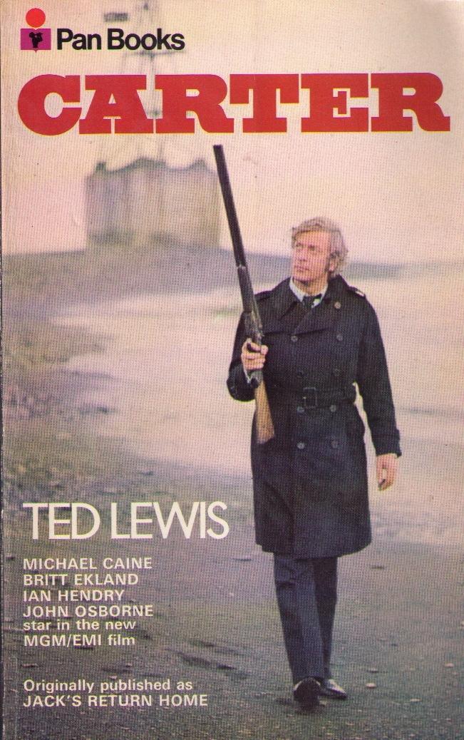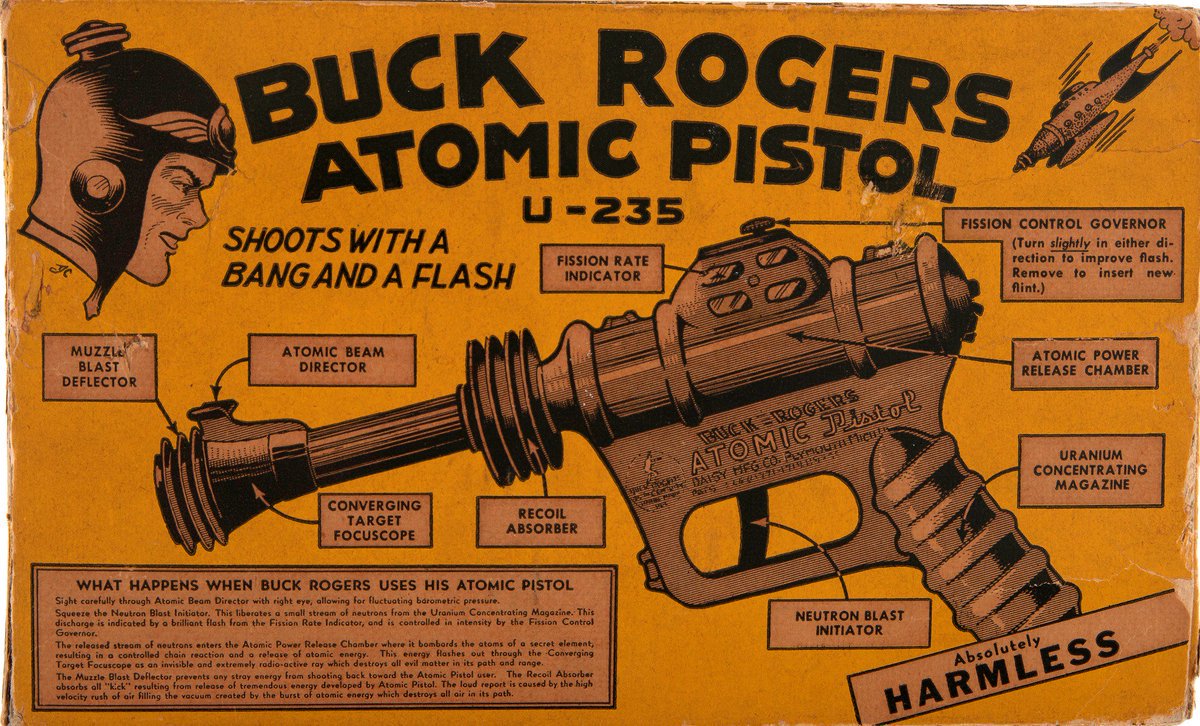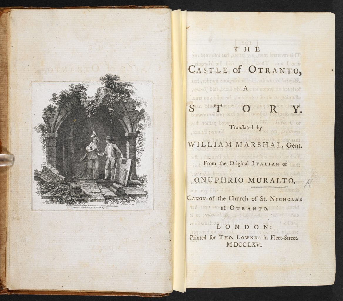
Today in pulp I look back at the fonts of 1975!
I know that's the content you come here for... #FridayFeeling
I know that's the content you come here for... #FridayFeeling

Now I know what you're thinking: 1975? Surely that was wall to wall Bookman Swash!
Well not quite...
Well not quite...

We all know that the books of '75 were fond of a cursive font. Goudy Fancy was all the rage and even Cooper Black got a bit swashy.
But many new typefaces were starting to appear too....

But many new typefaces were starting to appear too....


Futura Fineline had first appeared in 1971 and its elegant glyphs were a good match for the mid-70s mood. 

Eightball had also appeared in 1972. Its slightly crazy, slightly zany look was a popular way to add a nonchalant counterpoint to many a boring book cover. 


The Tabasco typeface had appeared in the early 1970s and was part of a trend towards a kind of simple futurism in font design - unfussy, but just jarring enough when you parsed the title. 

So was Pipeline. Released in 1970 this was a very popular choice for sci-fi novels and movie posters in 1975, mixing lower case 'n's into the title case mix. 

Expressa, launched in 1973, took a different route towards simple futurism: smooth curves and pleasant proportions. It worked well with a shadow too. 

Speaking of shadow... Pluto half-solid was a very mid-70s typeface. It had a psychedelic chrome vibe that suggested a funky future was just around the corner. 

Funky was certainly a popular theme for the fonts of 1975. Here's Behemoth Clarendon Italic Swash, proving that less isn't more when it comes to a title typeface. 

Anonymous, released in 1974, is a top-heavy marching line of chunky, blocky glyphs that I think is quite charming. 

Speaking of blocky, 1975 also saw a nostalgic harking back to fin de siècle typefaces such as Gothic Bold from 1899... 

But for me the typeface that sums up the book covers of 1975 is ITC Serif Gothic. It was everywhere that year: elegant, emotional and ever so expressive. 

• • •
Missing some Tweet in this thread? You can try to
force a refresh


