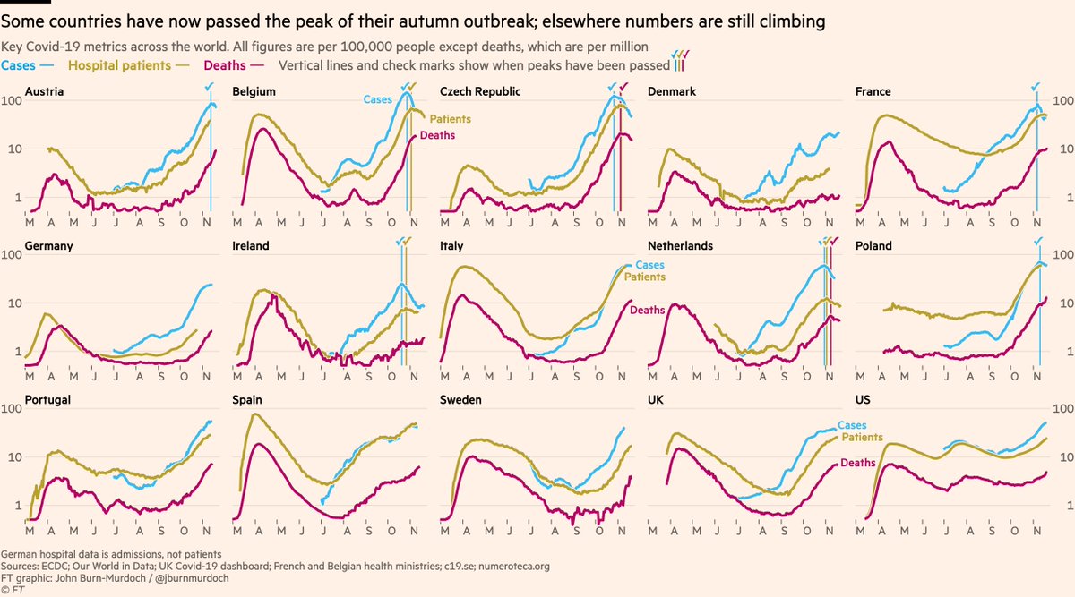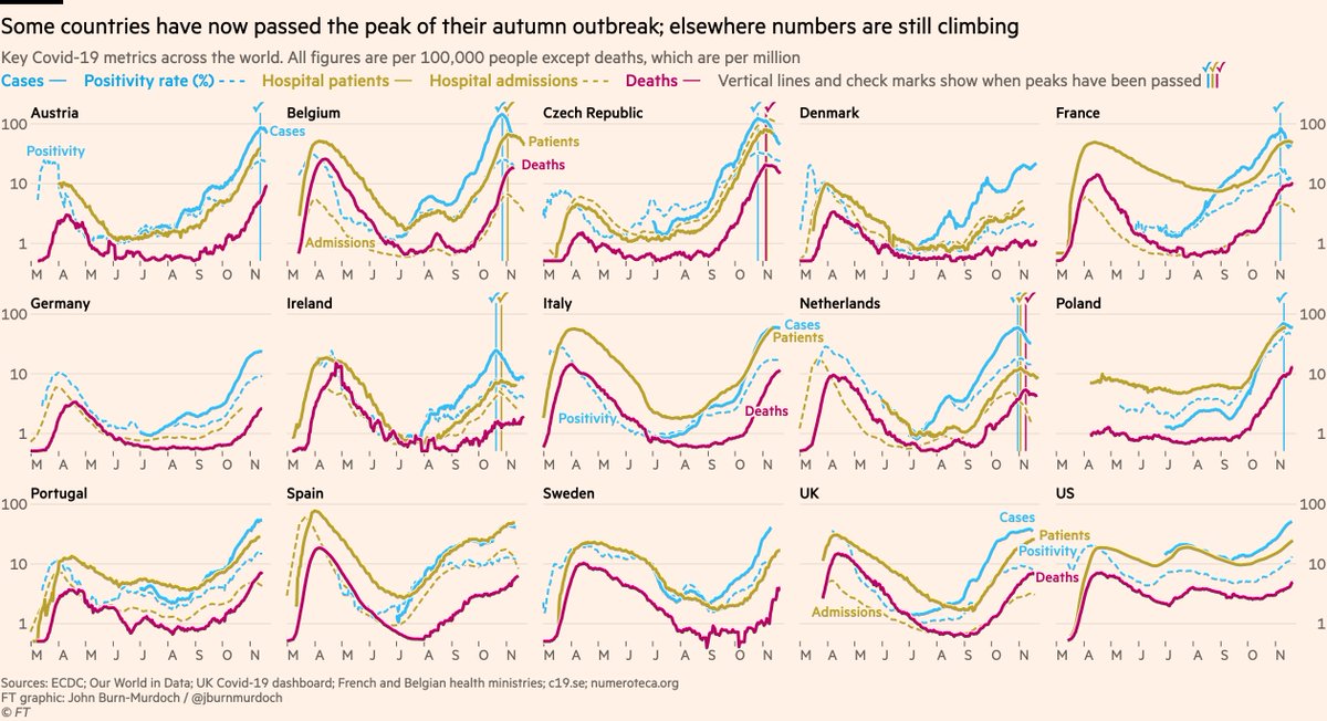
NEW: Tue 24 Nov update of Covid-19 trajectories
Main chart, including positivity rate + both hospital metrics + 5 new countries
• Poland’s peak was false: testing had dipped, so I’m now using positivity rate to judge peak prevalence
• Positivity falling in UK, ITA & ESP ✅
Main chart, including positivity rate + both hospital metrics + 5 new countries
• Poland’s peak was false: testing had dipped, so I’m now using positivity rate to judge peak prevalence
• Positivity falling in UK, ITA & ESP ✅

Now UK nations & regions:
• Deaths appear to have peaked in NE & Yorks, but from the more granular data I can tell you that’s Yorks-driven. May still be rising in NE
• Cases & admissions appear to have peaked in the Midlands ✅
• Can’t clearly say southern regions peaked yet
• Deaths appear to have peaked in NE & Yorks, but from the more granular data I can tell you that’s Yorks-driven. May still be rising in NE
• Cases & admissions appear to have peaked in the Midlands ✅
• Can’t clearly say southern regions peaked yet

Now the US state layout:
Still all eyes on the upper-midwest. Death rates in South Dakota higher than any state at any time and still climbing, but case rates in SD and neighbouring Iowa appear to have peaked.
Wyoming also concerning, and prevalence rising in most other states.
Still all eyes on the upper-midwest. Death rates in South Dakota higher than any state at any time and still climbing, but case rates in SD and neighbouring Iowa appear to have peaked.
Wyoming also concerning, and prevalence rising in most other states.

Some notes:
• These all use a log y-axis because rates of change are critical here. Remember, a straight line on a log scale means constant rate of growth/decay.
@BristOliver has a great explainer here on why log scales still matter in the downward phase
• These all use a log y-axis because rates of change are critical here. Remember, a straight line on a log scale means constant rate of growth/decay.
@BristOliver has a great explainer here on why log scales still matter in the downward phase
https://twitter.com/BristOliver/status/1330457775755964421
• Please DM with any questions, suggestions etc. Lots of great feedback yesterday 👍
• I’ll keep adding countries. If possible I want hospital data so I can show all three core metrics, but where that is missing I will add some countries with only cases & deaths
• I’ll keep adding countries. If possible I want hospital data so I can show all three core metrics, but where that is missing I will add some countries with only cases & deaths
That’s all, folks
• • •
Missing some Tweet in this thread? You can try to
force a refresh


