Placing each state’s chart in its rough location highlights different shapes of the epidemic, from short but towering spikes in north-east to prolonged climbs or twin-peaks in south & west
Do read the full story by @hannahkuchler & @Edgecliffe for a deep dive into how the US lost control of the virus, with early missteps in New York playing a critical role: ft.com/content/a52198…
I particularly love this wonderful graphic from the brilliant @DatumFan, showing that as Trump focused on stopping arrivals from China, Europe was already a key source of transmission to the US. By early February more new cases were coming from chains within the US, not overseas
This US piece is the penultimate instalment from our series on the lessons from the year so far.
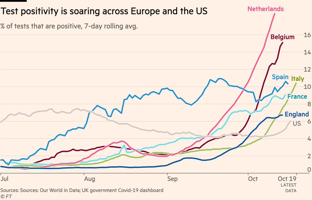
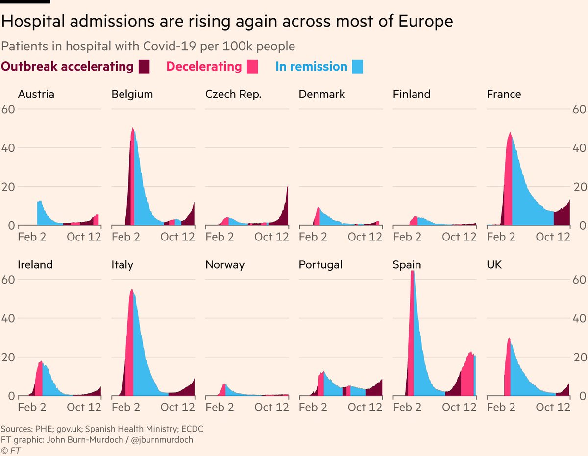
1) The autumn resurgence of the virus is well underway, however you want to measure it.
Skeptics will say that we’re just seeing more cases because of more testing, so let’s head that one off at the pass.
Here are positivity rates, which are now rising across Europe and the US
2) Some might object that we’re just spotting much more mild cases of the virus now than we were in spring.
This is true (and a good thing — we’re catching more people who could infect others), BUT serious cases are also climbing, as measured by people in hospital with Covid-19
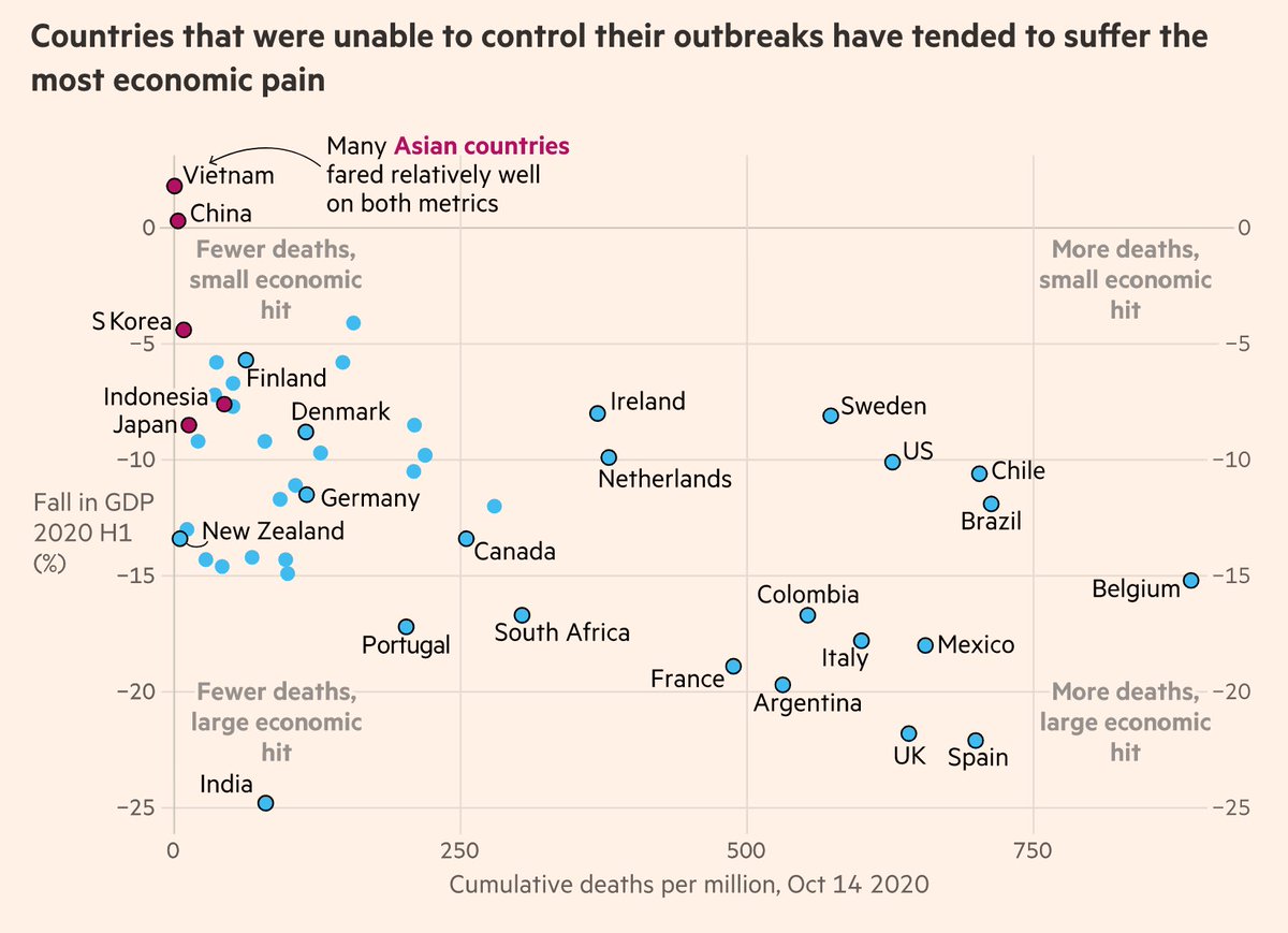
NEW: today we've published the culmination of a weeks-long @ftdata team effort, summarising everything data has shown us about the virus over the year so far, from Wuhan to the autumn resurgence ig.ft.com/coronavirus-gl…
Free to read, with a wealth of #dataviz on the key trends.
A huge amount of work from a vast cast of people went into this, over many weeks.
Consider this our rolling credits screen:
1) @caletilford & @aendrew built a beautiful interactive experience, designed by @carolinenevitt who also drew up a bespoke colour palette for the series
This is why the Japanese approach of avoiding the three Cs (enClosed spaces, Crowded spaces, Close contact) has been so effective.
Even if someone is highly infectious, you hugely constrain the amount of spreading they can do if you limit the number of people they’re mixing with
We still don’t know exactly what causes super-spreading. Is it mainly that someone is especially infectious, or mainly that a moderately infectious person spends time in an enclosed & crowded space while infectious?
Whatever the answer is, avoiding the 3Cs can only help.
I’ve noticed a lot of people slipping up on how they interpret UK Covid-19 prevalence & testing data, so here’s a very brief thread on how to interpret figures from different sources, and what caveats each source does and does not come with:
• Pillar 2 community testing: these are the bulk of cases picked up at the moment. Case and positivity rates here *could* be influenced by where and who is being tested, so e.g patterns in this data with age, deprivation etc could be skewed by who is getting tested
• @ONS infection survey: these tests are random, and designed to be representative of the overall population.
Therefore trends and patterns in this data *are not* due to e.g certain locations or groups of people being more likely to get tested.
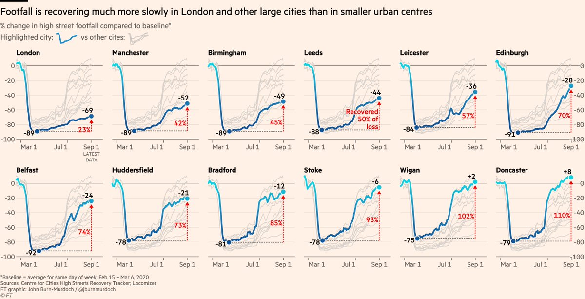
1/ Footfall in central London is still down 69%, but has picked up elsewhere
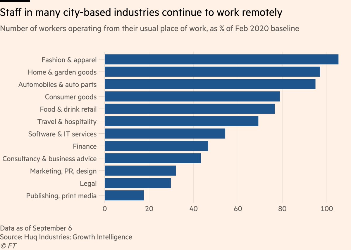
2/ This is driven by working patterns, but that in itself plays out in two distinct ways:
First, job type. Staff are returning to the workplace at very different rates in different sectors, and the sectors with the most remote working today are clustered in cities, esp. London
3/ Workers in retail, hospitality can’t do their jobs remotely and have returned to the workplace. They’re popping out for lunch or drinks near work and maybe shopping centrally before going home.
In big cities, office-workers are still at home, leaving the high streets empty.