NEW: Monday 23 Nov update of Covid-19 trajectories

It’s been a while... but these are the charts I’m going to be using to track the rise and fall of autumn/winter outbreaks

This is not doom & gloom; these charts focus on highlighting when countries have passed the peak
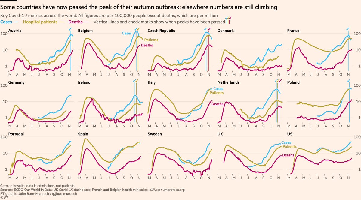
The charts show 3 key metrics for assessing outbreak phase: cases, deaths & hospital occupancy.

You can see how cases flatten off first, then hospitalisations, and then deaths.

The Netherlands has passed all three peaks. Belgium has passed two, and deaths will stop rising soon.
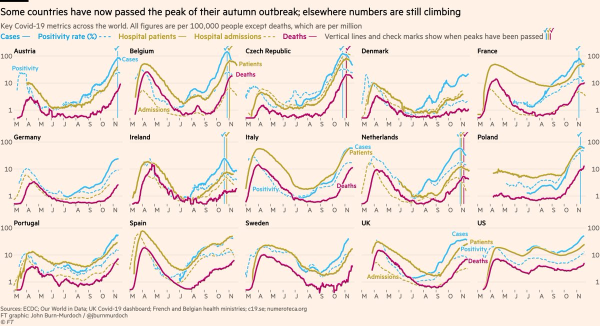
Here’s the same thing in more detail, adding another metric for prevalence (positivity rate) and another for hospitalisations (admissions)

NB in all these charts I’m only showing cases from summer onwards to make sure no misleading comparisons are made between now and spring
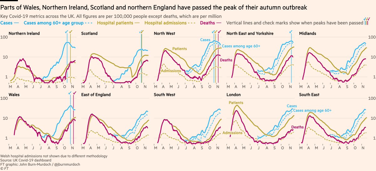
We can also take this format subnational.

Here are all UK nations and regions:
• Wales and the North West are through the worst and on the way down 📉
• Scotland, N. Ireland and parts of northern England also peaking
• Numbers still rising elsewhere in England, esp SW & SE
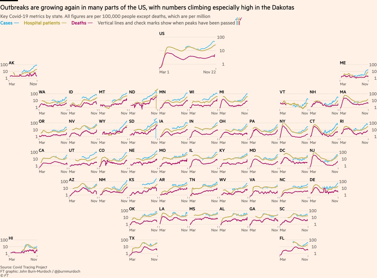
And finally a US state layout:

Numbers are rising especially steeply in the northern midwest, with the Dakotas faring worst. Death rates in South Dakota have passed New York’s April peak.

The glimmer of hope is that rates of cases and hospital use may be peaking in the Dakotas.
Some notes:
• These all use a log y-axis because rates of change are critical here. Remember, a straight line on a log scale means constant rate of growth/decay. @BristOliver has a great explainer here on why log scales still matter in the downward phase
• These charts are version 1.0, so please DM with any questions, suggestions etc

• I will be adding more countries. If possible I want hospital data so I can show all three core metrics, but where that is missing I will add some countries with only cases & deaths
That’s all for now — happy Monday one and all :-)

• • •

Missing some Tweet in this thread? You can try to force a refresh
 

Keep Current with John Burn-Murdoch

John Burn-Murdoch Profile picture

Stay in touch and get notified when new unrolls are available from this author!

Read all threads

This Thread may be Removed Anytime!

PDF

Twitter may remove this content at anytime! Save it as PDF for later use!

Try unrolling a thread yourself!

how to unroll video
  1. Follow @ThreadReaderApp to mention us!

  2. From a Twitter thread mention us with a keyword "unroll"
@threadreaderapp unroll

Practice here first or read more on our help page!

More from @jburnmurdoch

24 Nov
NEW: Tue 24 Nov update of Covid-19 trajectories

Main chart, including positivity rate + both hospital metrics + 5 new countries

• Poland’s peak was false: testing had dipped, so I’m now using positivity rate to judge peak prevalence
• Positivity falling in UK, ITA & ESP ✅ Image
Now UK nations & regions:
• Deaths appear to have peaked in NE & Yorks, but from the more granular data I can tell you that’s Yorks-driven. May still be rising in NE
• Cases & admissions appear to have peaked in the Midlands ✅
• Can’t clearly say southern regions peaked yet Image
Now the US state layout:

Still all eyes on the upper-midwest. Death rates in South Dakota higher than any state at any time and still climbing, but case rates in SD and neighbouring Iowa appear to have peaked.

Wyoming also concerning, and prevalence rising in most other states. Image
Read 6 tweets
24 Nov
From today’s @ONS data we can state that week ending Nov 23 had 1,904 more deaths than the 5-year average

"But were they caused by Covid or lockdown?"
2,366 deaths involved Covid

"But did they die *of* Covid, or just *with* it?"
Covid was the underlying cause of death for 2,056
In other words, there are substantial excess deaths, and they were ~all caused by Covid-19

In fact, deaths caused by Covid are 152 *more than* total excess, suggesting the mild flu season (due in part to social distancing) is reducing other deaths and thus the overall excess
Indeed, deaths caused by flu or pneumonia have been around 100 below the 5-year average for the last couple of weeks fingertips.phe.org.uk/static-reports…
Read 4 tweets
18 Nov
Micro-thread:

1/6 The question of whether or not to keep schools open during a pandemic is complex, and like many Covid debates the answers depend heavily on how much value people attach to different things, but one thing we certainly shouldn't be doing is relying on bad science
2/6 A paper recently went viral claiming people will lose more years of life *as a direct result of missing school* than the years lost *by all people dying from Covid*

Unsurprisingly for such a bold claim, it turns out the study is absolutely ridden with holes...
3/6 @ikashnitsky has an excellent critique here, demonstrating that the "months of missed school ➡️ months of reduced life expectancy" equation used is essentially 🚮
Read 6 tweets
16 Nov
NEW from me & @christinezhang:

Much was made of US exit polls showing non-white voters swinging towards Trump, but is it that simple?

We spent 10 days poring over data from thousands of precincts in battleground states to get a more robust answer

Story: ft.com/content/31a027…
1) At first glance, the precinct-level data do support the exit poll’s finding of a non-white shift towards Trump:

Majority-black, -Latino and -Asian neighbourhoods in Atlanta, Philadelphia, Arizona and California all returned higher vote shares for Trump this year vs 2016. Image
2) But there’s a problem with proportional shift analysis:

Asking e.g "did the % of Latino voters backing Trump increase?" ignores turnout, and in doing so it ignores what elections are actually decided by: numbers of votes.
Read 20 tweets
22 Oct
NEW: a fresh layout for our US excess deaths data

Placing each state’s chart in its rough location highlights different shapes of the epidemic, from short but towering spikes in north-east to prolonged climbs or twin-peaks in south & west

Free to read: ft.com/content/a52198… Image
Do read the full story by @hannahkuchler & @Edgecliffe for a deep dive into how the US lost control of the virus, with early missteps in New York playing a critical role: ft.com/content/a52198…
I particularly love this wonderful graphic from the brilliant @DatumFan, showing that as Trump focused on stopping arrivals from China, Europe was already a key source of transmission to the US. By early February more new cases were coming from chains within the US, not overseas Image
Read 4 tweets
21 Oct
NEW with @clivecookson

Hospital mortality data suggests the autumn resurgence of Covid-19 is proving less lethal than the spring, but is it that simple?

What’s going on beneath the surface, and is there cause to be optimistic?

A deep dive into the data: ft.com/content/b3801b…
1) The autumn resurgence of the virus is well underway, however you want to measure it.

Skeptics will say that we’re just seeing more cases because of more testing, so let’s head that one off at the pass.

Here are positivity rates, which are now rising across Europe and the US
2) Some might object that we’re just spotting much more mild cases of the virus now than we were in spring.

This is true (and a good thing — we’re catching more people who could infect others), BUT serious cases are also climbing, as measured by people in hospital with Covid-19
Read 15 tweets

Did Thread Reader help you today?

Support us! We are indie developers!


This site is made by just two indie developers on a laptop doing marketing, support and development! Read more about the story.

Become a Premium Member ($3/month or $30/year) and get exclusive features!

Become Premium

Too expensive? Make a small donation by buying us coffee ($5) or help with server cost ($10)

Donate via Paypal Become our Patreon

Thank you for your support!

Follow Us on Twitter!