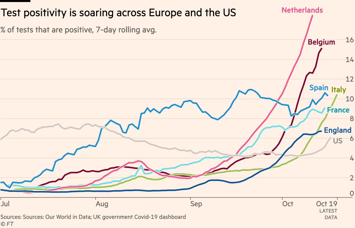
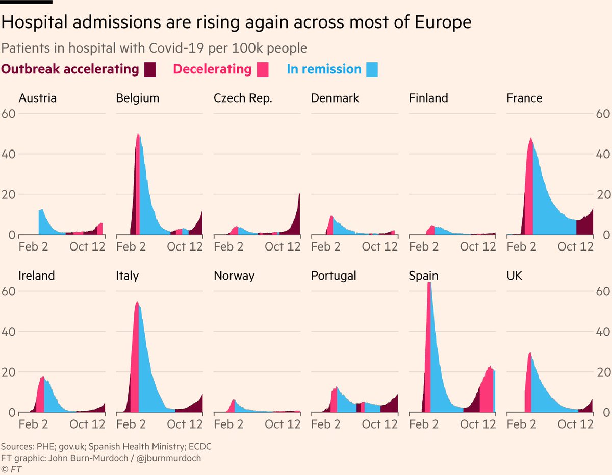
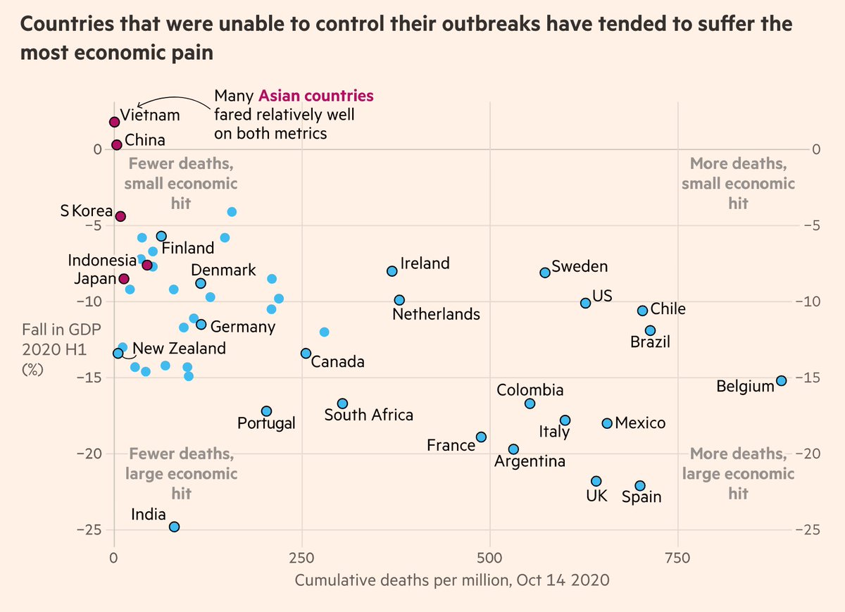
Micro-thread:

1/6 The question of whether or not to keep schools open during a pandemic is complex, and like many Covid debates the answers depend heavily on how much value people attach to different things, but one thing we certainly shouldn't be doing is relying on bad science
2/6 A paper recently went viral claiming people will lose more years of life *as a direct result of missing school* than the years lost *by all people dying from Covid*

Unsurprisingly for such a bold claim, it turns out the study is absolutely ridden with holes...
3/6 @ikashnitsky has an excellent critique here, demonstrating that the "months of missed school ➡️ months of reduced life expectancy" equation used is essentially 🚮
4/6 And the always-excellent @GidMK carried out his own Twitter peer-review here, picking apart several other issues, each of which is enough to render the findings useless
5/6 In addition to the above, my own gripe is that this study is an example of another issue that I think limits discussions over Covid policy:

Deaths (and years of lost life) have become the uber-metric for judging all claims on either side, in way that erases so much nuance.
6/6 When evaluating impacts of disrupted education (or other domains), it feels to me just as important to assess how that disruption influences a life's *nature or course*, as it's duration

Life and death are kinda fundamental to human existence. But they're more than 1s and 0s

• • •

Missing some Tweet in this thread? You can try to force a refresh
 

Keep Current with John Burn-Murdoch

John Burn-Murdoch Profile picture

Stay in touch and get notified when new unrolls are available from this author!

Read all threads

This Thread may be Removed Anytime!

PDF

Twitter may remove this content at anytime! Save it as PDF for later use!

Try unrolling a thread yourself!

how to unroll video
  1. Follow @ThreadReaderApp to mention us!

  2. From a Twitter thread mention us with a keyword "unroll"
@threadreaderapp unroll

Practice here first or read more on our help page!

More from @jburnmurdoch

16 Nov
NEW from me & @christinezhang:

Much was made of US exit polls showing non-white voters swinging towards Trump, but is it that simple?

We spent 10 days poring over data from thousands of precincts in battleground states to get a more robust answer

Story: ft.com/content/31a027…
1) At first glance, the precinct-level data do support the exit poll’s finding of a non-white shift towards Trump:

Majority-black, -Latino and -Asian neighbourhoods in Atlanta, Philadelphia, Arizona and California all returned higher vote shares for Trump this year vs 2016. Image
2) But there’s a problem with proportional shift analysis:

Asking e.g "did the % of Latino voters backing Trump increase?" ignores turnout, and in doing so it ignores what elections are actually decided by: numbers of votes.
Read 20 tweets
22 Oct
NEW: a fresh layout for our US excess deaths data

Placing each state’s chart in its rough location highlights different shapes of the epidemic, from short but towering spikes in north-east to prolonged climbs or twin-peaks in south & west

Free to read: ft.com/content/a52198… Image
Do read the full story by @hannahkuchler & @Edgecliffe for a deep dive into how the US lost control of the virus, with early missteps in New York playing a critical role: ft.com/content/a52198…
I particularly love this wonderful graphic from the brilliant @DatumFan, showing that as Trump focused on stopping arrivals from China, Europe was already a key source of transmission to the US. By early February more new cases were coming from chains within the US, not overseas Image
Read 4 tweets
21 Oct
NEW with @clivecookson

Hospital mortality data suggests the autumn resurgence of Covid-19 is proving less lethal than the spring, but is it that simple?

What’s going on beneath the surface, and is there cause to be optimistic?

A deep dive into the data: ft.com/content/b3801b…
1) The autumn resurgence of the virus is well underway, however you want to measure it.

Skeptics will say that we’re just seeing more cases because of more testing, so let’s head that one off at the pass.

Here are positivity rates, which are now rising across Europe and the US
2) Some might object that we’re just spotting much more mild cases of the virus now than we were in spring.

This is true (and a good thing — we’re catching more people who could infect others), BUT serious cases are also climbing, as measured by people in hospital with Covid-19
Read 15 tweets
18 Oct
NEW: today we've published the culmination of a weeks-long @ftdata team effort, summarising everything data has shown us about the virus over the year so far, from Wuhan to the autumn resurgence ig.ft.com/coronavirus-gl…

Free to read, with a wealth of #dataviz on the key trends.
A huge amount of work from a vast cast of people went into this, over many weeks.

Consider this our rolling credits screen:

1) @caletilford & @aendrew built a beautiful interactive experience, designed by @carolinenevitt who also drew up a bespoke colour palette for the series
2) @tomhannen @BobHaslett @sdbernard created some stunning visuals, including gorgeous animations 🎥😍

3) @alekswis @martinstabe @officeofjane @theboysmithy and I dug into data and scientific papers to report out the story itself, and added charts that told that story 📖📈
Read 4 tweets
15 Oct
⚠ warning to anyone using ECDC subnational cases rates data ⚠

Figures released this morning include several errors, some very significant.

They’ve since silently uploaded a new file, but incorrect one is still online 😑

We’re checking new file for errors and will report back
Latest ECDC data appears to be correct: ecdc.europa.eu/en/publication…

You can the impact of the correction in this before (left) and after (right) duo courtesy of @sdbernard.

With the correction, all of France breathes a sigh of relief
Today has been another classic episode of the hit series "Covid data is an utter shitshow".

Data jiggery pokery going on everywhere, well beyond that ECDC slip-up.
Read 4 tweets
1 Oct
Tidied up a chart from the new Indian study that I think does a great job of showing what we mean by super-spreading:

Vast majority of confirmed cases don’t go on to infect anyone else; a small number of people account for the majority of transmission

science.sciencemag.org/content/early/… Image
This is why the Japanese approach of avoiding the three Cs (enClosed spaces, Crowded spaces, Close contact) has been so effective.

Even if someone is highly infectious, you hugely constrain the amount of spreading they can do if you limit the number of people they’re mixing with
We still don’t know exactly what causes super-spreading. Is it mainly that someone is especially infectious, or mainly that a moderately infectious person spends time in an enclosed & crowded space while infectious?

Whatever the answer is, avoiding the 3Cs can only help.
Read 4 tweets

Did Thread Reader help you today?

Support us! We are indie developers!


This site is made by just two indie developers on a laptop doing marketing, support and development! Read more about the story.

Become a Premium Member ($3/month or $30/year) and get exclusive features!

Become Premium

Too expensive? Make a small donation by buying us coffee ($5) or help with server cost ($10)

Donate via Paypal Become our Patreon

Thank you for your support!

Follow Us on Twitter!