NEW: here’s how England’s restriction tiers have changed from pre-lockdown

Tier 3 now runs from coast to coast across most of the north, plus Bristol, Kent & Slough.

Almost everywhere else is in Tier 2, except Cornwall, Scilly and Isle of Wight.
Some places might feel hard done by:

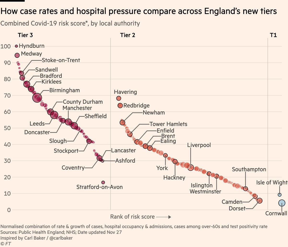
Inspired @carlbaker’s brilliant charts, here is a comparison of the latest case rates across areas in each tier.

👀 several outer London boroughs (Tier 2) have higher rates than places in Tier 3, such as Manchester, Leeds and Sheffield
Here’s our story: ft.com/content/62b566…
And here’s another chart comparing outbreak status across the tiers, but this time adding rate of change as well as current prevalence.

The people of Stratford-on-Avon can be forgiven for feeling a little miffed...

• • •

Missing some Tweet in this thread? You can try to force a refresh
 

Keep Current with John Burn-Murdoch

John Burn-Murdoch Profile picture

Stay in touch and get notified when new unrolls are available from this author!

Read all threads

This Thread may be Removed Anytime!

PDF

Twitter may remove this content at anytime! Save it as PDF for later use!

Try unrolling a thread yourself!

how to unroll video
  1. Follow @ThreadReaderApp to mention us!

  2. From a Twitter thread mention us with a keyword "unroll"
@threadreaderapp unroll

Practice here first or read more on our help page!

More from @jburnmurdoch

27 Nov
NEW: here’s the definitive chart on which parts of England have been hard-done-by or "let off" by the new tiers.

This one combines all the metrics the govt says it’s using:
• Cases (overall rate, rise or fall, and over-60s)
• Hospital occupancy & admissions
• Positivity rate Image
In summary:
• Tiers seem correct for majority of places. All high-risk areas are in highest tier
• "Harsh" decisions like Stratford typically areas whose neighbours have high risk
• Outer London has been "let off", but difficult to have outer & inner London in different tiers
The question some might ask is:

If places like Stratford were bumped up a tier because of high risk in surrounding areas, why was inner London not bumped up to tier 3 where parts of outer London appear to belong?

I think there are valid reasons, but it’s worth pondering.
Read 5 tweets
26 Nov
NEW: mini-thread of maps & charts to watch for today’s UK tiers:

Here’s where we stand according to latest case data

Lots of blue on the right is good: rates falling almost everywhere. Some exceptions are outer London & south east, where rates are higher and may still be rising
Another way of looking at this is in scatter form, plotting current prevalence (horizontal) vs rate of change (vertical).

Note how inner London areas are in the bottom left: low rates and falling. But several outer London boroughs are above the average and possibly still rising
We can put that last chart into context by comparing it to how things stood on national lockdown eve.

Most areas in "very high" tier 3 had weekly rates above 400 at the time restrictions came in. Today no London borough is at that level, though parts of the south east are.
Read 7 tweets
24 Nov
NEW: Tue 24 Nov update of Covid-19 trajectories

Main chart, including positivity rate + both hospital metrics + 5 new countries

• Poland’s peak was false: testing had dipped, so I’m now using positivity rate to judge peak prevalence
• Positivity falling in UK, ITA & ESP ✅ Image
Now UK nations & regions:
• Deaths appear to have peaked in NE & Yorks, but from the more granular data I can tell you that’s Yorks-driven. May still be rising in NE
• Cases & admissions appear to have peaked in the Midlands ✅
• Can’t clearly say southern regions peaked yet Image
Now the US state layout:

Still all eyes on the upper-midwest. Death rates in South Dakota higher than any state at any time and still climbing, but case rates in SD and neighbouring Iowa appear to have peaked.

Wyoming also concerning, and prevalence rising in most other states. Image
Read 6 tweets
24 Nov
From today’s @ONS data we can state that week ending Nov 23 had 1,904 more deaths than the 5-year average

"But were they caused by Covid or lockdown?"
2,366 deaths involved Covid

"But did they die *of* Covid, or just *with* it?"
Covid was the underlying cause of death for 2,056
In other words, there are substantial excess deaths, and they were ~all caused by Covid-19

In fact, deaths caused by Covid are 152 *more than* total excess, suggesting the mild flu season (due in part to social distancing) is reducing other deaths and thus the overall excess
Indeed, deaths caused by flu or pneumonia have been around 100 below the 5-year average for the last couple of weeks fingertips.phe.org.uk/static-reports…
Read 4 tweets
23 Nov
NEW: Monday 23 Nov update of Covid-19 trajectories

It’s been a while... but these are the charts I’m going to be using to track the rise and fall of autumn/winter outbreaks

This is not doom & gloom; these charts focus on highlighting when countries have passed the peak
The charts show 3 key metrics for assessing outbreak phase: cases, deaths & hospital occupancy.

You can see how cases flatten off first, then hospitalisations, and then deaths.

The Netherlands has passed all three peaks. Belgium has passed two, and deaths will stop rising soon.
Here’s the same thing in more detail, adding another metric for prevalence (positivity rate) and another for hospitalisations (admissions)

NB in all these charts I’m only showing cases from summer onwards to make sure no misleading comparisons are made between now and spring
Read 8 tweets
18 Nov
Micro-thread:

1/6 The question of whether or not to keep schools open during a pandemic is complex, and like many Covid debates the answers depend heavily on how much value people attach to different things, but one thing we certainly shouldn't be doing is relying on bad science
2/6 A paper recently went viral claiming people will lose more years of life *as a direct result of missing school* than the years lost *by all people dying from Covid*

Unsurprisingly for such a bold claim, it turns out the study is absolutely ridden with holes...
3/6 @ikashnitsky has an excellent critique here, demonstrating that the "months of missed school ➡️ months of reduced life expectancy" equation used is essentially 🚮
Read 6 tweets

Did Thread Reader help you today?

Support us! We are indie developers!


This site is made by just two indie developers on a laptop doing marketing, support and development! Read more about the story.

Become a Premium Member ($3/month or $30/year) and get exclusive features!

Become Premium

Too expensive? Make a small donation by buying us coffee ($5) or help with server cost ($10)

Donate via Paypal Become our Patreon

Thank you for your support!

Follow Us on Twitter!