Just published my new @OurWorldInData post:
• Why did renewables become so cheap so fast?
→ And what can we do to use this global opportunity for green growth?
ourworldindata.org/cheap-renewabl…
• Why did renewables become so cheap so fast?
→ And what can we do to use this global opportunity for green growth?
ourworldindata.org/cheap-renewabl…
Today fossil fuels – coal, oil, and gas – account for 79% of the world’s energy production.
But as this chart shows they have very large negative side effects.
But as this chart shows they have very large negative side effects.

Why is the world relying on power from fossil fuels if they cause so many deaths and such large greenhouse gas emissions?
Because in the past they were *far cheaper* than other sources of energy.
Because in the past they were *far cheaper* than other sources of energy.
This tells us what has to change if we want to gid of fossil fuels.
If we want the world to be powered by safer and cleaner alternatives (see the chart above), then we have to make sure that those alternatives are cheaper than fossil fuels.
If we want the world to be powered by safer and cleaner alternatives (see the chart above), then we have to make sure that those alternatives are cheaper than fossil fuels.
This chart shows how the electricity prices from the long-standing sources of power – fossil fuels and nuclear – have changed over the last decade.
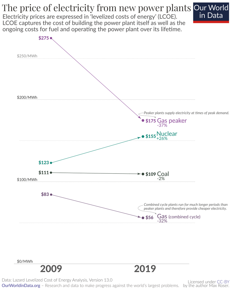
The ‘levelized costs of energy’ (LCOE) is explained in the post.
A tweet-length explanation: If you are a power plant owner it’s the answer to this question: What would be the minimum price that my customers need to pay so that the power plant breaks even over its lifetime?
A tweet-length explanation: If you are a power plant owner it’s the answer to this question: What would be the minimum price that my customers need to pay so that the power plant breaks even over its lifetime?
Now look at how the price of power from renewables has changed.
In the last 10 years power from new wind power plants became 70% cheaper.
Power from new solar got 89% cheaper! From $359 per MWh to $40.
In the last 10 years power from new wind power plants became 70% cheaper.
Power from new solar got 89% cheaper! From $359 per MWh to $40.
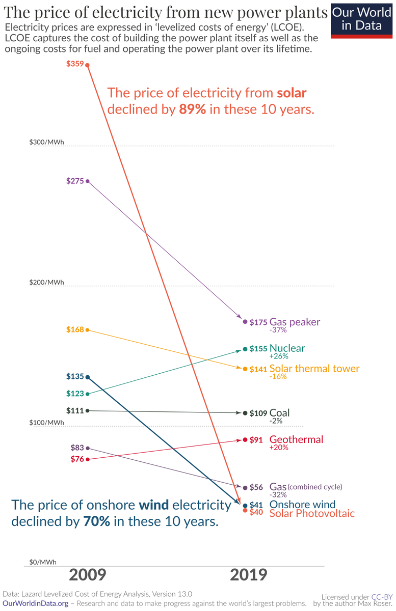
Just 10 years ago it wasn’t even close: power from a new solar plant was 223% more expensive than power from a new coal plant.
This is not the case anymore. It changed extremely fast.
This is not the case anymore. It changed extremely fast.
How can this be? Why do we see the cost of renewable energy decline so very fast?
The costs of fossil fuels and nuclear power depend largely on two factors, the price of the fuel that they burn and the power plant’s operating costs.
The costs of fossil fuels and nuclear power depend largely on two factors, the price of the fuel that they burn and the power plant’s operating costs.
Renewable energy plants are different: their operating costs are comparatively low and they don’t have to pay for any fuel.
What is determining the cost of renewable power is the cost of the power plant, the *cost of the technology itself*.
What is determining the cost of renewable power is the cost of the power plant, the *cost of the technology itself*.
So we have to understand how the price of the technology changes.
For solar photovoltaics that's the price of the solar modules.
For solar photovoltaics that's the price of the solar modules.
And this technology has been getting cheaper extremely fast and steadily.
This is the 'learning curve' of solar modules – their price declined by 20% each time global cumulative capacity doubled.
This is the 'learning curve' of solar modules – their price declined by 20% each time global cumulative capacity doubled.

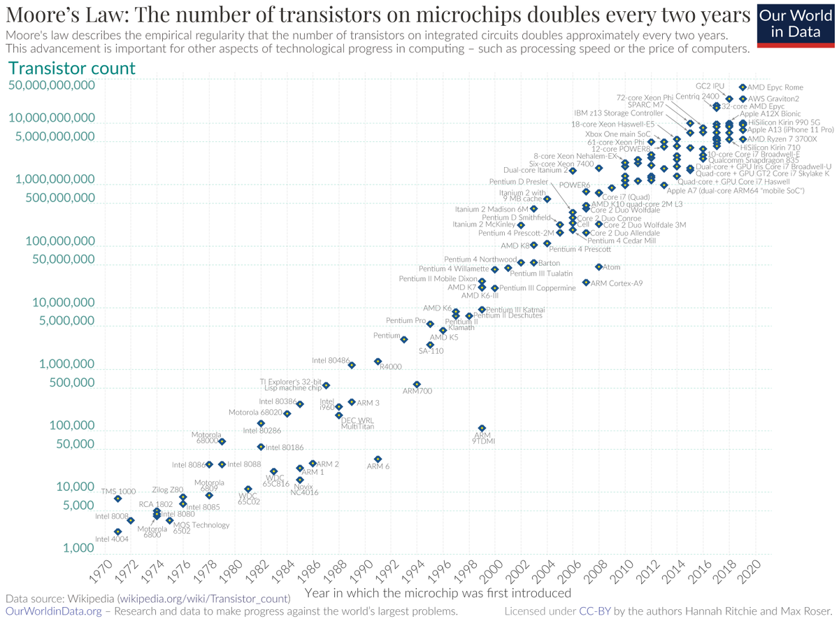
A more famous development that is similar to this is Moore’s Law.
The details are in the post (in the fold-out box for those who are interested), but you can think of Moore’s Law as a variation of a learning curve.
The details are in the post (in the fold-out box for those who are interested), but you can think of Moore’s Law as a variation of a learning curve.
Solar PV modules might very well follow a rapidly declining learning curve, but solar modules themselves are not what we want.
We want the electricity that they produce.
Does the price of electricity from renewables follow a learning curve?
We want the electricity that they produce.
Does the price of electricity from renewables follow a learning curve?
Yes, the prices of electricity from renewables also follow learning curves.
This chart – the central chart of the text – shows that power from renewables get cheaper as we increase capacity.
But this is not happening from power from fossil fuels and nuclear.
This chart – the central chart of the text – shows that power from renewables get cheaper as we increase capacity.
But this is not happening from power from fossil fuels and nuclear.
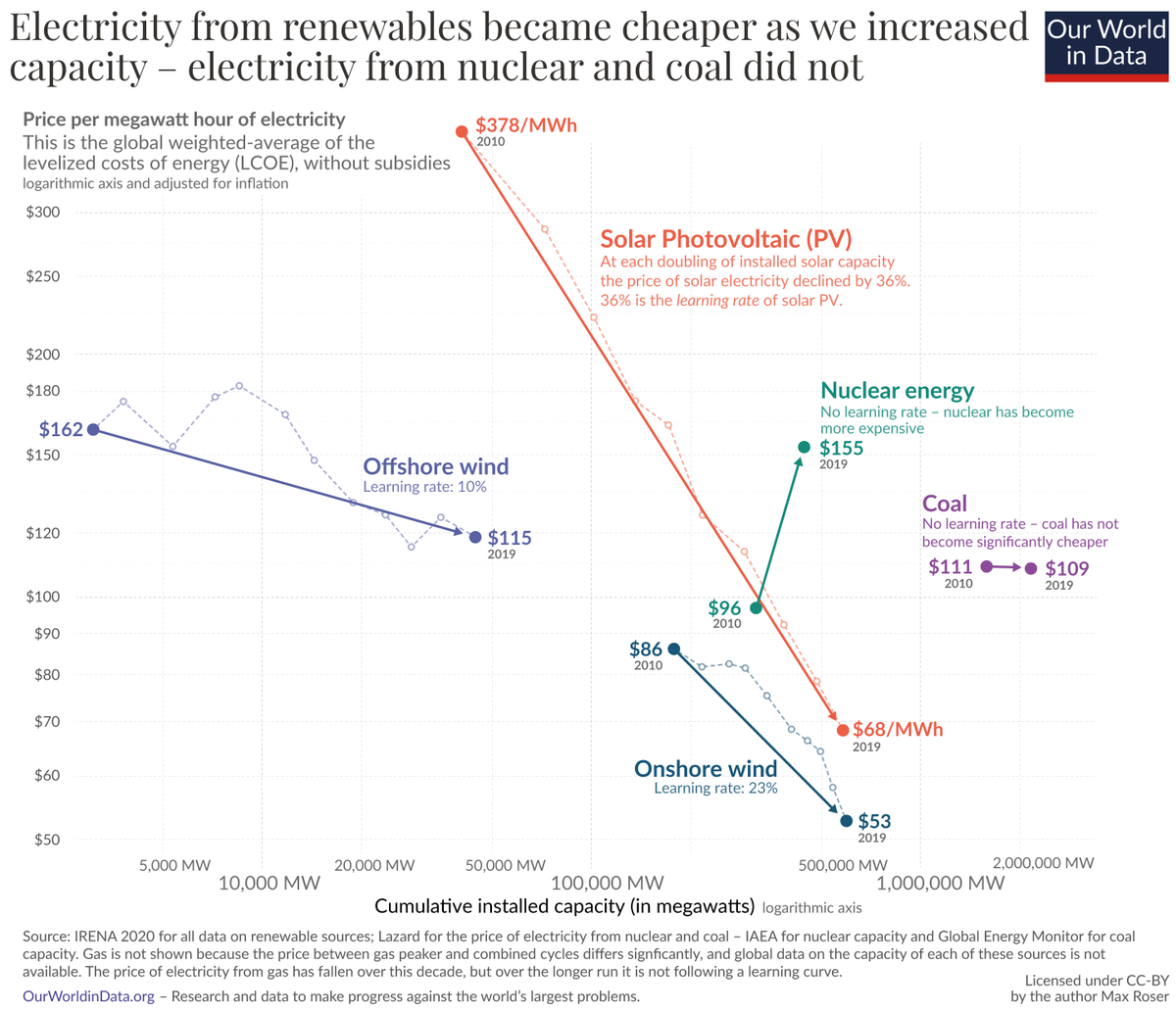
In the post I explain why we should not expect that this will change in the future for fossil fuels. They offer cheap power, but electricity from these sources is not following a learning curve.
The more renewable energy technologies we deploy, the more their costs will fall. And this will increase demand for those source, more growth will mean even more growth.
Rich countries have the resources to make investments into renewable technology that drive down the price along the learning curves.
I think that this is a good way to spend money and help workers to get out of the COVID recession. But beyond that…
I think that this is a good way to spend money and help workers to get out of the COVID recession. But beyond that…
Beyond that the key argument for rich countries to deploy more renewables is that they are not just working towards the transition to low-carbon energy for themselves, but for the entire world. Cheap power is irresistible for everyone.
Ramez Naam – @ramez – made this argument very well in this related post of his here: techcrunch.com/2019/02/15/how…
This is the beautiful thing about technology: once it is invented somewhere it can help everywhere.
The steep decline of solar power is a particularly fortunate development for many of the world's poorest countries that often have very sunny climates.
https://twitter.com/MaxCRoser/status/1333741716055134210
Energy systems have very long path dependencies, since it is very costly to build a power plant or to decide to shut a power plant down.
Investments in renewable technologies today will therefore have very long-term benefits.
Investments in renewable technologies today will therefore have very long-term benefits.
Every time someone decides to build a low-carbon power plant instead of a coal plant is a win for decades.
Low prices are the key argument to convince the world – especially those places that have the least money – to build low-carbon power systems for a sustainable future.
Low prices are the key argument to convince the world – especially those places that have the least money – to build low-carbon power systems for a sustainable future.
An additional benefit of it is more economic growth – and less poverty
This matters because many cannot afford electricity. Energy poverty is a problem for a large share of the world.
This matters because many cannot afford electricity. Energy poverty is a problem for a large share of the world.

Cheap power changes this because your real income is the ratio between what you are paid and the price of the goods and services you pay for.
Falling energy prices means economic growth and less poverty – a way out of energy poverty.
Falling energy prices means economic growth and less poverty – a way out of energy poverty.
This is just a very summary, the post has the details:
ourworldindata.org/cheap-renewabl…
Many thanks for reading. Let me know if you have questions. I hope you find it useful.
ourworldindata.org/cheap-renewabl…
Many thanks for reading. Let me know if you have questions. I hope you find it useful.
• • •
Missing some Tweet in this thread? You can try to
force a refresh