Harald Profile picture
8 Dec, 7 tweets, 3 min read
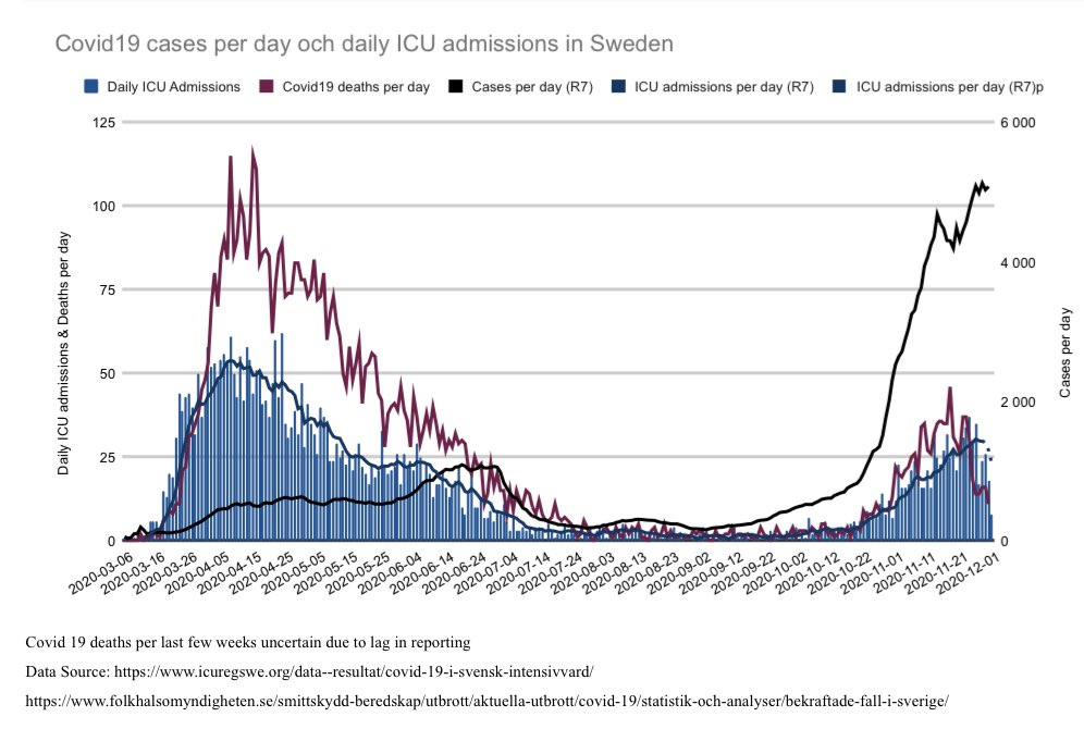
1/7 🇸🇪 update including new figures from @Folkhalsomynd
-cases
-ICU admissions
-#covid19 dod
-dive inte admissions and cases (4 regions)

ICU admissions seems to be turning, see following tweets for further details. Deaths yet to show sign of change of direction. +
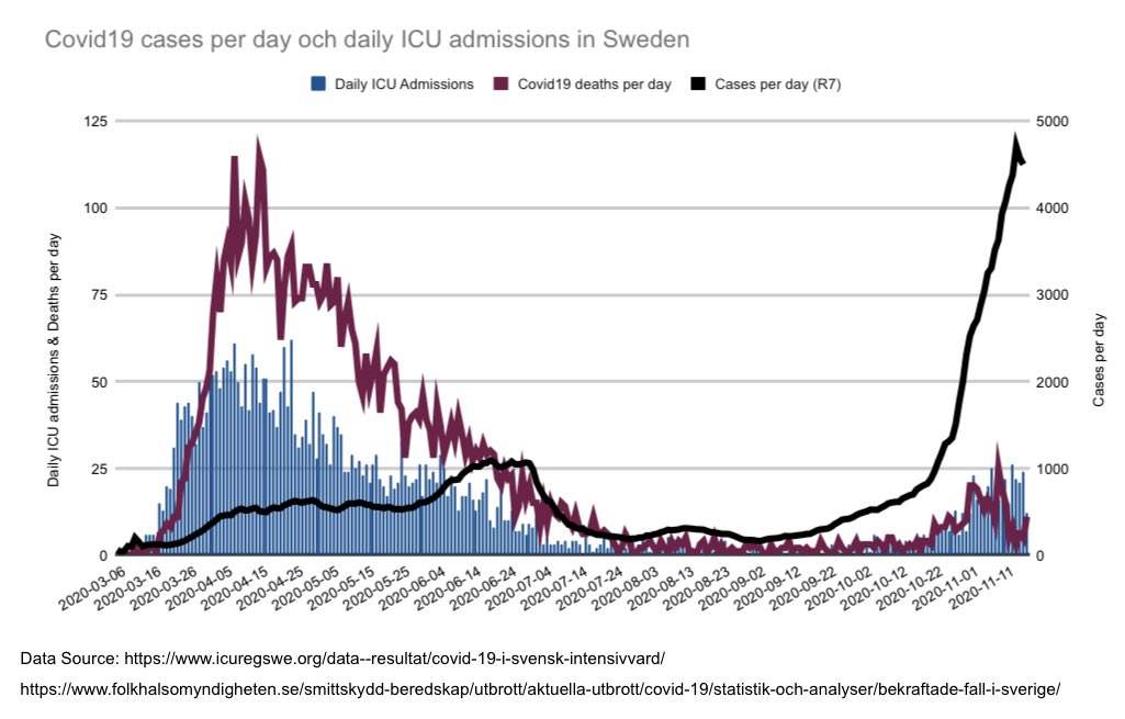
 Image
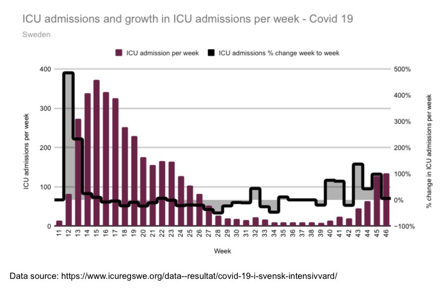
2/7 it seems we now have a week with fewer admissions than prior week🙏🏼 w48 unfortunate climbed ca 17% past w47. Let’s look at four regions 👇🏽+ Image
3/7 plateau of Västra Götaland still continues, very good! + Image
4/7 Stockholm looks to continue decreasing ICU admissions as well, at least not increasing + Image
5/7 Uppsala at pretty low levels, pray they keep it that way. We want Christmas to be without stress + Image
6/7 Skåne, still the region with ICU admissions yet to decrease. As I’ve mentioned before this would be expected given the milder spring outbreak. + Image
7/7 last graph demonstrates higher all cause mortality again as #covid19 deaths are increasing. I’d still be surprised if we go beyond spring levels. See also update from yesterday 👇🏽
Image

• • •

Missing some Tweet in this thread? You can try to force a refresh
 

Keep Current with Harald

Harald Profile picture

Stay in touch and get notified when new unrolls are available from this author!

Read all threads

This Thread may be Removed Anytime!

PDF

Twitter may remove this content at anytime! Save it as PDF for later use!

Try unrolling a thread yourself!

how to unroll video
  1. Follow @ThreadReaderApp to mention us!

  2. From a Twitter thread mention us with a keyword "unroll"
@threadreaderapp unroll

Practice here first or read more on our help page!

More from @HaraldofW

2 Dec
1/5 🇸🇪 A regional dive into ICU Admissions & cases for
Stockholm, Västra Götaland, Skåne and Uppsala + weekly admissions

Stockholm👇🏽 adding red-line in all graphs which indicate 2 weeks +/-3 days from local advice. You can determine for yourself the possible effect on ICU. +
2/5 Västra Götaland (Gothenburg) seems to have been on a plateau in terms of admissions since around 10 November. +
3/5 Uppsala - positive trend in terms of not higher admission rates. To early to say anything. But whereas spring was typically sharp rise with slow decline we now seems to see a gentler increase and decrease all together but more extended? +
Read 5 tweets
1 Dec
1/4 🇸🇪 post-weekend update

ICU admissions increase slightly between week 47-48 but less than week before and perhaps less since increase began. Still figure has to stabilise.

In next tweets we look at
- cases
- corona dod
- acm
- acm compared between 4 age groups

+
2/4 Cases 🆙
There is no sudden spike rather slow increase of other metrics in graph —> ICU admissions and covid deaths... +
3/4 weekly all cause mortality graph updated inc covid deaths, data released today. We are now above average acm and we have seen covid deaths increase as well.

We have had some 20 weeks with below average, now broken. +
Read 4 tweets
24 Nov
1/5 🇸🇪 update
-all cause mortality
-deaths #covid19
-cases
-ICU admissions

First graph - Including week 46 - acm still at or below average for this time of year. During spring with similar c19 deaths per week we already had above average. +
2/ cases turned up again. Slight increase still re ICU admissions in terms of higher general no but not higher peak. +
3/ as demonstrated in graph👇🏽 increase of ICU admissions fifth consecutive week. Link to regional ICU admissions, Stockholm would be most interesting.


+
Read 5 tweets
21 Nov
1/21 🇸🇪 I’ve been looking at cases and ICU admissions lately. In this graphaton 🧵 I’ll present the figures for each region including date of local recommendations - in titel - if there are any.

Stockholm
2/21 Örebro
3/21 Västernorrland
Read 21 tweets
17 Nov
1/5 🇸🇪 weekly short update👇🏽 w45-46 similar re ICU admissions in Sweden + Image
2/5 Growth rate of ICU admissions continues to be slow + Image
3/5 Cases....
Admissions plateau or slowing we hope🙏🏼?
#covid19 deaths increases, also seen in tweet below 👇🏽+ Image
Read 5 tweets
19 Oct
1/8 🇸🇪 update of a few graphs of all cause mortality (acm) including September.

Adding including a few earlier tweets in this short-thread
-#covid19
-Nordic comparison
-ICU capacity

Firstly update of graph comparing ACM October through September👇🏽 + Image
2/8 Secondly update of graph comparing January through September. 2020 similar to 2015 but lower than 2013 and basically all years prior to that + Image
3/8 Thirdly adding chart comparing flu season to flu season. As noticed, 2019 had very few deaths. + Image
Read 8 tweets

Did Thread Reader help you today?

Support us! We are indie developers!


This site is made by just two indie developers on a laptop doing marketing, support and development! Read more about the story.

Become a Premium Member ($3/month or $30/year) and get exclusive features!

Become Premium

Too expensive? Make a small donation by buying us coffee ($5) or help with server cost ($10)

Donate via Paypal Become our Patreon

Thank you for your support!

Follow Us on Twitter!