Harald Profile picture
17 Nov, 5 tweets, 2 min read
1/5 🇸🇪 weekly short update👇🏽 w45-46 similar re ICU admissions in Sweden + Image
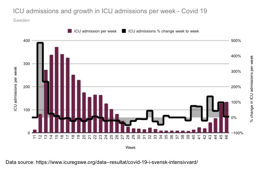
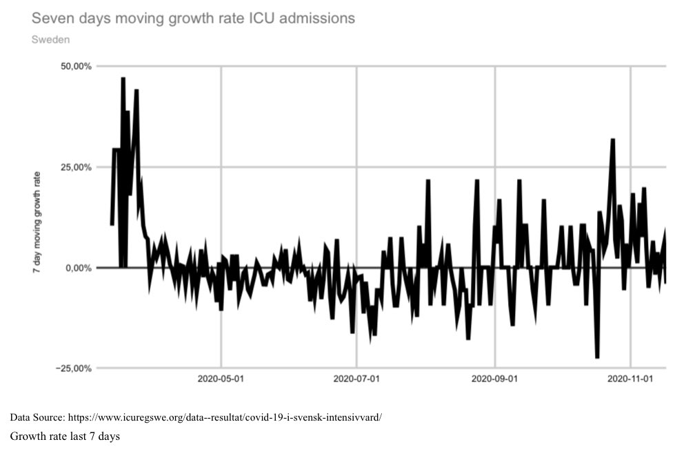
2/5 Growth rate of ICU admissions continues to be slow +
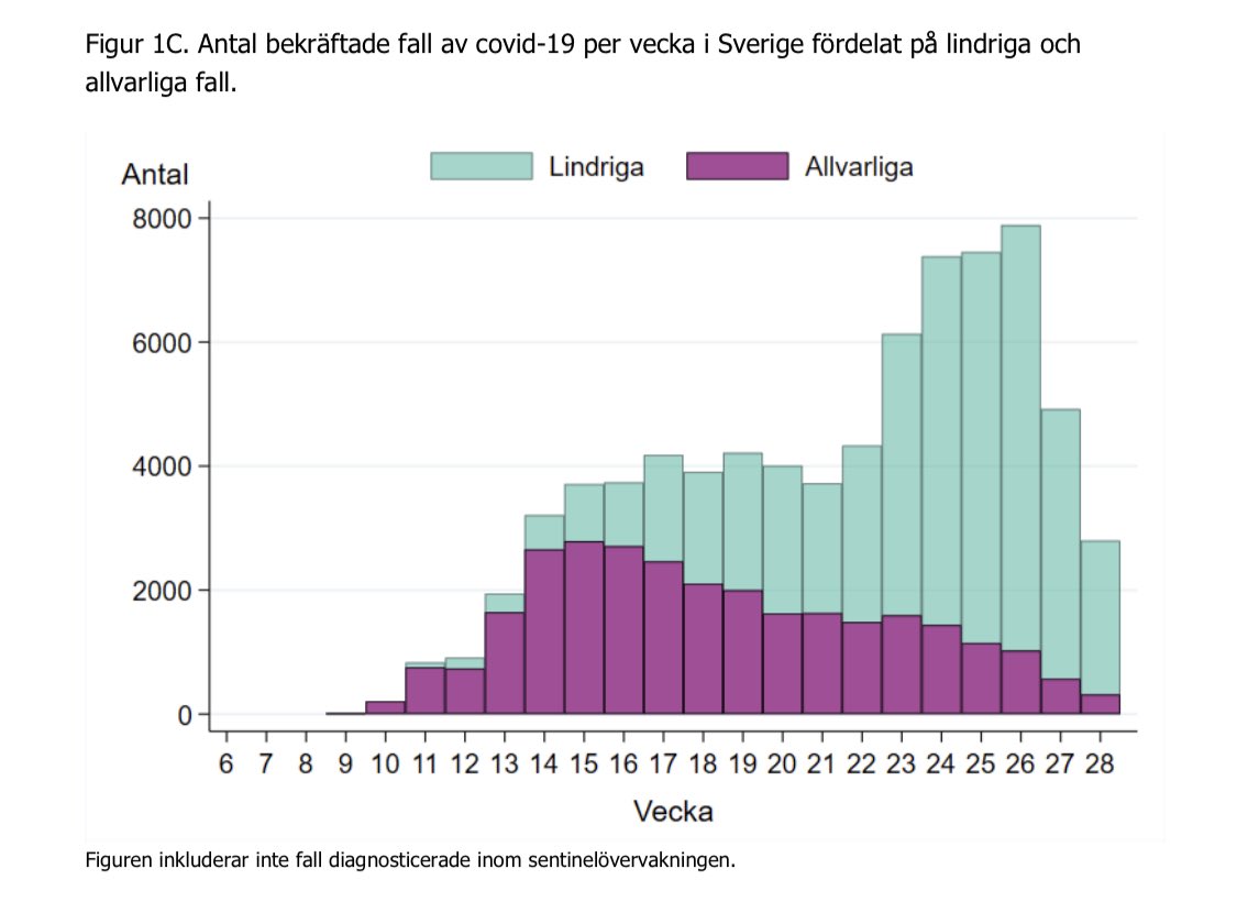
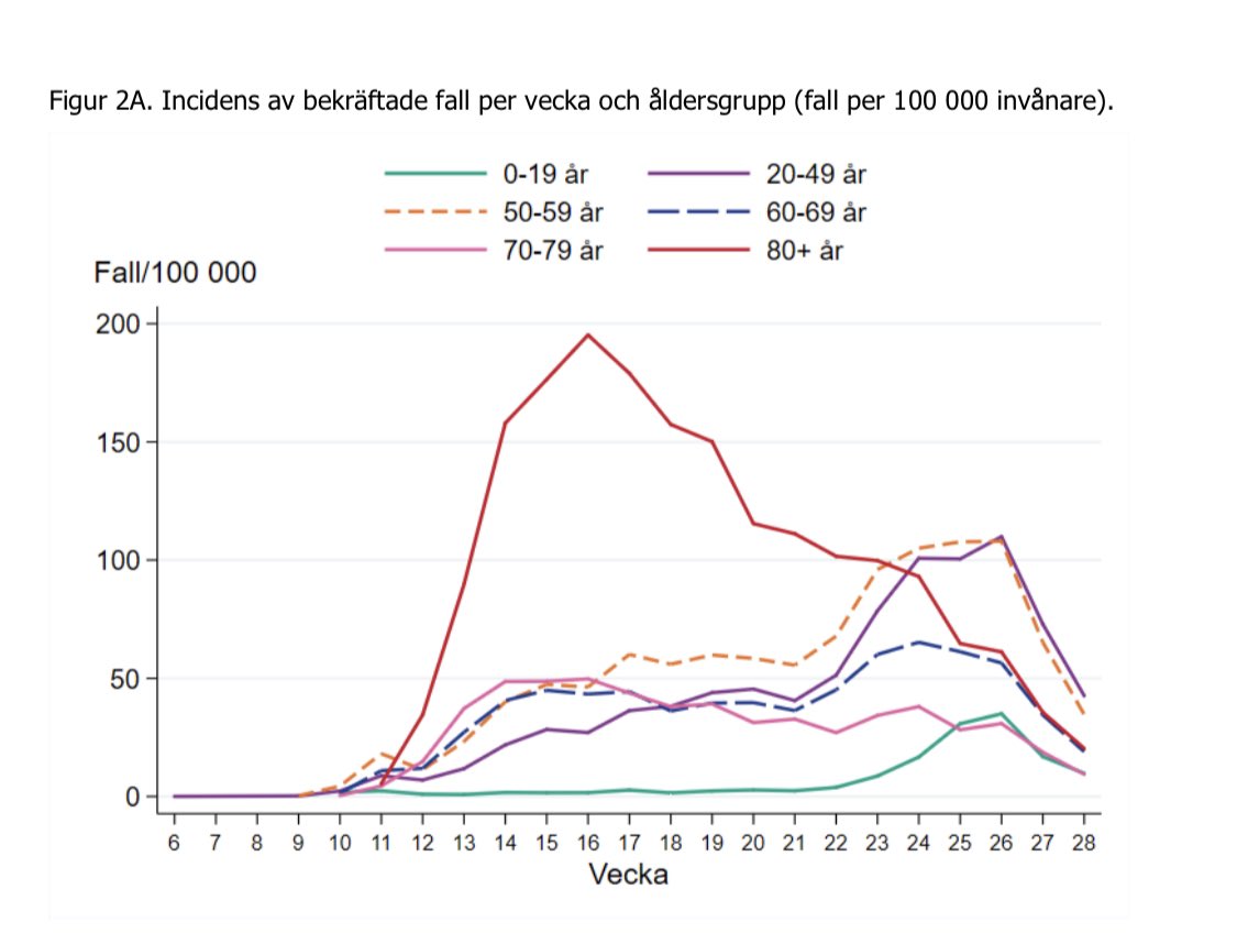
 Image
3/5 Cases....
Admissions plateau or slowing we hope🙏🏼?
#covid19 deaths increases, also seen in tweet below 👇🏽+ Image
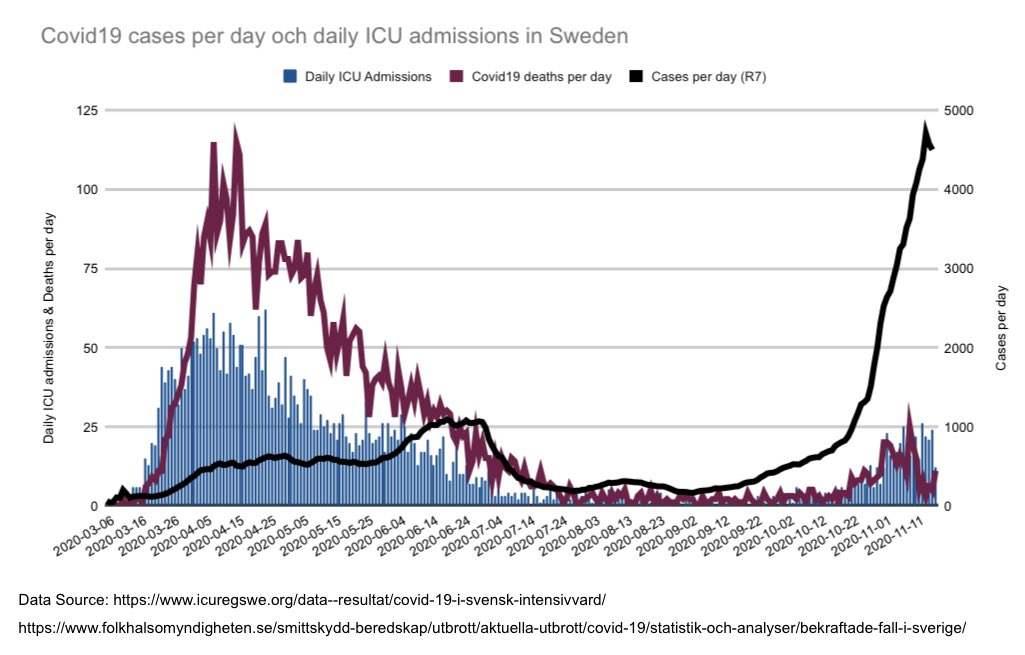
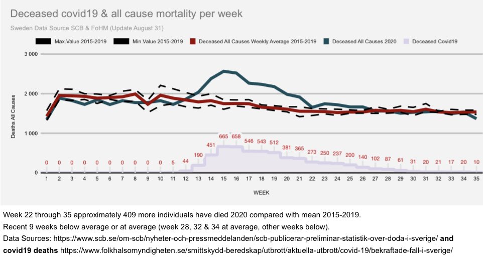
4/5 #covid19 deaths increase. All cause mortality less continue to be below or at average 19 consecutive weeks with preliminary figures. + Image
5/5 Last one, November through October all cause mortality👇🏽

That’s it for this week re several graphs from a Sweden where government lost their spine. Image

• • •

Missing some Tweet in this thread? You can try to force a refresh
 

Keep Current with Harald

Harald Profile picture

Stay in touch and get notified when new unrolls are available from this author!

Read all threads

This Thread may be Removed Anytime!

PDF

Twitter may remove this content at anytime! Save it as PDF for later use!

Try unrolling a thread yourself!

how to unroll video
  1. Follow @ThreadReaderApp to mention us!

  2. From a Twitter thread mention us with a keyword "unroll"
@threadreaderapp unroll

Practice here first or read more on our help page!

More from @HaraldofW

19 Oct
1/8 🇸🇪 update of a few graphs of all cause mortality (acm) including September.

Adding including a few earlier tweets in this short-thread
-#covid19
-Nordic comparison
-ICU capacity

Firstly update of graph comparing ACM October through September👇🏽 + Image
2/8 Secondly update of graph comparing January through September. 2020 similar to 2015 but lower than 2013 and basically all years prior to that + Image
3/8 Thirdly adding chart comparing flu season to flu season. As noticed, 2019 had very few deaths. + Image
Read 8 tweets
14 Sep
1/10 🇸🇪 Graphs updated including August. Only September left and this👇🏽 graph is complete. Comparing October through August looking at all cause mortality.

Following tweets will focus on all cause mortality in Sweden:
-No adjustments
-Crude adjustments
-ASMR
-Average
-Trend
+
2/10 Link to my previous thread will be in last tweet, containing more details on Swedish #covid19 data. This thread is shorter and focus on all cause mortality. Here we see January through August. 2020 similar to eg 2012, 2013 & 2015. +
3/10 Looking at rolling three months average we see that current short trend is down since spike in April and that the long trend in general is downwards as well probably due to better general health and better health services. +
Read 12 tweets
7 Sep
1/4 🇸🇪 updating a few graphs, adding one additional week (35)👇🏽 follow the dark green line. At or below average of 2015-2019 for 9 consecutive weeks. Week 35 so far only recorded 10 #covid19 deaths. Will be adjusted upwards but still very few. +
2/4 Year 2020 and year 2019 continues to stay ca 13 days from average of 2015-2018 and when accounting for population growth... +
3/4 Voila... +
Read 4 tweets
22 Aug
1/4 🇸🇪 there have been speculation if 2019 with few deaths could impact the outcome of deaths 2020. What does history tell us? Instead of y2y I looked at consecutive flu seasons👇🏽and as we can see deaths increased until 2000 and then slight downward trend until 2014 and then up+
2/4 We see that most drops in all cause mortality (acm) season2season are followed by an increase the year after. Does larger drops (more than -3,37%) result in increases? Yes always during this period. Does the drop revert with equally large percentage increase? +
3/4 Well, so it seems at least. When looking at drops in three ranges we see that often a drop is followed by an on average equally large increase. 2019 had a large drop of acm which was followed by a large increase in 2020.+
Read 6 tweets
10 Aug
1/18 🇸🇪 4th update. Shorter, many aspects are similar to last update, eg age distribution of #covid19 deaths in Sweden -> ca 90% over 70 years old or that ca 70% of those deceased were either care home residents or receiving home care service as can be seen in graph below. +
2/18 Let’s start with two model projections. First the IHME model which shows that prediction of deaths were far above actual. This is continually worth reminding of because these messages were hammered into our heads by media and the #covid19 opinionados. +
3/18 Equally disastrous were the projections of ICU beds needed, hospitals were predicted to be overrun. Very good for us this did not happen and we kept below max capacity at all times. + #COVID19sverige
Read 18 tweets
17 Jul
1/5 🇸🇪 a few graphs from FoHMs latest weekly (w28) update. This graph shows (green) mild cases and (purple) severe cases of total #covid19 cases per week. + #COVID19sverige
2/5 This graph shows confirmed #covid19 cases per week and age groups. All age groups decline compared to last week. +
3/5 This graph shows number of confirmed cases in care homes. Of all confirmed cases, ca 9% have been in care homes (ca 7000). Almost half of them from Stockholm. Of confirmed care home cases, ca 38% have died.+ @Daniilgor
Read 5 tweets

Did Thread Reader help you today?

Support us! We are indie developers!


This site is made by just two indie developers on a laptop doing marketing, support and development! Read more about the story.

Become a Premium Member ($3/month or $30/year) and get exclusive features!

Become Premium

Too expensive? Make a small donation by buying us coffee ($5) or help with server cost ($10)

Donate via Paypal Become our Patreon

Thank you for your support!

Follow Us on Twitter!