Ed Tubb Profile picture
9 Dec, 7 tweets, 2 min read
1/n I know I post a count literally every evening — but this is worth saying:

You get the most accurate sense of the pandemic by focusing less on the bumps in this line and instead squinting at the general shape of it.

The picture won't be precise — but the data isn't either.
2/n The problem is that all the ups and downs in these lines strongly suggest *narrative* — but for the most part, the data doesn't have anywhere near that fidelity.

Big turnarounds happen in pandemics, yes, but you won't know for sure you've had one until weeks later.
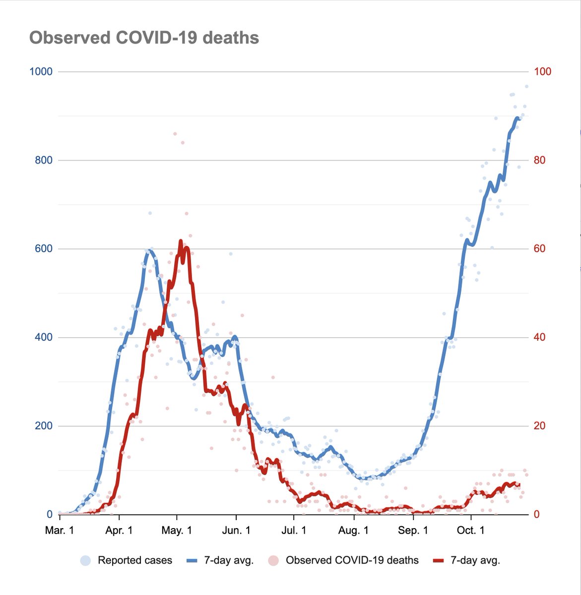
3/n Think of all the times we've heard about flattening, or a plateau, or a spike after some holiday.

You can see those moments clearly in the ups and downs of the fall wave.

At the same time: You can also draw a remarkably straight line through the same curve.
4/n It's not that that week by week data didn't matter, it's that the trend — broadly speaking — hadn't actually changed.
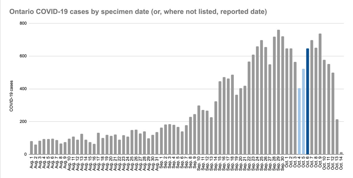
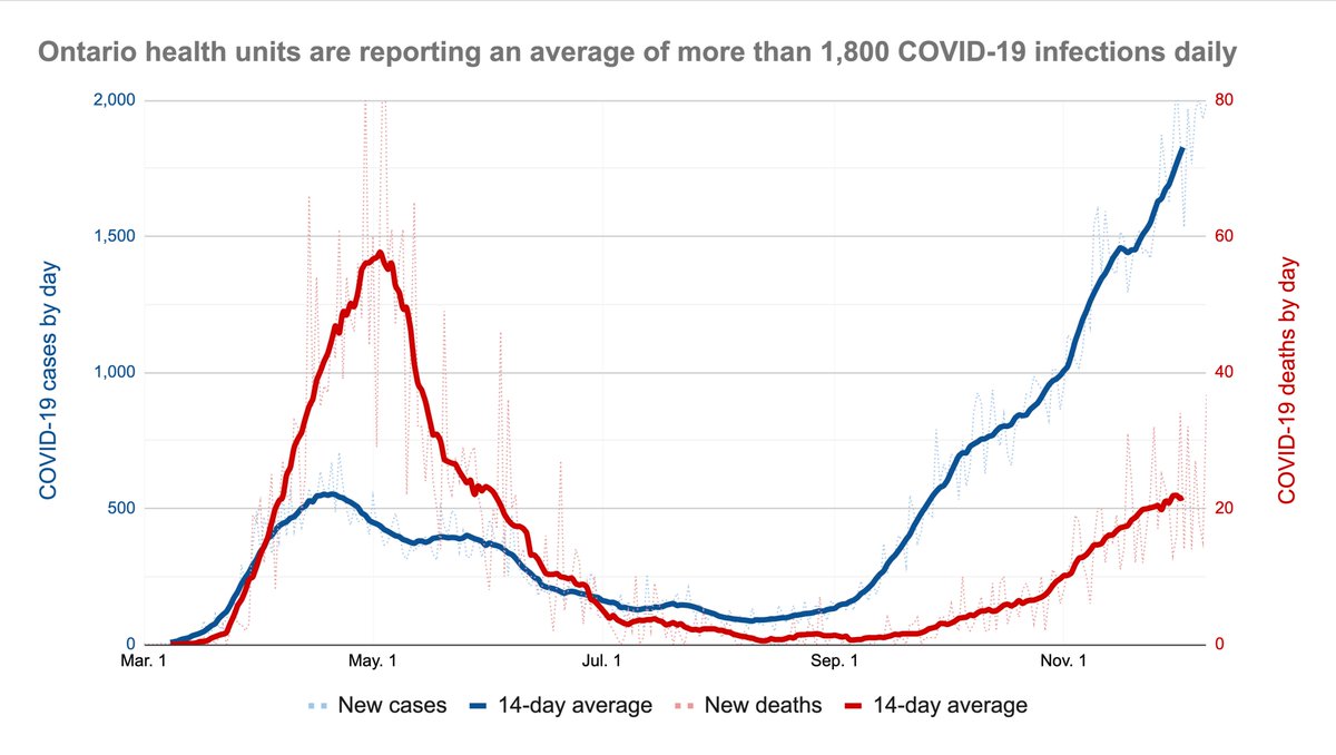
5/n Anyway, I'm saying all this because I'm *tempted* to think things have slowed a touch lately in Ontario, and yet when I squint at it, that's a very straight line upward since Sept., isn't it?
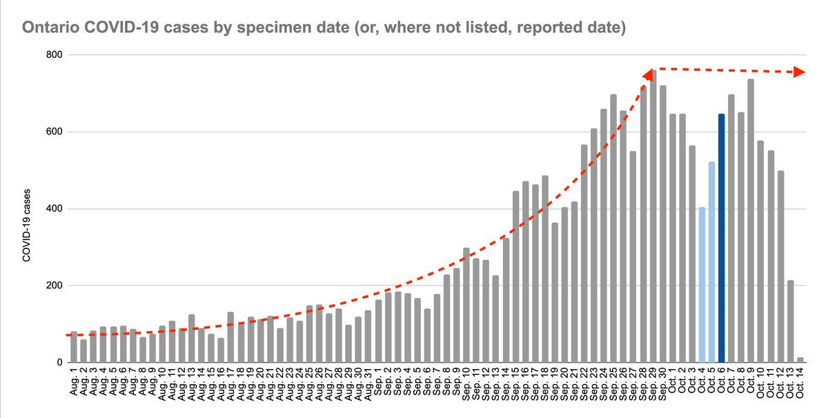
6/n I've shared this chart before, but it basically sums it up.

This is the same Ontario case curve, just smoothed over 14 days rather than 7.

How many times has this curve truly changed direction?
7/n To be 100% clear: A straight line chart of an inherently exponential phenomenon like an infectious disease does, in fact, show a gradual slowdown.

Steady exponential growth would curve upward.

What it doesn't show is any sudden turnaround.

• • •

Missing some Tweet in this thread? You can try to force a refresh
 

Keep Current with Ed Tubb

Ed Tubb Profile picture

Stay in touch and get notified when new unrolls are available from this author!

Read all threads

This Thread may be Removed Anytime!

PDF

Twitter may remove this content at anytime! Save it as PDF for later use!

Try unrolling a thread yourself!

how to unroll video
  1. Follow @ThreadReaderApp to mention us!

  2. From a Twitter thread mention us with a keyword "unroll"
@threadreaderapp unroll

Practice here first or read more on our help page!

More from @EdTubb

2 Nov
1/2 Here's this "expected deaths" curve overlayed with the province's cases by day, left, and the observed deaths tally, right.

The "expected" curve peaks on April 17 (when nursing home outbreaks peaked by cases).

The real curve peaks May 4.
2/2 You see what looks like a similar match with a peak on the downside of the "expected" curve at May 14-15 with one on the real curve around May 27.

So... ballpark: If it's predictive, this "expected deaths" number could be a look ahead by 10 to 14 days.
Testing this:

On Oct. 1 "expected deaths" hit a 7-day avg. of 5.5 deaths a day; we passed that 15 days later (on Oct. 16.)

On Oct. 16 "expected deaths" was at a 7-day avg. of 8.0; we passed that 17 days later (today.)

That's pretty good — maybe a bit longer than the spring?
Read 4 tweets
2 Nov
1/n Not long after I did the attached chart of cases by age, I realized I could use the Ontario database to predict how deadly each day's set of new cases might be, based on the age breakdown and their average death rates.

That's easy enough.
2/n First, we know two important things about the COVID-19 death rate.

1. It's become a lot lower over time, probably because we're better prepared to treat it.

2. It takes some time for some patients to die.
3/n If you're looking to estimate how likely any given patient is to die, it's simple enough to resolve those issues.

1. Throw out data from the spring.

2. Throw out recently infected cases, and any case listed "not resolved".
Read 8 tweets
15 Oct
1/n I've been talking for a bit about uncertainty with the Ontario COVID-19 data over the new testing system.

Here's a chart that illustrates my caution: This is cases by the day a patient's sample was collected:

A steep slope up to a peak on Sept. 29.

Then a *big* dip.
2/n That dip itself is very easy to explain:

Dark blue is the day appointments started.

Light blue are the days some centres were closed to prepare. Before that, there were a few days of extremely long wait times.

It's what's happened *after* the dip that I'm not clear on.
3/n My question: Is the new testing regime equally as good at catching cases as it was in late Sept.?

If it is, then the data is evidence cases have actually been falling since hitting a peak in late Sept. — maybe they *have* plateaued.

The signal would be something like this:
Read 5 tweets
15 Oct
Ontario is reporting 783 new cases this morning, with 5 deaths.

39,961 completed tests, which is up.

Looks like sample-taking is rebounding, too: 49,717 samples added to the queue yesterday.

(That's why "under investigation" is up nearly 10k to 36k)

data.ontario.ca/dataset/status…
The labs first need to *have* samples to be able to test them, so the fact more tests were collected than tested yesterday does not yet suggest there's a "backlog" problem.

With big input numbers, it's normal for a large total of tests to be in the queue at the end of the day.
The question is whether the labs can handle this input after it comes in, so should watch to see if the completed number gets back up into the mid-to-high 40k range tomorrow.
Read 4 tweets
14 Oct
1/n Here's a short thread on COVID-19 deaths in Ontario's second wave.

Why are deaths still relatively low?

After all, weren't we seeing far more people dying in Ontario at this time in the spring?

Well, yes... and maybe no. Image
2/n Here's the fall 2nd wave so far, left, compared to the spring 1st wave to its peak by daily cases, which came in mid-April.

As you can see: In the spring, deaths followed soon after cases — we clearly have *not* seen a similar pattern so far in the fall. ImageImage
3/n But let's remember the spring:

Infections were coming hard and fast.

The system was not prepared.

We weren't testing.

As a result. That case curve *was itself* delayed.

ie: Many infections happened weeks before the case was confirmed; that largely doesn't happen now.
Read 9 tweets
24 Sep
As of 8 pm Wed., Ontario's regional public health units are reporting another 373 confirmed or probable COVID-19 cases, with 4 more deaths.

The 7-day avg. is 🔺 to 403 cases/day and 🔺 to 1.7 deaths/day.

First time the 7-day avg. has been north of 400 cases/day since May 26. Image
Accounting notes:

- Toronto reported 129 new cases but the unit's total rose by 99. In the past, this would suggest data cleaning scrubbed 30 cases, but I don't know yet if that's the case today. Regardless, my total for the day includes 129 from Toronto.
- The province's total for Toronto from the same reporting period was 102.

- The province also had 0 in Middlesex-London, but the unit reported 12.

- So: Add 30ish from Toronto and 12 from London to province's 335 from this morning, and it's much closer to what I'm seeing.
Read 7 tweets

Did Thread Reader help you today?

Support us! We are indie developers!


This site is made by just two indie developers on a laptop doing marketing, support and development! Read more about the story.

Become a Premium Member ($3/month or $30/year) and get exclusive features!

Become Premium

Too expensive? Make a small donation by buying us coffee ($5) or help with server cost ($10)

Donate via Paypal Become our Patreon

Thank you for your support!

Follow Us on Twitter!