Our job is to communicate clearly to people. If they are confused, that's on us much more than on them.
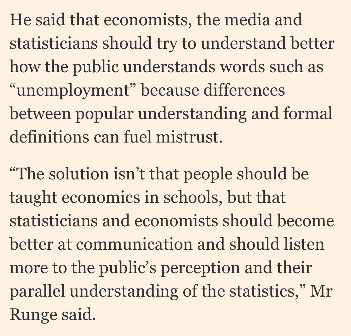
And no, this doesn't mean we should change our definition of things like unemployment and GDP to match what people [mis]understand, but it does mean we should provide explainers if we're using these terms when speaking to a mass audience.
It's the same in #dataviz. If someone doesn't understand my chart, that's mainly on me.
This is why we always included log scale explainers when sharing our trajectory trackers, for example.
We're hear to communicate, not to make pronouncements from on high and then walk away.
Almost without exception, people *want* to learn. Let them push at an open door instead of locking it and throwing away the key.
• • •
Missing some Tweet in this thread? You can try to
force a refresh
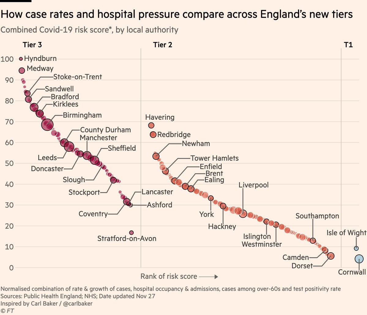
NEW: here’s the definitive chart on which parts of England have been hard-done-by or "let off" by the new tiers.
This one combines all the metrics the govt says it’s using:
• Cases (overall rate, rise or fall, and over-60s)
• Hospital occupancy & admissions
• Positivity rate
In summary:
• Tiers seem correct for majority of places. All high-risk areas are in highest tier
• "Harsh" decisions like Stratford typically areas whose neighbours have high risk
• Outer London has been "let off", but difficult to have outer & inner London in different tiers
The question some might ask is:
If places like Stratford were bumped up a tier because of high risk in surrounding areas, why was inner London not bumped up to tier 3 where parts of outer London appear to belong?
I think there are valid reasons, but it’s worth pondering.
NEW: mini-thread of maps & charts to watch for today’s UK tiers:
Here’s where we stand according to latest case data
Lots of blue on the right is good: rates falling almost everywhere. Some exceptions are outer London & south east, where rates are higher and may still be rising
Another way of looking at this is in scatter form, plotting current prevalence (horizontal) vs rate of change (vertical).
Note how inner London areas are in the bottom left: low rates and falling. But several outer London boroughs are above the average and possibly still rising
We can put that last chart into context by comparing it to how things stood on national lockdown eve.
Most areas in "very high" tier 3 had weekly rates above 400 at the time restrictions came in. Today no London borough is at that level, though parts of the south east are.
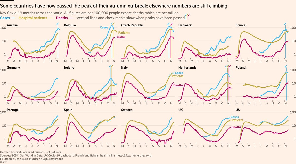
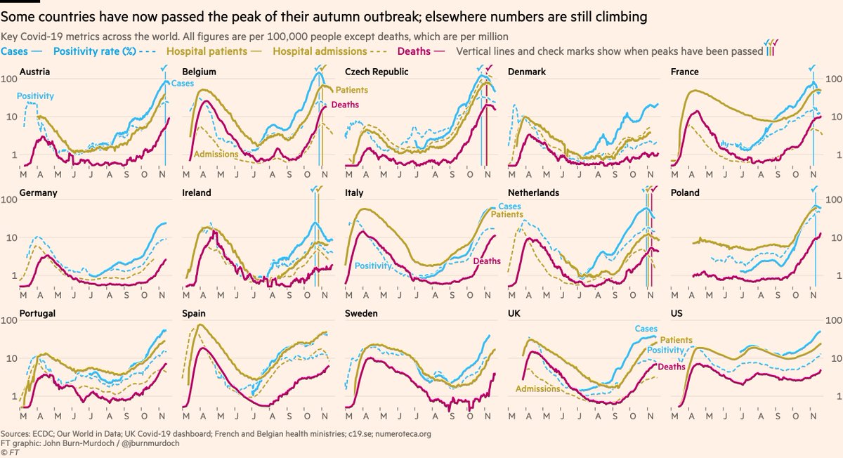
Main chart, including positivity rate + both hospital metrics + 5 new countries
• Poland’s peak was false: testing had dipped, so I’m now using positivity rate to judge peak prevalence
• Positivity falling in UK, ITA & ESP ✅
Now UK nations & regions:
• Deaths appear to have peaked in NE & Yorks, but from the more granular data I can tell you that’s Yorks-driven. May still be rising in NE
• Cases & admissions appear to have peaked in the Midlands ✅
• Can’t clearly say southern regions peaked yet
Now the US state layout:
Still all eyes on the upper-midwest. Death rates in South Dakota higher than any state at any time and still climbing, but case rates in SD and neighbouring Iowa appear to have peaked.
Wyoming also concerning, and prevalence rising in most other states.
In other words, there are substantial excess deaths, and they were ~all caused by Covid-19
In fact, deaths caused by Covid are 152 *more than* total excess, suggesting the mild flu season (due in part to social distancing) is reducing other deaths and thus the overall excess
Indeed, deaths caused by flu or pneumonia have been around 100 below the 5-year average for the last couple of weeks fingertips.phe.org.uk/static-reports…