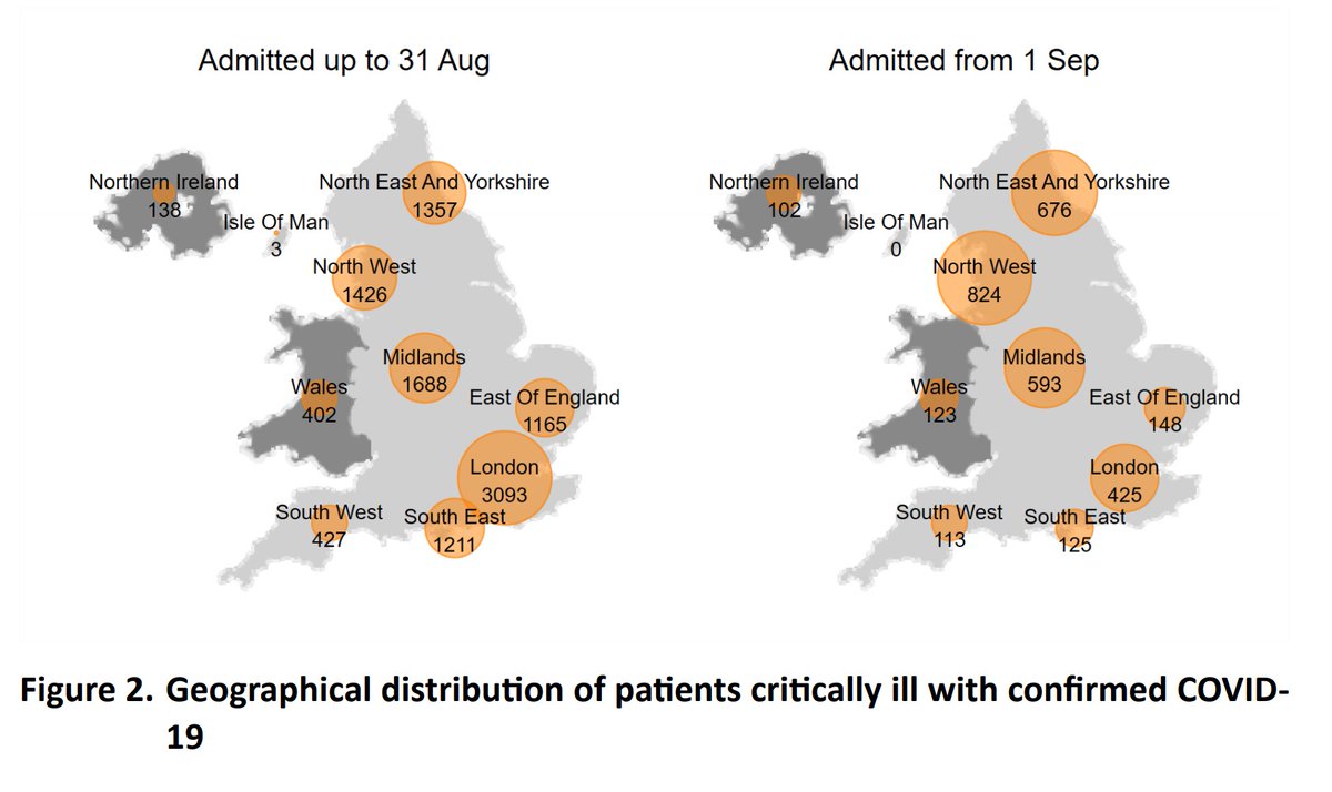
The latest @ICNARC update on ICU activity was published yesterday, and is summarised here on behalf of @COVID19actuary. Focussing on patient numbers (as outcomes are little changed), there's a clear upswing in admissions in the south east of the country, particularly London. 1/12
Five areas have now surpassed their first wave total and in total the figure is now at 93% of the first wave and will be exceeded in the next week at current rates of admission. 2/12
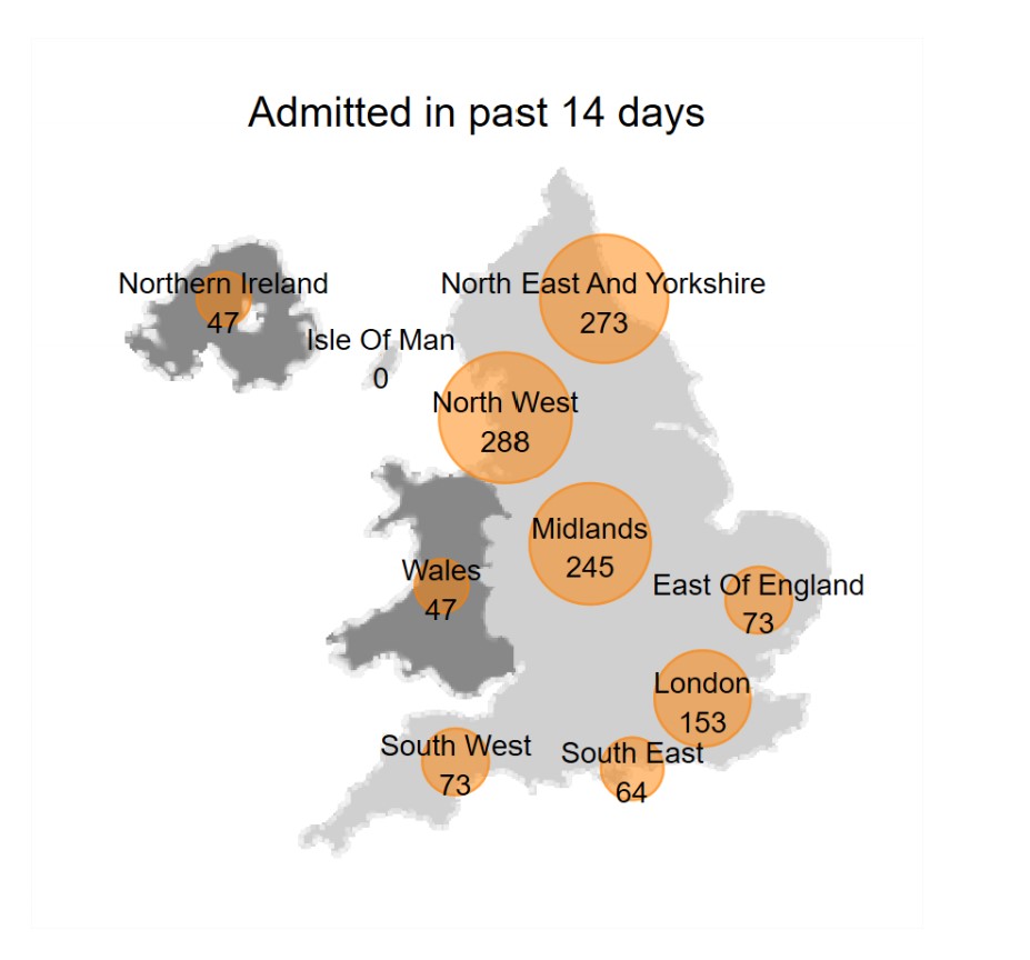
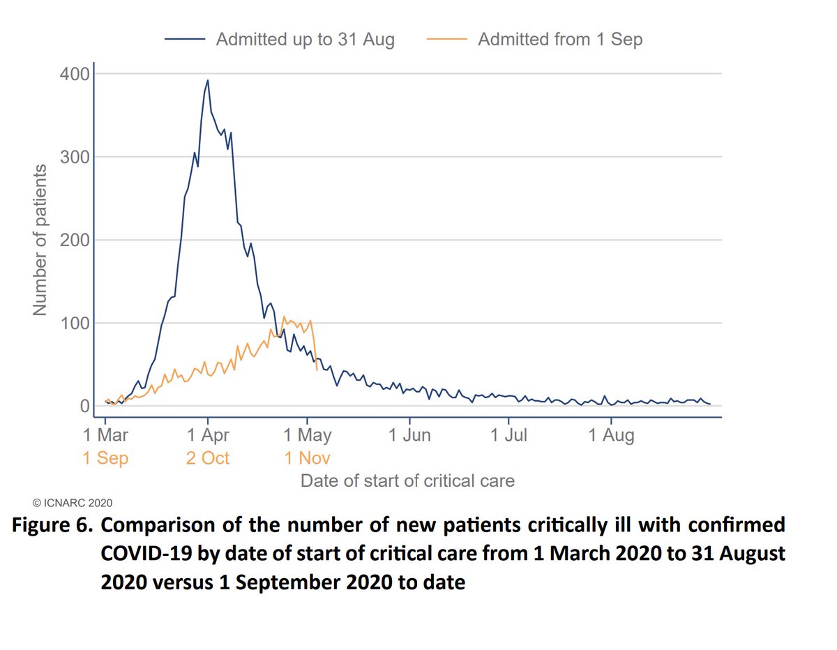
A visual representation of how the second wave has been more spread than the first, and also how the numbers are rising again after falling during the second half of November. The current gradient looks steeper than anything seen to date in this wave. 3/12
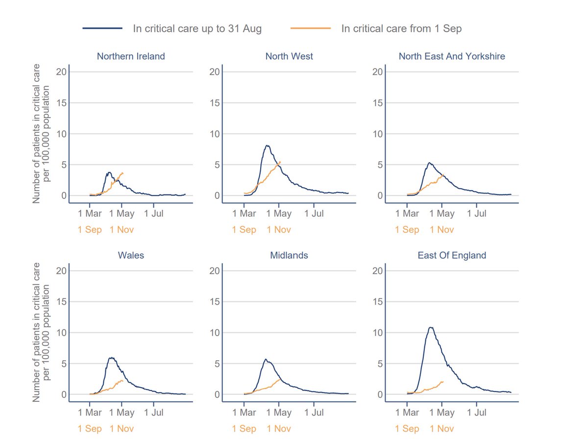
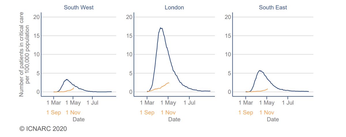
This next slide shows activity in relation to population size. You can see how London and the East are reaching admission levels not seen since the peak of the first wave (not that that should be seen as the only benchmark of success or failure), and are still rising. 4/12
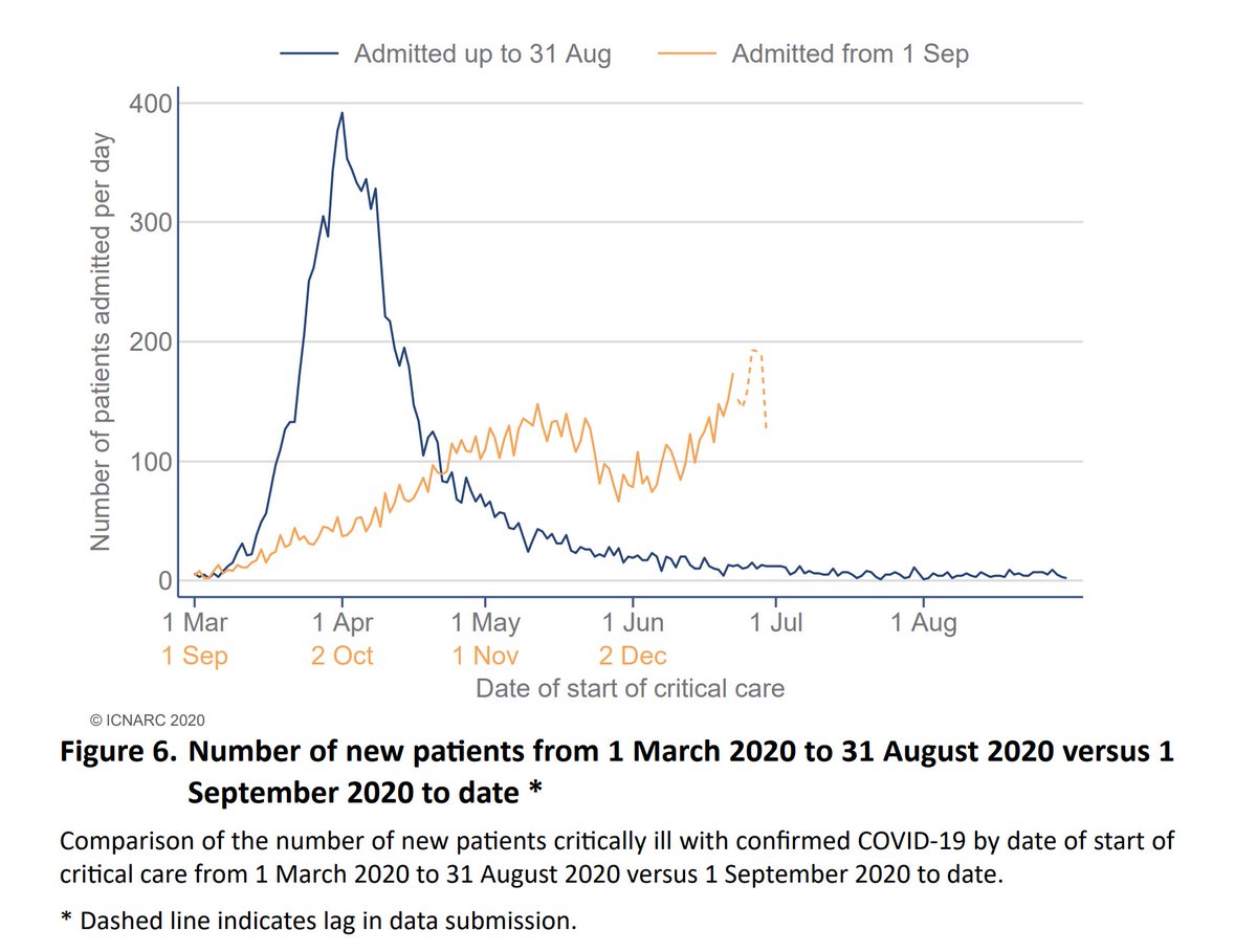
Numbers in ICU are also rising again, although are still well below the peak. The upward trajectory is particularly concerning in London, currently appearing nearly as steep as in late March. 5/12
We don't have Dec's figures yet, but we can expect the orange bar to be even higher given the figures above. But why are non-elective non-COVID patients so much lower? The next graphs give some insight. 6/12
Admissions due to heart conditions are well down, as are strokes, although the latter is less marked. A better understanding of what is causing this reduction would be of interest - to a layperson it's not obvious that there would be any misclassification at admission. 7/12
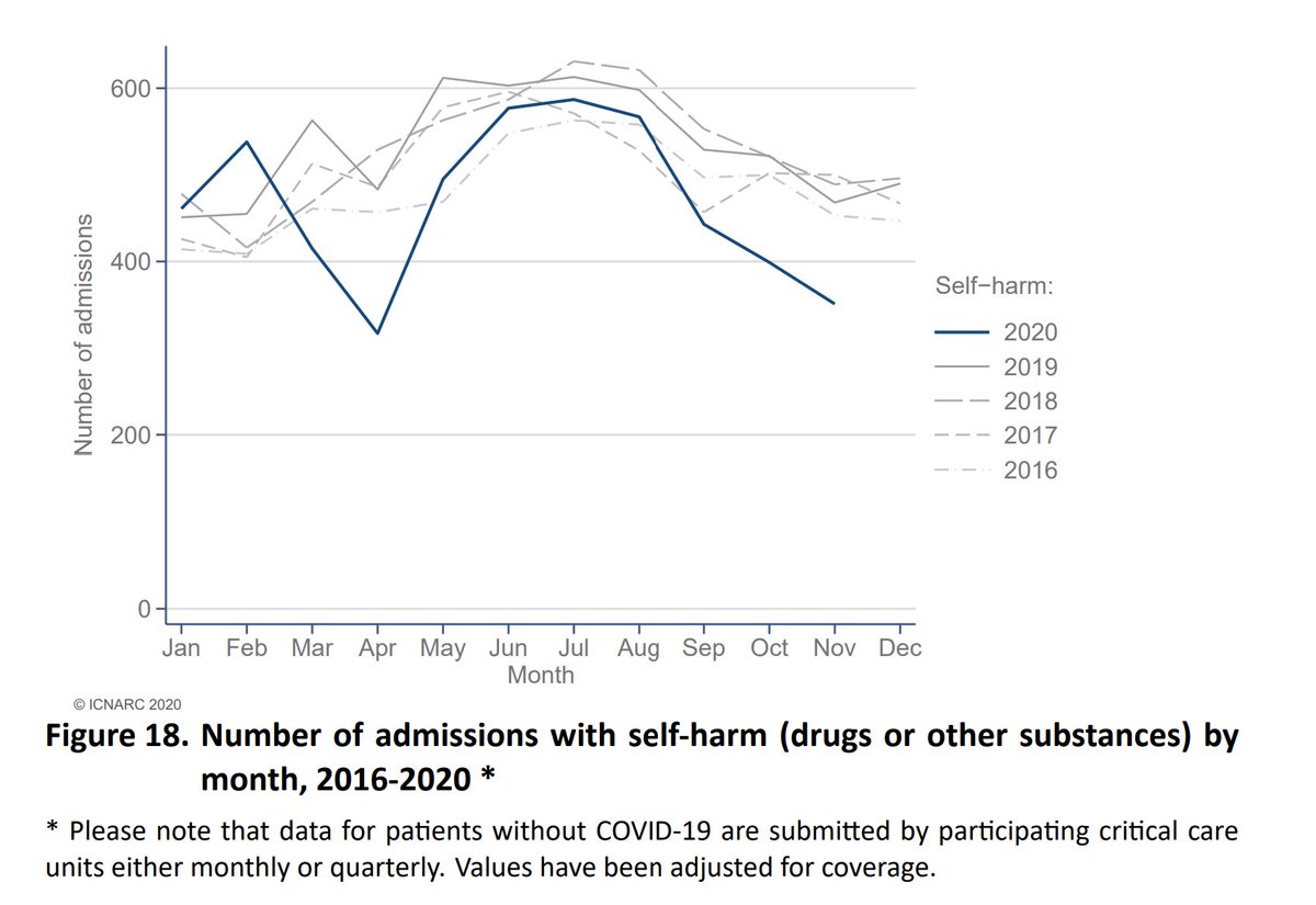
There's also a big reduction in trauma and self harm. Less activity, particularly of the elderly, might explain the former - the latter certainly doesn't support the increase in mental health related incidents that some have hypothesised. 8/12
We can see here that although pneumonia admissions are reduced, COVID activity is over double the expected for pneumonia. The unusually high 400 flu admissions we saw in Dec 19 is a tenth that for COVID this year, so these admissions can't simply be flu "re-badged". 9/12
Over 40% of admissions are under 60. Although this isn't representative of overall hospital admissions, it means over 4,000 of working age have required intensive treatment during the second wave. COVID is not just for the elderly (not that they are any less important). 10/12
Finally, two slides on outcomes. Over 3,000 who required ICU treatment have already sadly succumbed to the illness, around 30%. But with many still being treated, the overall survival rate is less favourable than that, with 37% dying within 28 days. 11/12
Worth noting that ICU represents a small part of overall hospital activity. Around 85% of COVID deaths are not of ICU patients. Our support and gratitude should be to all health service staff working under very difficult conditions as we mark the new year. Thank you all! 12/12
Addendum: Report can be found here, covering 10,149 patients admitted up to 30/12/20. icnarc.org/Our-Audit/Audi…

• • •

Missing some Tweet in this thread? You can try to force a refresh
 

Keep Current with John Roberts

John Roberts Profile picture

Stay in touch and get notified when new unrolls are available from this author!

Read all threads

This Thread may be Removed Anytime!

PDF

Twitter may remove this content at anytime! Save it as PDF for later use!

Try unrolling a thread yourself!

how to unroll video
  1. Follow @ThreadReaderApp to mention us!

  2. From a Twitter thread mention us with a keyword "unroll"
@threadreaderapp unroll

Practice here first or read more on our help page!

More from @john_actuary

31 Dec 20
The @ONS issued an ad-hoc update of infectivity levels yesterday, covering the period up to Dec 23rd. It suggests by that date, 1.7% or 932,000 were infected in England, a 38% increase in 7 days. These modelled estimates do smooth the data, but the rate of increase is clear. 1/5 Image
The regional picture will come as no surprise, with infectivity in London put at 3.5%, up 60% in a week. That's very consistent with recent admissions growth in London. As this data is a week old, today's admissions broadly equate to infections for the latest week shown. 2/5 Image
There's also data on prevalence of the new variant, now (or should I say, "then") over 70% in the wider south and east part of England, less than half of that in most other regions. 3/5 Image
Read 5 tweets
24 Nov 20
The latest data on registered deaths shows a continued increase in excess deaths, and we've now passed the grim milestone of exceeding 2019 total deaths. I've seen comment that the recent xs is due to a catch up of registrations. There's no evidence of that as we can see... 1/3
The ONS helpfully provides an estimate of weekly deaths by date of death. Recent weeks have more uncertainty, as a smaller proportion of the eventual total has been registered, but it's clear that the view is still of continuing increases. 2/3
This data is all just based on the weekly raw death numbers. As @ActuarybyDay notes, a better view, adjusting for population growth and ageing of the population will be published later today by the CMI, and we will link to it with analysis when released. 3/3
Read 4 tweets
17 Nov 20
The actuarial profession's CMI has produced its weekly update on mortality during the pandemic. It reports that in the latest week (to 6th Nov) excess deaths were 9% above expectation. Some more context to follow. 1/11
The analysis uses age standardised mortality rates, which adjusts for changes in the size/age dist'n of the pop'n. This gives a better answer than using numbers of deaths - typically you get a lower excess as our population is ageing, so we would expect more deaths each yr. 2/11
This chart compares 2020 with the average of 10-19. Note that as mortality has improved over the decade you would expect more recent years to be lower, and vice versa. Note also how close 20 was tracking to 19 before late March. You can see the line drifting up again now. 3/11
Read 11 tweets
8 Nov 20
A summary of some key points from @ICNARC's latest weekly update on COVID patients in ICU, on behalf of @ActuaryByDay and @COVID19actuary. New admissions have now risen to 3129 since 1 Sep, with 1263 in the last 14 days. It's still heavily weighted towards the North. 1/9
The slower growth than in March is very apparent, though numbers are steadily climbing. The last few days will have reporting delays, so need to be taken with a degree of caution. We know that the picture is very varied regionally, so let's take a look at that data too. 2/9
Except for NI, all areas are well below their first wave peak. Note how London, by population, was hit much worse first time around, so any comparisons with it appear more favourable. In fact, this time rates are broadly consistent with most areas, except for the NW. 3/9
Read 9 tweets
6 Nov 20
The latest @ONS infectivity survey has been released. For England ONS suggests that new infections have levelled off at around 50,000 per day. (The estimate has reduced from 51,900 to 45,700, but this must be seen in the context of the confidence intervals around each one.) 1/6 Image
Overall infections have increased, albeit more slowly, from 568k to 619k, being 1 in 90 of the community. Remember that this survey excludes healthcare settings, including care homes. 2/6 Image
The regional picture shows a clear reduction in the NW, consistent with the levelling off in admissions that @COVID19actuary has been reporting of late. Other regions appear to be stabilising too. 3/6 Image
Read 6 tweets
29 Oct 20
The interim report of Round 6 of @imperialcollege's #REACT study makes grim reading. It estimates 96,000 new infections a day, with an R of 1.56, and doubling every 9 days. Nearly 1m are estimated to be infected. Covering 16-25 Oct, it's very up to date. Here's some detail. 1/8
Regionally, Yorks/Humber has overtaken the NW, consistent with admissions data @COVID19actuary has been reporting recently. Lower prevalence areas have higher growth rates, with R over 2, so there should be no complacency elsewhere, with short doubling times. 2/8
Similarly for age, although 18-24 is highest the most rapid growth is now at older ages, with a threefold increase at 55-64, and doubling above 65. It's these groups which will be driving the increases in admissions we've already seen (and sadly, subsequent deaths). 3/8
Read 8 tweets

Did Thread Reader help you today?

Support us! We are indie developers!


This site is made by just two indie developers on a laptop doing marketing, support and development! Read more about the story.

Become a Premium Member ($3/month or $30/year) and get exclusive features!

Become Premium

Too expensive? Make a small donation by buying us coffee ($5) or help with server cost ($10)

Donate via Paypal Become our Patreon

Thank you for your support!

Follow Us on Twitter!