The latest @ONS infectivity survey has been released. For England ONS suggests that new infections have levelled off at around 50,000 per day. (The estimate has reduced from 51,900 to 45,700, but this must be seen in the context of the confidence intervals around each one.) 1/6 Image
Overall infections have increased, albeit more slowly, from 568k to 619k, being 1 in 90 of the community. Remember that this survey excludes healthcare settings, including care homes. 2/6 Image
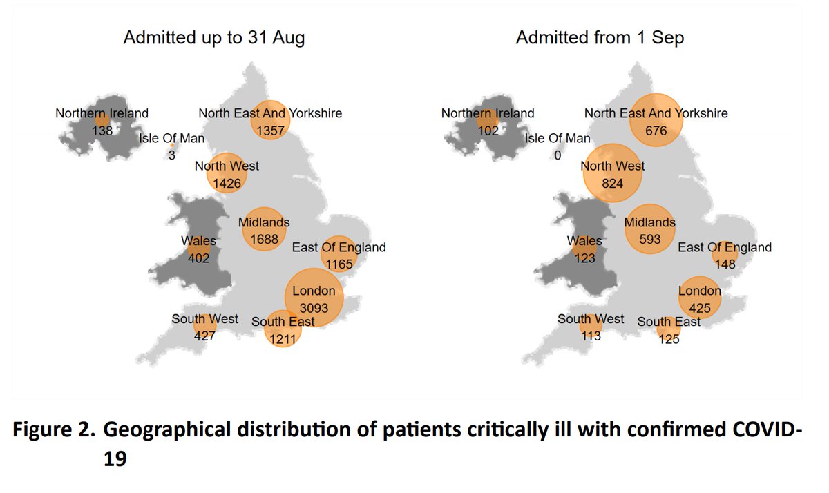
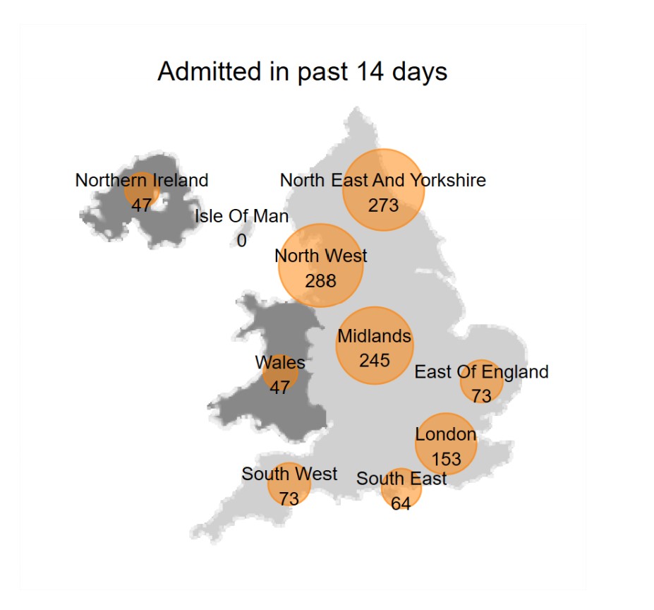
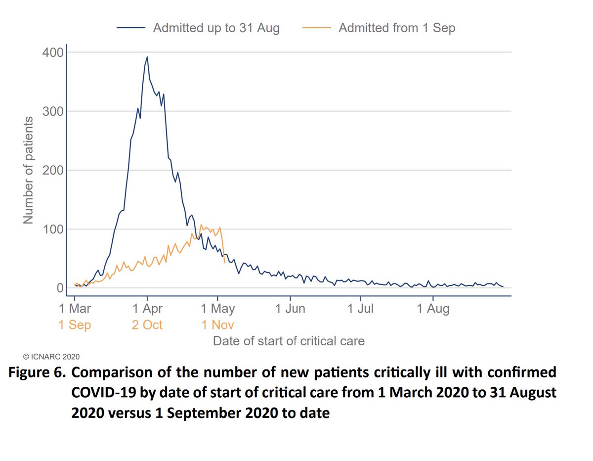
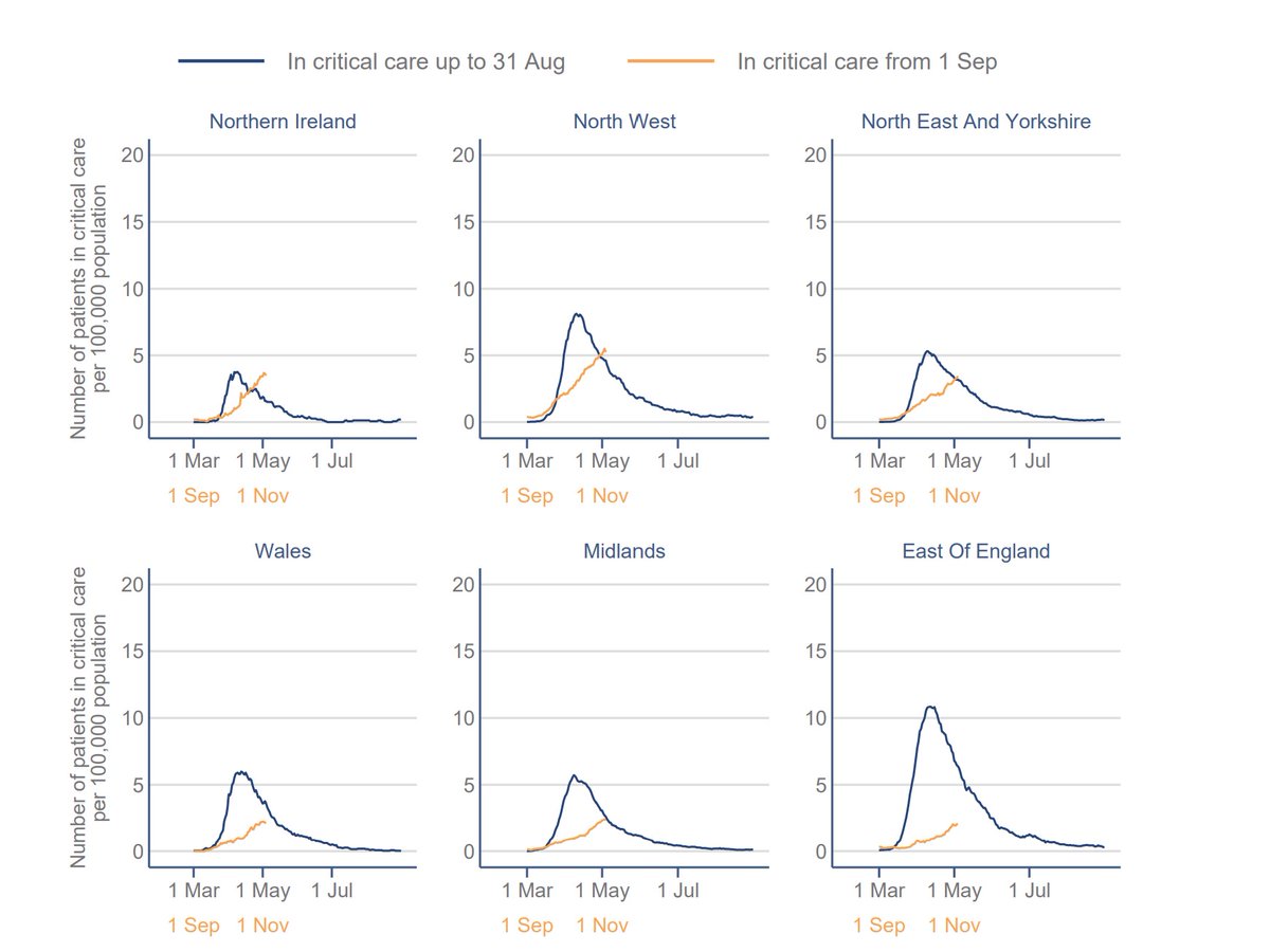
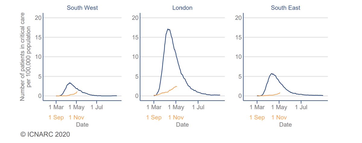
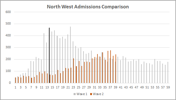
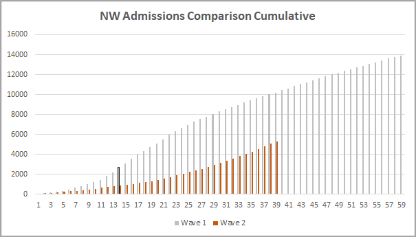
The regional picture shows a clear reduction in the NW, consistent with the levelling off in admissions that @COVID19actuary has been reporting of late. Other regions appear to be stabilising too. 3/6 Image
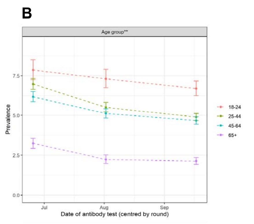
By age, there's a clear reduction in older school ages and younger adults. The position is less clear though in older age groups, which influence hospital admissions figures. 4/6 Image
The other countries are all showing increases. Wales increases from 1 in 120 to 1 in 110, Scotland to 1 in 110 (140), and NI to 1 in 75 (80). However, the CI's are large, (eg Wales is 1 in 60 to 1 in 250), so these need to be treated with some caution. 5/6
Thanks as always to @ONS and its partner organisations for continuing to produce timely and objective data to help us understand the current course of the pandemic. 6/6 END Image

• • •

Missing some Tweet in this thread? You can try to force a refresh
 

Keep Current with John Roberts

John Roberts Profile picture

Stay in touch and get notified when new unrolls are available from this author!

Read all threads

This Thread may be Removed Anytime!

PDF

Twitter may remove this content at anytime! Save it as PDF for later use!

Try unrolling a thread yourself!

how to unroll video
  1. Follow @ThreadReaderApp to mention us!

  2. From a Twitter thread mention us with a keyword "unroll"
@threadreaderapp unroll

Practice here first or read more on our help page!

More from @john_actuary

8 Nov
A summary of some key points from @ICNARC's latest weekly update on COVID patients in ICU, on behalf of @ActuaryByDay and @COVID19actuary. New admissions have now risen to 3129 since 1 Sep, with 1263 in the last 14 days. It's still heavily weighted towards the North. 1/9 ImageImage
The slower growth than in March is very apparent, though numbers are steadily climbing. The last few days will have reporting delays, so need to be taken with a degree of caution. We know that the picture is very varied regionally, so let's take a look at that data too. 2/9 Image
Except for NI, all areas are well below their first wave peak. Note how London, by population, was hit much worse first time around, so any comparisons with it appear more favourable. In fact, this time rates are broadly consistent with most areas, except for the NW. 3/9 ImageImage
Read 9 tweets
29 Oct
The interim report of Round 6 of @imperialcollege's #REACT study makes grim reading. It estimates 96,000 new infections a day, with an R of 1.56, and doubling every 9 days. Nearly 1m are estimated to be infected. Covering 16-25 Oct, it's very up to date. Here's some detail. 1/8
Regionally, Yorks/Humber has overtaken the NW, consistent with admissions data @COVID19actuary has been reporting recently. Lower prevalence areas have higher growth rates, with R over 2, so there should be no complacency elsewhere, with short doubling times. 2/8
Similarly for age, although 18-24 is highest the most rapid growth is now at older ages, with a threefold increase at 55-64, and doubling above 65. It's these groups which will be driving the increases in admissions we've already seen (and sadly, subsequent deaths). 3/8
Read 8 tweets
27 Oct
The latest #REACT study by @imperialcollege shows decreasing levels of antibody prevalence. Overall levels fell by 24% over a 12 week period, from 6% to 4.8% in Round 2, and now 4.4%. Let's take a closer look in this short thread. 1/6
By age the % fall was greatest in the oldest groups, with an increasing trend from age 45. There is some variability though, eg in the data table in the report we see 75+ increased in Rd 3 by 25%, reflecting some wide CI's. 2/6
Showing the wide regional variation, London fell 27% from 13% to 9.5%, whereas at the other end of the spectrum, the SW fell 42% from 2.8% to 1.6%. Note again the increase in Rd 3 for the SW, with a very wide CI for the change we shouldn't read too much into this. 3/6
Read 6 tweets
23 Oct
The latest weekly report from @ONS on infectivity shows a further increase for England, with 433k (up from 336k) estimated to be infected in the most recent period. That's 1 in 130 (1 in 160), and with 35,200 (27,900) new infections per week. 1/6
The regional trends are starting to show some variation, with some signs of levelling in the last couple of weeks for the worst affected regions. Wider confidence intervals make these more uncertain though, but hopeful signs maybe. 2/6
By age there's a clear fall in early teens, a levelling off for younger adults, but still growth at older ages, albeit at a lower level. Those are the ages which matter in terms of hospitalisation though. 3/6
Read 7 tweets
23 Oct
I'm uncomfortable with comparisons with the 1st wave - there's an implication that as long as numbers are lower, everything's OK, which I disagree with. But with numbers in the NW rising, how do admissions compare? 1/7
At first sight much better. The peak day so far is much lower, and it's taken longer to get to even half that level. (I've assumed the peak was on D14 in the first wave as the later peak appears to be data catch up.) I'll discuss the current trend later. 2/7
If you look at the cumulative position, again we're well down on Wave 1. But interestingly, the total admissions are almost twice that seen by the first peak. They've just been much more spread out. Remember "flatten the curve" - it's clearly had a big effect this time. 3/7
Read 7 tweets
22 Oct
The latest weekly PHE Flu & COVID Surveillance Report is out. assets.publishing.service.gov.uk/government/upl… At first glance there's been a welcome flattening off of both cases and infectivity, but the age split shows that at older ages there are still increases. Case rates first.... 1/5
Now infectivity levels, for pillar 2 (community testing). Most are still rising steeply, except for younger ages. 2/5
Admissions next, using rates per 100k, to allow for differing populations by region. It's still consistent with the picture @COVID19actuary has been sharing for some time now. The age split shows the concern over older age groups. 3/5
Read 5 tweets

Did Thread Reader help you today?

Support us! We are indie developers!


This site is made by just two indie developers on a laptop doing marketing, support and development! Read more about the story.

Become a Premium Member ($3/month or $30/year) and get exclusive features!

Become Premium

Too expensive? Make a small donation by buying us coffee ($5) or help with server cost ($10)

Donate via Paypal Become our Patreon

Thank you for your support!

Follow Us on Twitter!