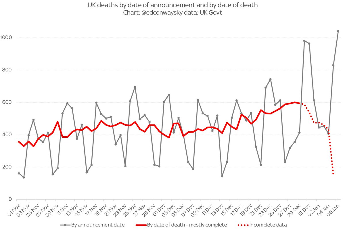
There will doubtless be lots of attention on this number tonight: 1k #COVID19 deaths for first time since last spring.
Now, a lot of people are dying, the number is mounting and this is clearly awful news.
BUT be cautious about this fig. It comes back to the bank holiday effect…
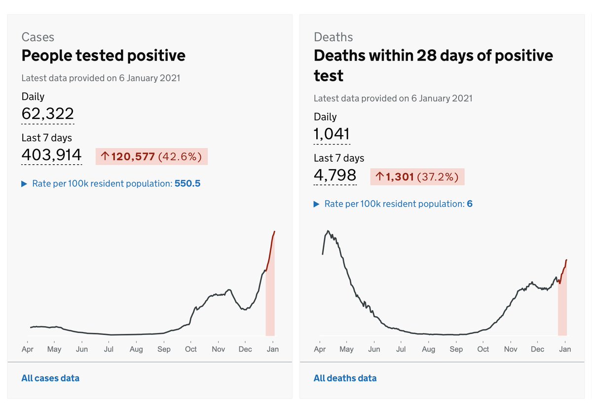
As I said yday, testing and deaths registration is affected by xmas and new year - and that’s happening with this data. The 1k deaths figure is not deaths happening in the past 24 hours but deaths REPORTED in that period. An important distinction when gauging #COVID19 spread
In the case of tonight’s 1k deaths figure, almost one in four of them happened more than a week ago: there’s a big backlog of registrations which are only now being processed. The real picture is the red line in this chart. Not the grey line (where that 1k fig comes from)
The underlying picture is that #COVID19 deaths are mounting at a far more gradual but also far more sustained rate than we saw in the spring. This is clearly not cause for celebration, but is somewhat different from the skyrocketing phenomenon one might take from the headline fig
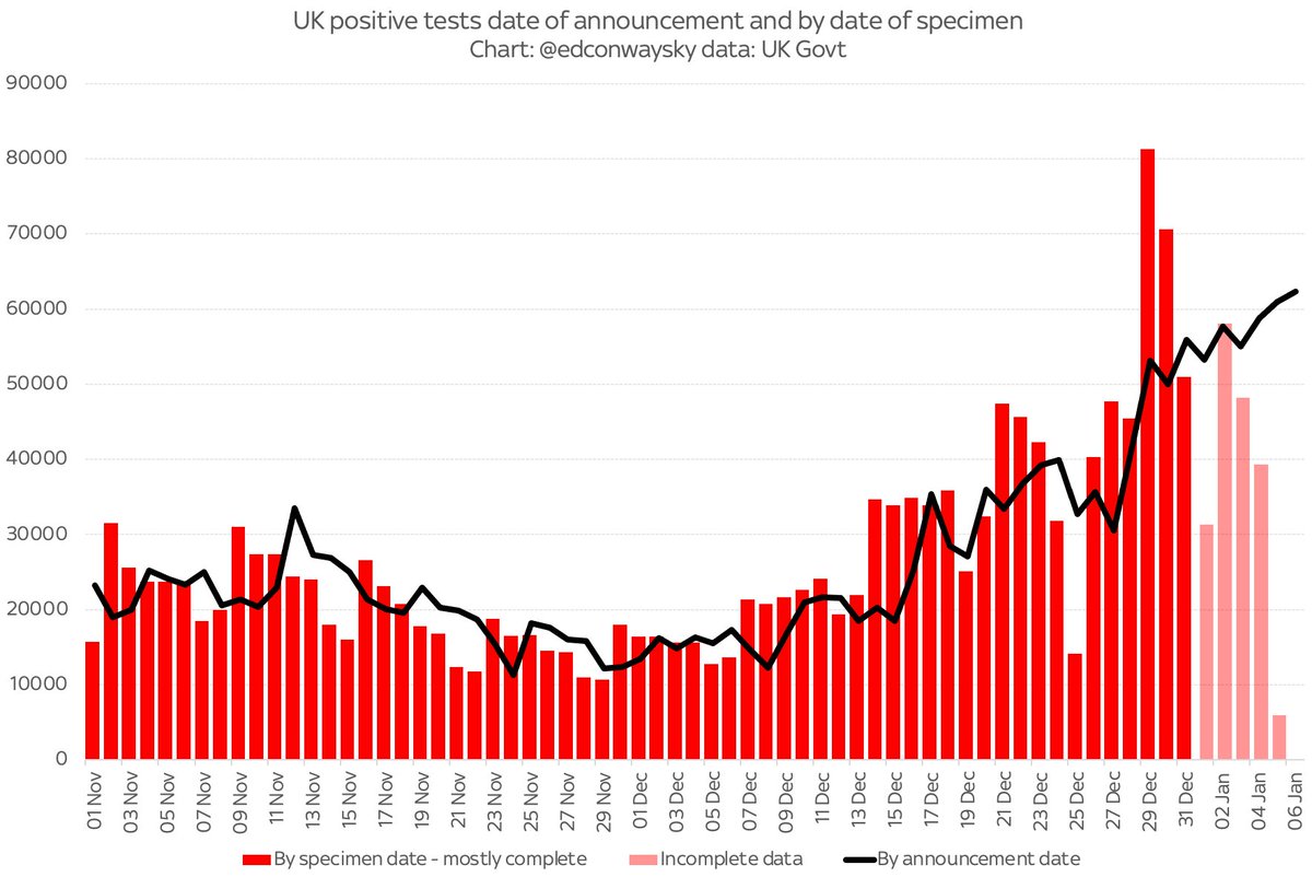
Ironically when it comes to the testing data the daily reported figures (black line) might currently be giving a somewhat better indication of the spread of #COVID19 than the numbers by specimen date (red bars). See that big jump on Dec 29 and 30? Bank holiday effect again...

• • •

Missing some Tweet in this thread? You can try to force a refresh
 

Keep Current with Ed Conway

Ed Conway Profile picture

Stay in touch and get notified when new unrolls are available from this author!

Read all threads

This Thread may be Removed Anytime!

PDF

Twitter may remove this content at anytime! Save it as PDF for later use!

Try unrolling a thread yourself!

how to unroll video
  1. Follow @ThreadReaderApp to mention us!

  2. From a Twitter thread mention us with a keyword "unroll"
@threadreaderapp unroll

Practice here first or read more on our help page!

More from @EdConwaySky

5 Jan
I’m diving back into the #COVID19 data.
I’d rather hoped I wouldn’t have to but the stats are, once again, scary.
However, I hope I can provide some context, since I see there are still plenty claiming this is either the end of the world or nothing to fear at all.
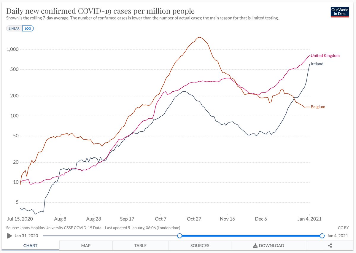
A case in point is tweets like this. George is right that the curve is almost vertical, but this is precisely why it makes sense to use logarithmic axes and provide some cross-country comparisons. You might, to look at this, have assumed the UK faces a unique crisis, but no:
Convert it to a log axis and add a couple of countries it’s a different story. Yes the UK rise recently is fast, but actually Ireland’s looks faster - though still at slightly lower levels than in UK. Compare UK to Belgium and you see it had a considerably worse outbreak in Oct
Read 16 tweets
1 Jan
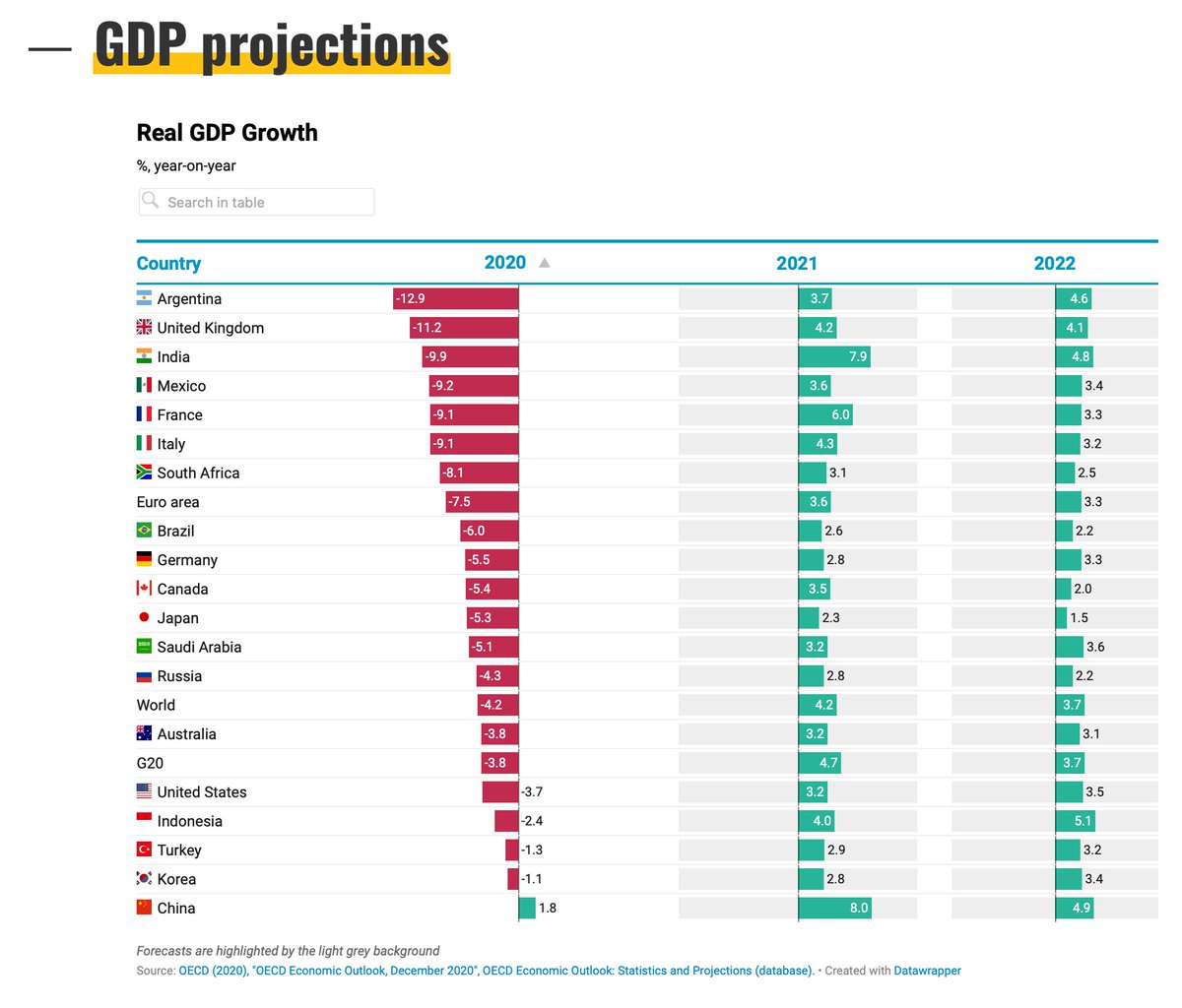
Which developed country would you say is facing the biggest economic slump of all? The conventional answer is the UK. Eg see this @OECD forecast. But here's a thread about an obscure bit of statistical small print which might mean we've been overstating the scale of the recession
Before we get onto the small print let's deal with what the numbers are telling us. And there's no doubt they're bad. Very bad. Indeed, the @OBR_UK reckons we're facing the biggest slump in GDP since 1709. Down 11% this year alone.
We won't get final 2020 GDP for months (and even that'll be subject to revision). But on the basis of the 1st estimate of Q3 GDP UK contracted at annual rate of 9.7%. So you can see where OBR are coming from ons.gov.uk/economy/grossd…

* yes it was later revised; we'll get to that
Read 25 tweets
24 Dec 20
Here’s a fundamental Brexit truth I don’t think we’ve discussed enough: the reason why Brexit has been on the front pages for so much of the past few years doesn’t actually have that much to do with Brexit. Let me explain:
Of course the UK’s relationship with the EU is of enormous economic, social & legal importance, past, present and future. Of course the trade deal matters, as will immigration rules and all the rest. But the real, real reason Brexit has been such a big deal is something else:
Brexit is first and foremost a story about the Tory party, which happens to be the party of government. Brexit mattered these past four and a half years because it deposed two prime ministers. It decided elections. It was an issue of immense political significance.
Read 11 tweets
6 Nov 20
Transparency, worst case scenarios, & why govt is treading a dangerous path over #COVID19.
This is the longest thread I've ever posted.
But I think it may be among the most important.
Please do read and share if it strikes a chord.
This stuff affects all of us.
Deep breath... 🧵
Before we go any further let's get something out of the way: I'm not making a point here abt whether govt is right or wrong to impose lockdown. Like most of you, I can see strong arguments for & against but respect that others are better informed than I am to make these calls
This is really about something else: trust. Lockdowns, like em or not, won't work if no-one trusts the process and doesn't comply. It would be the worst of both worlds - economic damage but limited epidemiological effect. But that trust is earned. And easily lost.
Read 33 tweets
5 Nov 20
Big news.
Another u-turn - but one which will be welcomed by many employees and businesses. Though they will ask why it had to come so late. After all, many companies already laid off employees whose jobs could have been saved.
More on this on @skynews with my colleague @pkelso
Key info on the extension of the furlough scheme until March:
-Employers only cover NI & pensions. Biz may have to contribute more from Jan (but, perhaps to avoid future u-turns, no concrete plans to ratchet it down)
- Employees laid off since 23 Sep can be rehired & furloughed
- Job retention bonus shelved
- More support for self-employed
And the Treasury wants us all (esp the self-employed) to know THIS WILL ALL COST A LOT OF MONEY
Read 5 tweets
5 Nov 20
The count is going down to the line in Georgia. Here’s something we did live on @skynews last night, digging into county level data to show why that race is very much on (and since then it’s got even tighter!)
Yes that’s right election geeks, at @skynews we ARE showing you detailed county level data on the US election, to give the most granular, detailed analysis of any UK network. @SophyRidgeSky is currently there at the big screen. I’ll be back later. TUNE IN.
Here’s @SophyRidgeSky with one of my favourite graphics of the election: showing how the race for AZ has narrowed in Trump’s favour and how the race for PA has narrowed in Biden’s favour.
You’ve heard the phrase “going down to the wire”. Well: there’s the wire - in those charts…
Read 6 tweets

Did Thread Reader help you today?

Support us! We are indie developers!


This site is made by just two indie developers on a laptop doing marketing, support and development! Read more about the story.

Become a Premium Member ($3/month or $30/year) and get exclusive features!

Become Premium

Too expensive? Make a small donation by buying us coffee ($5) or help with server cost ($10)

Donate via Paypal Become our Patreon

Thank you for your support!

Follow Us on Twitter!