There's been a bit of confusion about the shape of some of the ONS modelled infection estimates, and subsequent updates to the curves - even from people who spend a lot of time looking at COVID data. So what might be doing on? A thread... 1/
First, a disclaimer: I don't work on the ONS infection survey, so these are just my independent observations, based on my reading of the methods and grappling with similar datasets in the past (so don't @ me as if it's my model/graphs!) 2/
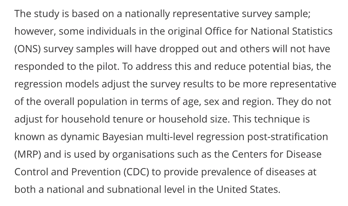
The ONS infection survey involves random sampling of UK households (more here: ons.gov.uk/peoplepopulati…). This generates an individual-level dataset with characteristics like age & location, as well as test result (e.g. positive/negative) 3/
But how are these raw data converted into an estimate of infection levels over time? After all, the daily data will be very noisy, and potentially not representative if certain groups have/haven't responded. There are two steps the infection survey uses to address this... 4/
First, the model adjusts for factors like age & region to try and ensure that estimates are representative of the wider population. Second, it uses a 'spline' to try and extract the underlying trend over time from the noisy raw data. (More on methods: medrxiv.org/content/10.110…) 5/
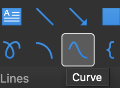
In essence, a spline is a series of curved sections, linked by 'anchor points'. If you've ever used the 'curve' tool in powerpoint, you'll have an conceptual sense of what this involves. 6/
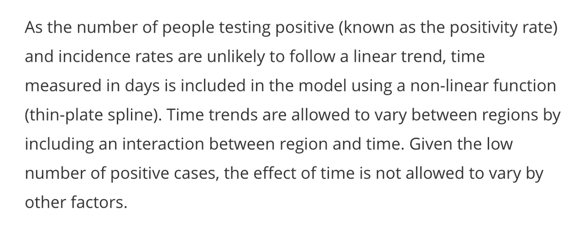
The question is how many anchor points to include – with a large dataset, there's a risk of 'overfitting' and adding loads, which produces a very up-and-down curve that isn't a sensible representation of the underlying epidemic. Here's more on splines: 7/
To avoid overfitting, the ONS model uses a 'thin plate' spline with a limit to the number of curved sections. Imagine a thin metal sheet that can bend, but has a limit to how many ups and downs it has in its shape (hence the name 'thin plate' spline). 8/
Because a spline basically consists of a series of curves, it tends to curve up or down eventually. If infection levels accelerate, then slow slightly, I suspect the spline may add an 'anchor point' to switch from curve that swoops up steeply to one that will eventually peak. 9/
As more data comes in, the spline may update its shape – particularly where it puts the anchor points – and hence whether it ends in a curve that swoops up or down... 10/
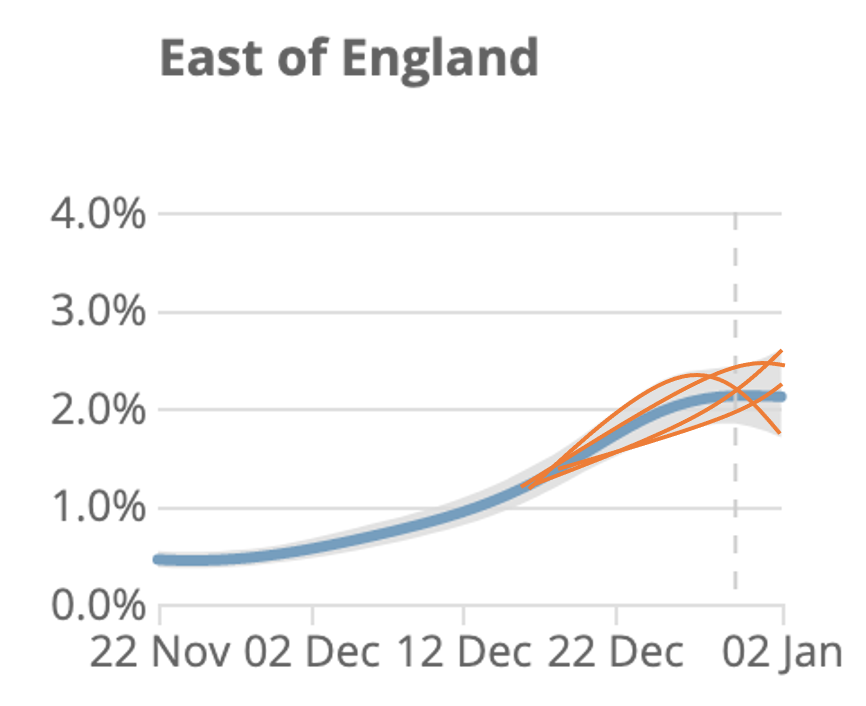
This brings us back to the ONS curves. The model doesn't actually calculate a single spline to estimate the trend - it calculates a range of curves that could plausibly fit the data. Some may swoop up, and others down, and the overall curve is the average. 11/
Here's a cartoon illustration of what the underlying splines (orange) could potentially look like, compared with recent data (blue). Note I've just made up the orange lines - the actual fits may look different, but hopefully it makes the point. 12/
In summary, it's challenging to extract trends from noisy data, and I suspect two main sources of confusion with the ONS curves are: a) underlying spline has some constraints in possible shapes it can take & b) the range of plausible curves isn't shown in published graphs. 13/
Again, I didn't develop above ONS model, but given recent Twitter observations by @Dr_D_Robertson @ChrisGiles_ @TAH_Sci @JoshBiostats @apsmunro and others, thought it would be useful to try and elaborate a bit on possible methodological considerations. 14/14
Footnote – plot below shows how central estimate for prevalence has changed over time. And note that this is prevalence (% currently infected) not incidence (i.e. rate newly infected – previously modelled, but not currently shown in reports)

• • •

Missing some Tweet in this thread? You can try to force a refresh
 

Keep Current with Adam Kucharski

Adam Kucharski Profile picture

Stay in touch and get notified when new unrolls are available from this author!

Read all threads

This Thread may be Removed Anytime!

PDF

Twitter may remove this content at anytime! Save it as PDF for later use!

Try unrolling a thread yourself!

how to unroll video
  1. Follow @ThreadReaderApp to mention us!

  2. From a Twitter thread mention us with a keyword "unroll"
@threadreaderapp unroll

Practice here first or read more on our help page!

More from @AdamJKucharski

3 Jan
A few people have correctly pointed out that theoretical tradeoff below could be different in longer term if no vaccine available. Given vaccine on horizon in UK, I focused on timescale of weeks because that will be a crucial period. But let's explore some broader scenarios... 1/
Suppose control measures can get R=0.6. We can calculate expected total number of infections = N/(1-R), where N is current infections. So if 10k initial infections, would expect 25k overall, but 100k if virus 50% more transmissible (i.e. R=0.9). 2/
Next, suppose control can get R=0.8. In this scenario, 50% increase in transmission (R=1.2) tips epidemic into exponential growth. So we go from declining outbreak to one that sweeps uncontrolled through population. Hence 50% increase could mean many many fold more infections. 3/
Read 5 tweets
29 Dec 20
Below report also includes data on secondary attack rate for old UK variants vs new variant VOC 202012/01:
Secondary attack rate measures transmission risk per-contact, so above suggests difference between groups spreading old and new variant isn't down to one group simply having more contacts. This is consistent with data from our recent pre-print (cmmid.github.io/topics/covid19…)
In other words, it seems the new variant VOC 202012/01 has a different ’T’ to the old one.
Read 4 tweets
28 Dec 20
Why a SARS-CoV-2 variant that's 50% more transmissible would in general be a much bigger problem than a variant that's 50% more deadly. A short thread... 1/
As an example, suppose current R=1.1, infection fatality risk is 0.8%, generation time is 6 days, and 10k people infected (plausible for many European cities recently). So we'd expect 10000 x 1.1^5 x 0.8% = 129 eventual new fatalities after a month of spread... 2/
What happens if fatality risk increases by 50%? By above, we'd expect 10000 x 1.1^5 x (0.8% x 1.5) = 193 new fatalities. 3/
Read 5 tweets
4 Dec 20
How different would the global dynamics have been if COVID-19 had instead been a pandemic flu virus with similar fatality rate? A few thoughts... 1/
There are differences between pandemic flu and SARS-CoV-2, of course. In absence of control, serial interval for SARS-CoV-2 (science.sciencemag.org/content/369/65…) is longer than flu (ncbi.nlm.nih.gov/pmc/articles/P…), and evidence SARS-CoV-2 transmission more clustered (sciencedirect.com/science/articl…) 2/
The susceptibility profile may also be different. In flu pandemics, susceptibility is often concentrated in younger groups (pubmed.ncbi.nlm.nih.gov/20096450/) - for COVID-19, severity/susceptibility concentrated in older groups (e.g. nature.com/articles/s4159…). 3/
Read 7 tweets
27 Nov 20
Some locations in Tier 3 had evidence of rising epidemics before November lockdown; others were declining. Same for Tier 1 & 2 – some were rising; some were declining. How come? There are three likely explanations... 1/
First, things like population demography, household structure, and nature of local industry will influence social interactions and hence transmission potential. As a result, baseline R may just be slightly lower in some locations. 2/

Second, high levels of infection will lead to some accumulation of immunity (in short-term, at least). Unlikely it's enough to go back to normal without outbreaks, but could be enough for control measures that would get R near 1 in spring to now get R below 1. (Data from ONS) 3/
Read 7 tweets
25 Nov 20
Relaxing UK COVID-19 control measures over the Christmas period will inevitably create more transmission risk. There are four main things that will influence just how risky it will be... 1/
We can think of as epidemic as a series of outbreaks within households, linked by transmission between households. This is particularly relevant over Christmas, given school holidays and some workplace closures. 2/
We can also think of R in terms of within and between household spread. If the average outbreak size in a household is H, and each infected person in household transmits to C other households on average, we can calculate the 'household' reproduction number as H x C. 3/
Read 8 tweets

Did Thread Reader help you today?

Support us! We are indie developers!


This site is made by just two indie developers on a laptop doing marketing, support and development! Read more about the story.

Become a Premium Member ($3/month or $30/year) and get exclusive features!

Become Premium

Too expensive? Make a small donation by buying us coffee ($5) or help with server cost ($10)

Donate via Paypal Become our Patreon

Thank you for your support!

Follow Us on Twitter!