The @ONS has published an updated mortality series, with deaths and standardised mortality, now including 2020. Using the prior 5 year average, we can calculate excess deaths and mortality over recent years. 2020 is exceptionally bad on either measure. A short thread. 1/5
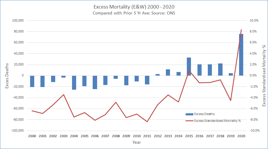
Standardised mortality is the best measure, as it adjusts for population size and an ageing population. At +8.3% it compares badly with the previous average of -5.0% this century. Only one other year, 2015, was slightly positive (+0.9%), with an exceptionally bad flu year. 2/5
Excess deaths were negative in the first decade. As improvements in mortality then slowed, the effect of the ageing population has outweighed the lower level of improvement. Hence why we've recently seen more deaths, (and why excess deaths alone is an imperfect measure.) 3/5
Inevitably this type of analysis is done using calendar years. But the deterioration only started in mid March. By the time we get to mid March 2021, the cumulative effect for a full year is likely to be greater given the current trajectory of reported deaths. 4/5
Mid March is significant not only because it signifies a year since the pandemic took hold, but it is also when we expect deaths to be falling rapidly due to the effect of vaccinations, as noted in this paper published by @COVID19actuary yesterday. 5/5

• • •

Missing some Tweet in this thread? You can try to force a refresh
 

Keep Current with John Roberts

John Roberts Profile picture

Stay in touch and get notified when new unrolls are available from this author!

Read all threads

This Thread may be Removed Anytime!

PDF

Twitter may remove this content at anytime! Save it as PDF for later use!

Try unrolling a thread yourself!

how to unroll video
  1. Follow @ThreadReaderApp to mention us!

  2. From a Twitter thread mention us with a keyword "unroll"
@threadreaderapp unroll

Practice here first or read more on our help page!

More from @john_actuary

13 Jan
The VDP has 14.6 people in categories 1 to 4 for the UK. With the gov't expressing confidence that the target to vaccinate them by Feb 15th can be achieved, let's start to check progress. (Yesterday's daily figure included for context.) We need an average of c350k per day. 1/5 Image
The current shortfall shouldn't be too concerning, (yet). We know that the programme is ramping up, but every day we fall behind will mean having to go above the starting average later on to catch up. The maths is a bit like limited overs cricket, but much more serious. 2/5
I've deliberately ignored the recent switch from "vaccinated" to "offered a vaccine". We know some will decline (hopefully not many), but the apparent sleight of hand in posting out test kits to meet a testing target is not easily forgotten. 3/5
Read 5 tweets
8 Jan
The latest update from @ICNARC on COVID intensive care activity has been published, summarised here on behalf of @COVID19Actuary. We've now passed a sobering milestone with more admissions (12,115) in the second wave than the first (10,935), with 2,938 in the last 14 days. 1/18
Here's the recent geographical split, and the emphasis on London and surrounding regions is as clear as it is not surprising. Only the East and London have yet to pass their first wave total, and at current rates, they will do so in the next few days. This data is to 7 Jan. 2/18
The recent upsurge is very clear here, after a slight dip following the November lockdown. Whilst the early phase of the second wave was much less severe than in March, the recent increase is not dissimilar, and from a base of a much higher level of activity. 3/18
Read 18 tweets
8 Jan
The latest infection surveillance report from @ONS is out. The headline numbers are the same as in the ad-hoc update earlier this week as the data is still to Jan 2, but we now have some more detail. In England, infection levels have increased dramatically. Let's take a look.1/11
For England it's estimated that an average of 1.12m people had the infection during the week ended Jan 2nd, representing 2.1% of the community population, or 1 in 50. This rate has doubled in a month. 2/11
Regionally there are some signs that London is levelling off, but at an exceptionally high rate of 3.5%. The West Midlands, East and SE might also be levelling, but infections are still growing elsewhere. 3/11
Read 11 tweets
6 Jan
The CMI has published its Mortality Monitor for Week 52 for England and Wales. It judges the best comparison for excess deaths to be against 2019, and on this basis (chart 2), the excess has now reached 13%, all of which arose during the last 9 months. 1/4 actuaries.org.uk/system/files/f… Image
The latest week has an excess of 51%, but this is a result of the timing of the Bank Holiday this year, so is not representative of the true picture. The next two weeks (including the final week 53, and first week of 2021) are likely to be similarly distorted. 2/4
This analysis uses age-standardised mortality, which adjusts for changes in population size and age distribution, and is thus a better measure. With an ageing population it typically produces lower percentage excesses than a simple death count would.
Read 4 tweets
1 Jan
The latest @ICNARC update on ICU activity was published yesterday, and is summarised here on behalf of @COVID19actuary. Focussing on patient numbers (as outcomes are little changed), there's a clear upswing in admissions in the south east of the country, particularly London. 1/12
Five areas have now surpassed their first wave total and in total the figure is now at 93% of the first wave and will be exceeded in the next week at current rates of admission. 2/12
A visual representation of how the second wave has been more spread than the first, and also how the numbers are rising again after falling during the second half of November. The current gradient looks steeper than anything seen to date in this wave. 3/12
Read 13 tweets
31 Dec 20
The @ONS issued an ad-hoc update of infectivity levels yesterday, covering the period up to Dec 23rd. It suggests by that date, 1.7% or 932,000 were infected in England, a 38% increase in 7 days. These modelled estimates do smooth the data, but the rate of increase is clear. 1/5 Image
The regional picture will come as no surprise, with infectivity in London put at 3.5%, up 60% in a week. That's very consistent with recent admissions growth in London. As this data is a week old, today's admissions broadly equate to infections for the latest week shown. 2/5 Image
There's also data on prevalence of the new variant, now (or should I say, "then") over 70% in the wider south and east part of England, less than half of that in most other regions. 3/5 Image
Read 5 tweets

Did Thread Reader help you today?

Support us! We are indie developers!


This site is made by just two indie developers on a laptop doing marketing, support and development! Read more about the story.

Become a Premium Member ($3/month or $30/year) and get exclusive features!

Become Premium

Too expensive? Make a small donation by buying us coffee ($5) or help with server cost ($10)

Donate via Paypal Become our Patreon

Thank you for your support!

Follow Us on Twitter!