So here's something interesting about our latest 'surge'. If one goes to coronavirus.ohio.gov/.../covi.../da… you can toggle between 'confirmed' cases, 'probable' cases and both of them together.
So what is a 'confirmed' case? That would be any laboratory confirmed 'case' - any positive PCR, antigen or antibody test, with all the issues of false positivity and hypersensitivity and non-infectiousness that go along with all of those tests.
A 'probable' case does not even have a positive test result associated with it. All it requires are symptoms. Maybe an epidemiological link. We are now in the middle of what used to be referred to as 'flu season' when there is a wide variety of respiratory illnesses that exist -
- and are passed around, creating symptoms in individuals that count under one of the 44 symptoms of 'COVID' in Ohio.
⭐️⭐️⭐️ So how big of a deal are the probable cases in Ohio? On the left are just the 'probable' cases/hospitalizations/deaths. On the right are the total assigned cases/hospitalizations/deaths -
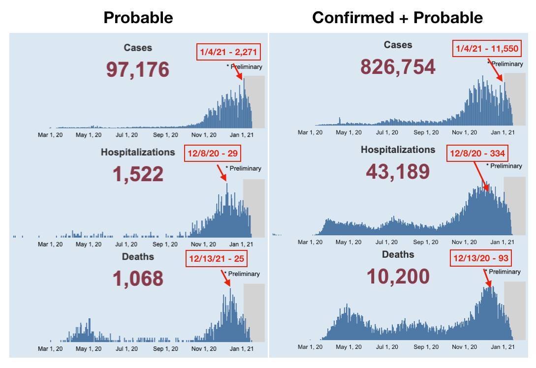
the numbers that are reported daily and are being used to continue to increase anxiety and destroy lives. I have labeled the peaks of the probable data, and labeled the corresponding day for the total side.
⬇️⬇️⬇️⬇️⬇️⬇️
19.7% of January 4th's 'cases' were probable.

8.7% of December 8th's hospitalizations were probable.

26.9% of December 13th's deaths were probable.
⬇️⬇️⬇️⬇️⬇️⬇️⬇️
Nearly 10% of ALL deaths are considered 'probable' - meaning there was no laboratory confirmation that the deceased even had the virus when they died or during their life at any point.
The comparison of the cases graph is also interesting. Notice that the total cases rose and fell from the end of October through mid-December, just as all of our data shows. But then we have had a more recent 'spike.'
On the probable side of things, there was no wave visible in November/December. Instead we see a steady increase in cases that are being considered probable. That is, cases that DO NOT have an associated positive test result of any sort.
⭐️⬇️⭐️⬇️⭐️⬇️
Nearly 1/5th of our newest 'peak' cases have NO positive test result associated with them.

They are just based off symptoms. In the middle of flu season.
#InThisTogetherOhio

• • •

Missing some Tweet in this thread? You can try to force a refresh
 

Keep Current with Understanding Ohio COVID Data

Understanding Ohio COVID Data Profile picture

Stay in touch and get notified when new unrolls are available from this author!

Read all threads

This Thread may be Removed Anytime!

PDF

Twitter may remove this content at anytime! Save it as PDF for later use!

Try unrolling a thread yourself!

how to unroll video
  1. Follow @ThreadReaderApp to mention us!

  2. From a Twitter thread mention us with a keyword "unroll"
@threadreaderapp unroll

Practice here first or read more on our help page!

More from @ohio_data

30 Dec 20
⭐️⭐️⭐️ Playing Number Games: Part Two

In my last post, I showed how the new 'Key Measures' ICU map was distorting the data by looking only at the comparison of COVID positive (not necessarily ill with COVID) patients versus -
- vs the number of total patients in the ICU - not the percentage of COVD positive patients out of the total number of ICU beds.
So what if they went back to simply the percentage of COVID positive patients out of all available ICU beds? First, the numbers would not be as scary, and second, the total number of beds available in a region is not stable from one day to the next.
Read 7 tweets
30 Dec 20
⭐️⭐️⭐️ Playing Number Games.

As noted in my last post, Gov. DeWine has signaled a movement away from the Ohio Public Health Advisory System (aka, the Map of Fear) because under the new rules, the state will be stuck in red perpetually with sufficient testing.
So to replace this map, he announced two new maps, to be updated weekly and found at coronavirus.ohio.gov/static/OPHASM/…
These two measures look at cases per capita WHICH CAN BE CONTROLLED SOLELY BY TESTING WITH FAULTY TESTS AND IS SEVERELY PUNITIVE TO RURAL COUNTIES.
The second map shows ICU utilization by region (first attached image), and these percentages look quite alarming.
Read 14 tweets
30 Dec 20
*Moving away from the OPHAS Map of Fear*

Gov. DeWine is moving us away from the Ohio Public Health Advisory system because it has gone almost entirely red now (and will, again, be completely without any purple again this week).
Below is Gov. DeWine's reasoning behind doing so - that he called this a 'early warning system' and that it 'told a good story.'

facebook.com/15501424/video…
Also attached is Fort's presentations of the Map of Fear using the new rules. Those rules are - 'high incidence' maintaining red indefinitely, a 'watchlist' week for counties before turning purple, and counties remaining purple for two weeks before being allowed to return to red.
Read 8 tweets
2 Dec 20
* But wait, there's more!
I just posted about an odd change in an odd entry I stumbled across in today's CSV file.
But there's even more to this story. Whenever I post these 'long COVID' entries, I usually get some pushback about maybe people having COVID so badly that they end up back in the hospital months down the road.
Ok. Absolutely valid possibility (still not appropriate labeling them as a current COVID case, but I digress).
So I went back into the old csv files to see if this 60-69 year old Montgomery County man existed in the file as having the 4/14 onset date -
Read 11 tweets
1 Dec 20
This one really bothered me during yesterday's press conference. The [linked] video [below] is of Dr. Andy Thomas of Wexner Medical Center saying things that sound really scary. None of what he said is untrue, but it gives a perception that is vastly different than reality.
facebook.com/15501424/video…
Yes, ~1/3 of all patients in the ICU or on a ventilator are COVID-positive (or at least once tested positive at some point in the last 8 months as my posts yesterday demonstrated).
But then he went on to the old threat of COVID 'crowding' other procedures out. First, there is significant regular capacity still available in the ICU (and as he noted, even the facility with 'trouble' was able to increase to 130%).
Read 8 tweets
1 Dec 20
ICU Bed Usage Part II

Something is extremely odd with indicator #7 of the OPHAS system. I have addressed this before in regards to region 6 of Ohio (facebook.com/.../permalink/…).
As odd as region 6 was, the variation was pretty small, up to ~2% extra overall capacity used on the OPHAS version than on the dashboard.
Keep in mind, BOTH the hospitalization dashboard on coronavirus.ohio.gov and indicator #7 on the OPHAS come from the exact same entity - the Ohio Hospital Association. There shouldn't be any difference.
Read 8 tweets

Did Thread Reader help you today?

Support us! We are indie developers!


This site is made by just two indie developers on a laptop doing marketing, support and development! Read more about the story.

Become a Premium Member ($3/month or $30/year) and get exclusive features!

Become Premium

Too expensive? Make a small donation by buying us coffee ($5) or help with server cost ($10)

Donate via Paypal Become our Patreon

Thank you for your support!

Follow Us on Twitter!