⬇️⬇️⬇️ The "Math" of Fear

As it is Thursday, I have a post for you today in anticipation of Gov. DeWine's new Maps of Fear which he has tried to phase in. I have previously discussed both the new red and blue maps and their issues -
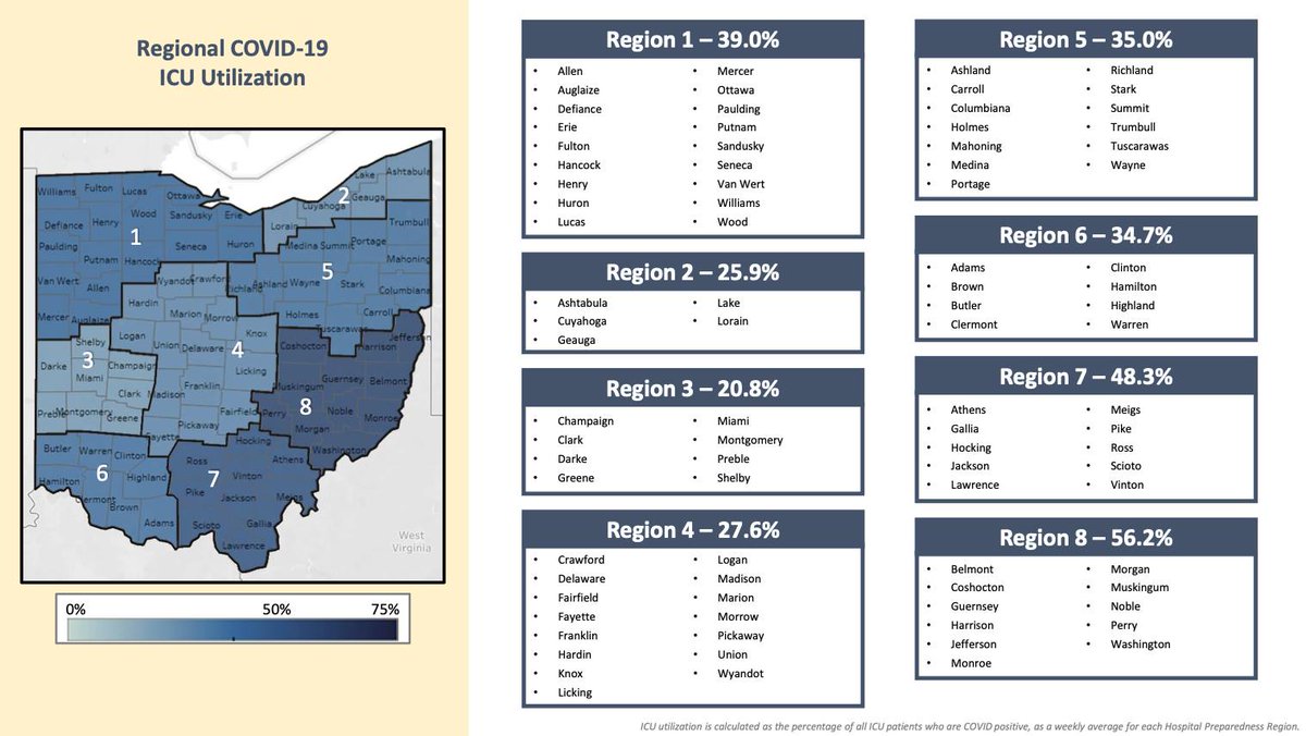
- but today I hope to illustrate even more clearly what level of manipulation is going on, particularly with the new blue 'ICU Utilization' map.
Attached I have two images.

The first is a hyper-simplistic (and unrealistic) but illustrative example of the calculations that the new blue map goes through to arrive at its numbers.
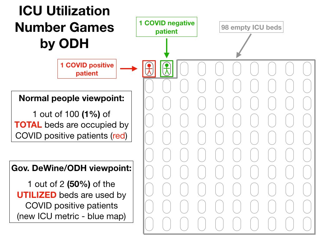
Instead of telling us the percent of beds occupied by COVID+ (not necessarily ill *with* COVID, but testing positive) - the governor and ODH only calculates the percentage of COVID+ out of just the *used* beds.
In the first image, I have an example of a 100 bed ICU with just two patients - one COVID positive (red) and one COVID negative (green). The other 98 beds are empty and able to accept new patients.
⭐️ Normal people would look at this situation and say that 1% of the beds in the ICU are being used by COVID positive patients.

But that's not how Gov. DeWine would present this situation to us. Instead of looking at the total available beds, they look only at the beds in use.
⭐️ In this example, there are only 2 beds *in use.* 1 of those is occupied by a COVID positive patient, making the 'ICU utilization' as defined by Gov. DeWine and ODH *50% instead of 1%.*
And if that green COVID neg patient were to be discharged and only the COVID positive patient remained, the COVID ICU utilization would be *100%* despite 99% of beds in the ICU still being available to accept patients. Now this is, again, a very extreme example and unrealistic.
In the second image, however, I illustrate the same concept with the real numbers for Region 8 (southeast Ohio). Southeast Ohio has been called out week after week now for having very high 'ICU bed utilization,' but what does that mean in real numbers?
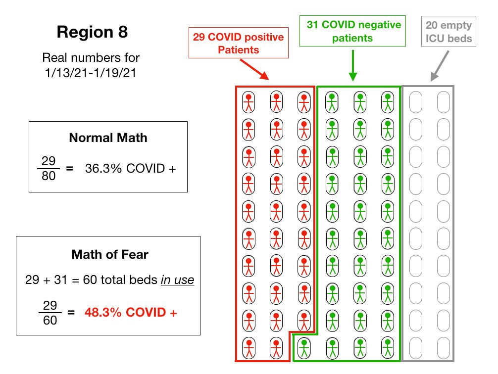
Over the (probable) 7 days that today's blue map will be made from, there was an average of ~80 total ICU beds in the region. On average, ~29 were occupied by COVID positive patients, and ~31 by COVID negative patients, with ~20 beds empty.
⭐️For those of us using 'normal' math, we would say that 29 out of 80 beds are occupied by COVID positive patients, or 36.3%.
⭐️But using Gov. DeWine's Math of Fear, our denominator is only 60 (29+31). Meaning that his equation becomes 29 out of 60 beds are occupied by COVID positive patients, or 48.3% instead of 36.3%!

By manipulating the numbers, they have increased the real percentage by a third.
Not only does it artificially increase the apparent usage, it also creates perverse incentives (like so many of his metrics). The fewer non-COVID patients are using the ICU beds, the worse the COVID numbers look.
The worse the COVID numbers look, the more scared people will be to use the hospitals for those other procedures potentially leading to even lower non-COVID usage. Conversely, the more people using the ICU beds for other reasons, the *less used* it looks.
The games need to stop.
Note: For simplicity, I rounded the beds and the people to whole numbers so I wouldn't have to chop them in pieces for the illustration, so the specific % calculated here might be slightly off of what Gov. DeWine presents later today. But these are the real numbers for Region 8.

• • •

Missing some Tweet in this thread? You can try to force a refresh
 

Keep Current with Understanding Ohio COVID Data

Understanding Ohio COVID Data Profile picture

Stay in touch and get notified when new unrolls are available from this author!

Read all threads

This Thread may be Removed Anytime!

PDF

Twitter may remove this content at anytime! Save it as PDF for later use!

Try unrolling a thread yourself!

how to unroll video
  1. Follow @ThreadReaderApp to mention us!

  2. From a Twitter thread mention us with a keyword "unroll"
@threadreaderapp unroll

Practice here first or read more on our help page!

More from @ohio_data

18 Jan
So here's something interesting about our latest 'surge'. If one goes to coronavirus.ohio.gov/.../covi.../da… you can toggle between 'confirmed' cases, 'probable' cases and both of them together.
So what is a 'confirmed' case? That would be any laboratory confirmed 'case' - any positive PCR, antigen or antibody test, with all the issues of false positivity and hypersensitivity and non-infectiousness that go along with all of those tests.
A 'probable' case does not even have a positive test result associated with it. All it requires are symptoms. Maybe an epidemiological link. We are now in the middle of what used to be referred to as 'flu season' when there is a wide variety of respiratory illnesses that exist -
Read 11 tweets
30 Dec 20
⭐️⭐️⭐️ Playing Number Games: Part Two

In my last post, I showed how the new 'Key Measures' ICU map was distorting the data by looking only at the comparison of COVID positive (not necessarily ill with COVID) patients versus -
- vs the number of total patients in the ICU - not the percentage of COVD positive patients out of the total number of ICU beds.
So what if they went back to simply the percentage of COVID positive patients out of all available ICU beds? First, the numbers would not be as scary, and second, the total number of beds available in a region is not stable from one day to the next.
Read 7 tweets
30 Dec 20
⭐️⭐️⭐️ Playing Number Games.

As noted in my last post, Gov. DeWine has signaled a movement away from the Ohio Public Health Advisory System (aka, the Map of Fear) because under the new rules, the state will be stuck in red perpetually with sufficient testing.
So to replace this map, he announced two new maps, to be updated weekly and found at coronavirus.ohio.gov/static/OPHASM/…
These two measures look at cases per capita WHICH CAN BE CONTROLLED SOLELY BY TESTING WITH FAULTY TESTS AND IS SEVERELY PUNITIVE TO RURAL COUNTIES.
The second map shows ICU utilization by region (first attached image), and these percentages look quite alarming.
Read 14 tweets
30 Dec 20
*Moving away from the OPHAS Map of Fear*

Gov. DeWine is moving us away from the Ohio Public Health Advisory system because it has gone almost entirely red now (and will, again, be completely without any purple again this week).
Below is Gov. DeWine's reasoning behind doing so - that he called this a 'early warning system' and that it 'told a good story.'

facebook.com/15501424/video…
Also attached is Fort's presentations of the Map of Fear using the new rules. Those rules are - 'high incidence' maintaining red indefinitely, a 'watchlist' week for counties before turning purple, and counties remaining purple for two weeks before being allowed to return to red.
Read 8 tweets
2 Dec 20
* But wait, there's more!
I just posted about an odd change in an odd entry I stumbled across in today's CSV file.
But there's even more to this story. Whenever I post these 'long COVID' entries, I usually get some pushback about maybe people having COVID so badly that they end up back in the hospital months down the road.
Ok. Absolutely valid possibility (still not appropriate labeling them as a current COVID case, but I digress).
So I went back into the old csv files to see if this 60-69 year old Montgomery County man existed in the file as having the 4/14 onset date -
Read 11 tweets
1 Dec 20
This one really bothered me during yesterday's press conference. The [linked] video [below] is of Dr. Andy Thomas of Wexner Medical Center saying things that sound really scary. None of what he said is untrue, but it gives a perception that is vastly different than reality.
facebook.com/15501424/video…
Yes, ~1/3 of all patients in the ICU or on a ventilator are COVID-positive (or at least once tested positive at some point in the last 8 months as my posts yesterday demonstrated).
But then he went on to the old threat of COVID 'crowding' other procedures out. First, there is significant regular capacity still available in the ICU (and as he noted, even the facility with 'trouble' was able to increase to 130%).
Read 8 tweets

Did Thread Reader help you today?

Support us! We are indie developers!


This site is made by just two indie developers on a laptop doing marketing, support and development! Read more about the story.

Become a Premium Member ($3/month or $30/year) and get exclusive features!

Become Premium

Too expensive? Make a small donation by buying us coffee ($5) or help with server cost ($10)

Donate via Paypal Become our Patreon

Thank you for your support!

Follow Us on Twitter!