🇺🇸💉VACCINE DATA UPDATE (Jan. 26)🌏💉
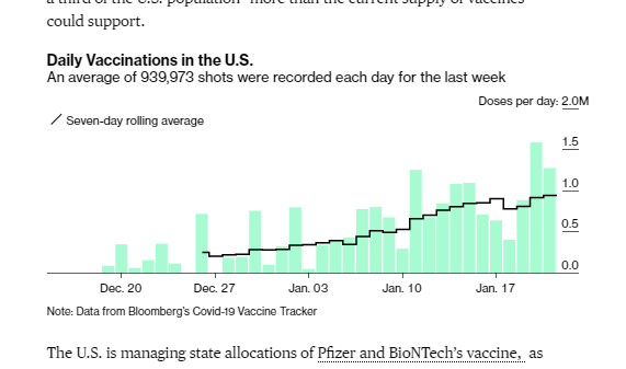
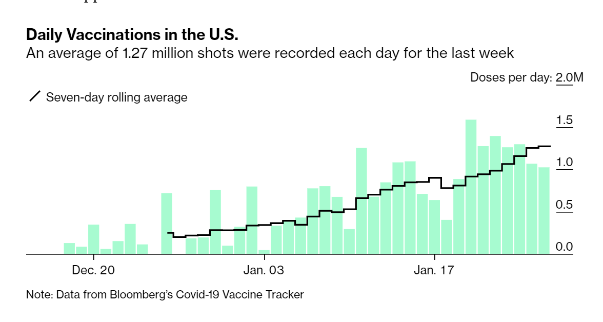
🇺🇸US: 24.5M doses admin
➕1.0M doses today; 📈7-day avg=1.3M
🏅3.68M people completed vaccination
🌏71.3M doses (daily rate ~3.57M)
☝️Some exciting updates -- see notes below!
bloomberg.com/graphics/covid…
🇺🇸US: 24.5M doses admin
➕1.0M doses today; 📈7-day avg=1.3M
🏅3.68M people completed vaccination
🌏71.3M doses (daily rate ~3.57M)
☝️Some exciting updates -- see notes below!
bloomberg.com/graphics/covid…
🔥We have new features!
We will now show rolling 7-day averages for each state, as well as % of pop with first and second doses in our sortable tables.
bloomberg.com/graphics/covid…
We will now show rolling 7-day averages for each state, as well as % of pop with first and second doses in our sortable tables.
bloomberg.com/graphics/covid…

We have similar features on our global map and table, and will keep adding to that part of the graphic (and cleaning up a few bugs).
bloomberg.com/graphics/covid…
bloomberg.com/graphics/covid…
We didn't disappear the # of doses supplied, but we did make it map-specific. You can find those numbers here:

• • •
Missing some Tweet in this thread? You can try to
force a refresh