1/ Chart Study from Dragon's Den. Been a while, but this is just a short one. Let's start with the BIG picture. Entire rally from 1932 and rally from 2009 are IDENTICAL. It's a nested pattern
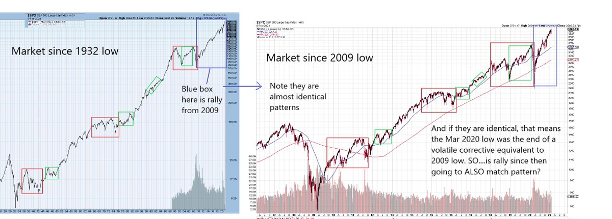
2/ So if nesting, the rally from Mar 2020 low should again be like pattern from 2009. Just one degree smaller. I think it is close.
3/ Here is a close up of move from 2020. Same pattern but one difference. We are losing momentum. Do we have one more smaller cycle left? Maybe
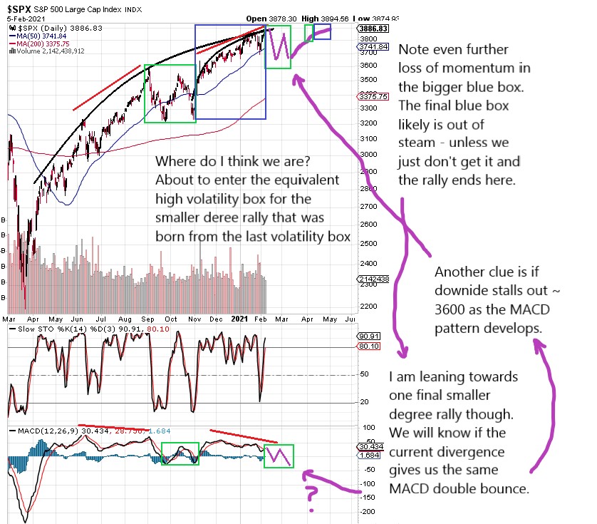
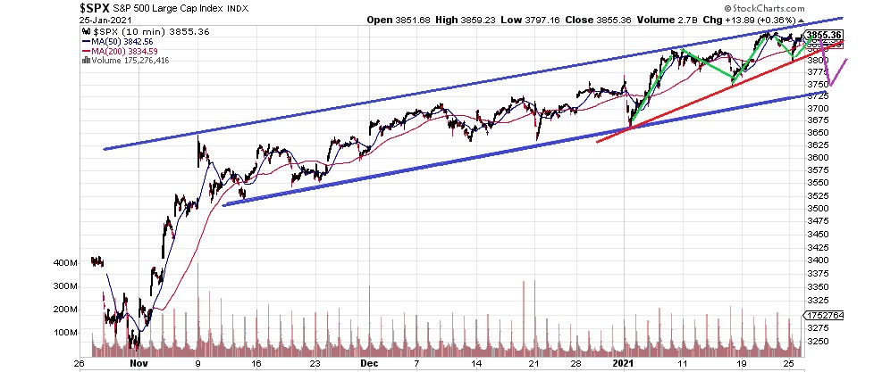
4/ This is the current final rally out of late Jan. Same abc-x-abc pattern. If true, it leads us to major reversal OR volatility box to prep for final move up which loses momentum even further.
5/ Not shown, but this exact same nest series can be seen in S&P and even things like the Transport Index. It's uncanny their identical nested pattern nature.
6/ I'll finish with this. You all already know where I think this is going. But here is one more clue on why we are about to peak major
7/ Outside of charts, the evidence is all around. Stocks like TSLA with P/Es approaching 2000. Garbage stocks pumped 1000% or more in weeks or even days. BTC - logically, why is ANYONE paying $40k for imaginary currency, unregulated, untracable, no govmt would support
8/ Home prices are astronomical, yet half the population can't see past their next paycheck. Absolutely none of this is sustainable, not even with the FED. The ~90 year economic cycle goes back to 1929. Like it or not, at a min, we are going to enter next Great Depression soon.
9/ Part of the challenge in identifying the "top" is that as active investors in the market, we are looking for day trades or swing trades. The big picture eludes us and it's easy to say "you're a dope" or "you're wrong".
10/ But the last 3 years, if compared to the last 90 is like maybe a week's worth of chart patterns for most. I'm pretty certain of the end result but trying to get that detailed back and forth structure will be meaningless once it happens
• • •
Missing some Tweet in this thread? You can try to
force a refresh
1/ Futures down tonight. 2 things. 1) I don't like big gaps near the high. Odds favor it is recovered. 2) No break until the lower blue line breaks. As long as the gap down stays above this, watch for rally to fill gap.
2/ That said, this is the final segment in the wedge and there is likely a lot of overlap but no more than 3 clear waves. once gap fills, that may be it so a terminal end is upon us.
3/ Once the lower wedge breaks though, next should be the lower parallel line here. We are seeing downside moves appear swiftly and this may continue to hold true with little time to react. I suspect that lower lines proves to be another bounce point tho.
1. Want to see what happens to irrational markets? In 1999-2000, the NDX went a little more than double over the span of 5 months. When it turned, 25% was lost in 7 trading days. After a strong bounce, it dropped again losing overall 35% in 3 weeks.
2. After another longer bounce and drop, the total was 40% down. It managed to recover ~62% of that in the months that followed.
3. BTFD crowd rejoiced that we are off again - not knowing that 2 years later the index would lose 85% of it's value.
1/ Seriously. I post what I believe and I have extremely high confidence in what I see. I will emphasize - I AM NOT A DAYTRADER. I don't give a sh*t what the market has done in the last few weeks, whether I am early, blah, blah...
2/ Read my pinned post - I do not give advice and YOUR trade plan will probably not match mine.
3/ If you disagree fine. But if you're going to be a d*ck because the market went up and my LONG term prognosis is another depression, we're looking at 2 different times frames.
1/ Chart study from Dragon's Den. This is the big picture. It has absolutely NOT changed at all and my guide for next 2-3 years.
2/ The 3 peaks pattern is the true market nesting pattern. In the last big picture chart, we see that 2000-2009 was a giant ABC corrective. Going one step bigger, 2000 - now is also a giant ABC but we have only just begun the C.
3/ In some ways, that will make the coming decline as well as the 2007-2009 decline similar in terms of pattern and character. It won't be 100% as the market has ways of making things a bit dynamic but the overall arch should be similar.
1/ Virus thoughts. Chart below shows tracking of positive cases. Note there is a weekly up/down cycle likely due to less testing and work done on the weekend. There is a 1-2 day lag for results to filter through so looking at this, all dips are on weekend.
2/ Clearly, shutdowns had the anticipated affect of "flattening the curve". However, Memorial Day was a pivot when the public basically went YOLO and you started seeing mass gatherings, many people without masks
3/ Incubation is 4-14 days, but most are 10-14 down the road. Note that ~June 6 marked a low point, 12 days after Memorial Day. No doubt we are seeing the result of mass ignorance of the virus as cases tick up dramatically since then.
Euphoria in stocks is very much like peak in dot com. This is much like 100 people playing musical chairs only when the music stops, 90 of them are going to get pulled, not just 1.
Uh oh.....what happened to the music?
If you did not trade the 2001 or 2007 top, you’re in for a real treat. And a lesson in how markets really work. The FED is POWERLESS.