Good news all round in this week's ONS infectivity survey. All four nations are showing falls averaging around 20%.
Starting with England, the modelled level has fallen from 1.55% to 1.28%, or just under 700k people (1 in 80).
Wales falls from 1.40% to 1.16% (1 in 80)
1/6
Northern Ireland falls from 1.56% to 1.33% (1 in 75), whilst Scotland, which has been the most stable of the four nations, falls from 0.88% to 0.67% (1 in 150).
2/6
Regionally in England, London is continuing to fall fastest. Most areas continue to fall, with the SE now the lowest region - a contrast with a few weeks ago.
The direction in the SW is less clear however.
3/6
By age, falls at all ages, greater in the younger age groups where prevalence was higher.
It is slightly curious though how all the modelled estimates are lower than the 1.28% for England in totality.
4/6
We've heard how the Kent variant has taken over as the most dominant, and this analysis confirms that, with nearly 90% of identifiable cases in England being of the new variant.
5/6
With 6 Nations Rugby back on our screens, it's great to see some results where every country can be winning!
Thanks to all at @ONS and partner organisations for this continuing extensive random sampling exercise in the community.
6/6 END
• • •
Missing some Tweet in this thread? You can try to
force a refresh
The latest England hospital data reveals that the 7 day moving average of the proportion of deaths has today moved below 50%, at 49.7%. The rate of fall appears very slightly faster since around 28th Jan.
Prior to a spike in Dec, the proportion was very stable at 56%.
1/3
The absolute daily figures are of course falling much more rapidly, in line with the falls in prevalence of the virus. It's halved in around 3 weeks, and although the latest days will still have unreported deaths, the trend appears to be continuing.
2/3
With reported deaths being much lower on Sun & Mon, I'll update again on Tuesday. Let's hope we see a continuation of the trend then!
3/3
The latest @ICNARC report on intensive care activity on behalf of @COVID19actuary, starting with the clearest evidence possible that this has not been "just another flu winter", even with non-COVID activity down.
Patient numbers have been close to double last Jan.
1/15
Unlike April, this peak has come after a sustained period of increased activity throughout the Autumn too, with the cumulative number of patients now exactly double that admitted in the first wave. This can be seen in the occupancy stats next too.
2/15
It's really worth emphasising that although the peak has passed in terms of admissions, the overall numbers in ICU are still exceptionally high, and remain at first wave peak levels.
Note also that this second wave timeline is now as long as the first.
412k first doses today (+10% on last Wed), with the total now 13.06m.
We continue to track at a steady 3.0m a week, and have just 1.54m to achieve the 14.6m that the VDP suggests is needed to complete PG's 1-4.
Some demographic insight next.
1/4
Thanks to openSAFELY we have some good insight on ethnicity take-up. Unfortunately it confirms that it is worryingly lower in BAME communities, particularly the over 80s.
There appears a slightly narrower spread in the 70-79 age group, although this is further away from completion yet. Given BAME groups have been hit hardest by COVID, this data is doubly concerning, although is unlikely to come as a surprise. 3/4
The VDP has 14.6 people in categories 1 to 4 for the UK. With the gov't expressing confidence that the target to vaccinate them by Feb 15th can be achieved, let's start to check progress. (Yesterday's daily figure included for context.) We need an average of c350k per day. 1/5
The current shortfall shouldn't be too concerning, (yet). We know that the programme is ramping up, but every day we fall behind will mean having to go above the starting average later on to catch up. The maths is a bit like limited overs cricket, but much more serious. 2/5
I've deliberately ignored the recent switch from "vaccinated" to "offered a vaccine". We know some will decline (hopefully not many), but the apparent sleight of hand in posting out test kits to meet a testing target is not easily forgotten. 3/5
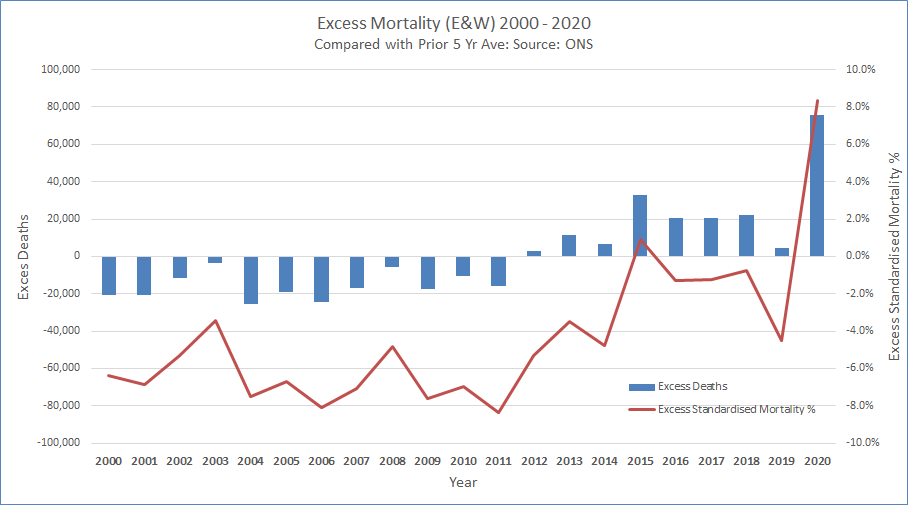
The @ONS has published an updated mortality series, with deaths and standardised mortality, now including 2020. Using the prior 5 year average, we can calculate excess deaths and mortality over recent years. 2020 is exceptionally bad on either measure. A short thread. 1/5
Standardised mortality is the best measure, as it adjusts for population size and an ageing population. At +8.3% it compares badly with the previous average of -5.0% this century. Only one other year, 2015, was slightly positive (+0.9%), with an exceptionally bad flu year. 2/5
Excess deaths were negative in the first decade. As improvements in mortality then slowed, the effect of the ageing population has outweighed the lower level of improvement. Hence why we've recently seen more deaths, (and why excess deaths alone is an imperfect measure.) 3/5
The latest update from @ICNARC on COVID intensive care activity has been published, summarised here on behalf of @COVID19Actuary. We've now passed a sobering milestone with more admissions (12,115) in the second wave than the first (10,935), with 2,938 in the last 14 days. 1/18
Here's the recent geographical split, and the emphasis on London and surrounding regions is as clear as it is not surprising. Only the East and London have yet to pass their first wave total, and at current rates, they will do so in the next few days. This data is to 7 Jan. 2/18
The recent upsurge is very clear here, after a slight dip following the November lockdown. Whilst the early phase of the second wave was much less severe than in March, the recent increase is not dissimilar, and from a base of a much higher level of activity. 3/18