Are we starting to see a clear vaccine effect in detected cases and hospitalizations?
In short, not yet.
A short thread.

In short, not yet.
A short thread.


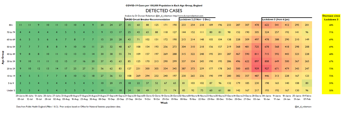
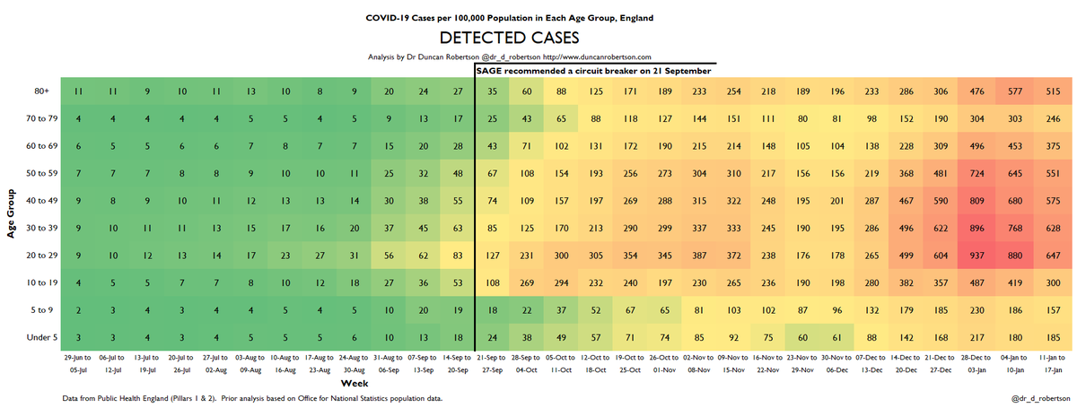
What is striking is how consistent these decreases are across adult age groups:
Hopitalizations falling 46-49%
Detected Cases falling 68-73%
Given that the over-80s were one of the first groups to be vaccinated, we could expect the top lines of these heatmaps to fall faster.
Hopitalizations falling 46-49%
Detected Cases falling 68-73%
Given that the over-80s were one of the first groups to be vaccinated, we could expect the top lines of these heatmaps to fall faster.
Of course, it's not that simple due to the time for people to be infected and be hospitalized, the time taken for vaccines to take effect, new variants potentially changing test results, LFD tests, and this also covers a period when there were significant outbreaks in care homes.
From these data (comparing case and hospitalization data for the week ending 10 January 2021 to week ending 7 February 2021), there does not appear to be a clear vaccine effect.
I hope and expect this to change over the weeks ahead.
I hope and expect this to change over the weeks ahead.
As LFD tests are being used and detected cases are significantly different to those reported by ONS and Imperial College, we should be cautious with cases data (as we have been since testing capacity was breached several months ago)
https://twitter.com/rowlsmanthorpe/status/1360235103901908993?s=20
I will be discussing the Covid data on @SkyNews with @SkyNewsIsabel at 4:10pm.
Here is my Sky News interview discussing Covid data
• • •
Missing some Tweet in this thread? You can try to
force a refresh


