💉VACCINE DATA (methodology) UPDATE⚠️
We have our usual update coming later tonight, and I'll thread it here. But in the meantime we have a very important methodology update about how we get data + count doses.
bloomberg.com/news/live-blog…
We have our usual update coming later tonight, and I'll thread it here. But in the meantime we have a very important methodology update about how we get data + count doses.
bloomberg.com/news/live-blog…
Short version: CDC made major changes in how they attribute doses to states, in a way that makes their data non-comparable with state-produced data. Unless something changed, we will be using CDC data for the U.S. going forward. Read the details here:
bloomberg.com/news/live-blog…
bloomberg.com/news/live-blog…
There are upsides and downsides to this change.
Upside: It places Defense Dept. vaccinations in the place where people reside. That's important -- the 1918 flu is thought to have started in a military base in Kansas. These federal categories aren't abstract.
Upside: It places Defense Dept. vaccinations in the place where people reside. That's important -- the 1918 flu is thought to have started in a military base in Kansas. These federal categories aren't abstract.
Downsides: We can't compare with states. People are assigned by the CDC to their *permanent* residence, not where they got vaccinated. And it's a big methodological change that screws up everyone's time-series data.
bloomberg.com/news/live-blog…
bloomberg.com/news/live-blog…
We've already heard from one state confused by this, since their dashboard number will always be lower than CDC's, since they don't capture federal entities. This may create confusion for people who look at trackers like ours, the CDC's and what states report.
Please read the full post for an explanation. We'll have our data out here soon.
bloomberg.com/news/live-blog…
bloomberg.com/news/live-blog…
💉VACCINE DATA UPDATE (Feb. 20)💉
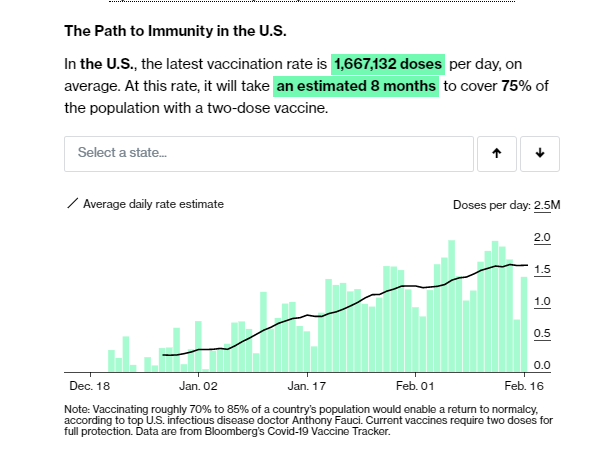
🇺🇸US: 61.3M doses total
🧑🤝🧑42.8M people w/ at least 1 dose, 17.9M completed vaccination
⚠️Please read our blog post below about the big methodological changes today
bloomberg.com/graphics/covid…
🇺🇸US: 61.3M doses total
🧑🤝🧑42.8M people w/ at least 1 dose, 17.9M completed vaccination
⚠️Please read our blog post below about the big methodological changes today
bloomberg.com/graphics/covid…
Thanks for sticking with us. It's been a long day!
• • •
Missing some Tweet in this thread? You can try to
force a refresh