Neil Ferguson, notorious lead author of Imperial College model, sent a snarky and supercilious response to an earnest but questioning citizen concerned about policy. Full significance of Ferguson's reply wasn't appreciated by recipient but will be understood by old CA readers.
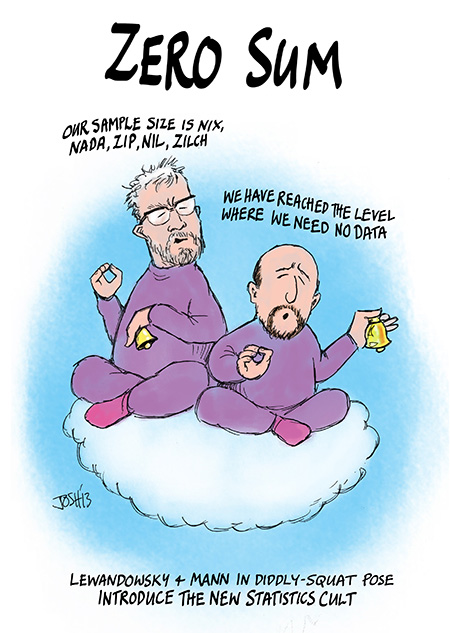
2/ Ferguson's go-to reference for someone daring to question his statistical work was the following: climatechangecommunication.org/wp-content/upl…. Guess what it was. Without peeking.
3/ COVID modeler Neil Ferguson's go-to reference was Lewandowsky and Cook, 2020. The Conspiracy Theory Handbook.
4/ I encountered Lewandowsky and Cook many years ago: they are the worst of the worst. See
climateaudit.org/tag/lewandowsky. If COVID modeler Neil Ferguson is citing them as scientific authority, then, to borrow a favorite climate phrase, his work is "worse than we thought".
5/ in a 5-second quick look at Lewandowsky and Cook's latest propaganda tract, I noticed that they continue to assert an urban legend propagated years ago by Lewandowsky that arose from gross statistical incompetence by him and his social psychology community.
6/ I looked at the actual data relied upon by Lewandowsky to support his Princess Diana claim. climateaudit.org/2013/11/07/mor…
7/ Lewandowsky's assertion was based on a crappy article (Wood et al 2012) which did rudimentary statistical analysis on Likert-scale questionnaire data, the distributions of which did not satisfy the assumptions of the statistical method. As a result, conclusions were unfounded
8/ although Lewandowsky claimed that this correlation PROVED that respondents held two inconsistent beliefs, if one actually looked at the data - a practice seemingly anathema to today's university academic modelers, ZERO respondents actually held the inconsistent beliefs.
9/ @CartoonsByJosh neatly summarized Lewandowsky "science" in this cartoon.
10/ my current notice of Ferguson arose as follows.

As elsewhere, COVID cases in Canada have declined sharply in past 6 weeks, but public health authorities nonetheless urged even more punitive lockdowns due to looming third wave from UK variant:
cbc.ca/news/politics/…
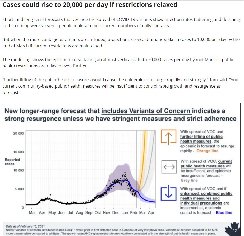
11/ while the Public Health Canada's February projections didn't give a reference for their projections, earlier presentations cited Anderson et al, from which I located graph that almost certainly underpins PH Canada's own graphic. sfu.ca/magpie/blog/hi…
12/ according to its covering note. the variant hockey stick graph was constructed as a purely mathematical exercise of inserting a variant (B.1.1.7) with 40-80% higher transmissibility. Estimate of higher transmissibility relied on Volz et al (Jan 4, 2021).
13/ So who are Volz et al? Here is link to original article: medrxiv.org/content/10.110….

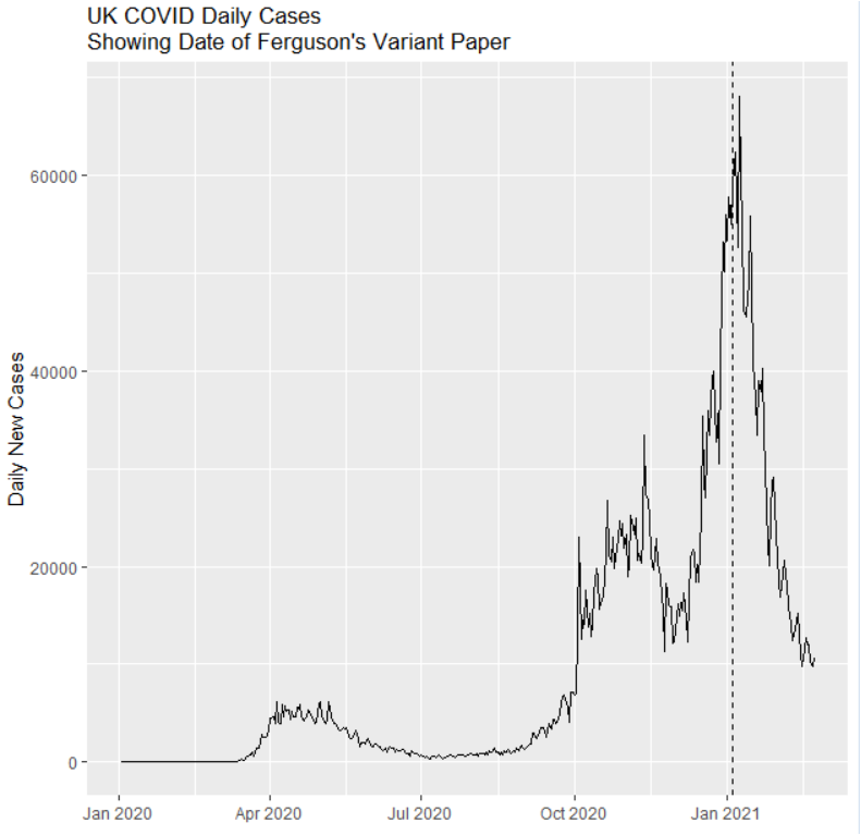
Senior author is .... Neil Ferguson.
14/ if one plots the date of Ferguson's variant paper against UK data on new cases, it was published at the absolute "top of the market". ALL of his calculations on relative transmissibility of B.1.1.7 are based on rising "market". Do his calculations work out of sample?
15/ I've spent the day trying to figure out Ferguson's code and data. They've put Supplementary Information online github.com/mrc-ide/sarsco… It's not very clearly presented but at least it's there. I wonder if anyone other than me has tried to run it, as it needs bodges to run.
16/ one bit of good fortune in trying to parse this study: they use the lmer function from the lme4 package for at least some of their key calculations.
17/ veteran readers may recall that I frequently used lme4 for analysis. Early on, I advocated it as a rational statistical basis for tree ring chronologies and had even planned to present it at a dendro conference in Finland, to which I'd been invited
climateaudit.org/tag/mixed-effe…

• • •

Missing some Tweet in this thread? You can try to force a refresh
 

Keep Current with Stephen McIntyre

Stephen McIntyre Profile picture

Stay in touch and get notified when new unrolls are available from this author!

Read all threads

This Thread may be Removed Anytime!

PDF

Twitter may remove this content at anytime! Save it as PDF for later use!

Try unrolling a thread yourself!

how to unroll video
  1. Follow @ThreadReaderApp to mention us!

  2. From a Twitter thread mention us with a keyword "unroll"
@threadreaderapp unroll

Practice here first or read more on our help page!

More from @ClimateAudit

15 Feb
primary concerns re COVID are: fatalities, ICU &hospitalization, which vary by age group. Not easy finding data granular enough to examine interactions. Nor are such details discussed collectively (as they should) in Ontario science briefings. Here is (hard-won) Toronto summary.
while COVID impact on ICUs has been a (if not the) primary focus of "Science Table" briefings, the number of fatalities is about 2.5 times higher than number of people who've gone to ICU. Mostly people over 80 who've died in community or in non-ICU hospital wards.
fatality rates of over 80s (and over 70s) in ICUs is very high: 70% (61%) respectively, while recovery rate of under 50s is very high (86%).
Read 12 tweets
11 Feb
the oh-so-woke Ontario Science Table presented graphs purporting to show share of LTC of total deaths (left) and ICU (right). According to these figures, LTC accounts for substantial majority of deaths (~70%) but micro-fraction of ICU admissions. Has this been observed elsewhere?
2/ on its face, this figure contradicts a claim that I've been making: that vaccinating vulnerable in LTC would be effective means of mitigating concerns over projected ICU overcrowding. But is figure correct?
3/ if figure is correct, this seems like pretty fundamental information for policy-makers. So why havent Ontario science advisors ever mentioned it previously?
Read 4 tweets
11 Feb
on Jan 21, 2021, just as vaccine supply in Canada dried up, Science Table, Ontario's woke COVID advisors, belatedly urged that govt to accelerate vaccination of LTC residents (relative to young HCWs outside LTC residences). Exactly what I'd urged on Dec 22
covid19-sciencetable.ca/sciencebrief/t…
2/ even this belated recognition by woke Science Table omitted the main reason why vulnerable 80+s, especially LTC 80"s, deserved priority even ahead of young HCWs: its direct impact on hospitalizations given expected pending hospital crisis
3/ I said this not to disparage contribution of young doctors, HCWs in ICUs. My father was a surgeon, two nieces are doctors. My family has benefited greatly from prompt and inspired care in Toronto ICUs. My point was policy: vaccinating seniors was best way to avert ICU crisis
Read 5 tweets
9 Feb
amidst COVID projection porn by Ontario "Science Table", actual data on new cases in Ontario LTC homes has had spectacular decline since early Jan, when govt figured out that LTC residents were getting shortchanged in allocation by public health (relative to hospital admin etc)
2/ yesterday, there were only 11 new cases among LTC residents (14 - Feb 17), down from 160-200 daily at beginning of January. In Dec, nearly all vaccines appear to have been appropriated by young HCWs - meritorious but not nearly as vulnerable as LTC residents.
3/ because hospitalization rates are extremely high for cases among seniors, esp 80+ seniors, such a dramatic reduction in LTC cases should have immediate and observable impact on hospitalization rates. Which have gone down dramatically as well.
Read 4 tweets
6 Feb
on Dec 21, faced with projections of 15-30,000 new cases daily by Jan 24 and threats of impossible burden on ICUs, Ontario went into moderate lockdown. Whether due to this policy or otherwise, new cases remained under 3000 at Jan 12, declining to 2200 by Jan 24.
2/ nonetheless, on Jan 12, Science Table, Ontario science advisors took time out from worrying about microaggressions at University of Toronto to declare that policy failing. They presented new projections, this time projecting up to 45000 new cases by mid-Feb.
3/ As on Dec 21, they showed extrapolations at daily growth rates of 3%, 5% and 7%, even though there had been negligible increase in daily new cases since Dec 21. On right, I added Dec 21 projections plus 2 days of actuals not shown by Science Table.
Read 8 tweets
6 Feb
Chris Rentsch - not a climate scientist - has done an astounding calculation that, for some reason, Gavin Schmidt and climate "community" have failed to do. He's used absorption spectra over past 18 years to measure CO2 forcing.
2/ CO2 absorption spectra have long been used as evidence of existence of CO2 greenhouse effect, but measuring change in CO2 absorption spectra over time and on a global basis is a very non-trivial calculation. Rentsch has done it.
3/ even if there were no immediate implications for the overall debate, this would be an important and praiseworthy accomplishment. If the calculation showed that things were "worse than we thought", Rentsch would almost certainly been feted by scientific societies.
Read 5 tweets

Did Thread Reader help you today?

Support us! We are indie developers!


This site is made by just two indie developers on a laptop doing marketing, support and development! Read more about the story.

Become a Premium Member ($3/month or $30/year) and get exclusive features!

Become Premium

Too expensive? Make a small donation by buying us coffee ($5) or help with server cost ($10)

Donate via Paypal Become our Patreon

Thank you for your support!

Follow Us on Twitter!