Did you reply similarly to JHU as you did me here, or to the many (very prominent) accounts who linked to JHU’s data, when JHU put out its daily % positive for every single state by using CTP’s “totalTestsResults” while including antigen positives in case counts?
I'm sure you cannot have missed the ubiquitous use of the two columns in CTP's CSV/API (which CTP used for its topline daily data updates) to calculate and blast state-by-state positivity—including by media and policymakers—despite admonitions from CTP.
In GA, and FL, and AR, and TN, and TX, and LA, and MS, and others…this results in a massive error. Just saying, “We warned you against comparing states” while venerated institutions are doing just that and putting it out into the world like a shockwave is willful blindness.
Take MS, for example. It conducts a MASSIVE amount of antigen tests. For the week 2/22 – 3/1 (CTP data), if you use just confirmed cases and molecular tests, MS would have shown a 7.87% positive testing rate. But add in probable cases without the tests, and it became 16.37%.
When JHU (among others) is blasting the data, 16.37% simply becomes *the* number. Knowing the data in the two columns was being used how it was (and fully realizing we’re choosing between imperfect data) I would have ensured those columns produced the smallest error.
Short answer: no, I didn’t miss it (see tweet below). But the speed with which state-by-state data traveled despite CTP’s pronouncements that it’s “irresponsible” might have counseled better aligning certain data in certain states in the most-used columns.
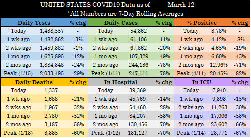
All graphics are 7-day averages. Today’s raw reporting for each metric is in the tweet below.
(Data retrieved directly from state dashboards. Not every state updates its numbers daily.)
UNITED STATES
Today’s raw reported metrics:
- Tests: 1,209,792 (-34,995)
- Cases: 35,488 (-4,435)
- Deaths: 536 (-303)
- Currently Hospitalized: 36,470 (-375)
- Currently in ICU: 7,369 (-114)
(+/- compared to same day last week for Tests/Cases/Deaths & yesterday for Hosp/ICU)
The first thing you might notice is the lower positive testing percentage, including in the historical data. This is due my backdating (mostly) testing data for about 35-40% of states to include antigen tests where we report a state’s antigen-positive cases.
All graphics are 7-day averages. Today’s raw reporting for each metric is in the tweet below.
(Data retrieved directly from state dashboards. Not every state updates its numbers daily.)
UNITED STATES
Today’s raw reported metrics:
- Tests: 1,459,570 (+48,238)
- Cases: 50,782 (-8,576)
- Deaths: 1,059 (-612)
- Currently Hospitalized: 36,845 (-690)
- Currently in ICU: 7,483 (-86)
(+/- compared to same day last week for Tests/Cases/Deaths & yesterday for Hosp/ICU)
Trend lines still looking good overall. We’re still seeing some acceleration in the percentage decrease in deaths. And while hospitalizations and ICU declines have slowed a bit, they’re maintaining double-digit drops week-over-week for several weeks now.
But certainly CTP is and was aware that legions of people used its API/CSV data, and those that did almost invariably used the two columns circled in red. A simple, “watch out, this isn’t a good comparator” doesn't stop the world from using data derived from these columns.
I don't get why cases/tests didn't match up (either include probable & antigen or just confirmed & molecular) in the columns that pretty much everyone used (and which everyone knew that everyone used). I get that cases and tests are separate beasts, but we know people pair them.
All graphics are 7-day averages. Today’s raw reporting for each metric is in the tweet below.
(Data retrieved directly from state dashboards. Not every state updates its numbers daily.)
UNITED STATES
Today’s raw reported metrics:
- Tests: 1,955,408 (+188,288)
- Cases: 65,127 (-3,450)
- Deaths: 1,482 (-306)
- Currently Hospitalized: 37,535 (-792)
- Currently in ICU: 7,569 (-108)
(+/- compared to same day last week for Tests/Cases/Deaths & yesterday for Hosp/ICU)
Percent positive is falling nicely. Remember though, this was expected when we started adding in antigen tests in those states where we reported probable cases (which are almost all antigen positives). This weekend, I’ll provide a look at the “old” % positive just to compare.
I just realized this morning a large error in several states in the way that @COVID19Tracking (and now our team) reported many states testing totals compared to the way it presented cases.
It's another denominator problem, folks.
🧵🧵🧵
When available, CTP (and our team) reported probable cases as the preferred metric, which is defined as follows:
Poking around on the state dashboards, the overwhelming majority of probables come via positive antigen test.
But when it comes to reporting tests, we (and CTP, in its list of test totals that everyone uses) exclude antigen tests!
Data retrieved directly from state dashboards, and not every state updates its numbers daily.
All graphics are 7-day averages, but today's raw reporting for each metric is in tweet below.
UNITED STATES
The United States reported the following raw counts—
Tests: 1,191,529
Cases: 53,531
Deaths: 1,715
Currently Hospitalized: 39,841
Currently in ICU: 7,985
Quite a few small-ish states reporting larger death counts today: MO - 134, MN - 140, OH - 169, and OK 167. Of MN’s 140 deaths, 138 were part of an audit and occurred “over the course of the last year” and will be removed from today’s count. From the MN website: