Thank you so much for the overwhelmingly positive reception of my latest piece, #Ganyu. Since everyone enjoyed it a lot, I'll talk about the creative process that went into the piece. #pixelart #ドット絵 

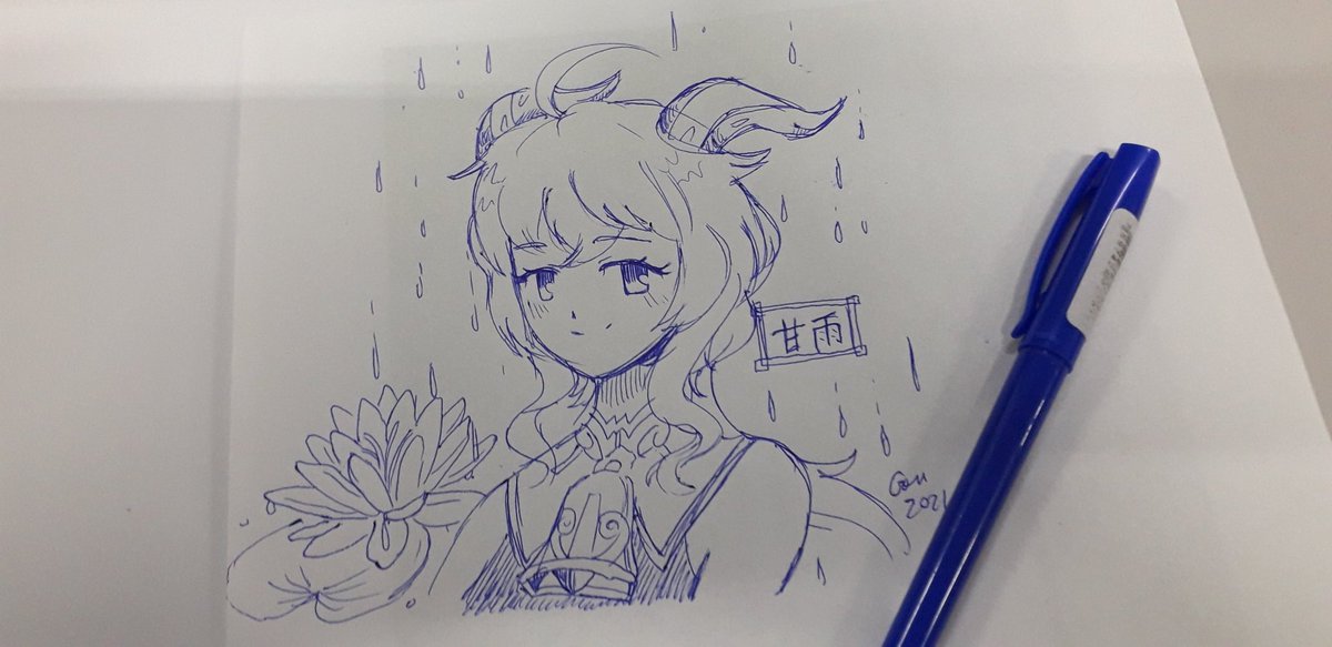
Originally I made this on paper, with a common ball pen. My old followers know that this is usually how I start a piece - I like to sketch it first to get a fuller idea of what I want to do. I started it in February 5th. 

Here I scanned and converted the lineart into binary, and started playing with colors. I have a basic palette I use for all my pieces. It helps me set the tone as I clean the lines. I edit these colors as I work on the piece, fine-tuning as I see fit. 

Here I start to play with ideas on how to lower color count. I don't do low color count pixelart on purpose, though - I do it because with fewer colors, you can tie them together and make them work well in the context. Here, her bodysuit shares colors with her face shading. 

As I shade elements, I refine the outlines and work on the cohesiveness of the palette. Here I already had the idea of making a piece with delicate hues - the hair color has become less saturated to fit better with the green shadows, which I also used for the lily pad. 

This is the first update after my notebook died - I made this at work. Here I decided to use pink for highlights, which was a highly pleasant color choice. It was also used to further smooth the skintones, giving the eyelashes a gentle feel. 


Detail on her bell. By reusing the existing colors, I was able to give it a shiny and colorful texture to it. 

Here, I did another bold choice - to fully ditch white from the palette. I knew that even though the eye would share the same color as the skin, the shading and our brain's perception would give the illusion that they were different enough. In pixelart, less is more. 

Here, I rendered the water lily flower and added water for it to float on. The raindrops were drawn as thin strings with several colors as to mimic a rainbow effect, and added a traditional mist pattern. This is called エ霞 (ekasumi) in Japan, due to its "エ" shape. 

The final piece. The name "甘雨" (Ganyu) was written vertically, as it was common in Sino-Japanese literature. That specific calligraphy is Seal Script and it seems to be the style favored in Genshin Impact's props, characterized by its geometrical style (screenshot from reddit). 


I hope that you enjoyed this thorough look on my creative process. I think it's nice to know what the artist was thinking while creating something. Art doesn't come out from nowhere, every aspect is influenced from somewhere. Thank you for reading to the end! #pixelart #ドット絵
@ThreadReaderApp unroll
• • •
Missing some Tweet in this thread? You can try to
force a refresh


