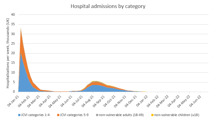
I’ve updated my model for recent news, and after a series of assumption changes that mostly net out, it still predicts a very small exit wave with ~4k additional deaths (reduced from 9k previously) – and with a small added dose of seasonality, no exit wave at all. 1/n
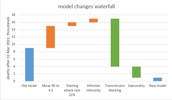
The key changes in the model are shown in the waterfall chart below, and explored in more detail in the thread that follows this summary. 2/n
This conclusion feels more solid than before, as no single-factor sensitivity (within plausible ranges of uncertainty) takes the exit-wave deaths over 10k- see 1st chart. To get significantly higher deaths I have to move multiple assumptions at the same time– see 2nd chart. 3/n
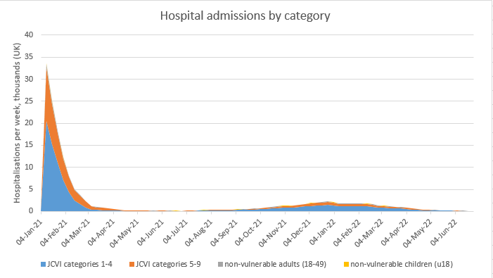
That’s the end of the summary – the remainder of this thread is for those interested in the details. First, a reminder of where we’re starting from: the old model predicted a small, slow-burning exit wave through this autumn with ~9k deaths. 4/n
My first change is to adjust R0 from 4.0 to 4.3. I don’t have much science for this, but my sense from comparing to other models is that I’m on the low end of the consensus. This change increases deaths in the exit wave to ~15k. 5/n
The second change is to nudge the starting attack rate (in Jan ’21) down to 21%, from 23%. Regular readers will note that I’m partly undoing a previous shift from 18% to 23%. I believe the 21% is consistent with ONS, MRC and other data; this takes deaths up to ~16k. 6/n
The third change is to switch from assuming that infection causes 100% sterilising immunity to 83% (consistent with SIREN data), with a further 9% getting partial immunity. This caused a *lot* of modelling work, but the impact is only another ~1k deaths (to ~17k) 7/n
The most significant change is to introduce an assumption that the lower viral loads in post-vaccination infections (and similarly reinfections) cause a 30% reduction in onward transmission. This reduces the size of the exit wave significantly, with deaths down to ~4k. 8/n
Finally, I am re-introducing an assumption of mild seasonality, with R0 reducing by c. 18% in mid-summer compared to mid-winter. This is enough to squash the exit wave, with just ~1k further deaths after the end of March (and most of those in April). 9/n
So, this is my new base case – with a very small or no exit wave. I’ve also updated the sensitivity analysis (using the no-seasonality case as a basis) – this shows that no single assumption change takes the exit-wave death toll over 10k. 10/n
To get larger movements, I’ve put the assumptions into 3 groups: one linked to R0 and infection, one linked to vaccine supply and take-up, and linked to vaccine efficacy. Only the last group has a large impact: over 30k deaths if all my VE assumptions are too optimistic. 11/n
Hence my conclusion is that while a large exit wave is still possible, it is looking increasingly unlikely, provided that we stick to the roadmap (roughly) as advertised, vaccine supply and take-up continues to be healthy, and that real-life vaccine efficacy turns out OK. 12/n
To finish, some brief comments on things the model doesn’t handle (the list is getting shorter as I gradually knock them off one by one, but there’s still a few there): 13/n
1) Firstly, heterogeneity of contacts &/or susceptibility could reduce the herd immunity threshold (HIT), but with people being vaccinated at random (and favouring older, less sociable groups) in my view this is unlikely to make a big difference in the UK this summer 14/n
2) On the other hand, spatial heterogeneity could make a difference – i.e. some local areas with lower vaccine uptake and attack rate &/or higher natural R0 could be further away from HIT and therefore susceptible to local outbreaks, even if UK as a whole is over its HIT. 15/n
3) The model makes no attempt to model ‘waning’ of immunity over time, or the potential impact of new variants that could fully or partially ‘escape’ the immunity that has built up so far. I hope to let you have some modelling of potential variant impacts after Easter. 16/n
And just to conclude with thanks to those who have helped me with advice on input-setting, assumptions and model design – you know who you are, and I won’t @ you here to avoid embarrassment and hate mail, but it’s much appreciated. Happy Easter everyone! /end

• • •

Missing some Tweet in this thread? You can try to force a refresh
 

Keep Current with James Ward

James Ward Profile picture

Stay in touch and get notified when new unrolls are available from this author!

Read all threads

This Thread may be Removed Anytime!

PDF

Twitter may remove this content at anytime! Save it as PDF for later use!

Try unrolling a thread yourself!

how to unroll video
  1. Follow @ThreadReaderApp to mention us!

  2. From a Twitter thread mention us with a keyword "unroll"
@threadreaderapp unroll

Practice here first or read more on our help page!

More from @JamesWard73

2 Apr
After yesterday’s model update () a few people have asked: so if there’s no exit wave, or just a small one, does that mean we could open up earlier? And the answer is: maybe, but it’s complicated. If you’re interested in the details, read on… 1/n
All of yesterday’s modelling assumed that we follow the government’s roadmap to 21st June, when we remove all remaining restrictions and controls, and behaviour returns to normal. (note that point: all controls removed on 21st June, it will become important later on). 2/n
But what happens if we vary this date? I’ve adjusted this in the model, bringing it back 1 week at a time up to 5th April, and also extending it the other way to 26th July, for completeness. As you can see (from blue line below), opening on 21st June looks OK, and you could 3/n Image
Read 15 tweets
24 Mar
I’ve spent a lot of time over the last 2 days going through the most recent paper thelancet.com/action/showPdf… from the Warwick modelling group that feeds into SAGE, and trying to work out why it predicts a large exit wave, when my model (mostly) doesn’t. My conclusions are: 1/12
1. Their model in fact doesn’t guarantee an exit wave: with fast vaccine rollout (4m per week) and high (85%) transmission blocking, and either high (85-95%) vaccine uptake or high (94%) protection vs. severe disease, there is no material exit wave - see the orange line 2/12
2. Their choice of central assumptions is (imo) consistently on the pessimistic side. In fact, my central assumptions frequently correspond closely to their “optimistic” upside scenario. To avoid a very long thread I’ve built a table that compares their assumptions to mine 3/12
Read 13 tweets
23 Mar
My “don’t panic” tweet from yesterday got a lot of traction – but today I’m going to recover my corona-centrist credentials by being more concerned. Again, this is mostly a story about LFDs and schools, and I’m not quite sure yet what to make of it. 1/n
Let’s start by looking at the short-term growth rates in different age groups, so we know where to drill down. They show a clear spike in 5-9 and 10-14 year olds, and maybe a hint of upwards pressure in their parents (35-40s). Cases are falling nicely in the over-80s. 2/n Image
Looking at the 5-9 year olds, we can see the spike on the 15th March which has then tailed away since – so as per my recent tweets, I’m getting less worried about this. We need to keep an eye on it, but it’s not an obvious problem right now. 3/n Image
Read 11 tweets
21 Mar
As it’s the weekend, I’m allowed to have some fun. So here’s the latest in my series of spurious-but-interesting political/covid correlation analyses. Last time we had: vote Labour, get covid. This time it’s: vote Conservative, get vaccinated! 1/n Image
(and please don’t @ me, I do realise why this is). In fact please take this as a subtweet of other analysis showing that vax rates are negatively correlated with covid infection levels, deprivation, or non-white ethnicity: if it’s not corrected for age, it’s meaningless. 2/n
Of course, what’s happening is that the vaccination rate is a near-perfect (92% correlation) proxy for average age. And the Conservative vote % is also strongly correlated (69%) to the average age of the constituency. 3/n ImageImage
Read 7 tweets
17 Mar
Lots of people asking: what does your model say about the delayed vaccine schedule? Can we still unlock on the planned dates?? So here goes with an emergency model update. Summary: don’t panic, it will be OK. 1/n
So just a reminder of my current model ‘base case’ (with R0 for the new variant now set to 4, following comparison with the Warwick/Imperial models). This has a relatively small ‘exit wave’ next winter, with ~10k deaths. 2/n
If we knock 10m doses out of the vaccine schedule in April (reducing my expected 4m per week estimate to 2m per week), we get a slightly stronger and earlier ‘exit wave’. But total deaths after March are not much higher at ~13k. 3/n
Read 13 tweets
16 Mar
As an addendum to this earlier post, some have asked whether similar analysis is available for hospitalisations and deaths, and if so, does it show the same pattern? Happily, I looked at this at the weekend, and the answer is: yes and no. 1/10
To start with, a quick note on methods. To compare cases, deaths and hospitalisations on the same chart we are constrained to use age groups for which hospital data is readily available i.e. 18-64, 65-84 and 85+. So I’ve used the (mostly unvaccinated) 18-64 group... 2/10
… as a benchmark for the other two groups, creating deviation charts similar to my earlier ones for cases. See below for the new charts for cases, admissions and deaths. But it will be more useful to compare the different data for the same age group on the same chart 3/10 ImageImageImage
Read 11 tweets

Did Thread Reader help you today?

Support us! We are indie developers!


This site is made by just two indie developers on a laptop doing marketing, support and development! Read more about the story.

Become a Premium Member ($3/month or $30/year) and get exclusive features!

Become Premium

Too expensive? Make a small donation by buying us coffee ($5) or help with server cost ($10)

Donate via Paypal Become our Patreon

Thank you for your support!

Follow Us on Twitter!