I bet you've never seen this graph. I haven't.

It's so interesting: just dividing the test done for the cases found the PREVIOUS week, we can see test pressure is NOT dependent on Epidemic spread BUT political intentions.

It's Madrid data, as we're currently working with.
One usual myth used by trølls and or government, sorry for the redundance, is claiming that is not that rising the number of test increases cases, BUT the raise in case forces increase in test.

It's FALSE.

It's EXACTLY THE OPPOSITE:
More test pressure when lower cases found.
For graph dummies, red line means up to 25 test/case-found are made with low spread, but only 5 during spike.

It should be a straight line, the more u find the more you search, or a Crisis Watch, curve related to Epidemic curve: u search even more when u find.

It's THE OPPOSITE
The political CREATION of the Xmas Irresponsibles is visible during December, specially around Xmas day. Pure political.

They kept rising the number of test donev despite the number of cases they find weren't growing.

THE FEAR MACHINE.

Fear Narrative needs a lot of trick.
1 extra issue we can add thru our True Infection thru Ct Madrid study, is this same cases found/test done, but with TRUE CASES

There's a remarkable different spike, it was used to create the clearly ARTIFICIAL 2nd wave
We've related about it with many other analysis: it's there
@stacey_rudin and @ClareCraigPath the brave women referent in social analysis would be interested in this.

It's good to see that manipulation this clear:
There's NO RATIONAL to do more test when less spread is found.
Except u have political intention: here, fear mongering.

• • •

Missing some Tweet in this thread? You can try to force a refresh
 

Keep Current with plaforscience

plaforscience Profile picture

Stay in touch and get notified when new unrolls are available from this author!

Read all threads

This Thread may be Removed Anytime!

PDF

Twitter may remove this content at anytime! Save it as PDF for later use!

Try unrolling a thread yourself!

how to unroll video
  1. Follow @ThreadReaderApp to mention us!

  2. From a Twitter thread mention us with a keyword "unroll"
@threadreaderapp unroll

Practice here first or read more on our help page!

More from @plaforscience

1 Apr
Twitter is build for noise.
Very often I need to Google my own old tweets, as TL is a dark, chaotic, bottomless pit.

I'm gathering here our team's
main original work, with their link and a little description, as an easy way to find them, both for me and anyone interested.
This is our statistically true daily infection reconstruction.
It uses the time from infection to death curve proportionally for each decease.

Deaths is the less manipulable series, and time curve is not disputed even among covidlievers.

April 2020

Variables affecting Rt in complex seasonality model.

It considers Climate, Previous/crossed Immunity, Biological Balance among respiratory viruses & Herd Immunity, showing seasonal HI threshold creation.

Valid for moderate climate (northern) hemisphere.

Read 8 tweets
31 Mar
The Madrid Region dossier we've been commenting lately is full of proofs of appalling intentions from our gov'ts.

The sheet on universal screenings shows the LACK of test confirmation after a positive.
The protocol includes not this step, and ONE positive is noted as 'Case'
There IS redundant check for NEGATIVES, as we see in the Close Contact protocol sheet.

Antigen negative is double checked thru PCR.
It also shows that EVEN negative test have quarantine consequences.

If every PCR+ mean case, without check, it means accepting ALL FALSE POSITIVES
But the worst antiscientifical manipulation, for me, hides in the footnote

PCR is specially recommended in LOW PREVALENCE SCREENINGS

There's a purely MATHEMATICAL rational for low prevalence suffering high proportion of False Positives, plain, non "covid is new" debatable truth
Read 5 tweets
30 Mar
We have shown the declared Madrid region lie in terms of active infections. Active infections were 40% lower than official Epidemic

It's NOT the only criteria present in reference document.

They also consider infectivity limits:
Ct>29 means NO INFECTIVE

As we can estimate Ct average, w total number of PCR+, we can calculate the number of 'cases' that were infective: according to gov't criteria!

The INFECTIVE Epidemic is not even half the Official.

All official cases were treated as DANGEROUS INFECTIVE.

They KNOW they weren't
Accumulated incidence in 14 days for Infective, hits 600 as max

Official was 1.000
Restrictions we're applied for that high number

We see clearly what we've told, the winter spike, specially so-called 2nd wave was GROSSLY EXAGGERATED thru testing policy catching old infections
Read 4 tweets
30 Mar
La Comunidad de Madrid ha publicado un documento con información sobre los Ct de los PCR positivos, que incluye un criterio para su interpretación.

Según ese documento LA PANDEMIA QUE NOS CUENTAN ES FALSA, en, al menos, un 40%

Y lo saben.

La oficial, en azul
La REAL, en rojo
El documento presenta una tabla de valores de CT semanales para las PCR positivas.
Incluye el % de positivos con Ct <20, >30 y el promedio de los positivos.
Es fácil calcular el % de piernas con CT 21-29.

Representamos las 3 franjas, 21-29 en negro.
Con estos 3 datos planteamos valores promedio para cada tramo

Consideramos la media del grupo <20 =20, probamos valores para >30 que produzcan Ct compatibles en la franja 21-29
El grupo >30 debe tener un promedio de 36, o la franja 21-29 arrojaría incompatibles Ct promedio >30
Read 10 tweets
29 Mar
THIS IS VERY IMPORTANT

Couple of days ago we get a Ct table from Madrid Region thru @DaFeid
Once we checked source we used it to analyse data, and the result is clear:

OUR GOV'Ts ARE INTENTIONALLY LYING US

They're telling an epidemic which THEY KNOW is 40% FAKE

Let's see how
The method.

Original table offers % of PCR+ for Ct <20, >30, and weekly Ct average.

First we deduce % of Ct 21-29. It's easy, the 3 series must add 100%.
We draw a graph with the 3 series, being 21-29 black.
Then we use week average to calculate average values for each frame.

We settle all <20 frame to a 20 value. It's the MOST CONSERVATIVE, with bias AGAINST manipulation. It minimises Ct for other 2 frames.
Read 11 tweets
28 Mar
There's enthusiasm in covidsphere over this study

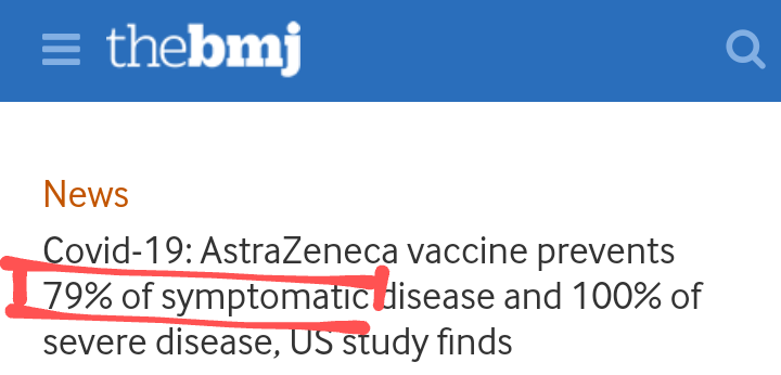
I really LOVE the 1s making emphasis in the 79% that will AVOID hospital attendance, cos the vax PREVENTS symptoms

For an illness cursing ASYMPTOMATIC in 80~85% of the cases it really doesn't look impressive

Except if u're dumb
Of course, the 100% protection is the good news. Surely it's not the perfect 0% risk, but I trust in very high protection.

Risk/benefit looks also good, vax sequels are extremely scarce, and some will be just only correlation, not dependent on jabbing.
The point is if universal vaxing makes any sense.

And it doesn't.

There's negligible risk for all under 60.
In that ages, vaxing protects you from something you are already over 99% protected.

Enthusiasm for protection you NATURALLY have is only a sign of irrational fear.
Read 5 tweets

Did Thread Reader help you today?

Support us! We are indie developers!


This site is made by just two indie developers on a laptop doing marketing, support and development! Read more about the story.

Become a Premium Member ($3/month or $30/year) and get exclusive features!

Become Premium

Too expensive? Make a small donation by buying us coffee ($5) or help with server cost ($10)

Donate via Paypal Become our Patreon

Thank you for your support!

Follow Us on Twitter!