Great marketers steal.
If there is any brand you should steal email marketing tactics from -- it's Airbnb.
They use it to perfection to acquire users and retain them.
Steal these 7 emails 🧵
If there is any brand you should steal email marketing tactics from -- it's Airbnb.
They use it to perfection to acquire users and retain them.
Steal these 7 emails 🧵

1. Welcome Email
You just signed up for an Airbnb account.
Here’s the next email you’ll receive.
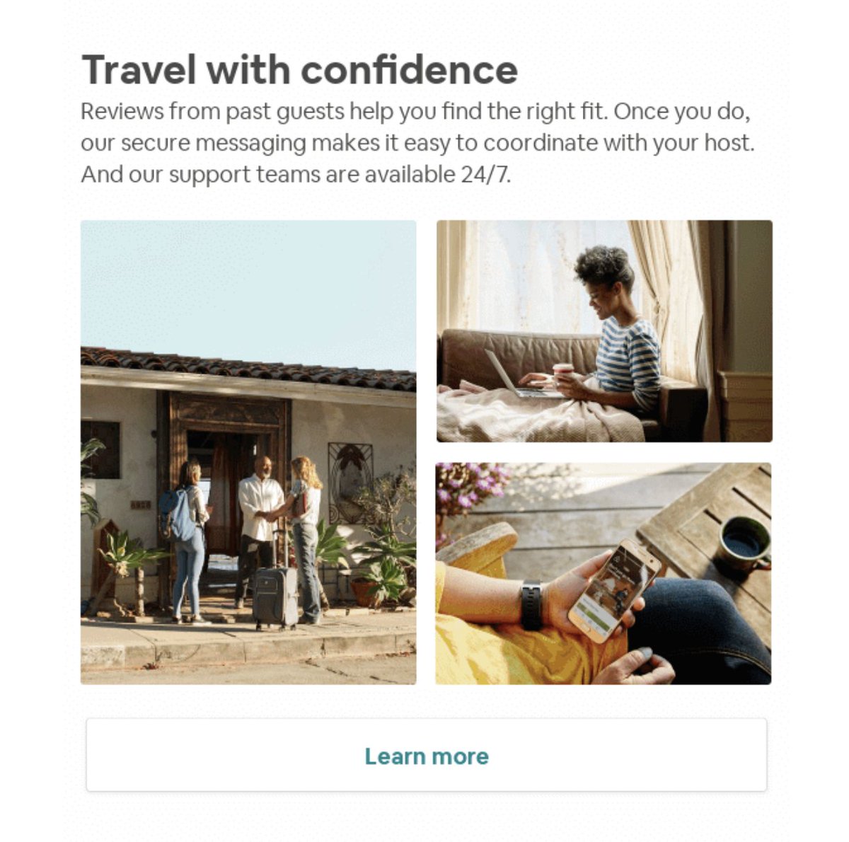
A welcome email that:
- Gives you a glimpse into a stay and experience (above the fold)
- Shows you social proof w/ guests & hosts in the photos (notice they’re all smiling)


You just signed up for an Airbnb account.
Here’s the next email you’ll receive.
A welcome email that:
- Gives you a glimpse into a stay and experience (above the fold)
- Shows you social proof w/ guests & hosts in the photos (notice they’re all smiling)


- Tells you what to do (find a home)
- Tells you not to worry (kills doubt)
- Shows you how to become a host
Your welcome email should be a helluva experience.
It should:
- Explain process/product
- Answer questions
- Provide value
- Kill Doubt
- Tells you not to worry (kills doubt)
- Shows you how to become a host
Your welcome email should be a helluva experience.
It should:
- Explain process/product
- Answer questions
- Provide value
- Kill Doubt
2. Emotionally Driven
Airbnb knows how to drive emotions through emails
How many times do you say “I dream of doing x or going to x”
Now, look at their headline and imagery.
Unique stays in unique places + stunning photography.
Perfect for creating desire and wanderlust.


Airbnb knows how to drive emotions through emails
How many times do you say “I dream of doing x or going to x”
Now, look at their headline and imagery.
Unique stays in unique places + stunning photography.
Perfect for creating desire and wanderlust.


Here's how they want it to go:
The emotions start cranking.
You envision the experience.
They show you how to make it reality.
You make it happen.
The emotions start cranking.
You envision the experience.
They show you how to make it reality.
You make it happen.
3. Enhance Experience
Airbnb understands how important it is for you to have a good experience through Airbnb.
They do everything they can to make that happen.
This email is a perfect example:
You just booked a trip to SF.
The Airbnb is all set.
Now, what to do in SF?


Airbnb understands how important it is for you to have a good experience through Airbnb.
They do everything they can to make that happen.
This email is a perfect example:
You just booked a trip to SF.
The Airbnb is all set.
Now, what to do in SF?


No problem.
Airbnb made an itinerary for you with a bunch of fun activities.
As a traveler, this makes your life simple.
It’s a literal guide to a good time.
Good experience = happy customer.
Happy customer = retention.
Airbnb made an itinerary for you with a bunch of fun activities.
As a traveler, this makes your life simple.
It’s a literal guide to a good time.
Good experience = happy customer.
Happy customer = retention.
4. 2-way referral
I wrote about this before.
PayPal did this.
Dropbox did this.
Airbnb uses a two-sided-referral system.
A friend signs up using your code -> they book something -> you get $30
Your friend signs up -> he gets $30 in free travel credit
Both parties win.
I wrote about this before.
PayPal did this.
Dropbox did this.
Airbnb uses a two-sided-referral system.
A friend signs up using your code -> they book something -> you get $30
Your friend signs up -> he gets $30 in free travel credit
Both parties win.

This referral loop follows the model for viral user acquisition.
5. Impressions matter.
The way you intro a new product, experience, or feature, is important.
It can be the difference between it gaining traction or dying.
Here’s how Airbnb did it:
First, their subject line is: Our secret’s finally out.
Enticing.
You open it.


The way you intro a new product, experience, or feature, is important.
It can be the difference between it gaining traction or dying.
Here’s how Airbnb did it:
First, their subject line is: Our secret’s finally out.
Enticing.
You open it.


Their headline: Book more than just homes
You’ve been booking unique homes. Now match it with unique experiences.
The imagery: Authentic experiences
Don’t just live like a local but experience the destination like a local.
You’ve been booking unique homes. Now match it with unique experiences.
The imagery: Authentic experiences
Don’t just live like a local but experience the destination like a local.
6. Retention
Airbnb put’s an emphasis on retaining a user.
One way they do this is by delighting users with a “thank you”
Here’s how they do it:
- You checked in for your first business trip
- As a thank you, here’s $50 for your next trip
Airbnb put’s an emphasis on retaining a user.
One way they do this is by delighting users with a “thank you”
Here’s how they do it:
- You checked in for your first business trip
- As a thank you, here’s $50 for your next trip

Now, the user has $50 sitting in their AirBnB account waiting to be used.
And trust me, they’re going to use it.
And trust me, they’re going to use it.
7. Relevance
When covid hit, traveling was put on a halt overnight.
Hosts who made an additional income from Airbnb didn’t know what to do.
So, Airbnb showed up big.
They consistently provided content, info, and ideas for hosts to continue to make money.


When covid hit, traveling was put on a halt overnight.
Hosts who made an additional income from Airbnb didn’t know what to do.
So, Airbnb showed up big.
They consistently provided content, info, and ideas for hosts to continue to make money.


They provided them with a strategy to maneuver through these times.
They understood the situation and helped alleviate the pain.
Amazing.
They understood the situation and helped alleviate the pain.
Amazing.
Would this help you?
- marketing breakdowns
- copywriting tips
- how-tos
- campaign dissection
If so, follow @alexgarcia_atx :)
Because I'm writing a thread for 27 days straight covering everything marketing.
- marketing breakdowns
- copywriting tips
- how-tos
- campaign dissection
If so, follow @alexgarcia_atx :)
Because I'm writing a thread for 27 days straight covering everything marketing.
It's also a daily newsletter that I send to 2k+ marketers. (over 50% of them open it daily)
Join them 👇
bit.ly/3flYp6b
Join them 👇
bit.ly/3flYp6b
Airbnb email marketing tactics:
1. Killer welcome email
2. Focus on driving an emotion
3. Enhance the experience
4. 2-way referral
5. Intro w/ value
6. Focus on retention
7. Be relevant (and show up)
1. Killer welcome email
2. Focus on driving an emotion
3. Enhance the experience
4. 2-way referral
5. Intro w/ value
6. Focus on retention
7. Be relevant (and show up)
Use these 7 hacks to create high converting squeeze pages and landing pages to collect emails
https://twitter.com/alexgarcia_atx/status/1383604271766065156
• • •
Missing some Tweet in this thread? You can try to
force a refresh


