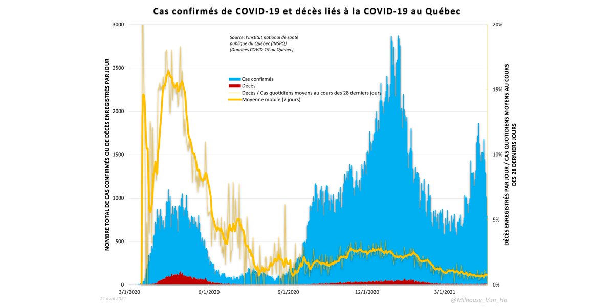
Greater Toronto update (thread).
#covid19 #covid19toronto #covid19ontario
City of Toronto cases, hospitalizations, deaths.
#covid19 #covid19toronto #covid19ontario
City of Toronto cases, hospitalizations, deaths.

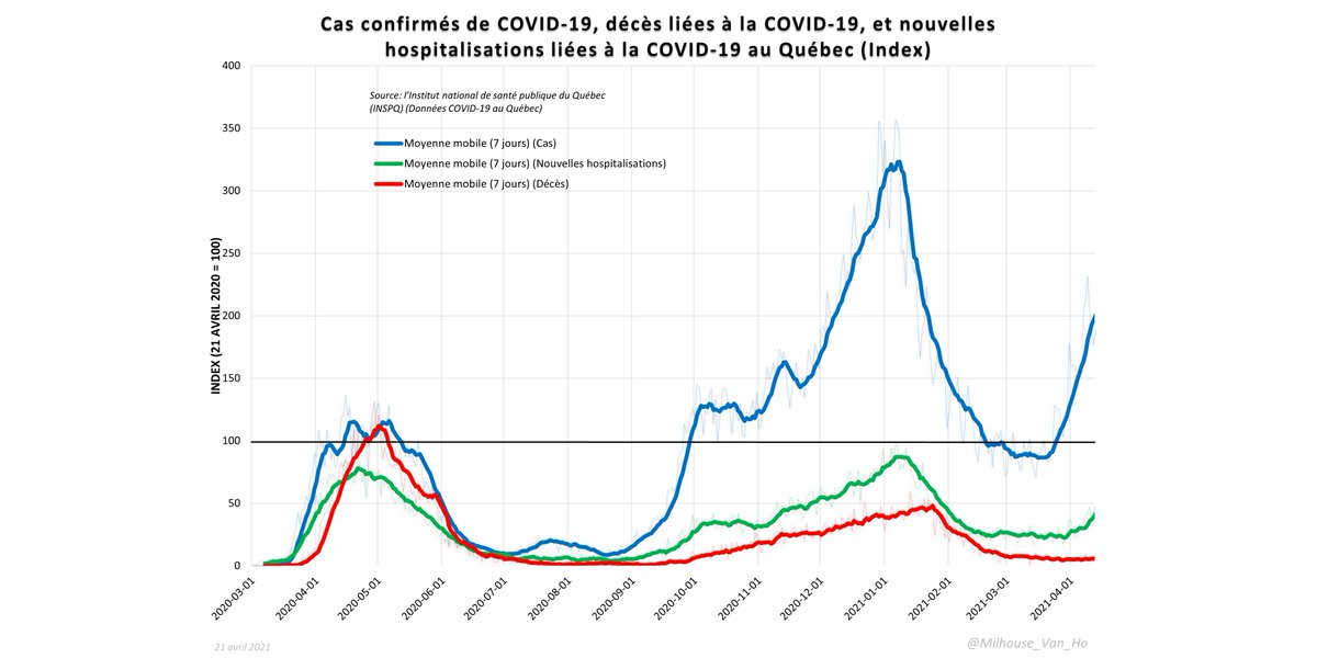
GTA cases, hospitalizations, and deaths, indexed to values 1 year earlier. The black line (index = 100) is where we were 365 days ago (all values indexed to values on that date).
(Below black bar = lower than one year ago today; Above black bar = higher than one year ago today)
(Below black bar = lower than one year ago today; Above black bar = higher than one year ago today)

• • •
Missing some Tweet in this thread? You can try to
force a refresh


