Masterclass, SmileDirect Club, and SendFox all have KILLER above the fold sections.
Why does this matter?
Nearly 80% of a users' viewing time on your site is spent above the fold.
This makes it essential to conversions.
Let's optimize yours in 3 min 🧵
Why does this matter?
Nearly 80% of a users' viewing time on your site is spent above the fold.
This makes it essential to conversions.
Let's optimize yours in 3 min 🧵
Your above-the-fold should follow an organized visual hierarchy.
This tells your consumer what to focus on and how to progress through the content.
Many readers scan in an F-pattern.
Use these 6 tips to develop a visual hierarchy:
(h/t wordstream)
This tells your consumer what to focus on and how to progress through the content.
Many readers scan in an F-pattern.
Use these 6 tips to develop a visual hierarchy:
(h/t wordstream)

Here are the essentials:
Headline (left side) - Drop your main value prop
Subheadline - Compliments headline. Introduces product/service. How value prop comes to life.
Creative - Show product or people. Helps bring context to life.
CTA - Focus on the value after signing up.
Headline (left side) - Drop your main value prop
Subheadline - Compliments headline. Introduces product/service. How value prop comes to life.
Creative - Show product or people. Helps bring context to life.
CTA - Focus on the value after signing up.
Social Proof - Can be done through creative or underneath CTA
Your above-the-fold should leave the consumer eager to keep scrolling.
Here people do judge a book by its cover.
Don't screw it up.
Your above-the-fold should leave the consumer eager to keep scrolling.
Here people do judge a book by its cover.
Don't screw it up.
1. Masterclass
Masterclass does a killer job at showing you that you’re getting taught by the best.
Fast-paced video that’s engaging.
World-renown individuals. (Social proof & influencers)
Shows an inside look at the quality of the product.
Masterclass does a killer job at showing you that you’re getting taught by the best.
Fast-paced video that’s engaging.
World-renown individuals. (Social proof & influencers)
Shows an inside look at the quality of the product.
The headline could be better though.
“Today’s the day” does not pass the Amazon “So What” test.
It doesn’t describe the main value prop.
Instead, I’d use “Master your craft by learning from the best”
Then my sub-headline would intro and describe the product and process.
“Today’s the day” does not pass the Amazon “So What” test.
It doesn’t describe the main value prop.
Instead, I’d use “Master your craft by learning from the best”
Then my sub-headline would intro and describe the product and process.
The CTA is worth noting.
Masterclass first collects your email then directs you to a checkout page.
They do this intentionally.
If you don’t convert at the checkout, then best believe you’re entering an email drip and getting re-targeted on FB/IG/YT.
Masterclass first collects your email then directs you to a checkout page.
They do this intentionally.
If you don’t convert at the checkout, then best believe you’re entering an email drip and getting re-targeted on FB/IG/YT.
Underneath i is the social proof that lets you know this is forreal.
1. Smile Direct Club
Great headline.
It addresses the main value prop - Smile you’ll love
It addresses the price - $3/ a day (sounds better than $90/m)
Subheadline also gets the job done.
It describes the process behind the value prop. (100% from home & in 4-6 months)
Great headline.
It addresses the main value prop - Smile you’ll love
It addresses the price - $3/ a day (sounds better than $90/m)
Subheadline also gets the job done.
It describes the process behind the value prop. (100% from home & in 4-6 months)
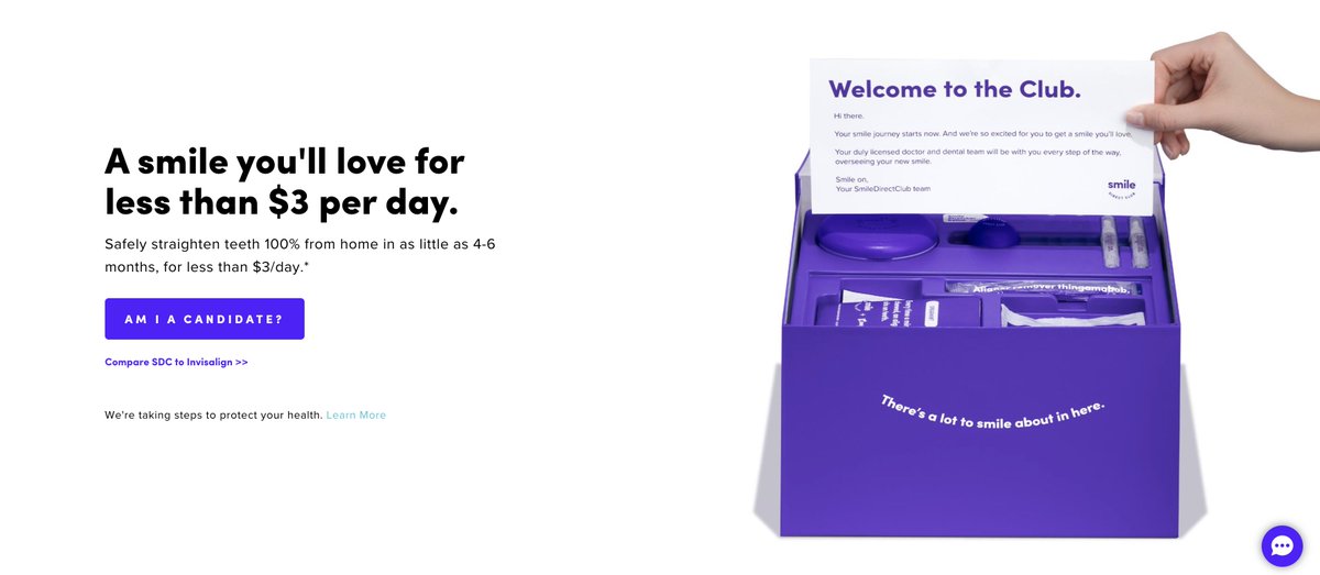
CTA is a cliffhanger.
It all sounds great, but…does it work for you?
The product image is A1.
It showcases the product.
Plus, the welcome card reassures you that you’ll have a team with you.
Social proof is missing, though :/
Could use: "101,898 love their smile now."
It all sounds great, but…does it work for you?
The product image is A1.
It showcases the product.
Plus, the welcome card reassures you that you’ll have a team with you.
Social proof is missing, though :/
Could use: "101,898 love their smile now."
3. Sendfox
I love this one by SendFox.
Their headline is one of the best I’ve seen.
It addresses 5 different pain points that would hold a creator back from starting a newsletter.
I love this one by SendFox.
Their headline is one of the best I’ve seen.
It addresses 5 different pain points that would hold a creator back from starting a newsletter.
The first 4 words remain the same while the bottom word interchanges with diff problems the creator would face.
- No money
- No subscribers
- No website
- No time
- No knowledge
And each sub-headline interchanges with each problem.
- No money
- No subscribers
- No website
- No time
- No knowledge
And each sub-headline interchanges with each problem.
Plus, It clearly answers how SendFox makes it happen.
Underneath the headline, six diff testimonials that address the solved problem.
Every aspect compliments the other.
Above the CTA, more social proof.
The exact number of creators using SendFox.
Underneath the headline, six diff testimonials that address the solved problem.
Every aspect compliments the other.
Above the CTA, more social proof.
The exact number of creators using SendFox.
Would this help you?
- marketing breakdowns
- copywriting tips
- how-tos
- campaign dissection
If so, follow @alexgarcia_atx :)
Because I'm writing a thread for 18 days straight covering everything marketing.
- marketing breakdowns
- copywriting tips
- how-tos
- campaign dissection
If so, follow @alexgarcia_atx :)
Because I'm writing a thread for 18 days straight covering everything marketing.
It's also a daily newsletter that I send to 3700+ marketers. (over 50% of them open it daily)
Join them 👇
bit.ly/3flYp6b
Join them 👇
bit.ly/3flYp6b
TL;DR
Essentials to Above-The-Fold:
1. Value prop-driven headline
2. Product/process intro + compliments headline
3. Creative shows product/people
4. CTA should remind ppl of value prop
5. Social proof reassures them
Essentials to Above-The-Fold:
1. Value prop-driven headline
2. Product/process intro + compliments headline
3. Creative shows product/people
4. CTA should remind ppl of value prop
5. Social proof reassures them
• • •
Missing some Tweet in this thread? You can try to
force a refresh
