Referral Programs work.
PayPal used one to acquire 100m users.
DropBox used it to grow 3900% in 15 months.
Airbnb generated 900% YoY growth for 1st-time bookings.
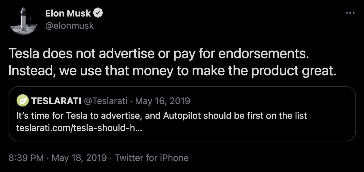
@elonmusk says one customer should generate three.
Here are 6 referral programs you should steal 🧵
PayPal used one to acquire 100m users.
DropBox used it to grow 3900% in 15 months.
Airbnb generated 900% YoY growth for 1st-time bookings.
@elonmusk says one customer should generate three.
Here are 6 referral programs you should steal 🧵
1. PayPal
The OG referral program.
When PayPal was starting out, they gave money away to new users and referred users.
It worked so well they had to reduce the amount of money they gave away.
At, first PayPal gave you $20 for signing up. And $20 to anyone you referred.
The OG referral program.
When PayPal was starting out, they gave money away to new users and referred users.
It worked so well they had to reduce the amount of money they gave away.
At, first PayPal gave you $20 for signing up. And $20 to anyone you referred.
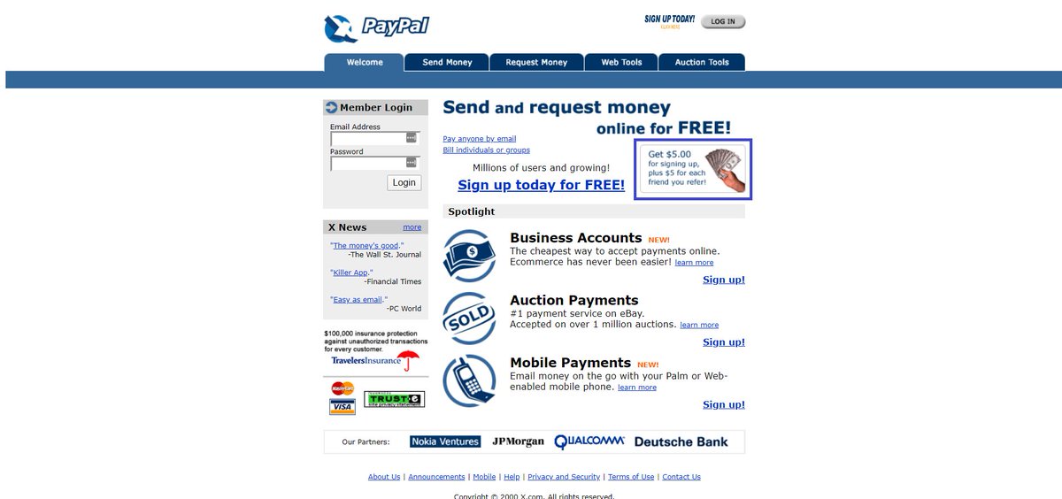
They then dropped it to $10.
Still, very successful, but they dropped it down to $5.
According to @elonmusk, PayPal spent roughly $60m on their referral incentives.
For PayPal, the daily growth rate was 7 - 10%. Plus, the user base surpassed 100m users.
Still, very successful, but they dropped it down to $5.
According to @elonmusk, PayPal spent roughly $60m on their referral incentives.
For PayPal, the daily growth rate was 7 - 10%. Plus, the user base surpassed 100m users.
Musk compared it to bacteria in a Petri dish.
Your referral program needs to expand quickly, and it has to happen fast.
Free money makes that happen.
Your referral program needs to expand quickly, and it has to happen fast.
Free money makes that happen.
2. Tesla
Again, ‘The Technoking of Tesla’ aka @elonmusk in the referral musk.
They gave away money at PayPal…why not Tesla too?
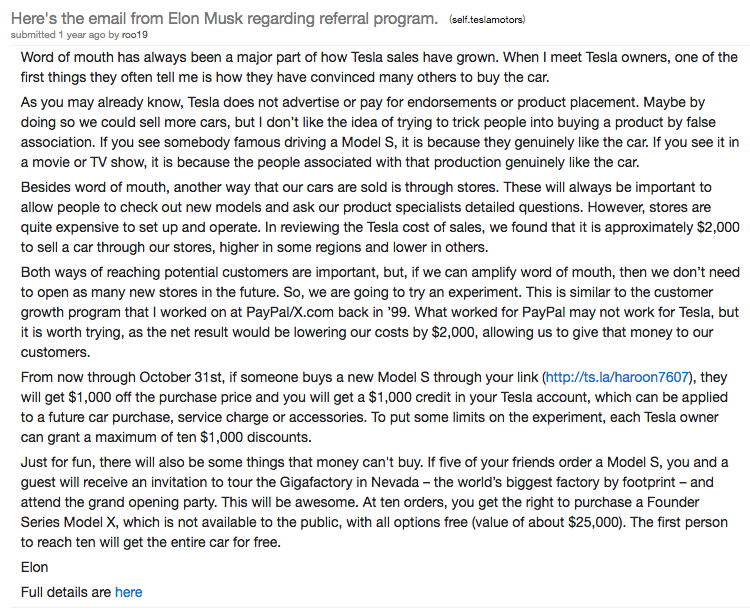
Tesla gave away $1000 per successful referral, access to exclusive events, and a “founder series” Model X.
Again, ‘The Technoking of Tesla’ aka @elonmusk in the referral musk.
They gave away money at PayPal…why not Tesla too?
Tesla gave away $1000 per successful referral, access to exclusive events, and a “founder series” Model X.
Here’s what Tesla did:
- They gave $1000 to Tesla owners whose referrals resulted in the purchase of a Model S.
- The friend would also get $1000
Plus, Tesla fans aren’t just any fans — they’re raving fans who are obsessed with Tesla’s every move.
So, Tesla incentivized them:
- They gave $1000 to Tesla owners whose referrals resulted in the purchase of a Model S.
- The friend would also get $1000
Plus, Tesla fans aren’t just any fans — they’re raving fans who are obsessed with Tesla’s every move.
So, Tesla incentivized them:
- Get 5 referrals and you’ll get an invite to the Gigafactory grand opening party.
- Get 10 referrals and you’ll get the right to purchase a special “founder series” Model X
DAMN.
- Get 10 referrals and you’ll get the right to purchase a special “founder series” Model X
DAMN.
3. DropBox
DropBox followed in the footsteps of PayPal.
They also created a 2-sided referral program.
Here’s how it went:
- You sign-up and receive free storage in the cloud.
- Refer a friend and you get 500MB of free storage.
- Your friend gets 500MB of free storage
DropBox followed in the footsteps of PayPal.
They also created a 2-sided referral program.
Here’s how it went:
- You sign-up and receive free storage in the cloud.
- Refer a friend and you get 500MB of free storage.
- Your friend gets 500MB of free storage
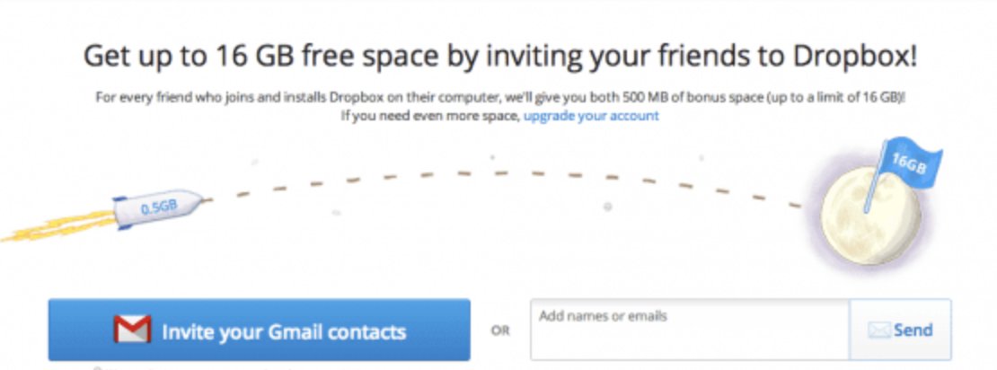
Do this until you reach 16 GB in free storage.
The key was both parties winning.
The results speak for themselves:
- 100k Users in Sept 2008 -> 4m users by Dec 2009
- 3900% growth in 15 months
- 2x its user base every 3 months for 15 months
The key was both parties winning.
The results speak for themselves:
- 100k Users in Sept 2008 -> 4m users by Dec 2009
- 3900% growth in 15 months
- 2x its user base every 3 months for 15 months
4. Airbnb
Getting paid to travel? Imagine that.
Airbnb made it happen.
They launched V 1.0 of their referral program in 2011.
How it worked:
- Refer a friend, and you’ll receive $25 when they take a trip
- Refer a friend, and you’ll receive $75 when they rent out their place
Getting paid to travel? Imagine that.
Airbnb made it happen.
They launched V 1.0 of their referral program in 2011.
How it worked:
- Refer a friend, and you’ll receive $25 when they take a trip
- Refer a friend, and you’ll receive $75 when they rent out their place
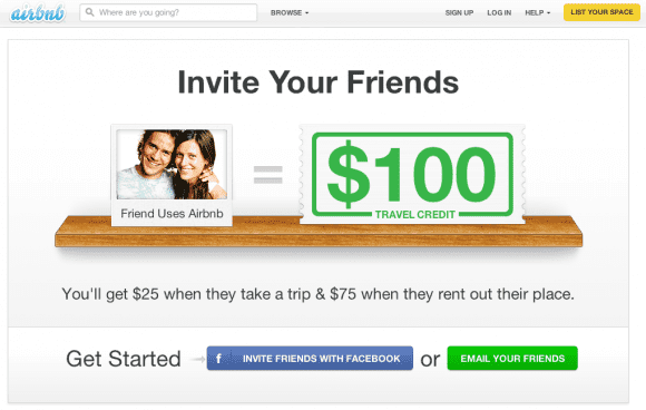
After seeing the success, they scratched V 1.0 and launched V 2.0.
Version 2.0 focused on distribution and driving awareness to their referral program.
They added things like:
- Direct invites via email
- Importing contacts
- Header to their site
Version 2.0 focused on distribution and driving awareness to their referral program.
They added things like:
- Direct invites via email
- Importing contacts
- Header to their site
The referral incentives remained the same.
And the results are mad: Referrals drove 900% year-on-year growth for 1st-time bookings
And the results are mad: Referrals drove 900% year-on-year growth for 1st-time bookings
5. Amazon Prime
Amazon Prime had an epic referral program.
A survey showed that Prime Members:
- Spent 2x as much as non-Prime members
- They also order more frequently than non-prime members
It was simple.
Amazon Prime had an epic referral program.
A survey showed that Prime Members:
- Spent 2x as much as non-Prime members
- They also order more frequently than non-prime members
It was simple.
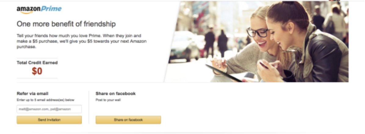
Refer a friend, and when they make a purchase over $5, you’ll get $5 to spend on Amazon.
It’s genius.
You get $ that you’ll eventually spend using Amazon.
You know that Espresso Floating Side Table you’ve been eyeing for weeks?
Refer enough friends, and it's all yours.
It’s genius.
You get $ that you’ll eventually spend using Amazon.
You know that Espresso Floating Side Table you’ve been eyeing for weeks?
Refer enough friends, and it's all yours.
IMO: It could’ve been better if it was 2-sided. Ex: Friend also receives $5 for spending more than $5.
6. Google
Of course, why would the most visited site in the world not have a referral program?
A badass one at that.
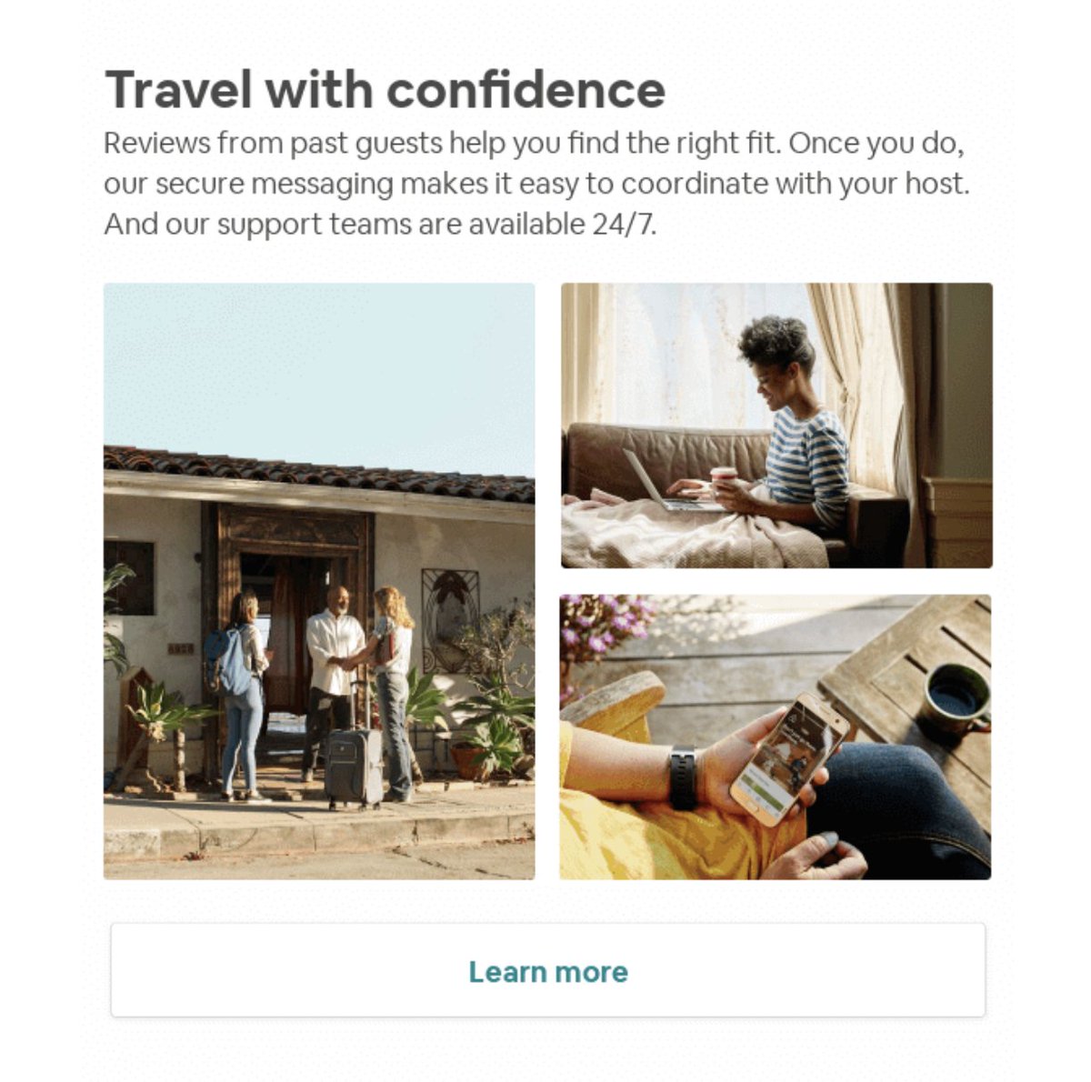
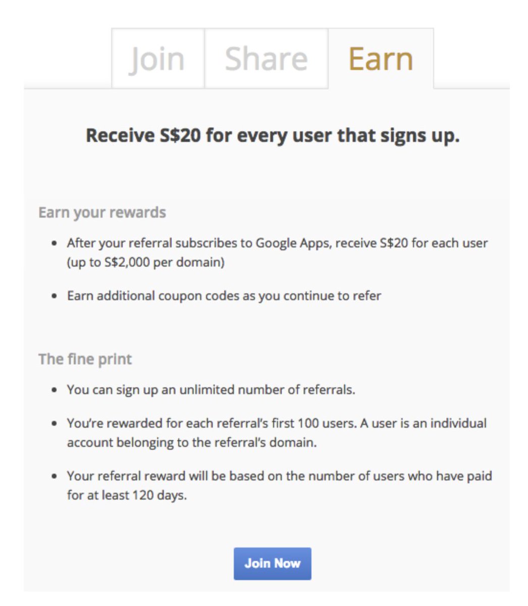
Their goal was to drive users to their Google Apps.
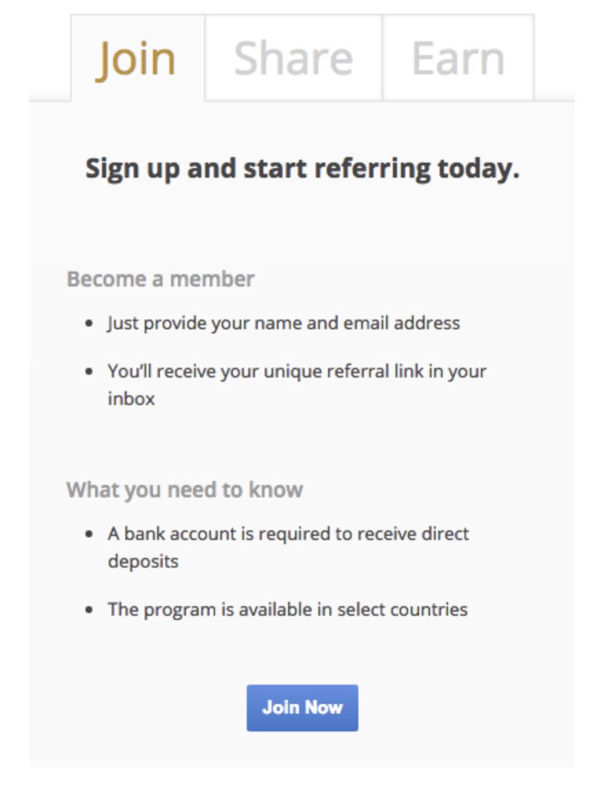
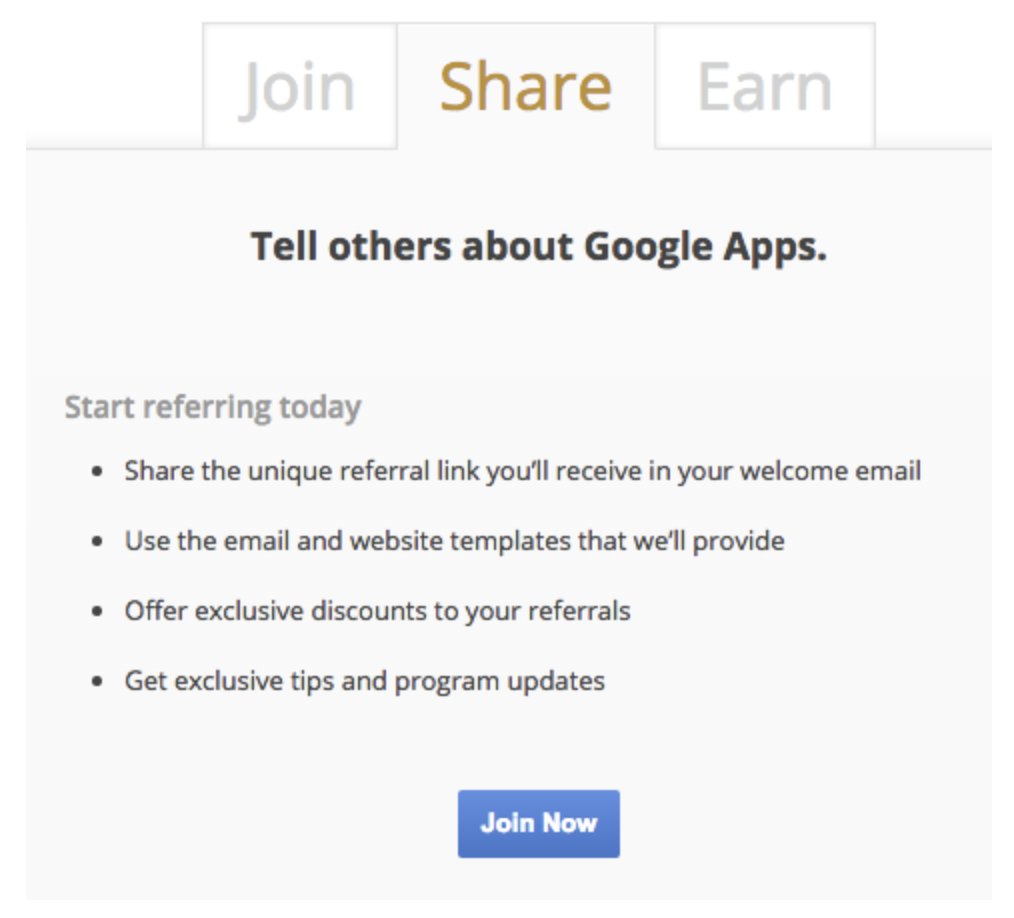
So, Google created 3 easy to navigate panels to tell you how to partake.
Of course, why would the most visited site in the world not have a referral program?
A badass one at that.
Their goal was to drive users to their Google Apps.
So, Google created 3 easy to navigate panels to tell you how to partake.
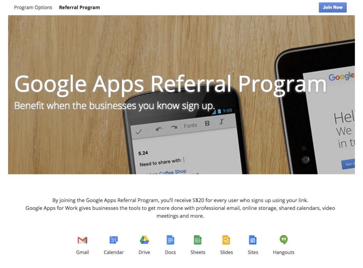
Here’s how it worked:
- For every user who signed up through your referral link, you would get $20
- You can do this until you reach $2000
Plus, a few days later, you’d receive an additional 20% off for the first year of Google Apps.


- For every user who signed up through your referral link, you would get $20
- You can do this until you reach $2000
Plus, a few days later, you’d receive an additional 20% off for the first year of Google Apps.
Would this help you?
- marketing breakdowns
- copywriting tips
- how-tos
- campaign dissection
If so, follow @alexgarcia_atx :)
Because I'm writing a thread for 20 days straight covering everything marketing.
- marketing breakdowns
- copywriting tips
- how-tos
- campaign dissection
If so, follow @alexgarcia_atx :)
Because I'm writing a thread for 20 days straight covering everything marketing.
It's also a daily newsletter that I send to 2800+ marketers. (over 50% of them open it daily)
Join them 👇
bit.ly/3flYp6b
Join them 👇
bit.ly/3flYp6b
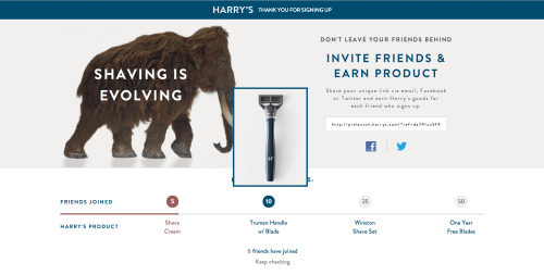
Harry's referral program is a case study in itself.
I'll have to drop a thread on it.
But here's a quick look
I'll have to drop a thread on it.
But here's a quick look
• • •
Missing some Tweet in this thread? You can try to
force a refresh
