Patagonia is a $1B powerhouse that encourages you not to buy their products.
@patagonia's CEO Rose Marcario calls it "Cause Marketing."
The result is a brand that consumers love to embody.
Steal these 8 marketing tactics from Patagonia 🧵
@patagonia's CEO Rose Marcario calls it "Cause Marketing."
The result is a brand that consumers love to embody.
Steal these 8 marketing tactics from Patagonia 🧵
1. Mission
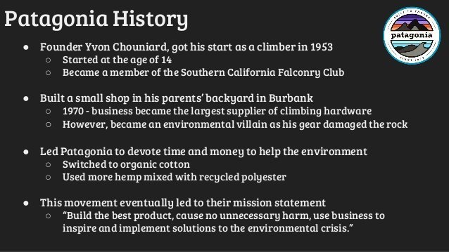
It starts with Patagonia’s mission statement.
“Build the best product, cause no unnecessary harm, use business to inspire and implement solutions to the environmental crisis.
Nearly every Patagonia marketing initiative follows in the footsteps of its mission.
It starts with Patagonia’s mission statement.
“Build the best product, cause no unnecessary harm, use business to inspire and implement solutions to the environmental crisis.
Nearly every Patagonia marketing initiative follows in the footsteps of its mission.
This attracts consumers who have similar values.
Customers with similar values open the floor to a long-term relationship with their consumers.
Inherently increasing Patagonia’s customer lifetime value.
Customers with similar values open the floor to a long-term relationship with their consumers.
Inherently increasing Patagonia’s customer lifetime value.
2. User Experience
Advertising in the traditional sense is a dead beat to Patagonia.
Instead, their focus is on the UX that advertises itself.
This includes:
- Built to last equipment
- Lifetime guarantee
- Reducing the environmental footprint
This advertises itself.
Advertising in the traditional sense is a dead beat to Patagonia.
Instead, their focus is on the UX that advertises itself.
This includes:
- Built to last equipment
- Lifetime guarantee
- Reducing the environmental footprint
This advertises itself.
3. Purposeful Advertising
In your face ads from Patagonia aren’t happening.
They’re not here to compete with the HMs or American Eagles for screen space.
Instead, their advertising aims to educate, inform, and inspire you.
In your face ads from Patagonia aren’t happening.
They’re not here to compete with the HMs or American Eagles for screen space.
Instead, their advertising aims to educate, inform, and inspire you.
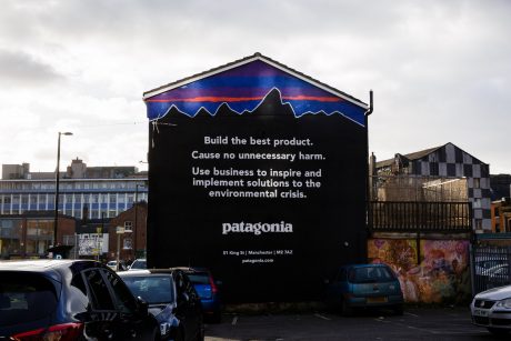
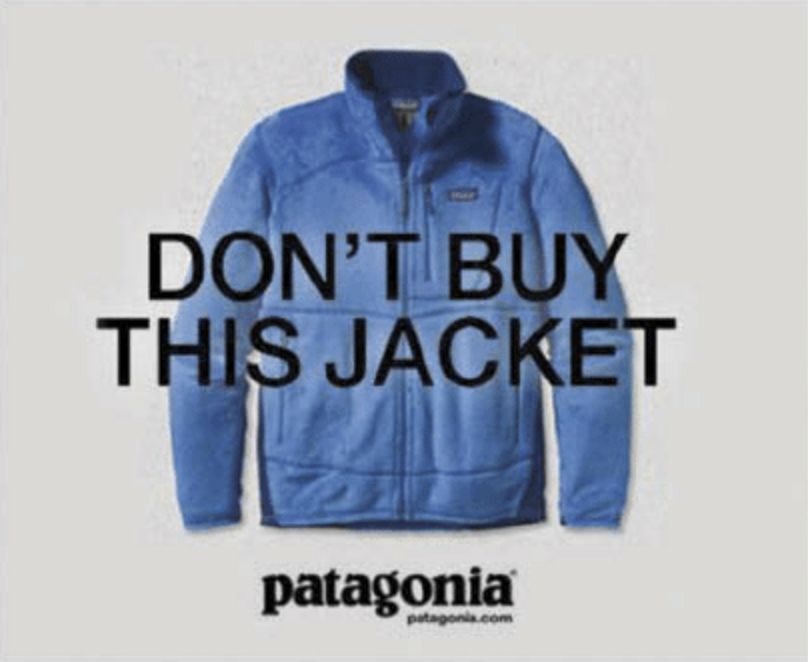
Whether a mural in London with their mission statement or The New York Times ad that read “Don’t Buy This Jacket” you will never see an ad that pushes you to buy the product.
Instead, it gets consumers to understand their mission and values in hope of you joining them.
Instead, it gets consumers to understand their mission and values in hope of you joining them.
4. Inclusive
Patagonia aims to create a connection between the company’s culture and customers' values.
How does Patagonia do this?
With their “Worn Wear Pop-Up Shop”
Here customers trade in their old gear.
The best pieces get sold through a “Worn Wear” product line.
Patagonia aims to create a connection between the company’s culture and customers' values.
How does Patagonia do this?
With their “Worn Wear Pop-Up Shop”
Here customers trade in their old gear.
The best pieces get sold through a “Worn Wear” product line.
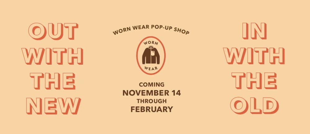
The rest gets “recrafted” into new apparel.
Customers who do this get in-store credit.
Patagonia’s “Worn Wear Pop-Up Shop” isn’t just a one-time thing.
They go on tour hitting up different US cities.
This inclusive experience drives customer advocacy.
Customers who do this get in-store credit.
Patagonia’s “Worn Wear Pop-Up Shop” isn’t just a one-time thing.
They go on tour hitting up different US cities.
This inclusive experience drives customer advocacy.
5. Customer Loyalty Program
Patagonia’s “Common Threads Initiative” loyalty program is mission-based.
It focuses its efforts on reducing its environmental footprint.
When you join the initiative as a customer you are promising to:
Patagonia’s “Common Threads Initiative” loyalty program is mission-based.
It focuses its efforts on reducing its environmental footprint.
When you join the initiative as a customer you are promising to:

This is another step in Patagonia’s journey of promoting environmental awareness.
Patagonia’s VP of marketing said in 2011 that, “Clear is the new clever for marketers. If you tell a customer exactly what you’re doing, it becomes a human company, it’s no longer a label.”
Patagonia’s VP of marketing said in 2011 that, “Clear is the new clever for marketers. If you tell a customer exactly what you’re doing, it becomes a human company, it’s no longer a label.”
6. Employee Generated Content
Employees are Patagonia’s best brand advocates.
They constantly highlight the folks building the company.
How?
They publish A TON of content on their “corporate” blog about their employees and how they embody the eco-friendly lifestyle brand.
Employees are Patagonia’s best brand advocates.
They constantly highlight the folks building the company.
How?
They publish A TON of content on their “corporate” blog about their employees and how they embody the eco-friendly lifestyle brand.
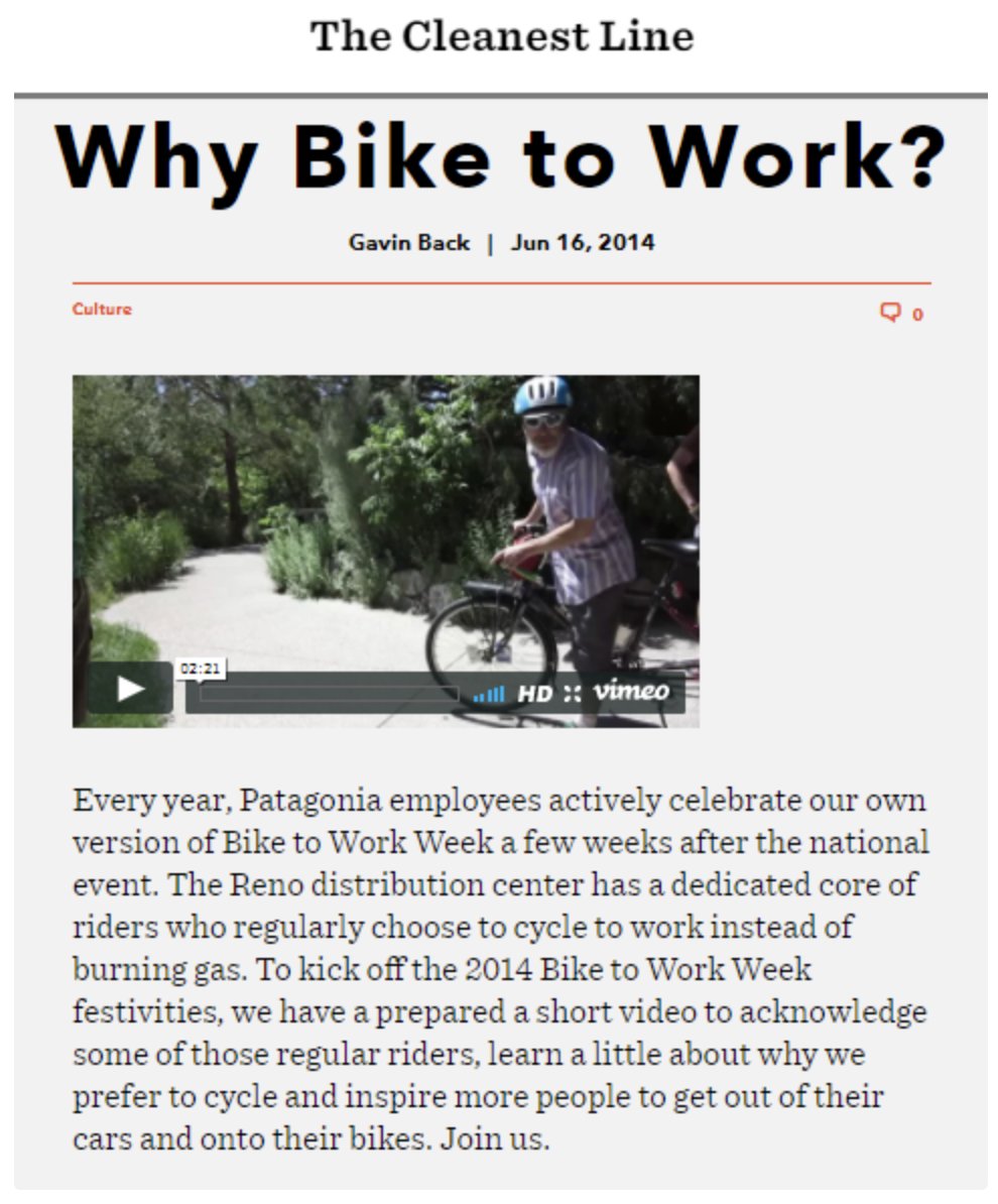
By using employee-generated content, Patagonia reinforces its company’s culture and values.
This creates a positive perception of the brand.
This wins over customers and quality new hires.
This creates a positive perception of the brand.
This wins over customers and quality new hires.
7. User-Generated Content
Patagonia highlights the customers that embody their brand.
Nearly all of their content on Instagram is user-generated.
It showcases its customers’ stories and experiences while reppin’ Patagonia.
Patagonia highlights the customers that embody their brand.
Nearly all of their content on Instagram is user-generated.
It showcases its customers’ stories and experiences while reppin’ Patagonia.

People are more likely to trust content posted by their peers than a brand.
One is a photo/video shoot.
The other is a customer in live-action choosing to create.
This creates a deep trust in the brand.
One is a photo/video shoot.
The other is a customer in live-action choosing to create.
This creates a deep trust in the brand.
8. Storytelling
Head to Patagonia’s Youtube page and you’ll end up spending hours consuming their content.
Their storytelling is next level.
You have:
- Feature Films ( 20 min - 1 hour+)
- Short Films (5 -20 min)
- Lifestyle Videos
- Their Footprint (an inside look)
Head to Patagonia’s Youtube page and you’ll end up spending hours consuming their content.
Their storytelling is next level.
You have:
- Feature Films ( 20 min - 1 hour+)
- Short Films (5 -20 min)
- Lifestyle Videos
- Their Footprint (an inside look)

Collectively, Patagonia’s storytelling checks all boxes.
It’s informing, educating, and inspiring.
Why do I love this?
It disproves that your content has to be quick and to the point for your consumer to care.
It’s informing, educating, and inspiring.
Why do I love this?
It disproves that your content has to be quick and to the point for your consumer to care.
Their most viewed video is an hour and twenty min long with over 3M views.
AMAZING!
AMAZING!
Would this help you?
- marketing breakdowns
- copywriting tips
- how-tos
- campaign dissection
If so, follow @alexgarcia_atx :)
Because I'm writing a thread for 17 days straight covering everything marketing.
- marketing breakdowns
- copywriting tips
- how-tos
- campaign dissection
If so, follow @alexgarcia_atx :)
Because I'm writing a thread for 17 days straight covering everything marketing.
It's also a daily newsletter that I send to 3900+ marketers. (over 50% of them open it daily)
Join them 👇
bit.ly/3flYp6b
Join them 👇
bit.ly/3flYp6b
TL;DR
1. Share your mission
2. Let the user experience advertise the brand
3. Purpose-driven advertising
4. Be inclusive
5. Mission-based customer loyalty program
6. Showcase your employees/builders
7. User-Generated content
8. Storytelling to the MAX
1. Share your mission
2. Let the user experience advertise the brand
3. Purpose-driven advertising
4. Be inclusive
5. Mission-based customer loyalty program
6. Showcase your employees/builders
7. User-Generated content
8. Storytelling to the MAX
• • •
Missing some Tweet in this thread? You can try to
force a refresh
