PCA is one of the most famous algorithms for dimensionality reduction and you are very likely to have heard about it in Machine Learning.
But have you ever seen it in action on a dataset?
If not, check this thread 🧵↓ for a quick depiction:
But have you ever seen it in action on a dataset?
If not, check this thread 🧵↓ for a quick depiction:
If you are not sure how PCA works, check this wonderful thread by @TivadarDanka
https://twitter.com/TivadarDanka/status/1387399961143353347
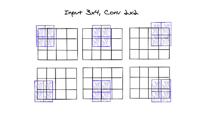
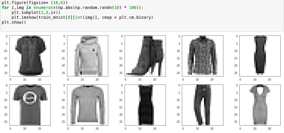
Let us consider a very simple Image Dataset, the Fashion MNIST dataset, which has thousands of images of fashion apparel.
Using PCA we can reduce the amount of information that we want, we can choose up to a certain amount that seems necessary for our particular task.
Using PCA we can reduce the amount of information that we want, we can choose up to a certain amount that seems necessary for our particular task.
It still would have a lot of the information of the entire dataset.
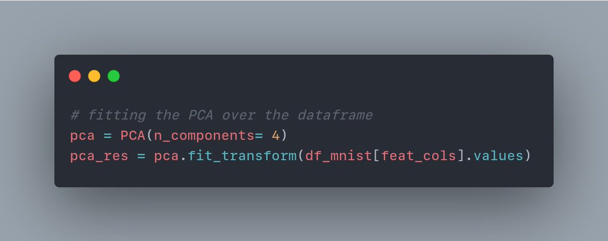
We fit the PCA, and it breaks down the image information in terms of several components. We can try with 4 components here.
We can try different numbers of components and see how many are enough for our case.
We fit the PCA, and it breaks down the image information in terms of several components. We can try with 4 components here.
We can try different numbers of components and see how many are enough for our case.
Here we can think of the variance explained by each component in the images as the measure of information.
We can see for each component how much information it is capturing in multiple ways.
Here's a bar chart with the y-axis showing the variance for each component.
We can see for each component how much information it is capturing in multiple ways.
Here's a bar chart with the y-axis showing the variance for each component.
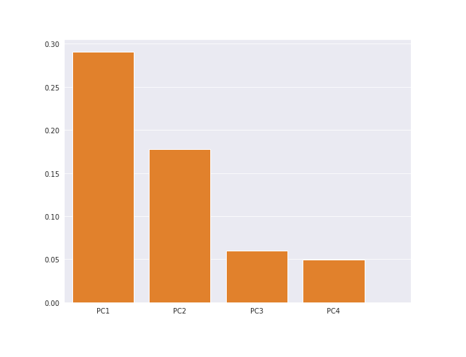
In above bar chart the components show around 29, 18, 6, and 5 explained variance
Cumulative Sum can be used to show that if we combine them then how much of the variance in total we would be able to explain.
Here's a line plot with individual and cumsum variance explained.
Cumulative Sum can be used to show that if we combine them then how much of the variance in total we would be able to explain.
Here's a line plot with individual and cumsum variance explained.
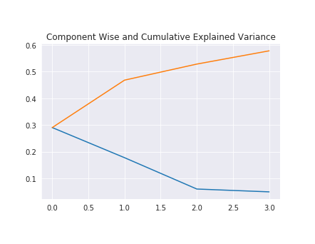
Now we can see in total we are able to explain about 58% of the variance by just 4 components
We can visualize each of them in terms of the images as well.
This would give us a better idea of the features from the images that are being captured by those components.
We can visualize each of them in terms of the images as well.
This would give us a better idea of the features from the images that are being captured by those components.
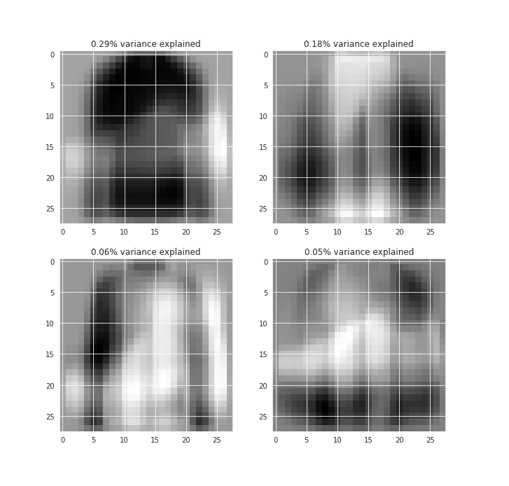
In the first component, we can see the shirt-like feature captured which is so common in the data.
And a very transparent shape for the shoe, hinting at some of the footwear variances captured.
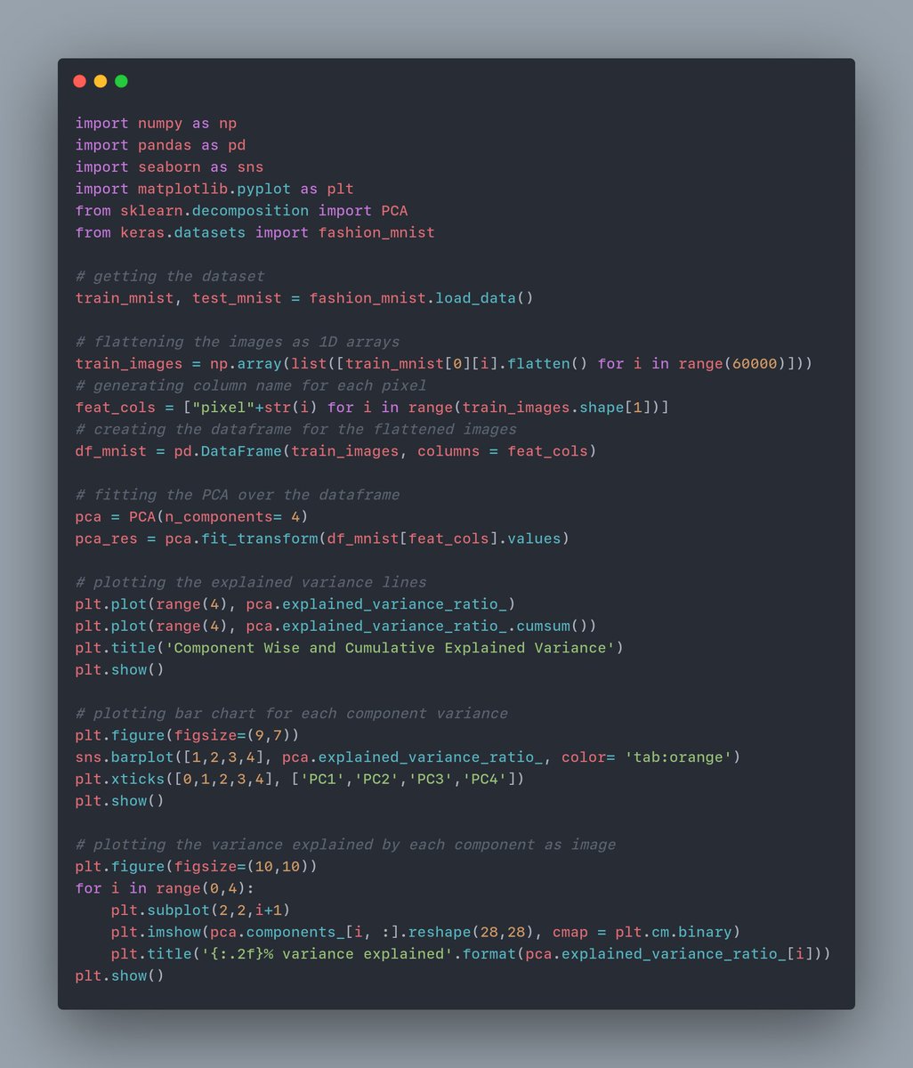
Here's the entire code snippet for PCA and the plots.
Hope this helps!👍
And a very transparent shape for the shoe, hinting at some of the footwear variances captured.
Here's the entire code snippet for PCA and the plots.
Hope this helps!👍
• • •
Missing some Tweet in this thread? You can try to
force a refresh