Today is Thursday, data dump day. The day we get our new official cases/100,000. Just 1 week ago, we were at 185.8 cases/100,000. Today, we will be at 155.9 (or close to it - they pull their data at a slightly different time than the csv file).
This is the number for all cases, probable and confirmed, and over 14 days. Two weeks ago, we were at 200 cases/100,000 (the last time Gov. DeWine mentioned the formerly all-important number). A drop of 44.1 cases/100,000, a truly incredible drop, yet will he speak of it today?
What argument do they have for the drop? In order for it to be truly 'science' a prediction must be made that is falsifiable. What is their falsifiable prediction? Have we masked harder? Have we kept further apart?
We have been told there's a much more contagious variant out the, vaccination rates have dropped in a massive way, all things that we are told are critically important, and yet we've dropped despite all the fear-mongering.
If we counted just confirmed, and only for 7 days (an appropriate time frame for a virus with an incubation period such as COVID-19) we would already be down to 44 cases/100,000 and as such, already be free, but ***when you control the denominator, you control the game.***
There are more than enough experimental biologics available for any who want one, and that number is dropping rapidly. Are the rest of us (the majority of us!) still willing to be held hostage to others' fears? To force our kids to get them, with no long-term safety data?
Particularly in the young. Just so they can avoid being quarantined for a seasonal virus that doesn't harm them?

This. Is. Insane.

• • •

Missing some Tweet in this thread? You can try to force a refresh
 

Keep Current with Understanding Ohio COVID Data

Understanding Ohio COVID Data Profile picture

Stay in touch and get notified when new unrolls are available from this author!

Read all threads

This Thread may be Removed Anytime!

PDF

Twitter may remove this content at anytime! Save it as PDF for later use!

Try unrolling a thread yourself!

how to unroll video
  1. Follow @ThreadReaderApp to mention us!

  2. From a Twitter thread mention us with a keyword "unroll"
@threadreaderapp unroll

Practice here first or read more on our help page!

More from @ohio_data

30 Apr
So, Delaware County has triggered indicator #6, 'increase' in new hospital admissions again.

Let's take a look, shall we? Image
Please look at the above graphic showing indicator #6 and a spreadsheet showing the 'hospitalizations.' First, note that this graph is a 7 day moving average. Each point represents 7 full days all averaged together. In order to have a value of '0' it's not just one day with 0.
It's at least 7. And on this graph, we see that there were 11 days without a single hospitalization from 4/2 and 4/11 there were 0 hospitalizations. And then again, there have been NO HOSPITALIZATIONS since 4/16.
Read 7 tweets
24 Mar
- Numbers have meaning. -

They don't just come from the ether. In Ohio (and many other places now) we are again focused on easily manipulated 'cases' and more specifically the now all-important 'cases per 100,000.'
Governor DeWine likes to say that it's a standard metric that they've been using all along (though I've noticed of late he no longer tries to tie it directly to the CDC's usage anymore, hmmmm) And it is a standard metric for the CDC. But not how it it being used in this instance.
This metric has been used for a long time for tracking the flu, and indeed, 50 cases/100,000 is the standard 'epidemic level' but what Gov. DeWine does not tell us is that it **matters how long we count for.**
Read 8 tweets
15 Mar
- Prevalence -

I have been criticized for the focus I have been putting on 'probable' cases for the last month or so. 1/3rd of our cases are 'probable,' so what? "They're mostly just positive antigen test cases! Just as good as PCR confirmed!"
Well, according to the FDA, no. The FDA has been very explicit that antigen tests need to be used in a very conscientious way. Specifically, that to properly interpret antigen tests results, the provider needs to take into account the prevalence of the disease in the region.
Please see fda.gov/.../potential-…... to see their exact recommendations, with a special focus on the section I have attached in the first image.

From that clip, it is clear that prevalence is an incredibly important number to understand.
Read 13 tweets
13 Mar
- Denominators, Part Two -

Or more of how Ohio's 'special math' works.

I had a question about what the significance of the number of days counted in the cases/100,000 metric is - whether it's 7 days (as the CDC counts it) or 14 days (the way Ohio counts it).
So I figure this is a good time for another set of hypotheticals to illustrate how this all works and how important the details really are. In the first attached graphic, I want you to imagine a county with exactly 100,000 residents that has exactly 7 new cases every single day.
If we count only one week's worth of cases (green box) we come up with 49 cases/100,000 - Freedom!

But if we count over 2 weeks (red box), we are suddenly at 98 cases/100,000!! PANIC! Image
Read 7 tweets
13 Mar
- Denominators -

So, there was a really great question in the comments yesterday, asking about where are we in our cases per 100,000 if we were to remove all probables in the last week. Let's take a look, shall we?
Please examine the attached table. In the first column I have listed out 'probable' cases, confirmed cases and the total combined from 2/24/21-3/9/21 - the range used for our current number. In the second column I have calculated the all important cases per 100,000 metric. Image
As you can see, the number of 'probables' alone exceeds the 50 cases/100,000.

But interestingly enough, if we were to count only confirmed cases and actually follow what the CDC does -
Read 6 tweets
21 Jan
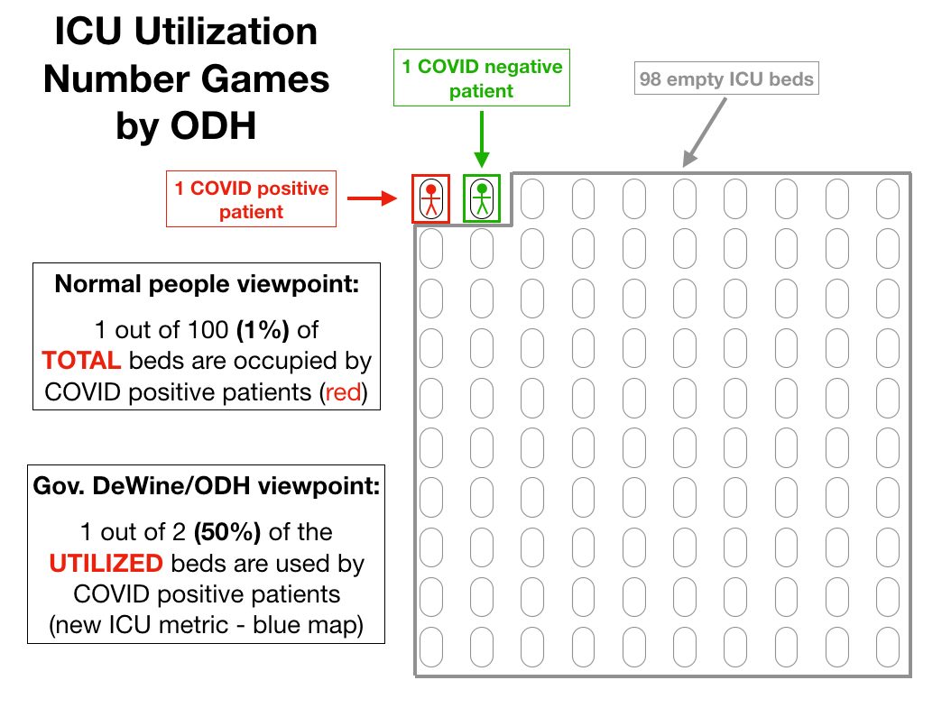
⬇️⬇️⬇️ The "Math" of Fear

As it is Thursday, I have a post for you today in anticipation of Gov. DeWine's new Maps of Fear which he has tried to phase in. I have previously discussed both the new red and blue maps and their issues -
- but today I hope to illustrate even more clearly what level of manipulation is going on, particularly with the new blue 'ICU Utilization' map.
Attached I have two images.

The first is a hyper-simplistic (and unrealistic) but illustrative example of the calculations that the new blue map goes through to arrive at its numbers.
Read 17 tweets

Did Thread Reader help you today?

Support us! We are indie developers!


This site is made by just two indie developers on a laptop doing marketing, support and development! Read more about the story.

Become a Premium Member ($3/month or $30/year) and get exclusive features!

Become Premium

Too expensive? Make a small donation by buying us coffee ($5) or help with server cost ($10)

Donate via Paypal Become our Patreon

Thank you for your support!

Follow Us on Twitter!