- Prevalence -

I have been criticized for the focus I have been putting on 'probable' cases for the last month or so. 1/3rd of our cases are 'probable,' so what? "They're mostly just positive antigen test cases! Just as good as PCR confirmed!"
Well, according to the FDA, no. The FDA has been very explicit that antigen tests need to be used in a very conscientious way. Specifically, that to properly interpret antigen tests results, the provider needs to take into account the prevalence of the disease in the region.
Please see fda.gov/.../potential-…... to see their exact recommendations, with a special focus on the section I have attached in the first image.

From that clip, it is clear that prevalence is an incredibly important number to understand.
So, what is prevalence? Prevalence is the proportion of persons in a population that have a disease/condition at a point in time or over a duration of time. For our purpose here, we will only consider at one point in time.
The math is simple. It is the number of people with the disease currently divided by the population and multiplied by 100 to get a percentage.

The tricky part is determining what constitutes who is currently 'diseased.'
In the state of Ohio, Governor DeWine and his 'experts' have declared that after 21 days, a person is deemed 'recovered' - although, as of the last day before they erased the data, over 4000 deaths had occurred after 21 days. But let us accept that range.
In the second attached image, please see the calculations for prevalence for both the whole state of Ohio (top) and just Franklin County, where Ohio State is located (bottom).
I have broken it down even further, with the top line representing the total cases over that time frame (both confirmed and probable) as well as only including the confirmed cases.
The prevalence is incredibly low. And a quick check of the FDA's example, we can see that we would be looking at between 70-96% of 'positives' would be **false positives.**
In the third image, I have done the same calculations, but limited it to just 10 days, which coincides with the CDC's duration of isolation guidance. The numbers are even more minuscule, with the prevalence being below 0.1% when we consider just the confirmed cases.
With an antigen test with 98% specificity, that means that more than 96% of all positives are FALSE.
There is absolutely no excuse for calling a positive antigen test a 'case' at this point. An argument could be made to use it as a surveillance tool, but they should not be used diagnostically as per the FDA and the CDC.
Stop counting probables, no matter their source!

#InThisTogetherOhio

• • •

Missing some Tweet in this thread? You can try to force a refresh
 

Keep Current with Understanding Ohio COVID Data

Understanding Ohio COVID Data Profile picture

Stay in touch and get notified when new unrolls are available from this author!

Read all threads

This Thread may be Removed Anytime!

PDF

Twitter may remove this content at anytime! Save it as PDF for later use!

Try unrolling a thread yourself!

how to unroll video
  1. Follow @ThreadReaderApp to mention us!

  2. From a Twitter thread mention us with a keyword "unroll"
@threadreaderapp unroll

Practice here first or read more on our help page!

More from @ohio_data

13 Mar
- Denominators, Part Two -

Or more of how Ohio's 'special math' works.

I had a question about what the significance of the number of days counted in the cases/100,000 metric is - whether it's 7 days (as the CDC counts it) or 14 days (the way Ohio counts it).
So I figure this is a good time for another set of hypotheticals to illustrate how this all works and how important the details really are. In the first attached graphic, I want you to imagine a county with exactly 100,000 residents that has exactly 7 new cases every single day.
If we count only one week's worth of cases (green box) we come up with 49 cases/100,000 - Freedom!

But if we count over 2 weeks (red box), we are suddenly at 98 cases/100,000!! PANIC! Image
Read 7 tweets
13 Mar
- Denominators -

So, there was a really great question in the comments yesterday, asking about where are we in our cases per 100,000 if we were to remove all probables in the last week. Let's take a look, shall we?
Please examine the attached table. In the first column I have listed out 'probable' cases, confirmed cases and the total combined from 2/24/21-3/9/21 - the range used for our current number. In the second column I have calculated the all important cases per 100,000 metric. Image
As you can see, the number of 'probables' alone exceeds the 50 cases/100,000.

But interestingly enough, if we were to count only confirmed cases and actually follow what the CDC does -
Read 6 tweets
21 Jan
⬇️⬇️⬇️ The "Math" of Fear

As it is Thursday, I have a post for you today in anticipation of Gov. DeWine's new Maps of Fear which he has tried to phase in. I have previously discussed both the new red and blue maps and their issues -
- but today I hope to illustrate even more clearly what level of manipulation is going on, particularly with the new blue 'ICU Utilization' map.
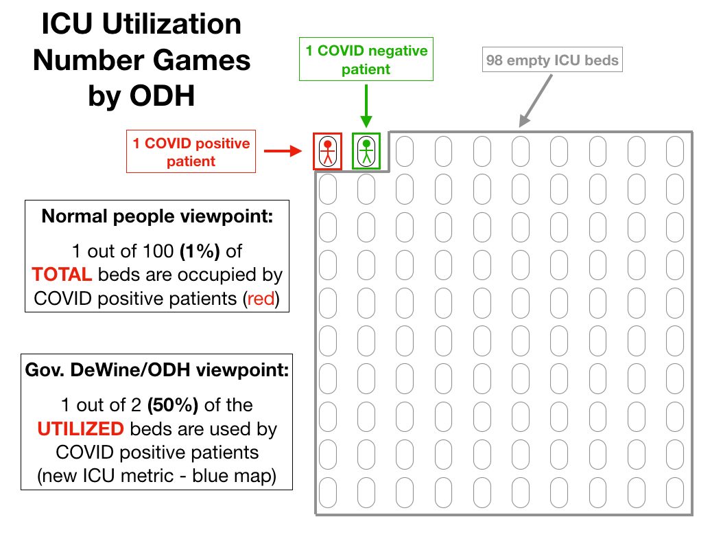
Attached I have two images.

The first is a hyper-simplistic (and unrealistic) but illustrative example of the calculations that the new blue map goes through to arrive at its numbers.
Read 17 tweets
18 Jan
So here's something interesting about our latest 'surge'. If one goes to coronavirus.ohio.gov/.../covi.../da… you can toggle between 'confirmed' cases, 'probable' cases and both of them together.
So what is a 'confirmed' case? That would be any laboratory confirmed 'case' - any positive PCR, antigen or antibody test, with all the issues of false positivity and hypersensitivity and non-infectiousness that go along with all of those tests.
A 'probable' case does not even have a positive test result associated with it. All it requires are symptoms. Maybe an epidemiological link. We are now in the middle of what used to be referred to as 'flu season' when there is a wide variety of respiratory illnesses that exist -
Read 11 tweets
30 Dec 20
⭐️⭐️⭐️ Playing Number Games: Part Two

In my last post, I showed how the new 'Key Measures' ICU map was distorting the data by looking only at the comparison of COVID positive (not necessarily ill with COVID) patients versus -
- vs the number of total patients in the ICU - not the percentage of COVD positive patients out of the total number of ICU beds.
So what if they went back to simply the percentage of COVID positive patients out of all available ICU beds? First, the numbers would not be as scary, and second, the total number of beds available in a region is not stable from one day to the next.
Read 7 tweets
30 Dec 20
⭐️⭐️⭐️ Playing Number Games.

As noted in my last post, Gov. DeWine has signaled a movement away from the Ohio Public Health Advisory System (aka, the Map of Fear) because under the new rules, the state will be stuck in red perpetually with sufficient testing.
So to replace this map, he announced two new maps, to be updated weekly and found at coronavirus.ohio.gov/static/OPHASM/…
These two measures look at cases per capita WHICH CAN BE CONTROLLED SOLELY BY TESTING WITH FAULTY TESTS AND IS SEVERELY PUNITIVE TO RURAL COUNTIES.
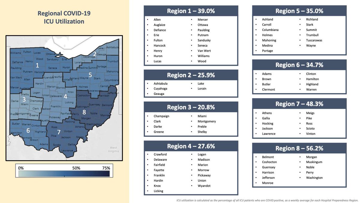
The second map shows ICU utilization by region (first attached image), and these percentages look quite alarming.
Read 14 tweets

Did Thread Reader help you today?

Support us! We are indie developers!


This site is made by just two indie developers on a laptop doing marketing, support and development! Read more about the story.

Become a Premium Member ($3/month or $30/year) and get exclusive features!

Become Premium

Too expensive? Make a small donation by buying us coffee ($5) or help with server cost ($10)

Donate via Paypal Become our Patreon

Thank you for your support!

Follow Us on Twitter!