
🚨💉🏡 NEW ARTICLE 🏡💉🚨
"Social Distancing, Politics and Wealth" out in Open Access in West European Politics, joint with @aslicansunar and @madselk through our @ERC_Research grant WEALTHPOL. Yes, we wrote a COVID article ;) What do we find? 1/n
tandfonline.com/doi/full/10.10…
"Social Distancing, Politics and Wealth" out in Open Access in West European Politics, joint with @aslicansunar and @madselk through our @ERC_Research grant WEALTHPOL. Yes, we wrote a COVID article ;) What do we find? 1/n
tandfonline.com/doi/full/10.10…
The paper uses Google Community Mobility data at the local level in the 1st wave of COVID19 and looks at the correlates of workplace and residential activity. Who went to work more? Who stayed at home? We focus on the UK, Sweden and Denmark and then expand to European regions 2/n
Let's begin with a dragon. Our dragon here is workplace activity relative to the baseline of Jan3-Feb6 2020 in the UK. Each dot is 1 of 366 local authorities. We see the head in Feb/Mar, the neck as lockdown hits and the body low though rising in summer with weekend spikes! 3/n 

I have been sneaky, I haven't yet mentioned the colour scheme. But perhaps you have guessed it - it's voting in the EU Referendum in 2016. Yellow is Remain, Blue is Leave. So what we see is higher workplace activity post-lockdown in Leave areas. No difference though b4 March 4/n
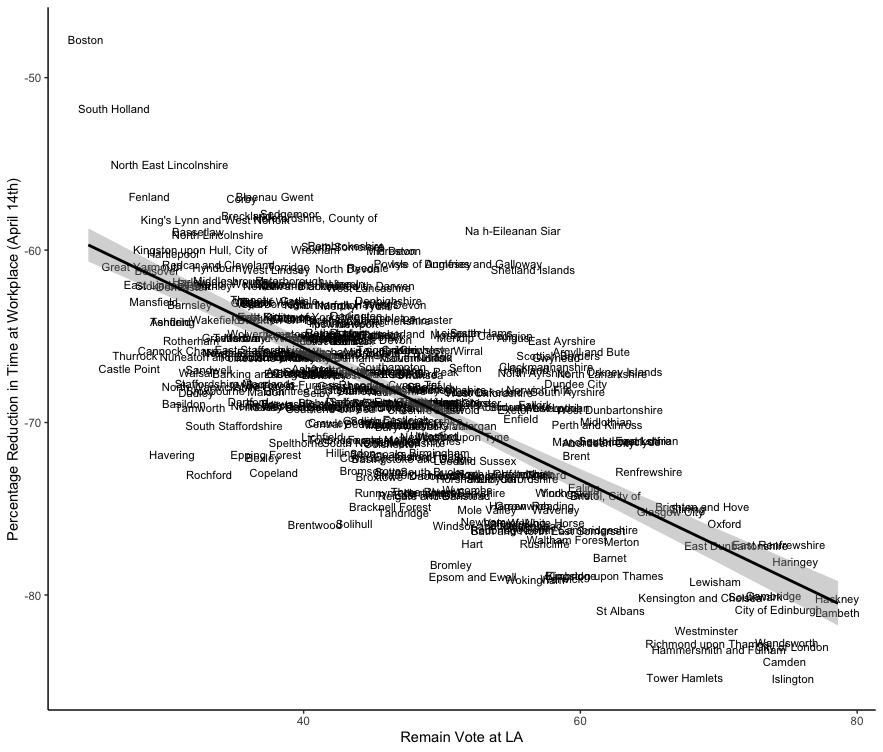
You can see this in two scatterplots, comparing workplace activity with Remain vote, first in early March 2020 and then in mid April 2020. Before the deluge, no relationship. After, a strong negative one. 5/n

You might think this is just London vs the rest. Which would be very fair. So let's look at figures of London alone (left) and Scotland alone (right) for April 14th 2020. Same pattern... 6/n


At this point you are thinking, as we did, surely it's not Brexit, it must be something that correlates with Brexit. The way we handle this is initially by running 180 odd daily regressions, controlling for income, class, density, age structure, etc. 7/n
When you do this you can spit out coefficients for each of these variables for each day, controlling for all the others. If you plot them by day you get this (thx @robwhickman). Below the dotted line means relationship is negative. You can see that for Remain from mid-Mar. 8/n

We also see negative relationships between workplace activity and (a) share working in high-skilled services, (b) density, (c) house prices. This is your work from home crew - jobs and housing wealth make it easier. This is a big finding for our WEALTHPOL project! 9/n
We mostly explore the political angle though since (a) we're political scientists and (b) there's evidence of this pattern in the States (see eg work by @TomPepinsky @ThatSaraGoodman @sgadarian). And we want to see if this is 'causal' so we ante up... 10/n
Now I'm uncomfortable with strong causal claims on this kind of thing. But we run a Diff-in-Diff model which adds dummies for every local authority and every day and looks at whether the pattern bw workplace activity and Remain shifts after lockdown. And result still there 11/n

We also look at residential 'activity', which should be the flip side of workplace activity. And indeed we find what we expect - higher residential activity in Remain locations post lockdown. 12/n

This all begs the question of whether this generalises. So let's look at Sweden first, where we colour by whether municipalities voted above median level for populist Sweden Democrats (blue) or below (yellow). Similar dragon even in lockdown-skeptical Sweden 13/n

And then we look at the Danish dragon, where red means more support for the populist Danish People's Party and grey less. Again a similar finding. And you can read the paper to see the same set of statistical tests. 14/n

Across all three cases we find not only this political pattern but also places with more expensive housing and higher density had less workplace activity post lockdown. 15/n
In the final section of the paper we turn to Europe as a whole and look at regional data across 295 regions in 23 countries. We develop a region-specific populism score from 15 items in the European Social Survey and an MRP model (above) and mobility measures (below). 16/n

Because lockdown timing varies across Europe we have a more complicated analysis with varied intervention types and timings using @thomasnhale's policy data. And we look at differences in workplace activity based on pop right (PRR) views. Strongest when lockdown is strongest 17/n

Also worth noting that populist right sentiment is a much stronger predictor than left-right ideology... And for WEALTHPOL fans, house prices strongly correlate with social distancing once more! 18/n
OK that's a wrap. The paper is OPEN ACCESS and available at tandfonline.com/doi/full/10.10…
Lots more in there about our argument for what's going on and how we ran data analysis. And I'll post all the data online at my website. 19/n
Lots more in there about our argument for what's going on and how we ran data analysis. And I'll post all the data online at my website. 19/n
If I were to add anything it's to say that I don't think for the most part populists truly disdain social distancing. I think there's also something about regions where populists are more successful also makes it harder to work from home. 20/n
We control for lots of things but ultimately statistical controls aren't a panacea. Still, it is the case that elites on the populist right have not always been... pro-lockdown. It's not unimaginable that that elite messaging affects behaviour. 21/n
At a minimum it's an important correlation for thinking about where in Europe might respond more or less to new lockdowns, whatever the underlying reasoning. Let's just hope we don't have (m)any more of those! n/n
Perhaps of interest @robfordmancs @ThatSaraGoodman @sarahobolt @drjennings @anandMenon1 @Dannythefink @BristOliver @CatherineDVries @simonjhix @jrhopkin @lucycbarnes
Oops - knew I'd make a mistake somewhere in this thread - to be precise the "effect" of PRR sentiment is strongest where there was some flexibility in the lockdown, as opposed to where there were hard and fast rules. That is politics matters more where there is space to matter.
• • •
Missing some Tweet in this thread? You can try to
force a refresh


